It turns out that the fleeting pronouncements we post on Twitter are catnip for academics and others eager to find the elusive pulse of American society. Since Twitter launched in 2006, researchers have been hard at work figuring out how to turn those 140-character musings into tea leaves with something meaningful to say about us all.
Here come three new projects that claim to provide a window into the American soul through Twitter. Whether they succeed or not, well, that’s still unclear. (And, by the way, you can start following Open Culture on Twitter here.)
Most feverishly excited about its work are the team behind the Global Twitter Heartbeat, which so far focuses mostly on the United States. With the help of a huge SGI processor to process a live feed of public social media data, a team of researchers from the University of Illinois at Urbana-Champaign has made a heat map to show how people react (through Twitter) to big events.
They looked at two things: Hurricane Sandy (top) and the 2012 Presidential Election (above). Using Twitter’s “garden hose feed”—a random sampling of 10 percent of the roughly 500 million tweets sent every day—researchers color-coded tweets red for negative tone and blue for positive and showed the shifting concentrations of Twitter activity across the country. It looks like a map of a talking weather system as occasional dialogue boxes open up to show representative tweets. Researcher Kalev Leetaru argues that tracking Twitter activity gives us the potential to track the heartbeat of society.
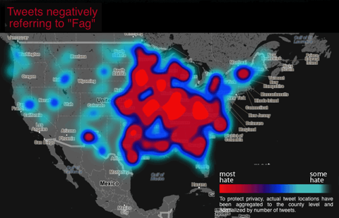
Two other projects look in an on-going way at tweet “tone,” or the negativity/positivity of messages. One spin on this research is the Geographic Hate Map (sample map above), a project by Dr. Monica Stephens of Humboldt State University in Northern California. To begin their work, Stephens and her team accessed a massive database of geographically tagged tweets sent between June, 2012 and April, 2013.
They used only tweets that contained any of ten “hate words.” They read each tweet to be sure the words were used in a negative way and built a map based on where the tweets came from. Then they aggregated to the county level and normalized for the amount of twitter traffic in that area so that densely populated areas don’t look more racist or homophobic by default.
Then there’s the glass half full. The Hedonometer measures happiness, or lack thereof, as expressed by tweets, calculating averages based on what the researchers call “word shifts” (watch an explanation above). This research project, put together by the University of Vermont Complex Systems Center, uses the same garden hose feed as the Global Twitter Heartbeat. This project searches for frequently used words to measure how good a day Twitter users are having. Since 2008 the Hedonometer has kept track of how often words like “happy,” “yes,” and “love” pop up in tweets, as opposed to “hate,” “no,” and “unhappy.” The saddest day on Hedonometer record so far is April 15, 2013, the day bombs exploded at the Boston Marathon finish line. Christmas Day tends to rank as the happiest day of the year.
To be sure, any tool that uses tweets for data is measuring a very young and specific subgroup of people. Tweets are not a reliable measure of anything, really, but maybe with some tweaking, these research models will come up with something interesting.
Related Content:
The Art of Data Visualization: How to Tell Complex Stories Through Smart Design
Watch a Cool and Creepy Visualization of U.S. Births & Deaths in Real-Time
An Animated Visualization of Every Observed Meteorite That Has Hit Earth Since 861 AD
Kate Rix writes about education and digital media. Follow daily ups and downs on Twitter @mskaterix.

Leave a Reply