Salvador Dalí & Walt Disney’s Short Animated Film, Destino, Set to the Music of Pink Floyd

In 1945, Walt Dis­ney and Sal­vador Dalí began col­lab­o­rat­ing on an ani­mat­ed film. 58 years lat­er, with Dalí long gone and Dis­ney gone longer still, it came out. The delayed arrival of Des­ti­no had to do with mon­ey trou­ble at the Walt Dis­ney Stu­dios not long after the project began, and it seems that few laid eyes on its unfin­ished mate­ri­als again until Dis­ney’s nephew Roy E. Dis­ney came across them in 1999. Com­plet­ed, it pre­miered at the 2003 New York Film Fes­ti­val and received an Oscar nom­i­na­tion for Best Ani­mat­ed Short Film. Now, fif­teen years lat­er, we know for sure that Des­ti­no has found a place in the cul­ture, because some­one has mashed it up with Pink Floyd.

Unlike The Wiz­ard of Oz, which has in Pink Floy­d’s Dark Side of the Moon the best-known inad­ver­tent sound­track of all time, the sev­en-minute Des­ti­no can hard­ly accom­mo­date an entire album. But it does match nice­ly with “Time,” Dark Side of the Moon’s fourth track, in length as well as in theme.

Though in many ways a more visu­al expe­ri­ence than a nar­ra­tive one — if com­plet­ed in the 1940s, it might have become part of a Fan­ta­sia-like “pack­age film” — Des­ti­no does tell a sto­ry, show­ing a grace­ful woman who catch­es the eye of Chronos, the myth­i­cal per­son­i­fi­ca­tion of time itself. This allows the film to indulge in some clock imagery, which one might expect from Dalí, though it also includes clocks of the non-melt­ing vari­ety.

Only with “Time” as its sound­track does Des­ti­no include the sound of clocks as well. All the ring­ing and bong­ing that opens the song came as a con­tri­bu­tion from famed pro­duc­er Alan Par­sons, who worked on Dark Side of the Moon as an engi­neer. Before the album’s ses­sions, he’d hap­pened to go out to an antique shop and record its clocks as a test of the then-nov­el Quadra­phon­ic record­ing tech­nique. The tran­si­tion from Par­sons’ clocks to Nick Mason’s drums fits uncan­ni­ly well with the open­ing of Des­ti­no, as does much that fol­lows. “Every year is get­ting short­er, nev­er seem to find the time,” sings David Gilmour. “Plans that either come to naught or half a page of scrib­bled lines.” Though Dis­ney and Dalí came up with much more than half a page of scrib­bled lines, both of them prob­a­bly assumed Des­ti­no had come to naught. Or might they have sus­pect­ed that the project would find its way in time?

You can watch a doc­u­men­tary on the Dis­ney-Dali col­lab­o­ra­tion here.

If you would like to sign up for Open Culture’s free email newslet­ter, please find it here. Or fol­low our posts on Threads, Face­book, BlueSky or Mastodon.

If you would like to sup­port the mis­sion of Open Cul­ture, con­sid­er mak­ing a dona­tion to our site. It’s hard to rely 100% on ads, and your con­tri­bu­tions will help us con­tin­ue pro­vid­ing the best free cul­tur­al and edu­ca­tion­al mate­ri­als to learn­ers every­where. You can con­tribute through Pay­Pal, Patre­on, and Ven­mo (@openculture). Thanks!

Relat­ed Con­tent:

Sal­vador Dalí & Walt Disney’s Des­ti­no: See the Col­lab­o­ra­tive Film, Orig­i­nal Sto­ry­boards & Ink Draw­ings

Dark Side of the Rain­bow: Pink Floyd Meets The Wiz­ard of Oz in One of the Ear­li­est Mash-Ups

The “Lost” Pink Floyd Sound­track for Michelan­ge­lo Antonioni’s Only Amer­i­can Film, Zabriskie Point (1970)

Pink Floyd’s “Echoes” Pro­vides a Sound­track for the Final Scene of Kubrick’s 2001: A Space Odyssey

Based in Seoul, Col­in Mar­shall writes and broad­casts on cities and cul­ture. His projects include the book The State­less City: a Walk through 21st-Cen­tu­ry Los Ange­les and the video series The City in Cin­e­ma. Fol­low him on Twit­ter at @colinmarshall or on Face­book.

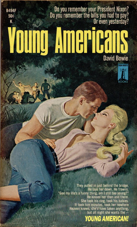
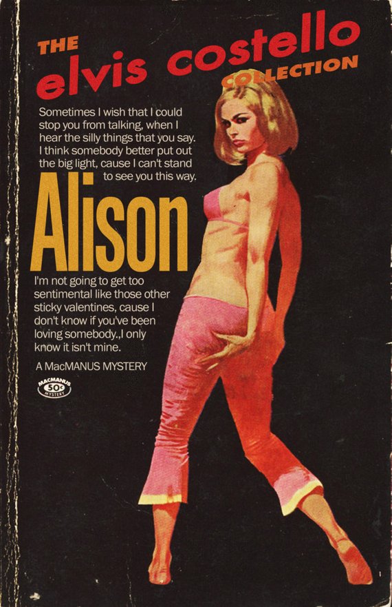
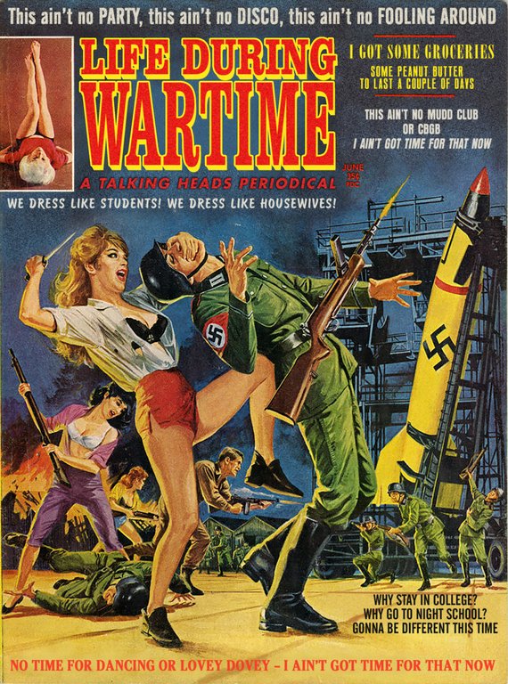
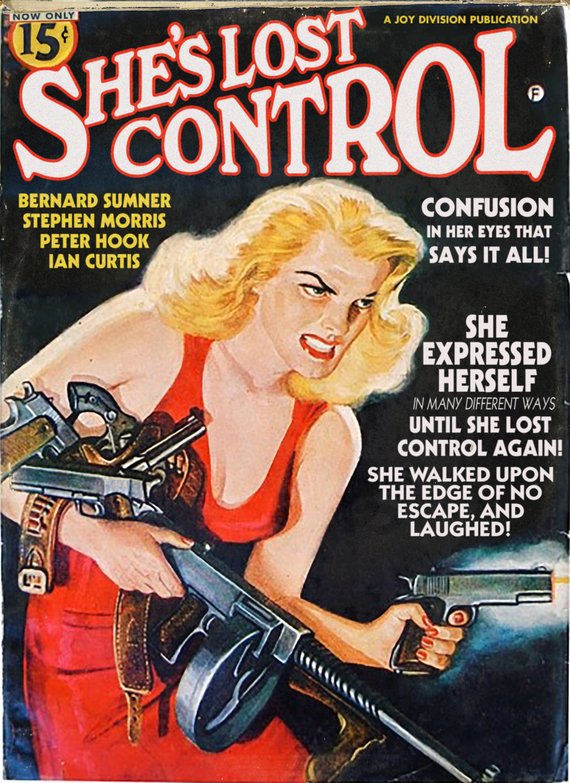
Songs by David Bowie, Elvis Costello, Talking Heads & More Re-Imagined as Pulp Fiction Book Covers

As David Bowie him­self implied in a 1975 inter­view, “Young Amer­i­cans” does­n’t have much of a nar­ra­tive.

Rather, it’s a por­trait of ambiva­lence, viewed at some remove.

The same can­not be said for Young Amer­i­cans, the whol­ly imag­i­nary mid­cen­tu­ry pulp nov­el.

One look at the lurid cov­er, above, and one can guess the sort of steamy pas­sages con­tained with­in. Bowie’s sweaty palmed class­mates at Brom­ley Tech­ni­cal High School could prob­a­bly have recit­ed them from mem­o­ry!

Dit­to Ali­son. The tawdry paper­back, not Elvis Costello’s ever­green 1977 bal­lad. There’s a rea­son its spine is falling apart, and it’s not because young lads like Elvis Costel­lo are fear­ful their hearts might prove untrue. That skimpy pink biki­ni top and hip hug­gers get-up is appeal­ing to an entire­ly dif­fer­ent organ.

Here we must reit­er­ate that these books do not exist and nev­er did.

Though there’s a lot of fun to be had in pre­tend­ing that they do.

Screen­writer Todd Alcott, the true author of these dig­i­tal mashups, is keen­ly attuned to the over­ripe visu­al lan­guage of mid­cen­tu­ry paper­backs.

He’s also got quite a knack for extract­ing lyrics from their orig­i­nal con­text and ren­der­ing them in the peri­od font, mag­i­cal­ly retool­ing them as the sort of sug­ges­tive quotes that once beck­oned from drug­store book racks.

Font has been impor­tant to him since the age of 13, when a school art project required him to com­bine text with an image:

I decid­ed that I want­ed the text to look like the text I’d seen in an ad for a John Lennon album, so I copied that font style. I did­n’t know that the font style had a name, but I knew that my instincts for how to draw those let­ters did­n’t match how the let­ters end­ed up look­ing. The font, as it turns out, was Franklin Goth­ic, and, as a 13-year-old, all I remem­ber was that I would start to draw the “S” and then real­ize that my “S” did­n’t look like Franklin Goth­ic’s “S,” and that the curvy let­ters, like “G” and “O,” did­n’t look right when they sat on the lines I’d made for the oth­er let­ters, because of course for a font, the curvy let­ters have to be a lit­tle bit big­ger than the straight let­ters, or else they end up look­ing too small. I became fas­ci­nat­ed with that kind of thing, how one font would give off one kind of feel­ing, and oth­er one would give off a com­plete­ly dif­fer­ent feel­ing. And it turns out there’s a rea­son for all of that, that every font car­ries with it a spe­cif­ic cul­tur­al con­no­ta­tion whether the read­er is aware of it or not. When I dri­ve down the street in LA, I see bill­boards and I can’t just look at one and say “Okay, got it,” I get a whole oth­er lay­er of mean­ing from them because their design and font choic­es tell me a whole his­to­ry of the peo­ple who designed them.

While Alcott dis­cov­ers many of his visu­als online, he has a soft spot for the bat­tered orig­i­nals he finds in sec­ond hand shops. Their wear and tear con­fers the sort of verisimil­i­tude he seeks. The rest is equal parts inspi­ra­tion, Pho­to­shop, and a grow­ing under­stand­ing of a design form he once dis­missed as the tawdry fruit of Low Cul­ture:

I’d nev­er under­stood pulp design until I start­ed this project.  As I start­ed look­ing at it, I real­ized that  the aes­thet­ic of pulp is so deeply attached to its prod­uct that it’s impos­si­ble to sep­a­rate the two. And that’s what great design is, a graph­ic rep­re­sen­ta­tion of ideas. When I start­ed exam­in­ing the designs, to see why some work and some don’t, I was over­whelmed with the sheer amount of artistry involved in the cov­ers. Pulp was a huge cul­tur­al force, there were dozens of mag­a­zines and pub­lish­ers, crank­ing out stuff every month for decades, detec­tive sto­ries and police sto­ries and noir sto­ries and mys­ter­ies. It employed thou­sands of artists, writ­ers and painters and illus­tra­tors. And the ener­gy of the paint­ings is just off the charts. It had to be, because any giv­en book cov­er had to com­pete with the ten thou­sand oth­er cov­ers that were on dis­play. It had to grab the view­er fast, and make that per­son pick up the book instead of some oth­er book. I love all kinds of mid­cen­tu­ry stuff, but noth­ing grabs you the way a good pulp cov­er does.

Not all of his mash ups traf­fic in mid-cen­tu­ry drug­store rack nympho­ma­nia.

New Order’s “Bizarre Love Tri­an­gle” is the ide­al recip­i­ent of the abstract approach so com­mon to psy­chol­o­gy and phi­los­o­phy titles of the peri­od.

Need­less to say, Alcott’s cov­ers are also a trib­ute to the musi­cians he lists as authors, par­tic­u­lar­ly those dat­ing to his New Wave era youth—Bowie, Costel­lo, Joy Divi­sion, Talk­ing Heads, King Crim­son

I know I could find more pop­u­lar con­tem­po­rary artists to make trib­utes for, but these are the artists I love, I con­nect to their work on a deep lev­el, and I try to make things that they would see and think “Yeah, this guy gets me.” 

My favorite thing is when peo­ple think the pieces are real. That’s the high­est com­pli­ment I can receive. I’ve had band mem­bers con­tact me and say “Where did you find this?” or “I don’t even remem­ber doing this album” or “Where did you find this?” That’s when I know I’ve suc­cess­ful­ly com­bined ideas.

Todd Alcott’s Mid-Cen­tu­ry Mash Up Book Cov­ers can be pur­chased as prints from his Etsy store.

All images pub­lished with the per­mis­sion of Todd Alcott.

Relat­ed Con­tent:

7 Rock Album Cov­ers Designed by Icon­ic Artists: Warhol, Rauschen­berg, Dalí, Richter, Map­plethor­pe & More

French Book­store Blends Real People’s Faces with Book Cov­er Art

36 Abstract Cov­ers of Vin­tage Psy­chol­o­gy, Phi­los­o­phy & Sci­ence Books Come to Life in a Mes­mer­iz­ing Ani­ma­tion

Ayun Hal­l­i­day is an author, illus­tra­tor, the­ater mak­er and Chief Pri­ma­tol­o­gist of the East Vil­lage Inky zine.  Join her in NYC on Mon­day, Sep­tem­ber 24 for anoth­er month­ly install­ment of her book-based vari­ety show, Necro­mancers of the Pub­lic Domain. Fol­low her @AyunHalliday.

V.S. Naipaul Writes an Enraged Letter to His Publisher After a Copy-Editor Revises His Book, A Turn in the South

Pho­to by Faizul Latif Chowd­hury, via Wiki­me­dia Com­mons

There are many ways for trav­el writ­ers to get their sub­ject bad­ly wrong. Per­haps the worst is sole­ly rely­ing on unin­formed obser­va­tion rather than seek­ing the wis­dom and expe­ri­ence of knowl­edge­able locals. To his cred­it, cel­e­brat­ed Nobel prize-win­ning nov­el­ist V.S. Naipaul—who passed away on August 11th at age 85—met, min­gled, and spoke freely with indi­vid­u­als from every walk of life (includ­ing Eudo­ra Wel­ty) in the process of writ­ing A Turn in the South, a trav­el­ogue of his sojourn through the much-mythol­o­gized and maligned South­ern states of the U.S.

Naipaul’s voice alone might have over­whelmed the work with the extreme­ly harsh, some have said big­ot­ed, judg­ments he became known for in nov­els like A Bend in the Riv­erGueril­las, and The Enig­ma of Arrival. Instead, he won praise from review­ers like South­ern his­to­ri­an C. Vann Wood­ward, who wrote that Naipaul “brings new under­stand­ing of the sub­ject to his read­er.” Wood­ward also not­ed that Naipaul “con­fess­es to ‘writ­ing anx­i­eties’ about under­tak­ing this book on peo­ple unknown to him.”

Though he con­sult­ed and quot­ed local voic­es in his sur­vey of the South, it is ulti­mate­ly Naipaul’s voice that orga­nizes the work, and his pre­cise, eru­dite prose the read­er hears. It was a voice he took great pride in, as he should. For his many faults, Naipaul was a mas­ter­ful lit­er­ary styl­ist. One won­ders, then, why a copy edi­tor at Knopf would feel it nec­es­sary to make exten­sive revi­sions to the man­u­script of A Turn in the South before its pub­li­ca­tion.

Copy-edit­ing is an essen­tial func­tion, writes Let­ters of Note, with­out which many books would go to print “pep­pered with redun­dant hyphens, need­less rep­e­ti­tion, mis­placed semi­colons,” etc. But it is also a task that should inter­fere as lit­tle as pos­si­ble with the mat­ters of dic­tion, style, and syn­tax that char­ac­ter­ize an autho­r­i­al voice. Like a con­sci­en­tious back­pack­er, a good copy edi­tor should endeav­or to leave almost no trace unless the text is full of seri­ous prob­lems.

Clear­ly, as Naipaul’s irri­tat­ed let­ter below shows, some­thing went wrong. Upon receiv­ing the copy-edit­ed text, he writes, he was oblig­ed to restore the orig­i­nal from mem­o­ry. Naipaul assures Knopf’s edi­tor-in-chief Son­ny Mehta that he under­stands the Eng­lish lan­guage and its his­to­ry very well, and knows that, unlike French, it has no “court rules,” and can be bent any num­ber of ways with­out break­ing. He implies it is the job of every “seri­ous or ded­i­cat­ed” writer in Eng­lish to use the lan­guage as they see fit, and the job of an edi­tor to most­ly get out of the way.

No doubt this rela­tion­ship can prove com­pli­cat­ed and frus­trat­ing for both par­ties. Still, though we only get Naipaul’s side of the sto­ry, it’s hard not to take it when he points out he had writ­ten 20 books by that time, all of them acclaimed for the qual­i­ty of their writ­ing. “My name goes on my book,” he declares. (So does the name “Knopf,” Mehta might have replied.) “I am respon­si­ble for the way the words are put togeth­er.” Read the let­ter in full below. And see Lit­er­ary Hub for Naipaul’s Ten Rules of Writ­ing if you’re inter­est­ed in his pre­scrip­tions for clear Eng­lish prose—advice he had earned license to take or leave in his own work.


10 May 1988

Dear Son­ny,

The copy-edit­ed text of A Turn in the South came yes­ter­day; it is such an appalling piece of work that I feel I have to write about it. This kind of copy-edit­ing gets in the way of cre­ative read­ing. I spend so much time restor­ing the text I wrote (and as a result know rather well). I thought it might have been known in the office that after 34 years and 20 books I knew cer­tain things about writ­ing and didn’t want a copy-editor’s help with punc­tu­a­tion or the thing called rep­e­ti­tion; and cer­tain­ly didn’t want help with ways of get­ting round rep­e­ti­tion. It is utter­ly absurd to have some­one point­ing out to me rep­e­ti­tions in the use of “and” or “like” or “that” or “she”. I didn’t want any­one undo­ing my semi-colons; with all their dif­fer­ent ways of link­ing.

It hap­pens that Eng­lish — the his­to­ry of the lan­guage — was my sub­ject at Oxford. It hap­pens that I know very well that these so-called “rules” have noth­ing to do with the lan­guage and are real­ly rules about French usage. The glo­ry of Eng­lish is that it is with­out these court rules: it is a lan­guage made by the peo­ple who write it. My name goes on my book. I am respon­si­ble for the way the words are put togeth­er. It is one rea­son why I became a writer.

Every writer has his own voice. (Every seri­ous or ded­i­cat­ed writer.) This is achieved by the way he punc­tu­ates; the rhythm of his phras­es; the way the writ­ing reflects the process­es of the writer’s thought: all the ner­vous­ness, all the links, all the curi­ous asso­ci­a­tions. An assid­u­ous copy-edi­tor can undo this very quick­ly, can make A write like B and Ms C.

And what a waste of spir­it it is for the writer, who is in effect re-doing bits of his man­u­script all the time instead of giv­ing it a tru­ly cre­ative, revis­ing read. Con­sid­er how it has made me sit down this morn­ing, not to my work, but to write this enraged let­ter.

Yours 

Vidia

via Let­ters of Note

Relat­ed Con­tent:

Kurt Von­negut Explains “How to Write With Style”

Cor­mac McCarthy’s Three Punc­tu­a­tion Rules, and How They All Go Back to James Joyce

Oscar Wilde Offers Prac­ti­cal Advice on the Writ­ing Life in a New­ly-Dis­cov­ered Let­ter from 1890

Josh Jones is a writer and musi­cian based in Durham, NC. Fol­low him at @jdmagness

10 Great German Expressionist Films: From Nosferatu to The Cabinet of Dr. Caligari

In 1913, Ger­many, flush with a new nation’s patri­ot­ic zeal, looked like it might become the dom­i­nant nation of Europe and a real rival to that glob­al super­pow­er Great Britain. Then it hit the buz­z­saw of World War I. After the Ger­man gov­ern­ment col­lapsed in 1918 from the eco­nom­ic and emo­tion­al toll of a half-decade of sense­less car­nage, the Allies forced it to accept dra­con­ian terms for sur­ren­der. The entire Ger­man cul­ture was sent reel­ing, search­ing for answers to what hap­pened and why.

Ger­man Expres­sion­ism came about to artic­u­late these lac­er­at­ing ques­tions roil­ing in the nation’s col­lec­tive uncon­scious. The first such film was The Cab­i­net of Dr. Cali­gari (1920), about a malev­o­lent trav­el­ing magi­cian who has his ser­vant do his mur­der­ous bid­ding in the dark of the night. The sto­ry­line is all about the Freudi­an ter­ror of hid­den sub­con­scious dri­ves, but what real­ly makes the movie mem­o­rable is its com­plete­ly unhinged look. Marked by styl­ized act­ing, deep shad­ows paint­ed onto the walls, and sets filled with twist­ed archi­tec­tur­al impos­si­bil­i­ties — there might not be a sin­gle right angle in the film – Cali­gari’s look per­fect­ly mesh­es with the nar­ra­tor’s dement­ed state of mind.

Sub­se­quent Ger­man Expres­sion­ist movies retreat­ed from the extreme aes­thet­ics of Cali­gari but were still filled with a mood of vio­lence, frus­tra­tion and unease. F. W. Mur­nau’s bril­liant­ly depress­ing The Last Laugh (1924) is about a proud door­man at a high-end hotel who is uncer­e­mo­ni­ous­ly stripped of his posi­tion and demot­ed to a low­ly bath­room atten­dant. When he hands over his uni­form, his pos­ture col­laps­es as if the jack­et were his exoskele­ton. You don’t need to be a semi­ol­o­gist to fig­ure out that the doorman’s loss of sta­tus par­al­lels Germany’s. Fritz Lang’s M (1931), a land­mark of ear­ly sound film, is the first ser­i­al killer movie ever made. But what starts out as a police pro­ce­dur­al turns into some­thing even more unset­tling when a gang of dis­tinct­ly Nazi-like crim­i­nals decide to mete out some jus­tice of their own.

Ger­man Expres­sion­ism end­ed in 1933 when the Nazis came to pow­er. They weren’t inter­est­ed in ask­ing uncom­fort­able ques­tions and viewed such dark tales of cin­e­mat­ic angst as unpa­tri­ot­ic. Instead, they pre­ferred bright, cheer­ful tales of Aryan youths climb­ing moun­tains. By that time, the movement’s most tal­ent­ed direc­tors — Fritz Lang and F.W. Mur­nau — had fled to Amer­i­ca. And it was in Amer­i­ca where Ger­man Expres­sion­ism found its biggest impact. Its stark light­ing, grotesque shad­ows and bleak world­view would go on on to pro­found­ly influ­ence film noir in the late 1940s after anoth­er hor­rif­ic, dis­il­lu­sion­ing war. See our col­lec­tion of Free Noir Films here.

You watch can 10 Ger­man Expres­sion­ist movies – includ­ing Cali­gari, Last Laugh and M — for free below.

  • Nos­fer­atu — Free — Ger­man Expres­sion­ist hor­ror film direct­ed by F. W. Mur­nau. An unau­tho­rized adap­ta­tion of Bram Stok­er’s Drac­u­la. (1922)
  • The Stu­dent of Prague — Free — A clas­sic of Ger­man expres­sion­ist film. Ger­man writer Hanns Heinz Ewers and Dan­ish direc­tor Stel­lan Rye bring to life a 19th-cen­tu­ry hor­ror sto­ry. Some call it the first indie film. (1913)
  • Nerves — Free — Direct­ed by Robert Rein­ert, Nerves tells of “the polit­i­cal dis­putes of an ultra­con­ser­v­a­tive fac­to­ry own­er Herr Roloff and Teacher John, who feels a com­pul­sive but secret love for Rolof­f’s sis­ter, a left-wing rad­i­cal.” (1919)
  • The Cab­i­net of Dr. Cali­gari — Free — This silent film direct­ed by Robert Wiene is con­sid­ered one of the most influ­en­tial Ger­man Expres­sion­ist films and per­haps one of the great­est hor­ror movies of all time. (1920)
  • Metrop­o­lis — Free — Fritz Lang’s fable of good and evil fight­ing it out in a futur­is­tic urban dystopia. An impor­tant clas­sic. An alter­nate ver­sion can be found here. (1927)
  • The Golem: How He Came Into the World — Free — A fol­low-up to Paul Wegen­er’s ear­li­er film, “The Golem,” about a mon­strous crea­ture brought to life by a learned rab­bi to pro­tect the Jews from per­se­cu­tion in medieval Prague. Based on the clas­sic folk tale, and co-direct­ed by Carl Boese. (1920)
  • The Golem: How He Came Into the World — Free — The same film as the one list­ed imme­di­ate­ly above, but this one has a score cre­at­ed by Pix­ies front­man Black Fran­cis. (2008)
  • The Last Laugh Free — F.W. Mur­nau’s clas­sic cham­ber dra­ma about a hotel door­man who falls on hard times. A mas­ter­piece of the silent era, the sto­ry is told almost entire­ly in pic­tures. (1924)
  • Faust — Free - Ger­man expres­sion­ist film­mak­er F.W. Mur­nau directs a film ver­sion of Goethe’s clas­sic tale. This was Mur­nau’s last Ger­man movie. (1926)
  • Sun­rise: A Song of Two Humans — Free — Made by the Ger­man expres­sion­ist direc­tor F.W. Mur­nau. Vot­ed in 2012, the 5th great­est film of all time. (1927)
  • M — Free — Clas­sic film direct­ed by Fritz Lang, with Peter Lorre. About the search for a child mur­der­er in Berlin. (1931)

For more clas­sic films, peruse our larg­er col­lec­tion, 4,000+ Free Movies Online: Great Clas­sics, Indies, Noir, West­erns, Doc­u­men­taries & More.

Note: An ear­li­er ver­sion of this post appeared on our site in Decem­ber, 2014.

If you would like to sign up for Open Culture’s free email newslet­ter, please find it here. Or fol­low our posts on Threads, Face­book, BlueSky or Mastodon.

If you would like to sup­port the mis­sion of Open Cul­ture, con­sid­er mak­ing a dona­tion to our site. It’s hard to rely 100% on ads, and your con­tri­bu­tions will help us con­tin­ue pro­vid­ing the best free cul­tur­al and edu­ca­tion­al mate­ri­als to learn­ers every­where. You can con­tribute through Pay­Pal, Patre­on, and Ven­mo (@openculture). Thanks!

Relat­ed Con­tent:

Metrop­o­lis Restored: Watch a New Ver­sion of Fritz Lang’s Mas­ter­piece

Fritz Lang’s “Licen­tious, Pro­fane, Obscure” Noir Film, Scar­let Street (1945)

Free: F. W. Murnau’s Sun­rise, the 1927 Mas­ter­piece Vot­ed the 5th Best Movie of All Time

Watch Nos­fer­atu, the Sem­i­nal Vam­pire Film, Free Online (1922)

Jonathan Crow is a Los Ange­les-based writer and film­mak­er whose work has appeared in Yahoo!, The Hol­ly­wood Reporter, and oth­er pub­li­ca­tions. You can fol­low him at @jonccrow. And check out his blog Veep­to­pus, fea­tur­ing lots of pic­tures of bad­gers and even more pic­tures of vice pres­i­dents with octo­pus­es on their heads.  The Veep­to­pus store is here.


The Beach Party Film: A Short Appreciation of One of the Oddest Subgenres in Film History

Dal­las, TX cinephile Andrew Sal­adi­no has a fab­u­lous film cri­tique chan­nel called The Roy­al Ocean Film Soci­ety, which he’s been oper­at­ing since 2016, fol­low­ing in the foot­steps of Every Frame a Paint­ing (RIP) and Press Play (RIP). In this recent essay, he turns his eye to the most­ly for­got­ten and nev­er par­tic­u­lar­ly good “dead genre” known as the Beach Par­ty film.

You’ve prob­a­bly seen one, or at least a par­o­dy of one, some­where along the way–formulaic and harm­less surf’n’fun films sold to teens, set in a world with very few adults, and most prob­a­bly star­ring Frankie Aval­on and Annette Funi­cel­lo as the cen­tral will-they-or-won’t-they roman­tic cou­ple. These weren’t trou­bled juve­nile delin­quents like ones played by Mar­lon Bran­do or James Dean–these were squeaky clean kids. These weren’t movies *about* teens like John Hugh­es films, he points out, but they were sold to teens.

The Beach Par­ty genre drew from two ear­ly films–Gid­get (1959) and Where the Boys Are (1960)–and dumb­ed them down into pure for­mu­la. And hell yes they were suc­cess­ful after the pre­miere of the first Frankie and Annette team-up, Beach Par­ty (1963).

Sal­adi­no uses his essay to make a case for the films not as great cinema–his great­est com­pli­ment is “they’re not evil”–but as the begin­ning of mod­ern mar­ket­ing prac­tices in Hol­ly­wood. And if you take a glance at the super­hero and YA dystopi­an fan­ta­sy gen­res still fill­ing up our mul­ti­plex­es, these mar­ket­ing ideas are still with us. Espe­cial­ly in how a good idea is copied over and over until audi­ences stop com­ing.

It was Amer­i­can Inter­na­tion­al Pic­tures, home to film­mak­ers Roger Cor­man (now con­sid­ered an indie film leg­end), James Nichol­son, and Samuel Z. Arkoff, that start­ed it all. Cheap­ly made, these films would start with a cool poster, raise funds based on the promise of the art­work, and only then would they write a script. (If you don’t think that hap­pens any­more, check out Snakes on a Plane.)

Of inter­est to the casu­al view­er these days are the var­i­ous cameos of old­er stars in some of these films as com­ic relief. Vin­cent Price stars in the orig­i­nal Beach Par­ty. Buster Keaton, Don Rick­les, and Paul Lyn­de appear in Beach Blan­ket Bin­go (1965).

One can also watch these for the musi­cal acts: surf gui­tarist Dick Dale appears in Beach Par­ty:

And Ste­vie Won­der pops up in Mus­cle Beach Par­ty:

The orig­i­nal AIP run of beach par­ty films topped out at sev­en, but in total Sal­adi­no counts over 30 films from var­i­ous indie com­pa­nies that final­ly ran aground in 1967 with the exe­crable (and Mys­tery Sci­ence The­ater 3000/em> favorite) Catali­na Caper, which fea­tures an alleged­ly very coked out Lit­tle Richard. Then it was on to anoth­er fad–outlaw rac­ing films appar­ent­ly.

Andrew Sal­adi­no has many oth­er essays worth check­ing out on his site, and he funds it all through a Patre­on account, so do check him out.

via Messy Nessy

Relat­ed Con­tent:
Hear the Beach Boys’ Angel­ic Vocal Har­monies in Four Iso­lat­ed Tracks from Pet Sounds: “Wouldn’t It Be Nice,” “God Only Knows,” “Sloop John B” & “Good Vibra­tions”
http://www.openculture.com/2017/08/hear-the-beach-boys-celestial-vocal-harmonies-in-four-isolated-tracks-from-pet-sounds.html
A Super­cut of Buster Keaton’s Most Amaz­ing Stunts–and Keaton’s 5 Rules of Com­ic Sto­ry­telling

Ted Mills is a free­lance writer on the arts who cur­rent­ly hosts the artist inter­view-based FunkZone Pod­cast and is the pro­duc­er of KCR­W’s Curi­ous Coast. You can also fol­low him on Twit­ter at @tedmills, read his oth­er arts writ­ing at tedmills.com and/or watch his films here.

Pablo Picasso’s Masterful Childhood Paintings: Precocious Works Painted Between the Ages of 8 and 15

It’s hard to imag­ine from this his­tor­i­cal dis­tance how upset­ting Pablo Picasso’s 1907 mod­ernist paint­ing Les Demoi­selles d’Avignon was to Parisian soci­ety at its debut. On its 100th anniver­sary, Guardian crit­ic Jonathan Jones described it as “the rift, the break that divides past and future.” The paint­ing caused an uproar, even among the artist’s peers. It was a moment of cul­ture shock, notes PBS. Its five nude fig­ures, bro­ken into pro­to-cubist planes and angles with faces paint­ed like African masks, met “with almost unan­i­mous shock, dis­taste, and out­rage.”

Hen­ri Matisse, him­self often cred­it­ed with ush­er­ing in mod­ernist paint­ing with his flat­tened fields of col­or, “is angered by the work, which he con­sid­ers a hoax, an attempt to paint the fourth dimen­sion.” Much of the out­rage was pur­port­ed to come from mid­dle-class moral qualms about the painting’s sub­ject, “the sex­u­al free­dom depict­ed in a broth­el.”

This is a lit­tle hard to believe. Nude women in broth­els, “odal­isques,” had long been a favorite sub­ject of some of the most revered Euro­pean painters. But where the women in these paint­ings always appear pas­sive, if not sub­mis­sive, Picas­so’s nudes pose sug­ges­tive­ly and meet the view­ers gaze, active­ly unashamed.

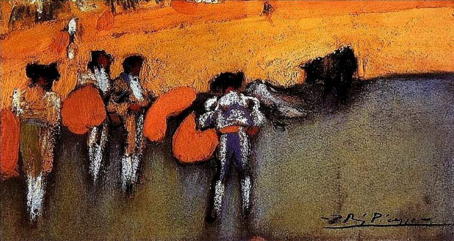
What like­ly most dis­turbed those first view­ers was the per­ceived vio­lence done to tra­di­tion. While we can­not recov­er the ten­der sen­si­bil­i­ties of ear­ly 20th-cen­tu­ry Parisian crit­ics, we can, I think, expe­ri­ence a sim­i­lar kind of shock by look­ing at work Picas­so had done ten years ear­li­er, such as the 1896 First Com­mu­nion, fur­ther up, and 1897 study Sci­ence and Char­i­ty at the top, con­ser­v­a­tive genre paint­ings in an aca­d­e­m­ic style, beau­ti­ful­ly ren­dered with exquis­ite skill by a then 15-year-old artist. See an ear­li­er draw­ing, Study for a Tor­so, above, com­plet­ed in 1892 when Picas­so was only 11.

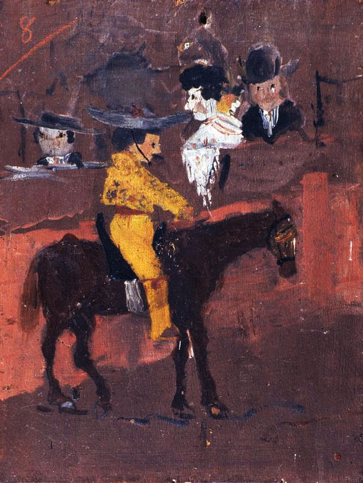
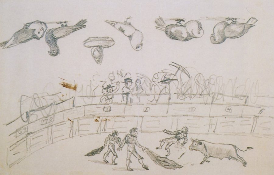
Giv­en his incred­i­ble pre­coc­i­ty, it may seem hard­ly any won­der that Picas­so inno­vat­ed scan­dalous­ly new means of using line, col­or, and com­po­si­tion. He was a prodi­gious mas­ter of tech­nique at an age when many artists are still years away from for­mal study. Where else could his rest­less tal­ent go? He paint­ed a favorite sub­ject in 1900, in the loose, impres­sion­ist Bull­fight, above, a return of sorts to his first oil paint­ing, Pic­a­dor, below, made when he was 8. Fur­ther down, see a draw­ing from the fol­low­ing year in his ear­ly devel­op­ment, “Bull­fight and Pigeons.”

This piece, with its real­is­tic-look­ing birds care­ful­ly drawn upside-down atop a loose sketch of a bull­fight, appeared in a 2006 show at the Philips Col­lec­tion in Wash­ing­ton, DC fea­tur­ing child­hood art­works from Picas­so and Paul Klee. Con­trary, per­haps, to our expec­ta­tions, cura­tor Jonathan Fineberg remarks of this draw­ing that “9‑year-old Picasso’s con­fi­dent, play­ful scrib­ble” gives us more indi­ca­tion of his tal­ent than the fine­ly-drawn birds.

“It’s not just that Picas­so could ren­der well, because you could teach any­body to do that,” Fineberg says. Maybe not any­body, but the point stands—technique can be taught, cre­ative vision can­not. “It’s not about skill. It’s about unique qual­i­ties of see­ing. That’s what makes Picas­so a bet­ter artist than Andrew Wyeth. Art is about a nov­el way of look­ing at the world.” You may pre­fer Wyeth, or think the down­ward com­par­i­son unfair, but there’s no deny­ing Picas­so had a very “nov­el way of see­ing,” from his ear­li­est sketch­es to his most rev­o­lu­tion­ary mod­ernist mas­ter­pieces. See sev­er­al more high­ly accom­plished ear­ly works from Picas­so here.

Relat­ed Con­tent:

14 Self-Por­traits by Pablo Picas­so Show the Evo­lu­tion of His Style: See Self-Por­traits Mov­ing from Ages 15 to 90

The Gestapo Points to Guer­ni­ca and Asks Picas­so, “Did You Do This?;” Picas­so Replies “No, You Did!”

How To Under­stand a Picas­so Paint­ing: A Video Primer

Josh Jones is a writer and musi­cian based in Durham, NC. Fol­low him at @jdmagness

The Assassin’s Cabinet: A Hollowed Out Book, Containing Secret Cabinets Full of Poison Plants, Made in 1682

Has­n’t every child dreamed of a hav­ing a hol­lowed-out book on their shelf, inside of which they can hide what­ev­er for­bid­den objects of mis­chief they like with­out fear of dis­cov­ery? The idea sure­ly goes back many gen­er­a­tions, and pos­si­bly even to the era when not many adults, let along chil­dren, owned any books at all. A decade ago, a hol­lowed-out book dat­ed 1682 went up on the auc­tion block at Ger­man house Her­mann His­tor­i­ca, and these pho­tos of its elab­o­rate design have cap­ti­vat­ed the imag­i­na­tions of even we 21st-cen­tu­ry behold­ers. But what are all the spaces with­in meant to con­tain?

Her­rman His­tor­i­ca’s list­ing describes the item as “a hol­low book used as secret poi­son cab­i­net,” a con­clu­sion pre­sum­ably arrived at after exam­in­ing its draw­ers’ “hand­writ­ten paper labels with the Latin names of dif­fer­ent poi­so­nous plants (among them cas­tor-oil plant, thorn apple, dead­ly night­shade, valer­ian, etc.).” My Mod­ern Met’s Jes­si­ca Stew­art adds that “call­ing it an assas­s­in’s cab­i­net may be a bit exag­ger­at­ed,” not­ing that “many of these plants, while poi­so­nous, were also part of herbal reme­dies —mak­ing it equal­ly pos­si­ble we are look­ing at an ornate med­i­cine cab­i­net.”

Book Addic­tion breaks down the nature and uses of the plants meant to be stored in the draw­ers, includ­ing Hyoscya­mus Niger, which in medieval times “was often used in com­bi­na­tion with oth­er plants to a make ‘mag­ic brews’ with psy­choac­tive prop­er­ties”; Aconi­tum Napel­lus, which in ancient Roman times “was a such a com­mon poi­son of choice among mur­ders and assas­sins that its cul­ti­va­tion was pro­hib­it­ed”; and Cicu­ta Virosa, which some have spec­u­lat­ed “was the hem­lock used by the ancient Greek Repub­lic as the state poi­son but as it is a native of north­ern Europe this may not be true,” but “is so tox­ic that a sin­gle bite into its root can be fatal” regard­less.

Strong stuff, whether for killing or cur­ing. The ambi­gu­i­ty between those two pur­pos­es has sure­ly stoked our mod­ern inter­est in this secret­ly repur­posed book, as has its nature as what Her­rman His­tor­i­ca calls an “elab­o­rate­ly worked Kun­stkam­mer object” — a “cab­i­net of curiosi­ties” of the kind that has long fas­ci­nat­ed mankind — “with strong ref­er­ence to the memen­to mori theme.” That ref­er­ence comes chiefly in the form of not just the proud-look­ing skele­ton on the inside cov­er, but the label on the bot­tle pro­vid­ed its own com­part­ment in the book: “Statu­tum est hominibus semel mori,” or “It is a fact that man must die one day.” But did the own­er of this book and the tools hid­den with­in want to has­ten that day, or delay it?

Relat­ed Con­tent:

Napoleon’s Kin­dle: See the Minia­tur­ized Trav­el­ing Library He Took on Mil­i­tary Cam­paigns

1,000-Year-Old Illus­trat­ed Guide to the Med­i­c­i­nal Use of Plants Now Dig­i­tized & Put Online

Wear­able Books: In Medieval Times, They Took Old Man­u­scripts & Turned Them into Clothes

Old Books Bound in Human Skin Found in Har­vard Libraries (and Else­where in Boston)

Dis­cov­er the Jacobean Trav­el­ing Library: The 17th Cen­tu­ry Pre­cur­sor to the Kin­dle

Behold the “Book Wheel”: The Renais­sance Inven­tion Cre­at­ed to Make Books Portable & Help Schol­ars Study (1588)

Won­der­ful­ly Weird & Inge­nious Medieval Books

Based in Seoul, Col­in Mar­shall writes and broad­casts on cities and cul­ture. His projects include the book The State­less City: a Walk through 21st-Cen­tu­ry Los Ange­les and the video series The City in Cin­e­ma. Fol­low him on Twit­ter at @colinmarshall or on Face­book.

The History of Cartography, “the Most Ambitious Overview of Map Making Ever Undertaken,” Is Free Online

“Car­tog­ra­phy was not born full-fledged as a sci­ence or even an art,” wrote map his­to­ri­an Lloyd Brown in 1949. “It evolved slow­ly and painful­ly from obscure ori­gins.” Many ancient maps made no attempt to repro­duce actu­al geog­ra­phy but served as abstract visu­al rep­re­sen­ta­tions of polit­i­cal or the­o­log­i­cal con­cepts. Writ­ten geog­ra­phy has an ancient pedi­gree, usu­al­ly traced back to the Greeks and Phoeni­cians and the Roman his­to­ri­an Stra­bo. But the mak­ing of visu­al approx­i­ma­tions of the world seemed of lit­tle inter­est until lat­er in world his­to­ry. As “medi­a­tors between an inner men­tal world and an out­er phys­i­cal world”—in the words of his­to­ri­an J.B. Harley—the maps of the ancients tend­ed to favor the for­mer. This is, at least, a very gen­er­al out­line of the ear­ly his­to­ry of maps.

Harley’s def­i­n­i­tion occurs in the first chap­ter of Vol­ume One of The His­to­ry of Car­tog­ra­phy, a mas­sive six-vol­ume, mul­ti-author work trac­ing map mak­ing from pre­his­toric times up to the twen­ti­eth cen­tu­ry; “the most ambi­tious overview of map mak­ing ever under­tak­en,” Edward Roth­stein writes at The New York Times.

The Uni­ver­si­ty of Chica­go project, begun in the mid-80s, com­bines “essays based on orig­i­nal research by author­i­ta­tive schol­ars with exten­sive illus­tra­tions of rare and unusu­al maps.” Unlike his­to­ries like Brown’s, how­ev­er, this one aims to move beyond “a deeply entrenched Euro­cen­tric­i­ty.” The project includes non-West­ern and pre-medieval maps, pre­sent­ing itself as “the first seri­ous glob­al attempt” to describe the car­tog­ra­phy of African, Amer­i­can, Arc­tic, Asian, Aus­tralian, and Pacif­ic soci­eties as well as Euro­pean. In so doing, it illu­mi­nates many of those “obscure ori­gins.”

You might expect such an ambi­tious offer­ing to come with an equal­ly ambi­tious pric­etag, and you’d be right. But rather than pay over $200 dol­lars for each indi­vid­ual book in the series, you can read and down­load Vol­umes One through Three and Vol­ume Six as free PDFs at the Uni­ver­si­ty of Chica­go Press’s site. In these extra­or­di­nary schol­ar­ly works, you’ll find maps repro­duced nowhere else—like the Star Fres­co from Jor­dan just above—with deeply learned com­men­tary explain­ing how they cor­re­spond to very dif­fer­ent ways of see­ing the world.

At the links below, see images of maps from all over the globe and through­out record­ed human his­to­ry, and begin to see the his­to­ry of car­tog­ra­phy in very dif­fer­ent ways your­self.

Vol­ume 1

Gallery of Col­or Illus­tra­tions

Vol­ume 2: Part 1

Gallery of Col­or Illus­tra­tions (Plates 1–24)
Gallery of Col­or Illus­tra­tions (Plates 25–40)

Vol­ume 2: Part 2

Gallery of Col­or Illus­tra­tions (Plates 1–16)
Gallery of Col­or Illus­tra­tions (Plates 17–40)

Vol­ume 2: Part 3

Gallery of Col­or Illus­tra­tions (Plates 1–8)
Gallery of Col­or Illus­tra­tions (Plates 9 –24)

Vol­ume 3: Part 1

Gallery of Col­or Illus­tra­tions (Plates 1–24)
Gallery of Col­or Illus­tra­tions (Plates 25–40)

Vol­ume 3: Part 2

Gallery of Col­or Illus­tra­tions (Plates 41–56)
Gallery of Col­or Illus­tra­tions (Plates 57–80)

Relat­ed Con­tent:

Ancient Maps that Changed the World: See World Maps from Ancient Greece, Baby­lon, Rome, and the Islam­ic World

Down­load 67,000 His­toric Maps (in High Res­o­lu­tion) from the Won­der­ful David Rum­sey Map Col­lec­tion

A Map Show­ing How the Ancient Romans Envi­sioned the World in 40 AD

Josh Jones is a writer and musi­cian based in Durham, NC. Fol­low him at @jdmagness

« Go BackMore in this category... »
Quantcast
Open Culture was founded by Dan Colman.