“We don’t make mistakes. We have happy accidents,” the late Bob Ross soothed fans painting along at home, while brushing an alarming amount of black onto one of his signature nature scenes.
His mellow on-camera demeanor and flowing, wet-on-wet oil painting style were perfectly calibrated to help tightly-wound viewers relax into a right-brained groove.
The creators of the Bob Ross Virtual Art Gallery take a more left brained approach.

Having collected data on Ross’ evergreen series, The Joy of Painting, they analyzed it for frequency of color use over the show’s 403 episodes, as well as the number of colors applied to each canvas.
For those keeping score, after black and white, alizarin crimson was the color Ross favored most, and 1/4 of the paintings made on air boast 12 colors.
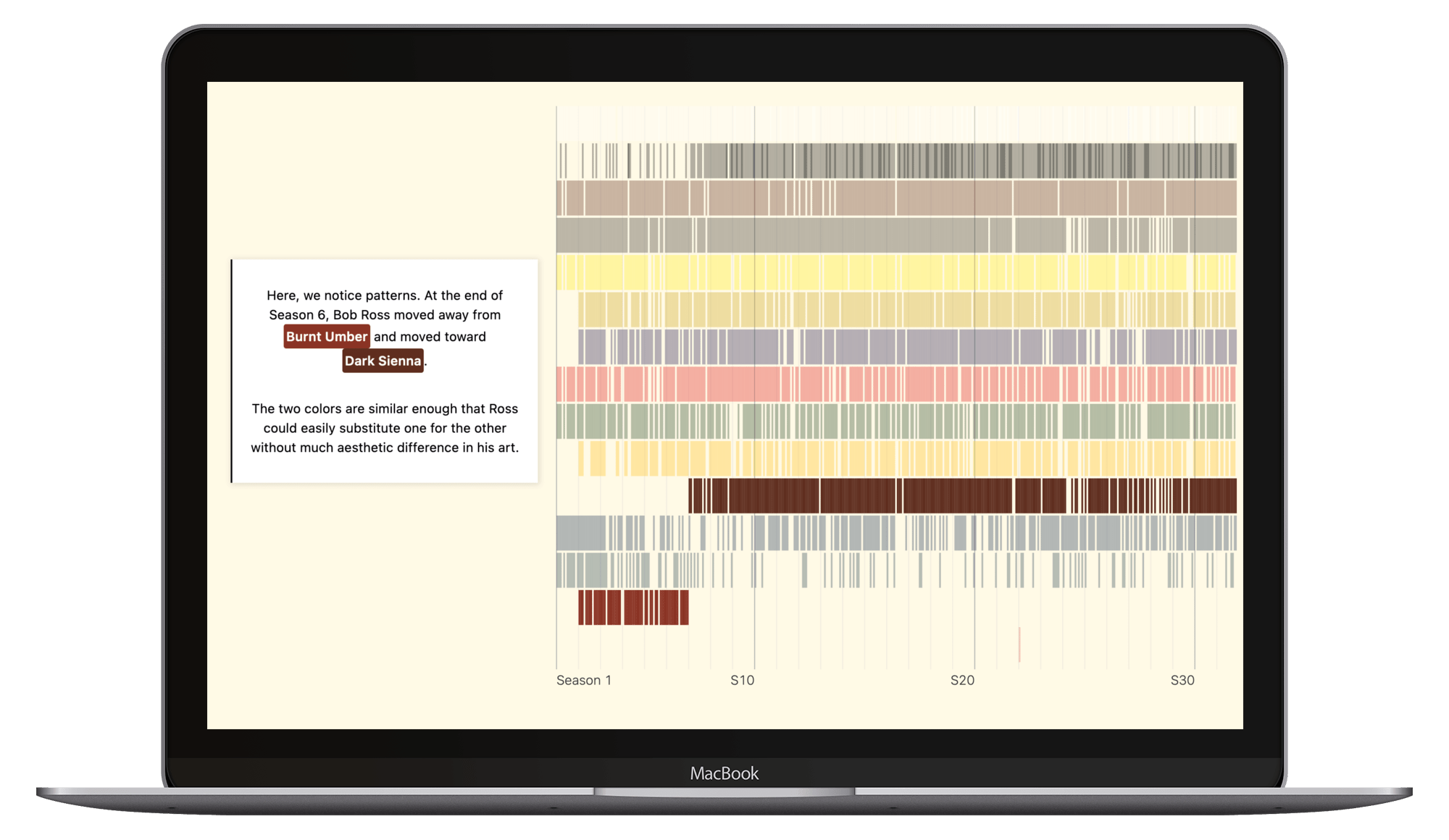
The data could be slightly skewed by the contributions of occasional guest artists such as Ross’ former instructor, John Thamm, who once counseled Ross to “paint bushes and trees and leave portrait painting to someone else.” Thamm availed himself of a single color — Van Dyke Brown — to demonstrate the wipe out technique. His contribution is one of the few human likenesses that got painted over the show’s 11-year public television run.
The Bob Ross Virtual Art Gallery has several options for viewing the data.
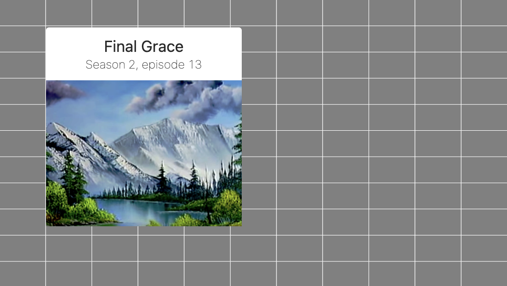
Mouse over a grid of grey rectangles to see the 403 artworks presented in chronological order, along with titles and episode numbers.
(This has all the makings of a thumping good memory game, à la Concentration… flip all the rectangles, study them, then see if you can navigate back to all the cabins or meadows.)
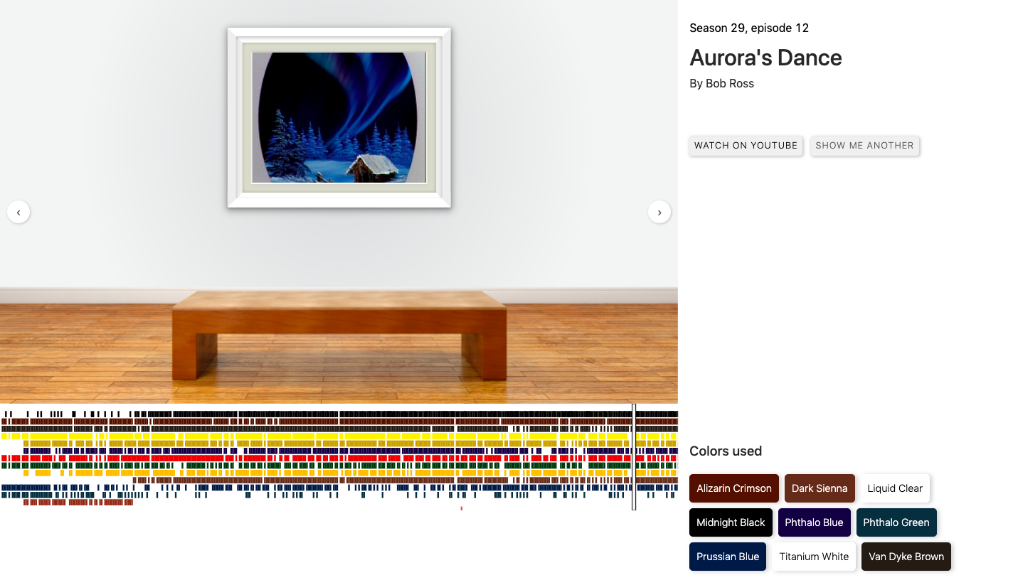
A bar graph, similarly composed of rectangles, reveals the colors that went into each painting.
Another chart analyzes Ross’ use of color over time, as he moved away from Burnt Umber and eased up on Pfthalo Green.
Indian Red was accorded but a single use, in season 22’s first episode, “Autumn Images.” (“Let’s sparkle this up. We’re gonna have fall colors. Let’s get crazy.”)
For art lovers craving a more traditional gallery experience, site creator Connor Rothschild has installed a virtual bench facing a frame capable of displaying all the paintings in random or chronological order, with digital swatches representing the paints that went into them and YouTube links to the episodes that produced them.
And for those who’d rather gaze at data science, the code is available on GitHub.
Explore the Bob Ross Virtual Art Gallery here. Scroll down to take advantage of all the options.
Related Content:
Experience the Bob Ross Experience: A New Museum Open in the TV Painter’s Former Studio Home
Bob Ross’ Christmas Special: Celebrate, Relax, Nod Off
Ayun Halliday is an author, illustrator, theater maker and Chief Primatologist of the East Village Inky zine. Join her Necromancers of the Public Domain: The Periodical Cicada, a free virtual variety show honoring the 17-Year Cicadas of Brood X. Follow her @AyunHalliday.


