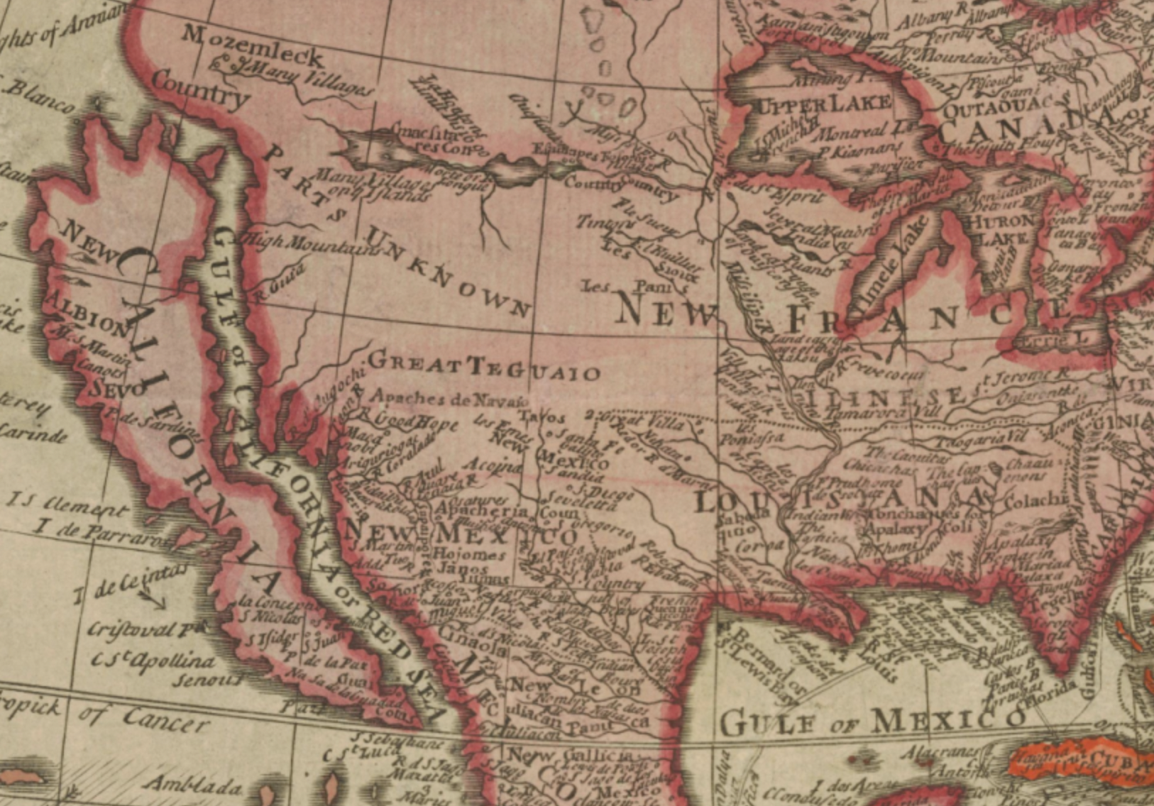
Regular readers of Open Culture know a thing or two about maps if they’ve paid attention to our posts on the history of cartography, the evolution of world maps (and why they are all wrong), and the many digital collections of historical maps from all over the world. What does the seven and a half-minute video above bring to this compendium of online cartographic knowledge? A very quick survey of world map history, for one thing, with stops at many of the major historical intersections from Greek antiquity to the creation of the Catalan Atlas, an astonishing mapmaking achievement from 1375.
The upshot is an answer to the very reasonable question, “how were (sometimes) accurate world maps created before air travel or satellites?” The explanation? A lot of history — meaning, a lot of time. Unlike innovations today, which we expect to solve problems near-immediately, the innovations in mapping technology took many centuries and required the work of thousands of travelers, geographers, cartographers, mathematicians, historians, and other scholars who built upon the work that came before. It started with speculation, myth, and pure fantasy, which is what we find in most geographies of the ancient world.
Then came the Greek Anaximander, “the first person to publish a detailed description of the world.” He knew of three continents, Europe, Asia, and Libya (or North Africa). They fit together in a circular Earth, surrounded by a ring of ocean. “Even this,” says Jeremy Shuback, “was an incredible accomplishment, roughed out by who knows how many explorers.” Sandwiched in-between the continents are some known large bodies of water: the Mediterranean, the Black Sea, the Phasis (modern-day Rioni) and Nile Rivers. Eventually Eratosthenes discovered the Earth was spherical, but maps of a flat Earth persisted. Greek and Roman geographers consistently improved their world maps over succeeding centuries as conquerers expanded the boundaries of their empires.
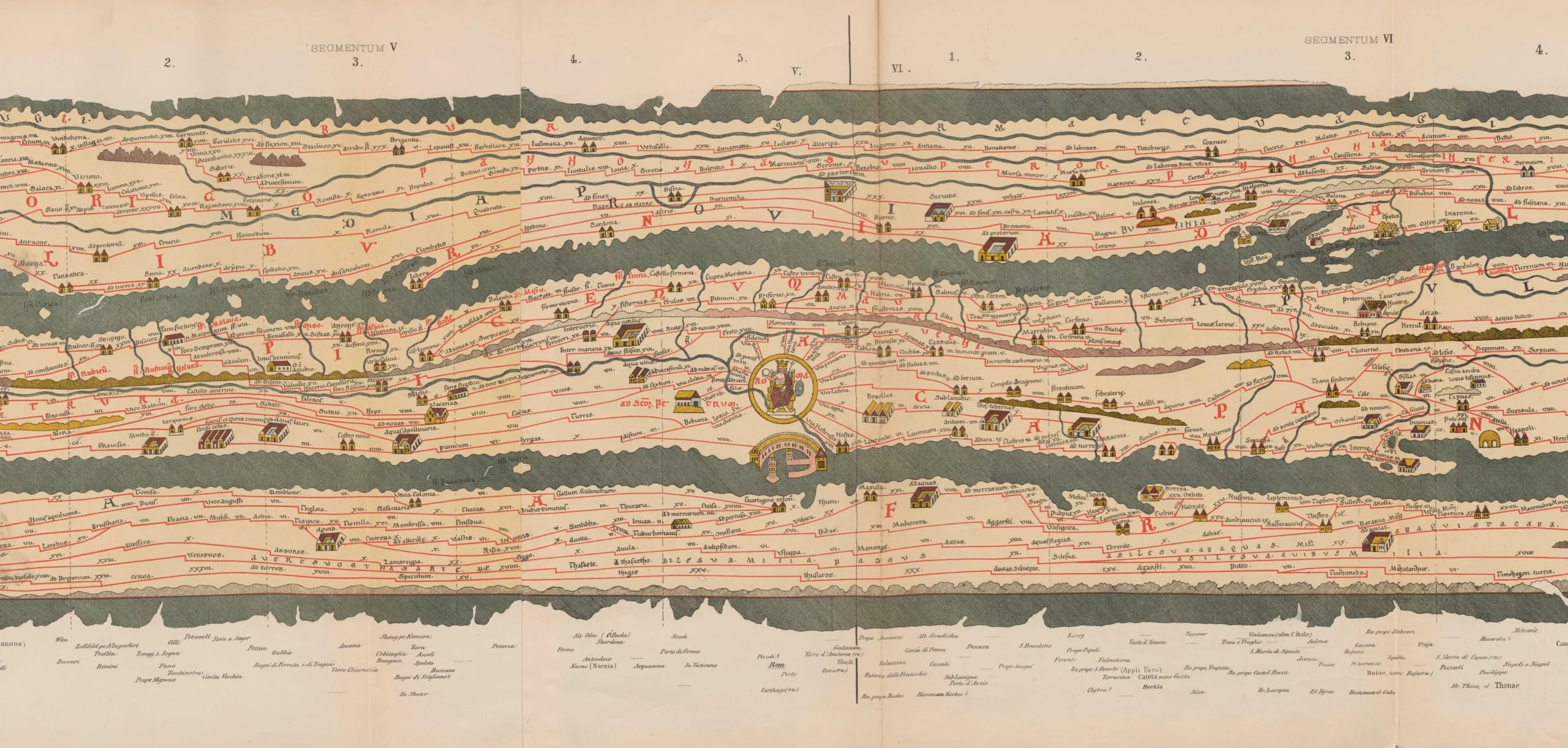
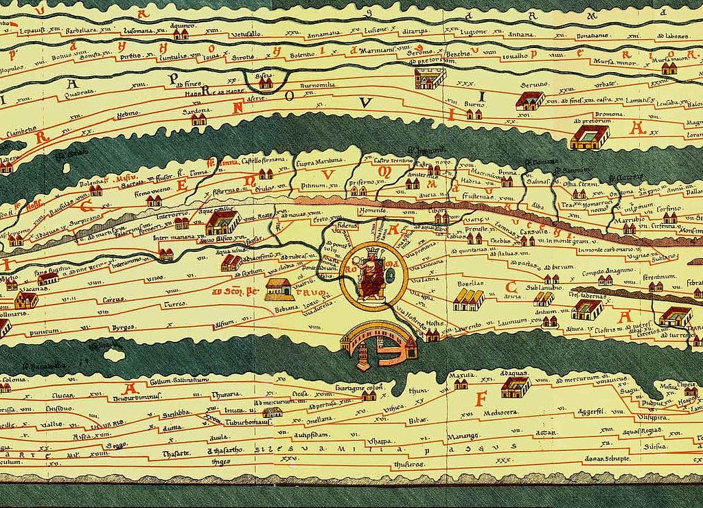
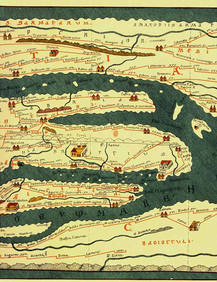
Some key moments in mapping history involve the 2nd century AD geographer and mathematician Marines of Tyre, who pioneered “equirectangular projection and invented latitude and longitude lines and mathematical geography.” This paved the way for Claudius Ptolemy’s hugely influential Geographia and the Ptolemaic maps that would eventually follow. Later Islamic cartographers “fact checked” Ptolemy, and reversed his preference for orienting North at the top in their own mappa mundi. The video quotes historian of science Sonja Brenthes in noting how Muhammad al-Idrisi’s 1154 map “served as a major tool for Italian, Dutch, and French mapmakers from the sixteenth century to the mid-eighteenth century.”
The invention of the compass was another leap forward in mapping technology, and rendered previous maps obsolete for navigation. Thus cartographers created the portolan, a nautical map mounted horizontally and meant to be viewed from any angle, with wind rose lines extending outward from a center hub. These developments bring us back to the Catalan Atlas, its extraordinary accuracy, for its time, and its extraordinary level of geographical detail: an artifact that has been called “the most complete picture of geographical knowledge as it stood in the later Middle Ages.”
Created for Charles V of France as both a portolan and mappa mundi, its contours and points of reference were not only compiled from centuries of geographic knowledge, but also from knowledge spread around the world from the diasporic Jewish community to which the creators of the Atlas belonged. The map was most likely made by Abraham Cresques and his son Jahuda, members of the highly respected Majorcan Cartographic School, who worked under the patronage of the Portuguese. During this period (before massacres and forced conversions devastated the Jewish community of Majorca in 1391), Jewish doctors, scholars, and scribes bridged the Christian and Islamic worlds and formed networks that disseminated information through both.
In its depiction of North Africa, for example, the Catalan Atlas shows images and descriptions of Malian ruler Mansa Musa, the Berber people, and specific cities and oases rather than the usual dragons and monsters found in other Medieval European maps — despite the cartographers’ use of the works like the Travels of John Mandeville, which contains no shortage of bizarre fiction about the region. While it might seem miraculous that humans could create increasingly accurate views of the Earth from above without flight, they did so over centuries of trial and error (and thousands of lost ships), building on the work of countless others, correcting the mistakes of the past with superior measurements, and crowdsourcing as much knowledge as they could.
To learn more about the fascinating Catalan Atlas, see the Flash Point History video above and the scholarly description found here. Find translations of the map’s legends here at The Cresque Project.
Related Content:
The History of Cartography, the “Most Ambitious Overview of Map Making Ever,” Is Now Free Online
Download 91,000 Historic Maps from the Massive David Rumsey Map Collection
Why Every World Map Is Wrong
Animated Maps Reveal the True Size of Countries (and Show How Traditional Maps Distort Our World)
The Evolution of the World Map: An Inventive Infographic Shows How Our Picture of the World Changed Over 1,800 Years
Josh Jones is a writer and musician based in Durham, NC. Follow him at @jdmagness
