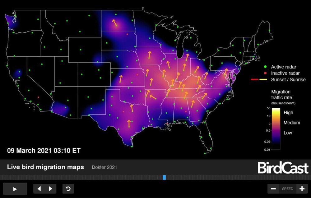
We talk about the weather more often than we talk about most things, other natural phenomena included. We certainly talk about the weather more often than we talk about birds, much to the disappointment of ornithological enthusiasts. This could be down to the comparative robustness of weather prediction, both as a tradition and as a daily technological presence in our lives. We can hardly avoid seeing the weather forecast, but when was the last time you checked the bird forecast? Such a thing does, in fact, exist, though it’s only come into existence recently, in the form of Birdcast, which provides “real-time predictions of bird migrations: when they migrate, where they migrate, and how far they will be flying.”
Developed by Colorado State University and the Cornell Lab of Ornithology, BirdCast offers both live bird migration maps and bird forecast migration maps for the United States. “These forecasts come from models trained on the last 23 years of bird movements in the atmosphere as detected by the US NEXRAD weather surveillance radar network,” says BirdCast’s web site.
Unprecedented in both the kind of information they provide and the detail in which they provide it, “these bird migration maps represented the culmination of a 20-year long vision, so too the beginnings of new inspiration for the next generation of bird migration research, outreach and education, and application.”
You can learn more about the development and workings of BirdCast in the recorded webinar below, featuring research associate Adriaan Dokter and Julia Wang, leader of the Lights Out project, which aims to get Americans spending more time in just such a state. “Every spring and fall, billions of birds migrate through the US, mostly under the cover of darkness,” says its section of BirdCast’s site. “This mass movement of birds must contend with a dramatically increasing but still largely unrecognized threat: light pollution.” The goal is “turning off unnecessary lighting during critical migration periods,” and with spring having begun last weekend, we now find ourselves in just such a period. Luckily, our fine feathered friends shouldn’t be disturbed by the glow of the BirdCast map on your screen. View live BirdCast maps here.
Based in Seoul, Colin Marshall writes and broadcasts on cities, language, and culture. His projects include the Substack newsletterBooks on Cities, the book The Stateless City: a Walk through 21st-Century Los Angeles and the video series The City in Cinema. Follow him on Twitter at @colinmarshall or on Facebook.
From a port settlement on the banks of the Thames that the Romans called Londinium came a thriving city of “roughly 100,000 people” in Shakespeare’s time, “a cross-section of early modern English culture,” the British Library notes, including “royalty, nobility, merchants, artisans, laborers, actors, beggars, thieves, and spies, as well as refugees from political and religious persecution on the continent.” The city thrived economically and merchants from the known world passed through its ports. “As a result, Londoners would hear a variety of accents and languages as they strolled about the city — a chorus of voices from across Europe and from all walks of life.”
The chorus of voices became a cacophony for many Londoners in the following century who resurrected a pastoral ideal and/or retired to the countryside in the 1600s. The city swelled to a population of around half a million. “It is also a period during which a high proportion of London’s inhabitants were migrants,” writes the Proceedings of the Old Bailey. “It was only by maintaining this constant influx that the capital could possibly maintain its population growth,” slow as it was. “London’s population in this period was also characterized by its diversity,” and by stagnation as plague and fire devastated the city throughout the century.
The city’s cosmopolitan communities grew as England became a colonial world power. Neoclassical art and architecture beautified the city’s new wealth, and along with wealth came poverty, overcrowding, immiseration, and crime. “Here malice, rapine, accident, conspire; and now a rabble, now a fire,” wrote Samuel Johnson in “London,” (1738), a poem written in imitation of Juvenal’s satire on Imperial Rome. In his “London” over half a century later, William Blake saw “marks of weakness, marks of woe” on every face he met in the city — beginning a protest tradition that reached its zenith during the massive population growth in Dickens’ time, and found new voice in glam, punk, grime, etc.
People have come from all over the world to make their home in London for centuries. Each wave of migrants has had to navigate the city’s class hierarchies — through plagues, fires, the Blitz, strikes, riots, protests, more fires, Brexit.… London has burned, “London is drowning,” sang Joe Strummer. But London remains, a megacity of nearly 9 million. In the video above, you can see the city’s growth mapped over a period of 2,000 years, from the Romans to the Saxons; from Tudor to Stuart, early and late Georgian, early and late Victorian, and into the wartorn 20th century.
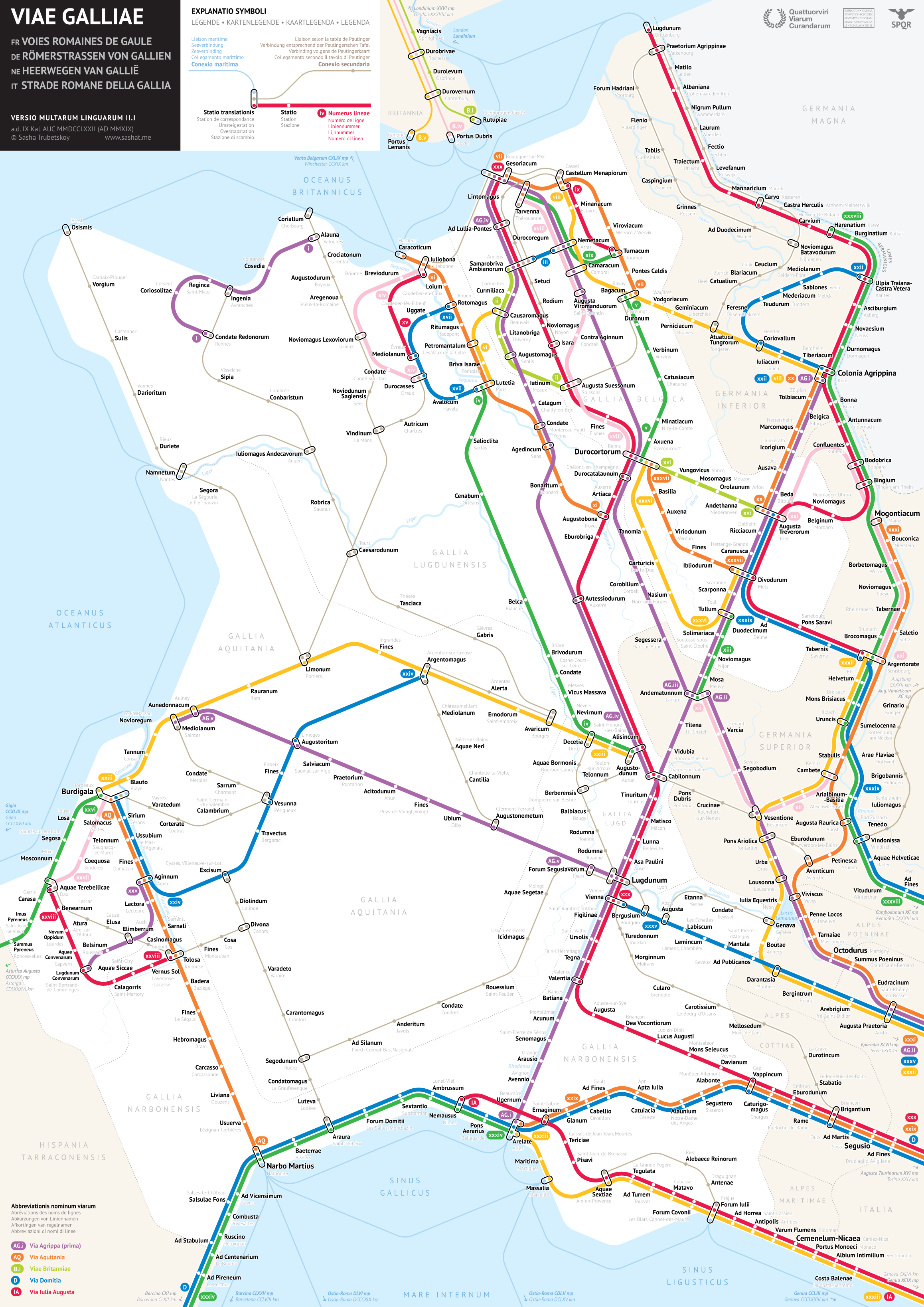
At a casual glance, some travelers may take the map above for a depiction of France’s enviable intercity high-speed rail network Train à Grande Vitesse, better known as TGV. In reality, its content predates that system’s inauguration in the early 1980s — and by nearly two millennia at that. This is in fact a map of Gaul, a region of Europe that, most broadly defined, included modern-day France, Luxembourg, and Belgium, as well as parts of Switzerland, Italy, the Netherlands, and Germany. Ruled by Rome for five centuries until the fall of the Roman Empire itself, Gaul was run through with a number of Roman roads, a subject of fascination for many archaeologically inclined historians.
They’ve also become a subject of fascination for a young data scientist and graphic designer by the name of Sasha Trubetskoy. His work, much featured here on Open Culture, includes maps of the Roman Roads of Britain, Italy, Spain and Portugal, as well as, at a larger scale, those of the entire empire.
“This was an interesting map to make, but I can’t say it was fun all the time,” writes Trubetskoy. “Generally I enjoyed the process, but it was far more challenging than I had anticipated.” You can hear him describe some of the challenges involved, and even show how solving them played out in his design process, in his three-hour explanatory live stream now archived on Youtube.
You can download Trubetskoy’s Roman Roads of Gaul map from his site, and even buy a high-resolution file suitable for printing as a poster (USD $9). “As far as I can tell, it’s done,” writes Trubetskoy of the work, wisely — or from frustrating personal experience — acknowledging that, despite or because of the centuries of distance between us and the relevant historical and geographical facts, those facts could still change. Just as ancient history cannot both make its way to us and maintain absolutely perfect fidelity to the past, so the kind of practical visual design embodied in a subway map necessitates a great deal of simplification and approximation to be useful. And speaking of the graphic arts, just imagine how useful this particular map would’ve been to Asterix.
Based in Seoul, Colin Marshall writes and broadcasts on cities, language, and culture. His projects include the Substack newsletterBooks on Cities, the book The Stateless City: a Walk through 21st-Century Los Angeles and the video series The City in Cinema. Follow him on Twitter at @colinmarshall or on Facebook.
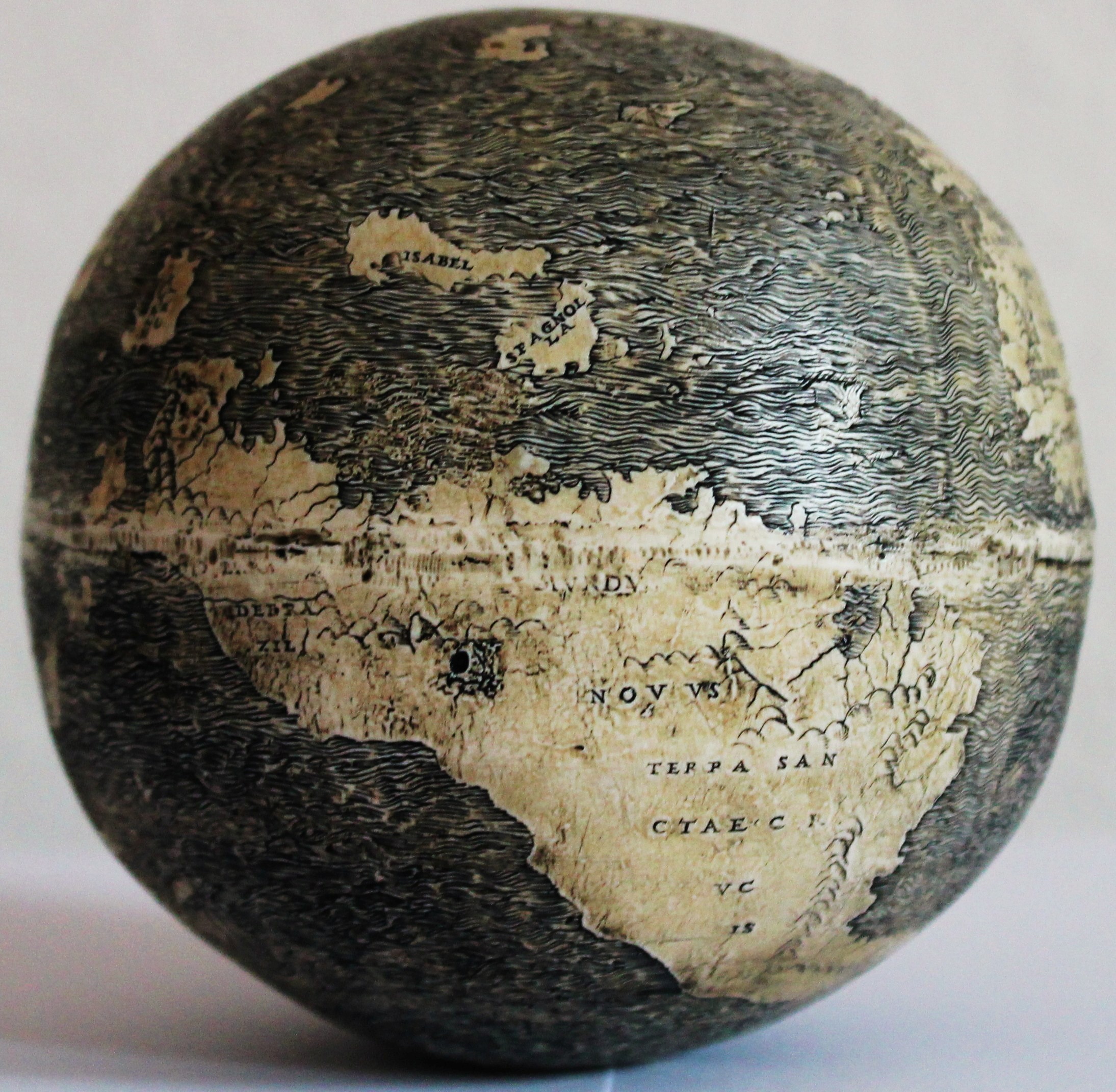
Every time you think you’ve got a handle on Leonardo da Vinci’s genius (which is to say, you think you’ve heard about the most important things he painted, wrote, and invented), yet more evidence comes to light of the many ways he meets the standard for the adjective “genius”.… Recently, Leonardo re-appeared not only as an inventor of futuristic military technology or discoverer of complex human anatomy, but also as the first European to depict the “New World” on a globe–proving he knew about Columbus’ voyages when the globe was made in 1504.
The discovery “marks the first time ever that the names of countries such as Brazil, Germania, Arabia and Judea have appeared on a globe,” notes Cambridge Scholars Publishing, who released a book by the globe’s discoverer and primary researcher, Stefaan Missinne. The artifact attributed to Leonardo is engraved, “with immaculate detail,” writes Meeri Kim at The Washington Post, “on two conjoined halves of ostrich eggs.” And it features a single sentence, in Latin, above Southeast Asia: Hic Sunt Dracones–“Here be dragons.”
We’ll notice other unique features of the engraved egg Missinne calls, simply, “the Da Vinci Globe,” such as the fact that in place of Central and North America are the islands of Columbus’ “discovery,” surrounded by a vast ocean in which Pacific and Atlantic join. Why ostrich eggs? Humans have used them for decorative purposes for millennia. Also, “in that time period,” says Thomas Sander, editor of the Washington Map Society’s journal, Portolan, “the ostrich was quite the animal, and it was a big thing for the noble people to have ostriches in their back gardens.”
Missinne, a real estate developer, collector, and globe expert originally from Belgium, discovered the globe in 2012 at the London Map Fair. It was purchased “from a dealer who said it had been part of an important European collection for decades,” and its buyer and owner remain anonymous. After the globe appeared, Missinne “consulted more than 100 scholars and experts in his year-long analysis,” putting “about five years of research into one year,” says Sander, calling the research “an incredible detective story.”
Missinne’s investigation seems to substantiate his claims that the globe was made by Leonardo or his workshop. The evidence, some of which you can find on the Cambridge Scholars Publishing site, includes a 1503 preparatory map in da Vinci’s papers; the presence of arsenic, which only Leonardo was known to use at the time in copper to keep it from losing its lustre; “The use of chiaroscuro, pentienti, triangular shapes, the mathematics of the scale reflecting Leonardo’s written dimension of planet earth”; and a 1504 letter from Leonardo himself stating, “my world globe I want returned back from my friend Giovanni Benci.”
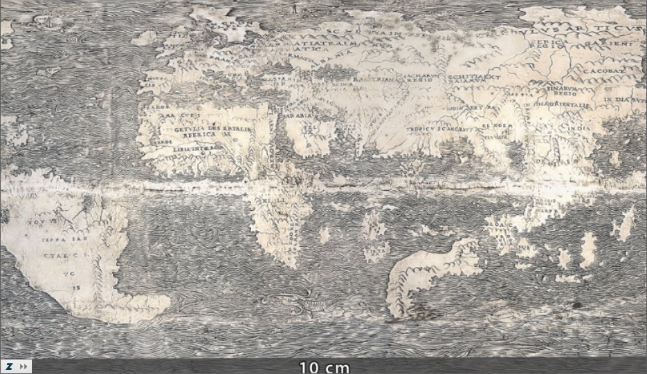
Missinne and Geert Verhoeven, of the Ludwig Boltzmann Institute for Archaeological Prospection & Virtual Archeology, have published a paper on the “unfolding” of Leonardo’s globe into the two-dimensional image above (see an interactive version here). “This miniature egg globe is not only the oldest extant engraved globe,” the authors write, “but it is also the oldest post-Columbian globe of the world and the first ever to depict Newfoundland and many other territories.” Previously, the Hunt-Lenox Globe, a small copper globe, was thought to be the oldest known such artifact. Dated to around 1510, this globe, Missinne discovered, is actually a copy made from a cast of the older, original ostrich-egg globe.
Missinne’s findings have their detractors, including John W. Hessler of the Library of Congress, who claims Missinne himself is the anonymous owner of the globe, which raises issues of conflict of interest. “Where this thing comes from needs to be clarified,” says Renaissance cartography expert Chet Van Duzer of the John Carter Brown Library in Providence, R.I., though he adds, “It is an exciting discovery, no question.” Missinne’s claims for the egg’s provenance are more modest than his marketing. He “speculates,” writes Kim, “ the egg could have loose connections to the workshop of Leonardo da Vinci.” Hessler’s view is less equivocal: “The Leonardo connection is pure nonsense.”
A layperson like Missinne, whatever his personal investment, might be inclined to overinterpret evidence or make tenuous connections a trained scholar would avoid. The many scholars he cites in support of his claims for the globe are also vulnerable to these charges, however, though to a lesser degree. What do we make of French Mona Lisa expert Pascal Cotte’s testimonial, “I hereby confirm the evidence of the left-handedness of the engravings on the Ostrich Egg Globe. As Leonardo was the only left-handed artist in his workshop, I hereby endorse the hypothesis of Leonardo da Vinci’s authorship”? As in all such academic debates, “Here be dragons.” Weigh the case in full in Missinne’s 2018 book, The Da Vinci Globe.
Jules Verne’s tales of adventure take his characters around the world, through the deepest seas, even into the center of the Earth—on journeys, that is, difficult or impossible in the 19th century. Verne himself, however, spent most his life in France, writing of places he had not seen. In one apocryphal story, the young Jules Verne is caught trying to sneak aboard a ship bound for the Indies and promises his father he will henceforth travel “only in his imagination.” Whether or not he made such a vow, he seemed to keep it, though the idea that he never traveled at all is a “tiresome canard,” writes Terry Harpold in an essay titled “Verne’s Cartographies.”
“Of the 80 novels and other short stories he published,” geographer Lionel Dupuy writes, “62 make up the corpus of Extraordinary Voyages (Voyages Extraordinaires). These books, in which imagination played a vital role, were termed ‘geographical novels,’ a category the author himself used for them.”
Verne would also use the term “scientific novel,” but he made it clear which science he meant:
I always had a passion for studying geography, as others did for history or historical research. I really believe that it is my passion for maps and great explorers around the world that led me to write the first of my long series of geographical novels.
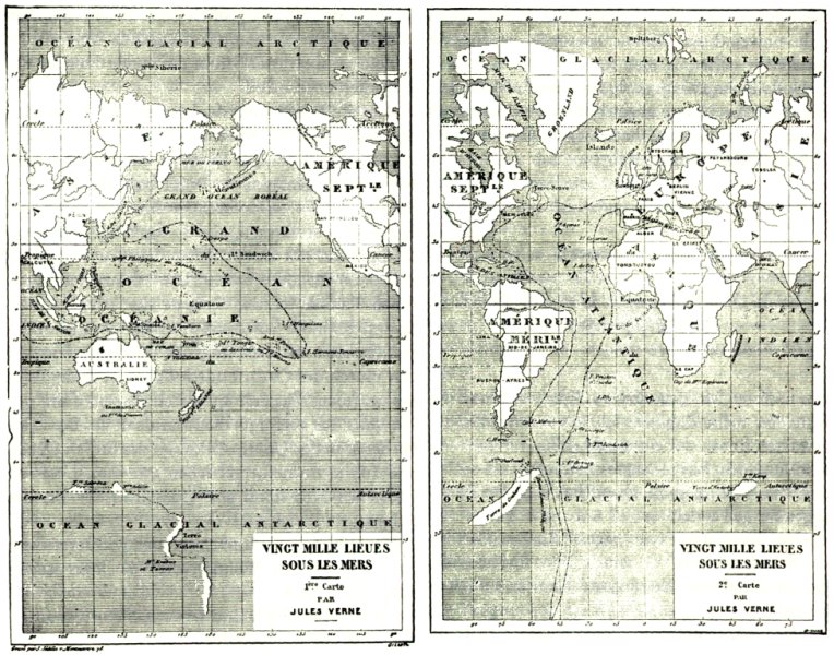
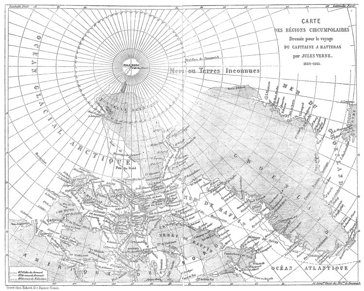
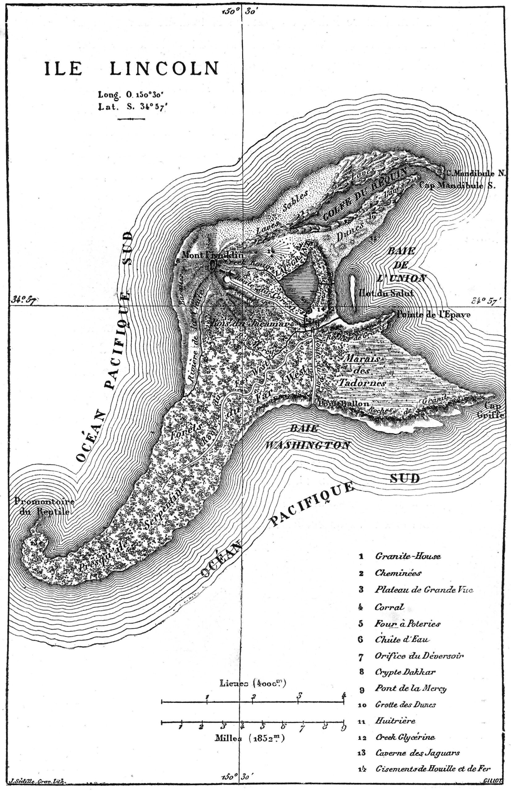
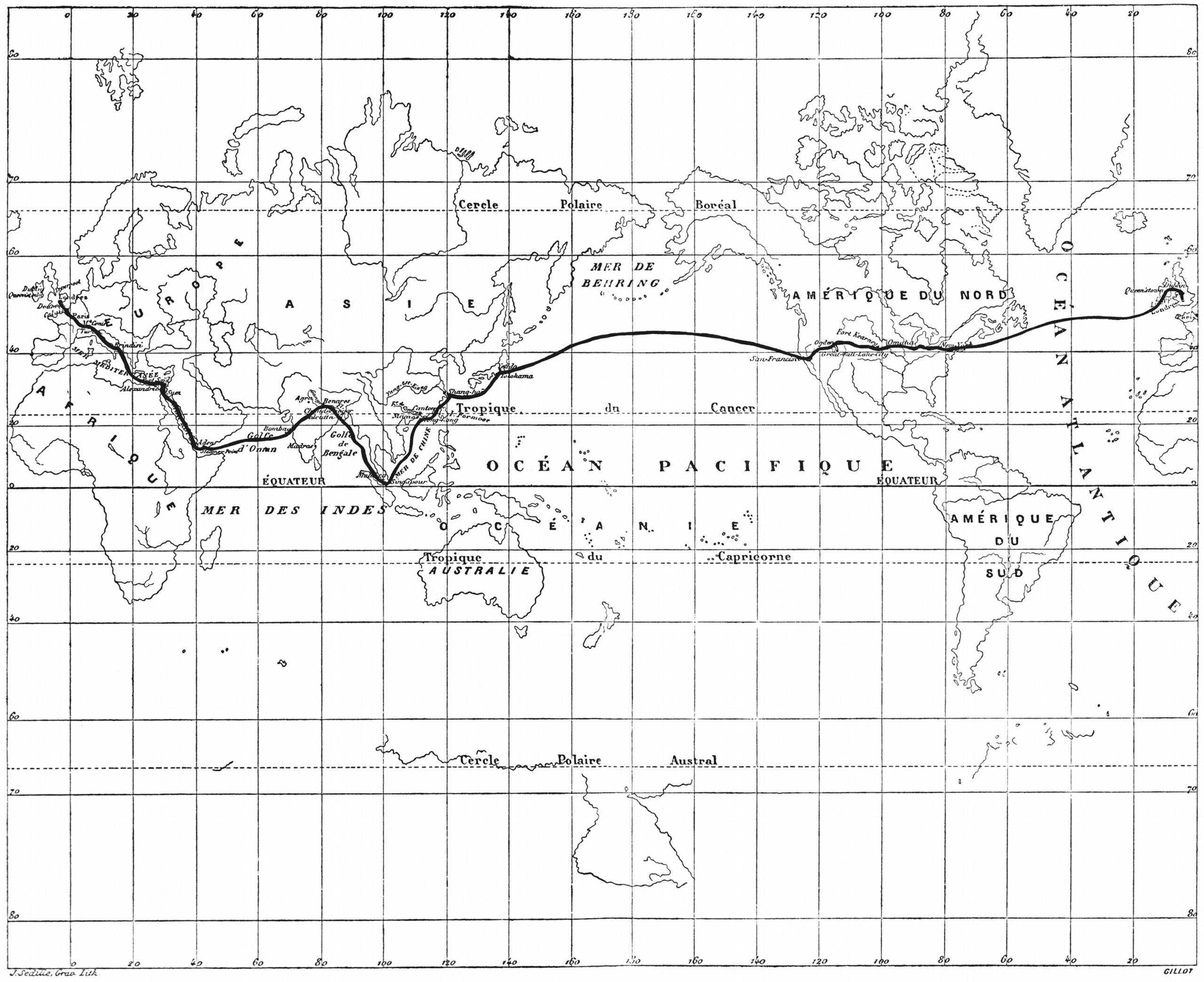
As a geographical novelist, and member of the Geographical Society from 1865 to 1898, it was only fitting that Verne include as many maps as he could in his quest, as he put it, “to depict the Earth, and not just the Earth, but the universe, for I have sometimes carried my readers far away from the Earth in my novels.” To that end, “thirty of the novels” in the first edition of Voyages Extraordinaires” published by Pierre-Jules Hetzel, “include one or more engraved maps,” Harpold points out. “There are forty-two such engravings in all.” View them here.
“These images and design elements are nuanced, graceful, and evocative; drafted and engraved by some of the finest artists of the time,” Harpold writes. “They represent the pinnacle of late nineteenth-century popular-scientific cartography.” They also represent the author of geographical fictions who, as both a scientist and artist, refused to let either form of thinking take over the text, combining myth and poetry with observation and measurement. As Dupuy puts it, “in Extraordinary Voyages, the passage from reality to imagination and back is encouraged by the emergence of a ‘marvelous’ that we can call ‘geographical.’”
In one sense, we might think of most kinds of fiction as geographical, in that they describe places we have never seen. This is particularly so in fictions that include maps of their imagined territories, such as those of William Faulkner, J.R.R. Tolkien, Robert Louis Stevenson, and so on. We might look to Jules Verne as their towering forbear. “Several of the maps appearing in the Hetzel Voyages were drafted under Verne’s close supervision or were based on his sketches or designs. Maps in three of the novels (20,000 Leagues [top], Hatteras [further up], Three Russians) were drafted by Verne himself, whose talents in this regard were appreciable,” writes Harpold.
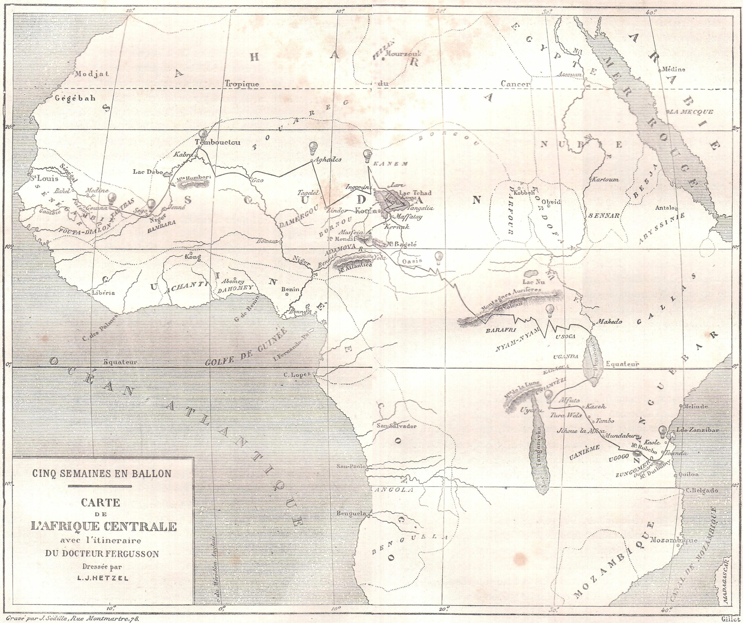
Verne’s maps mix real and fictional place names and are “always ambiguous and semiotically unstable objects.” They appear almost as admissions of the mythmaking that goes into the science of geography and the act of exploration. Near the end of his life, maps became more real to Verne than the world outside. As he grew too weary even to leave the neighborhood, he wrote to Alexandre Dumas fils, “If I have maintained a taste for work… , nothing remains of my youth. I live in the heart of my province and never budge from it, even to go to Paris. I travel only by maps.” See all of Verne’s maps from the Hetzel edition of Extraordinary Voyages, such as those for Around the World in Eighty Days (above) and Five Weeks in a Balloon (below),here.
Most of us do not, today, live in desperate need of maps. On the internet we can easily find not only the current maps we need to navigate most any territory on Earth, but also an increasing proportion of all the maps made before as well. You can find the latter in places like the David Rumsey Map Collection, which, as we wrote last year here on Open Culture, now boasts 91,000 historic maps free to download. It will surely add even more, as humanity seems to have only just begun digitizing its own many attempts to make the physical world legible, an art that goes back (as you know if you read the University of Chicago’s The History of Cartography online) to prehistoric Lascaux cave paintings of the night sky.
By that standard, the maps currently being digitized and uploaded by the British Library are downright modern — or early modern, to be more specific. Dating between 1500 and 1824, says Medievalists.net, these maps “are part of the Topographical Collection of King George III (K. Top),” which also includes “maps, atlases, architectural drawings, cartoons and watercolors.”
Part of “the larger King’s Library which was presented to the Nation by George IV in 1823,” the collection was amassed “during the formative period of the British Empire” and thus shows “how Britain viewed and interacted with the wider world during this period.”
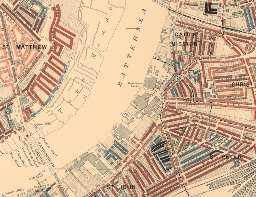
The British Library plans to post 40,000 of these maps (broadly considered), and you can now view the first set of roughly 18,000 at the institution’s Flickr Commons collection. Medievalists.net names as highlights of the full Topographical Collection of King George III such artifacts as “a hand-drawn map of New York City, presented to the future James II in 1664,” “The vast Kangxi Map of China of 1719 made by the Italian Jesuit Matteo Ripa,” “the earliest comprehensive land-use map of London from 1800,” and even “watercolors by noted 18th century artists such as Paul Sandby and Samuel Hieronymus Grimm.”
Many of the pieces the British Library has thus far uploaded to Flickr look like maps to us still today, but just as many, perhaps most, strike us more as works of art. This goes for traditional bird’s-eye-views rendered more vividly (and sometimes imaginatively) than we’re used to, as well for as richly drawn or even painted landscapes, all of which exist to provide a faithful representation of land, sea, and sky. You can view more such images along that spectrum, as well as read their stories in context, at the British Library’s Picturing Places site. The artistic and historical richness exuded by these maps today echoes the more tangible value they had when first created: back then, those who had the maps possessed the world.
Based in Seoul, Colin Marshall writes and broadcasts on cities, language, and culture. His projects include the Substack newsletterBooks on Cities, the book The Stateless City: a Walk through 21st-Century Los Angeles and the video series The City in Cinema. Follow him on Twitter at @colinmarshall, on Facebook, or on Instagram.
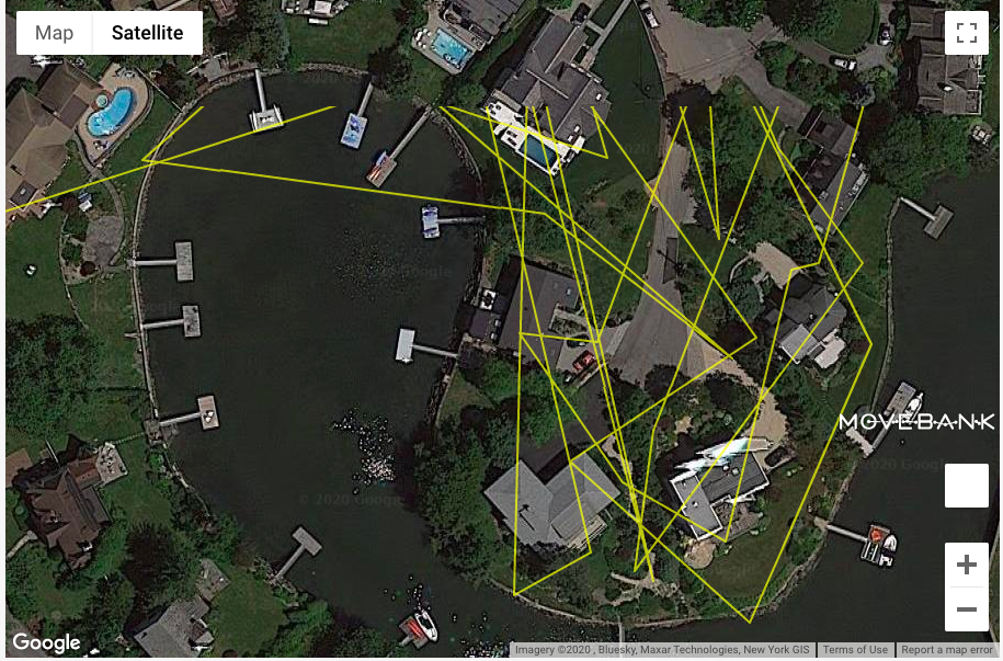
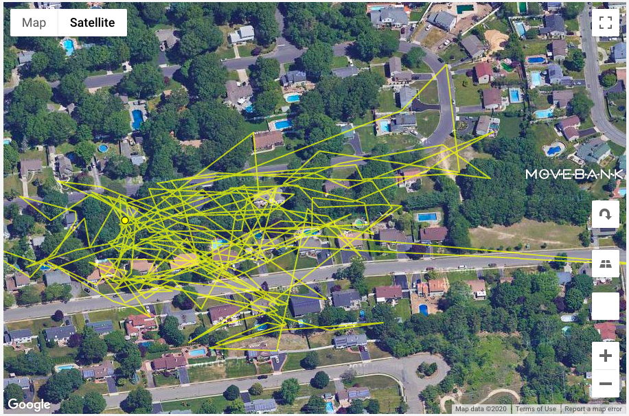
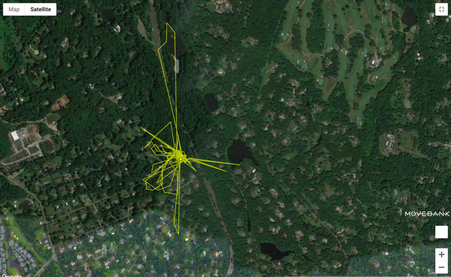
The Long Island feline residents volunteered—or more accurately, were volunteered—by their human companions to participate in a domestic cat movement study as part of the international Cat Tracker project.
Each beast was outfitted with a GPS tracker-enhanced harness, which they wore for a week.
(Many cat owners will find that alone something of an achievement.)
Scientists were particularly interested to learn the degree of mayhem these cherished pets were visiting on surrounding wildlife in their off hours.
Anyone who’s been left a present of a freshly murdered baby bunny, mole, or wingless bat can probably guess.
It’s a considerable amount, though by and large the domesticated participants stuck close to home, rarely traveling more than two football fields away from the comforts of their own yards. The impulse to keep the food bowl within easy range confines their hunting activities to a fairly tight area. Woe to the field mice who set up shop there.
Their movements also revealed the peril they put themselves in, crossing highways, roads, and parking lots. Researcher Heidy Kikillus, who tracked cats in New Zealand, reported that a number of her group’s subjects wound up in a fatal encounter with a vehicle.
Generally speaking, gender, age, and geography play a part in how far a cat roams, with males, younger animals, and country dwellers covering more ground. Unsurprisingly, those who have not been neutered or spayed tend to have a freer range too.
“Without the motivations of food and sex, most cats seem content to be homebodies,” zoologist Roland Kays, one of the US Project leaders, noted.
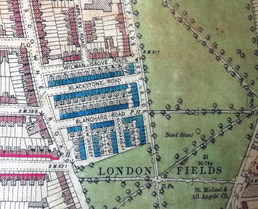
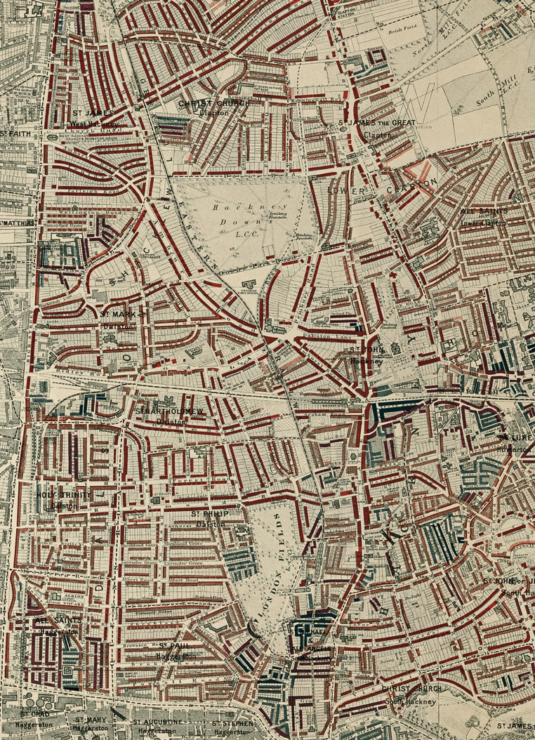
Mapping has always been contentious, no matter where you look in time. Maps preserve ideological assumptions on paper, rationalizing physical space as they render it in two dimensions. No matter how didactic, they can become political weapons. In the case of Charles Booth’s visually impressive Maps Descriptive of London Poverty, we have a series of maps whose own assumptions can sometimes seem at odds with their ostensible purpose: to improve the living conditions of London’s poor.
Booth’s “colourful poverty maps were created between 1886 and 1903,” Zoe Craig writes at Londonist, as part of a “ground-breaking study into the lives of ordinary Londoners.” A philanthropist born into wealth in the shipping trade, Booth took it upon himself to study poverty in London in order to initiate social reforms.
He succeeded. The study, conducted by Booth and a team of researchers, led to the creation of Old Age pensions, which Booth called “limited socialism,” as well as school meals for hungry children. He was clear about that fact that he saw such reforms as a bulwark against socialist revolution.
The study’s seventeen volumes are filled with picturesque accounts. “Picking through the tidbits of information from these people’s lives will make you feel a bit like a Victorian costume drama police detective,” Craig remarks. This reference to policing feels pointed, given the role of the police in maintaining class hierarchies in Victorian London. As an American, it can be hard to look at Booth’s map and not also see the 20th redlining practices in U.S. cities. Consider, for example, the categories Booth applied to London’s classes:
Called ‘Inquiry Into the Life and Labour of the People in London’, the epic work studied families and residents living across London, and coloured the streets according to their financial situation: between black for ‘lowest class, vicious, semi-criminal’ through pink for mixed ‘some comfortable, some poor’ to orange for ‘wealthy’.
As in Daniel Patrick Moynihan’s paternalistic 1965 report on the Black underclass in the U.S., the language reinforces Social Darwinist ideas that deem the “lowest class” unfit for full participation in civil society—“vicious, semi-criminal…”
Of course, the social and historical context differs markedly, but we might also consider Feargus O’Sullivan’s observations at Bloomberg CityLab. A new published edition of the map, he writes, “accompanied by compelling if bleak period photos, reveals a city that possesses echoes of London today. It depicts, after all, a densely-packed metropolis with a cosmopolitan population where immensely wealthy people lived just around the corner from neighbors who were struggling to make ends meet.”
Maps may not create the social conditions they describe, but they can help perpetuate them, rendering people visible in ways that allow for even more control over their lives. Criticisms of Booth’s study claimed that not only did the proposed reforms not go far enough but that the report described London’s class structure while offering little to no analysis of the causes of poverty. In language that sounded less objectionable to Victorian ears, the poor are mostly blamed for their own condition.
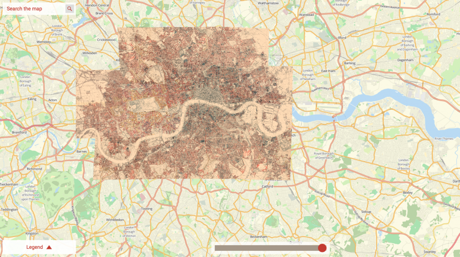
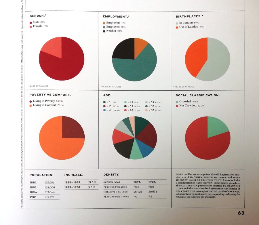
None of the study’s particular limitations take away from the graphic achievements of its maps and explanatory charts. They are, the London School of Economics writes, a striking “early example of social cartography.” The LSE hosts an incredibly detailed, searchable, high-resolution interactive version of the maps, assembled together and overlaid on a modern GPS map of London. They also detail the various editions of the maps as they appeared between 1898 and 1903.
Hand-colored and based on the 1869 Ordnance Survey, the maps seemed “sufficiently important” to Booth to warrant “comprehensive revision.” Here, the police appear in person to guide the process. “Social investigators accompanied policemen on their beats across London,” the LSE writes, “and recorded their own impressions of each street and the comments of the policemen.” You can read the police notebooks from these surveys at the LSE and learn more about the 12 district maps and the demographic data they represent at Mapping London. The LSE printed a hardcover print edition of Booth’s work in 2019, complete with 500 illustrations. You can purchase a copy here. Or visit the interactive editionhere.
We're hoping to rely on loyal readers, rather than erratic ads. Please click the Donate button and support Open Culture. You can use Paypal, Venmo, Patreon, even Crypto! We thank you!
Open Culture scours the web for the best educational media. We find the free courses and audio books you need, the language lessons & educational videos you want, and plenty of enlightenment in between.
