There’s been a lot of handwringing over the i‑Generation’s lack of map reading skills.
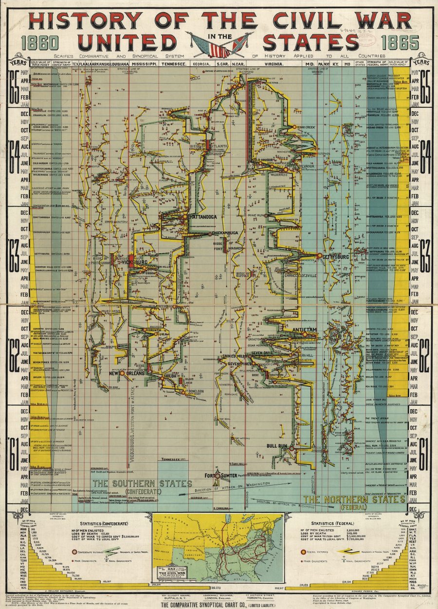
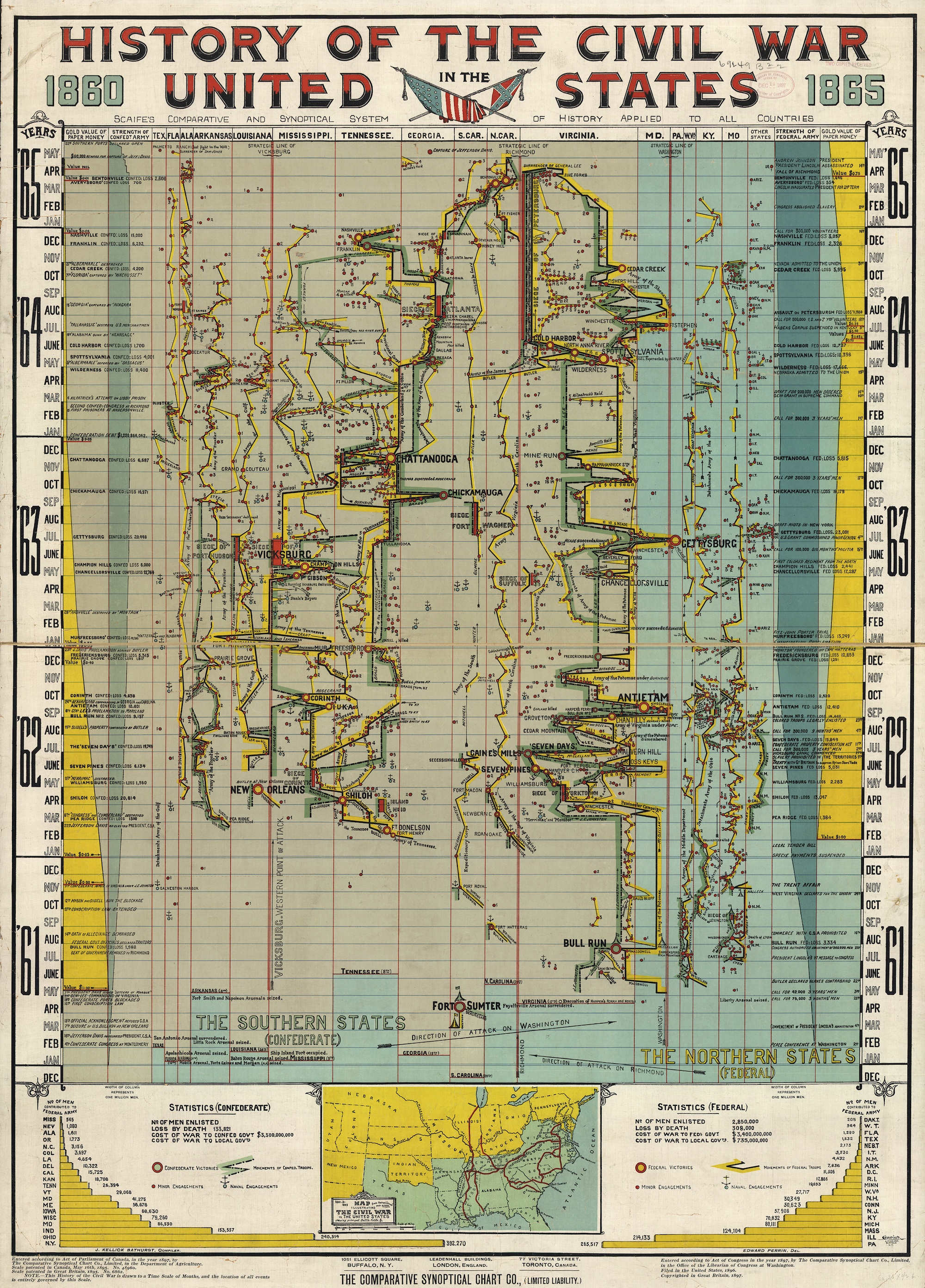
While we’re at it, let’s take a cold, hard look at the Gilded Age infographic, above.…
… and conclude that people who live in glass houses should stop reaching for stones.
Published in 1897 by the Comparative Synoptical Chart Company, this now unfathomable document–History of the Civil War in the United States: 1860–1865–achieved its goal of squeezing the maximum amount of content onto a single sheet.
This is in direct opposition to today’s generally accepted rules for creating successful infographics, one of which is to simplify.
Another holds that text should be used sparingly, lest it clutter up strong visuals. Consumers have a limited attention span, and for content to be considered shareable, they should be able to take it in at a glance.
Modern eyes may be forgiven for mistaking this chart for the world’s most convoluted subway map. But those aren’t stops, friend. They’re minor engagements. Bloodier and better-known battles are delineated with larger circles—yellow centers for a Union victory, pale green for Confederate.
The fastest way to begin making heads or tails of the chart is to note that each column is assigned to a different state.
The vertical axis is divided into months. Notice all the negative space around Fort Sumter.
And the constant entries in Virginia’s column.
The publisher noted that the location of events was “entirely governed” by this time scale.
You’ll have to look hard for Lincoln’s assassination.
Consumers who purchased the History of the Civil War in the United States 1860–1865 presumably pored over it by candlelight, supplementing it with maps and books.
It would still make a superb addition to any history teacher’s classroom, both as decoration and the tinder that could ignite discussion as to how we receive information, and how much information is in fact received.
Explore a larger, zoomable version of the map here.
Related Content:
A Free Course from Yale on the U.S. Civil War
Watch Veterans of The US Civil War Demonstrate the Dreaded Rebel Yell (1930)
Visualizing Slavery: The Map Abraham Lincoln Spent Hours Studying During the Civil War
Ayun Halliday is an author, illustrator, theater maker and Chief Primatologist of the East Village Inky zine. Follow her @AyunHalliday.
Leave a Reply