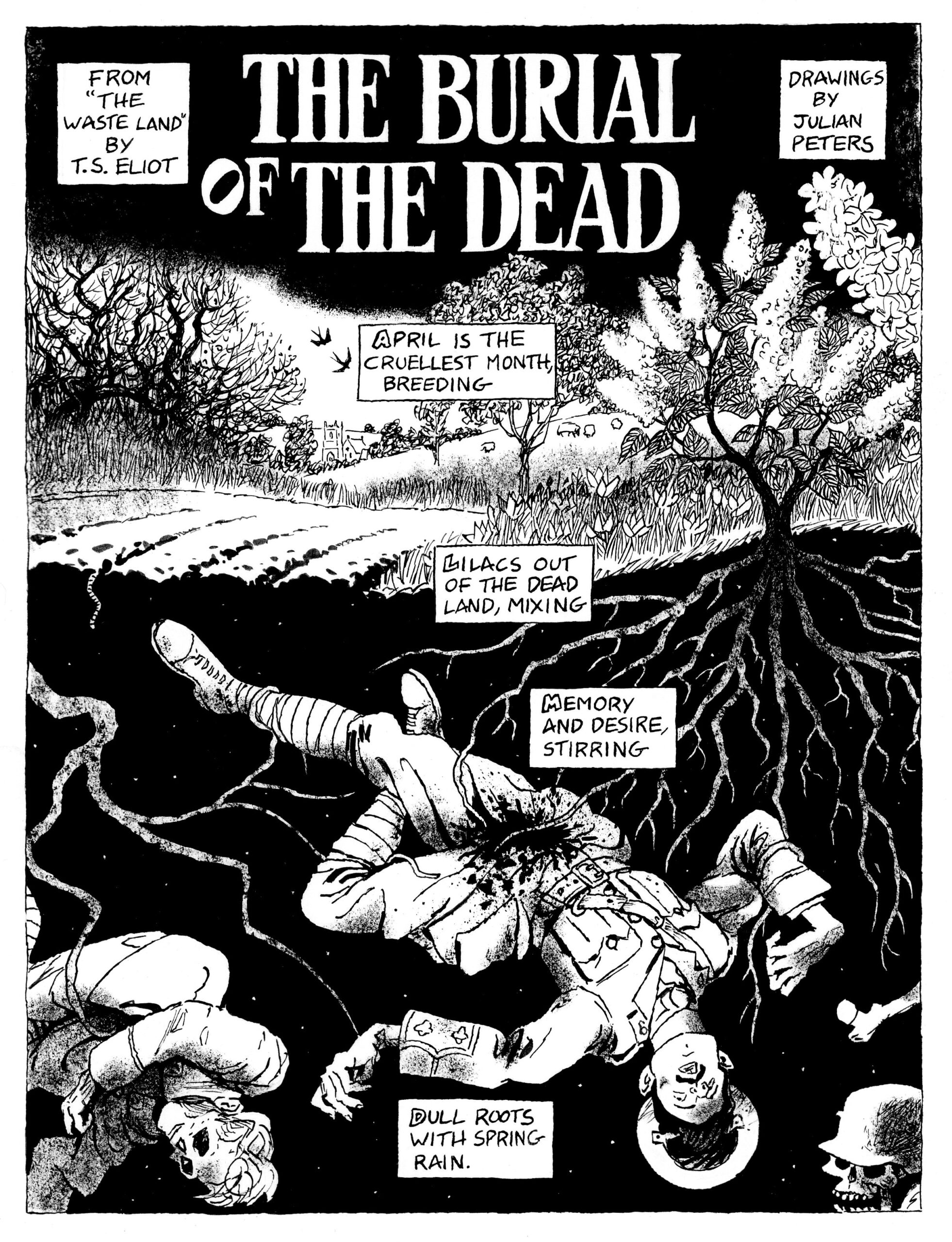
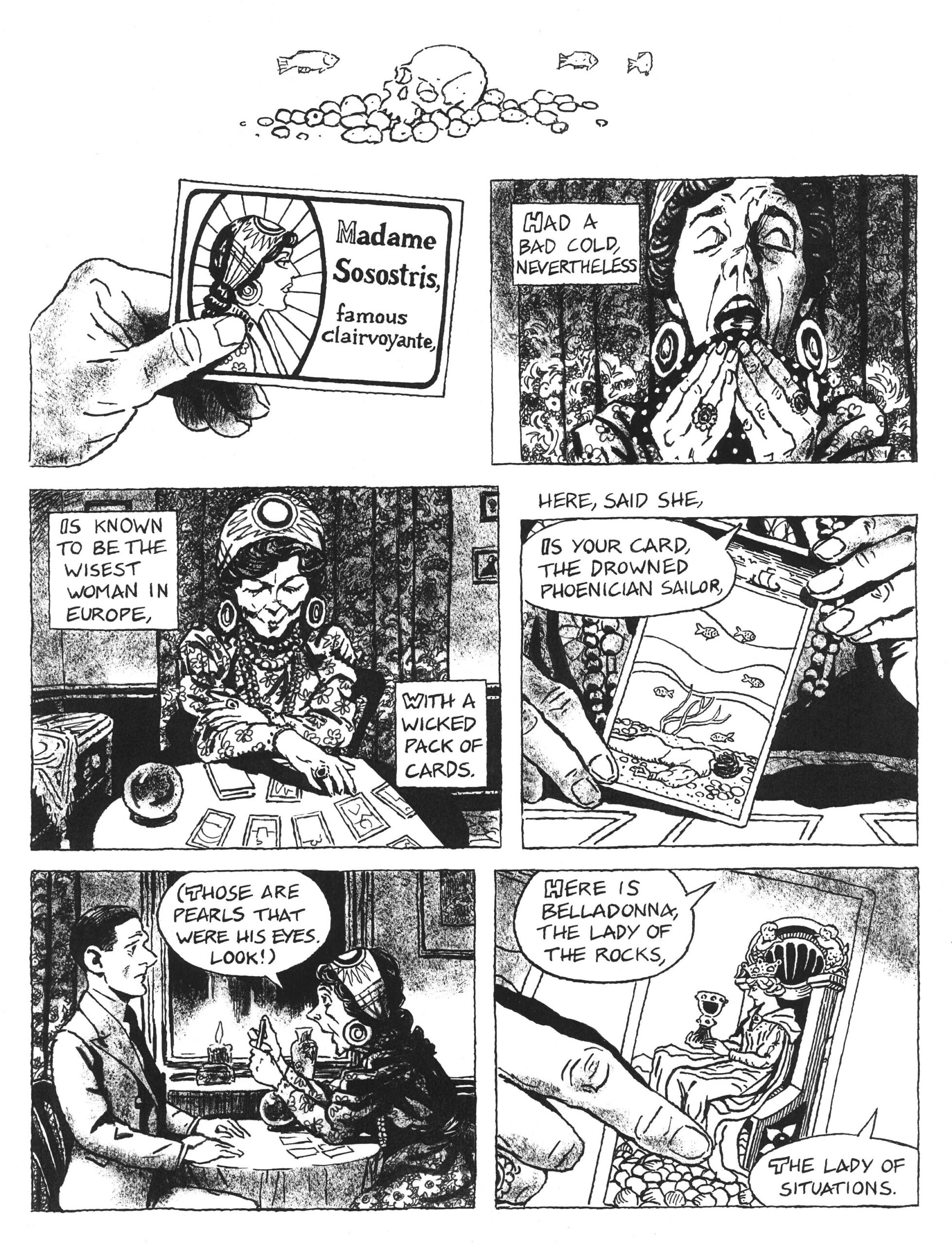
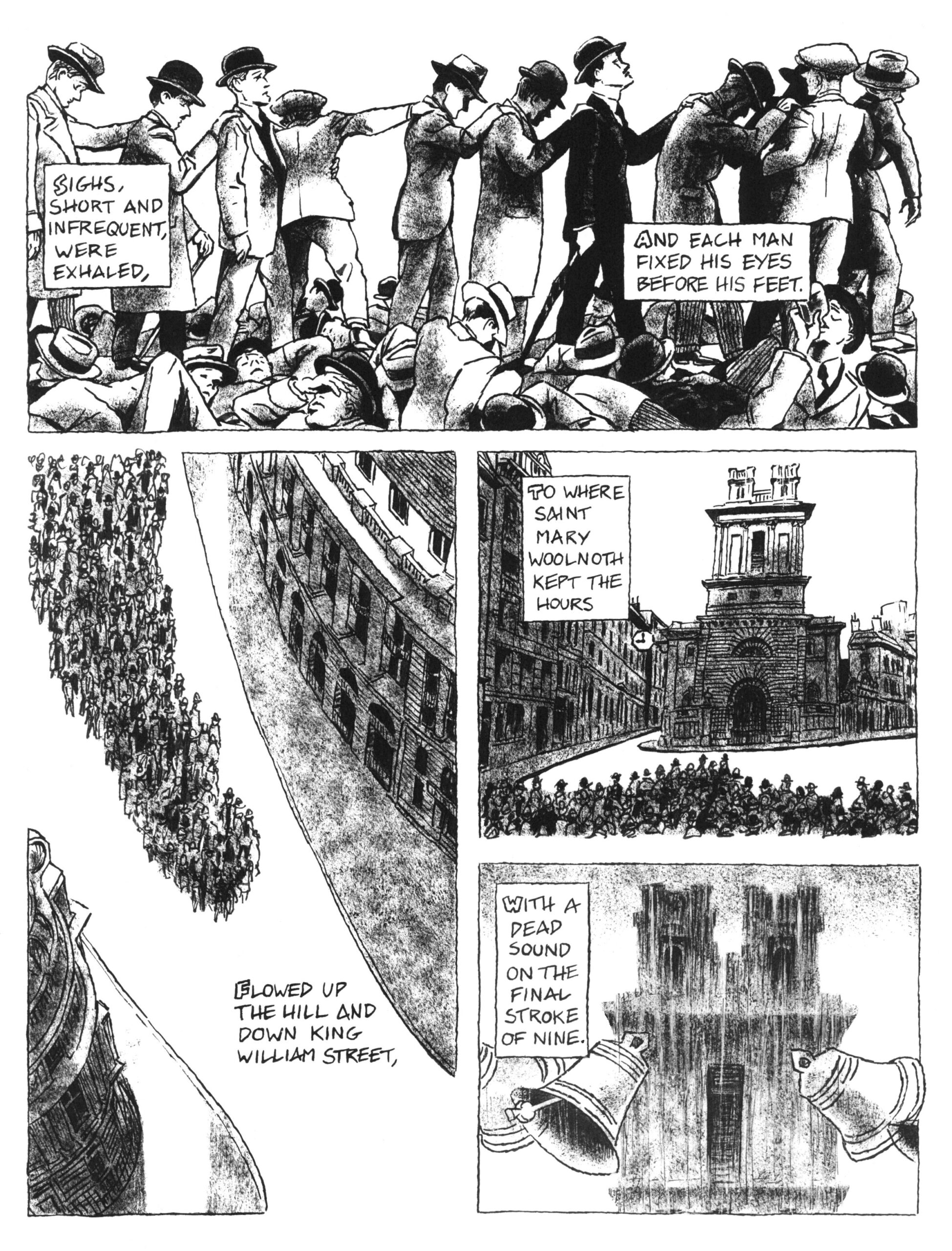
If you grew up reading American comic books during the second half of the twentieth century, you’ll be familiar with the seal of the Comics Code Authority. I remember seeing it stamped onto the upper-right corner of issues of titles from The Amazing Spider-Man to reprints of Carl Barks’ Scrooge McDuck stories to Jughead DoubleDigest, but I can’t say I paid it much mind at the time. This was in the nineteen-nineties, by which time the Comics Code itself has lost much of its force. But back when it was created, in 1954, it had as much restrictive power over the content of comic books as the “Hays Code” once had over motion pictures.
According to the video from Youtuber matttt above, the Comics Code was implemented in response to one publisher above all: EC Comics, whose grim and graphic titles like Tales from the Crypt and The Vault of Horror made both a big impact on popular culture and a dent in the reputation of the comics industry. Closing ranks, that industry formed the Comics Code Authority to enforce a regime of self-censorship, mangling EC in its gears just as it was about to publish one of the most innovative stories in its form: “Master Race,” the tale of an ex-SS officer in modern-day New York, by an artist named Bernard Krigstein.
At its height, EC was a veritable comics factory, with a set of procedures in place that ensured the efficient production of cheap thrills — often at considerable cost to the potential of the medium. Krigstein, who’d always harbored higher artistic aspirations, chafed at these limitations, finding such workarounds as subdividing rigidly defined panel spaces into sets of sequential images, the better to convey movement and action. Nowhere did this technique prove more effective than in “Master Race,” with its practically cinematic tour de force sequence in which the haunted Carl Reissman slips under the wheels of a passing subway train.
Quality takes time, and Krigstein missed the story’s deadline just before the Comics Code went into force. “Master Race” was published a few months later, albeit in one of EC’s new, sanitized, and thus much less popular titles. The methods of visual storytelling he refined have now become standard elements of comic art, but the medium’s enthusiasts can sense how far Krigstein could have gone, if not for the frustration that ultimately caused him to abandon comics for a career as a high-school teacher: “Something tremendous could have been done,” he said, “if only they’d let me do it.” With the Comics Code long since defunct — and now that EC’s most disturbing comics look tame — content has become a free-for-all. But what artist dares to be as bold as Krigstein in pushing forward the form?
Based in Seoul, Colin Marshall writes and broadcasts on cities, language, and culture. His projects include the Substack newsletterBooks on Cities and the book The Stateless City: a Walk through 21st-Century Los Angeles. Follow him on Twitter at @colinmarshall or on Facebook.
If you know more than a few millennials, you probably know someone who reveres Calvin and Hobbes as a sacred work of art. That comic strip’s cultural impact is even more remarkable considering that it ran in newspapers for only a decade, from 1985 to 1995: barely an existence at all, by the standards of the American funny pages, where the likes of Garfield has been lazily cracking wise for 45 years now. Yet these two examples of the comic-strip form could hardly be more different from each other in not just their duration, but also how they manifest in the world. While Garfield has long been a marketing juggernaut, Calvin and Hobbes creator Bill Watterson has famously turned down all licensing inquiries.
That choice set him apart from the other successful cartoonists of his time, not least Charles Schulz, whose work on Peanuts had inspired him to start drawing comics in the first place. Calvin and Hobbes may not have its own toys and lunchboxes, but it does reflect a Schulzian degree of thoughtfulness and personal dedication to the work. Like Schulz, Watterson eschewed delegation, creating the strip entirely by himself from beginning to end. Not only did he execute every brushstroke (not a metaphor, since he actually used a brush for more precise line control), every theme discussed and experienced by the titular six-year-old boy and his tiger best friend was rooted in his own thoughts.
“One of the beauties of a comic strip is that people’s expectations are nil,” Watterson said in an interview in the twenty-tens. “If you draw anything more subtle than a pie in the face, you’re considered a philosopher.” However modest the medium, he spent the whole run of Calvin and Hobbes trying to elevate it, verbally but even more so visually. Or perhaps the word is re-elevate, given how his increasingly ambitious Sunday-strip layouts evoked early-twentieth-century newspaper fixtures like Little Nemo and KrazyKat, which sprawled lavishly across entire pages. Even if there could be no returning to the bygone golden age of the comic strip, he could at least draw inspiration from its glories.
Ironically, from the perspective of the twenty-twenties, Watterson’s work looks like an artifact of a bygone golden age itself. In the eighties and nineties, when even small-town newspapers could still command a robust readership, the comics section had a certain cultural weight; Watterson has spoken of the cartoonist’s practically unmatched ability to influence the thoughts of readers on a daily basis. In my case, the influence ran especially deep, since I became a Calvin and Hobbes-loving millennial avant la lettre while first learning to read through the Sunday funnies. It took no time at all to master Garfield, but when I started getting Calvin and Hobbes, I knew I was making progress; even when I didn’t understand the words, I could still marvel at the sheer exuberance and detail of the art.
Calvin and Hobbes also attracted enthusiasts of other generations, not least among other cartoonists. Joel Allen Schroeder’s documentary Dear Mr. Watterson features more than a few of them expressing their admiration for how he raised the bar, as well as for how his work continues to enrapture young readers. Its timelessness owes in part to its lack of topical references (in contrast to, say, Doonesbury, which I remember always being the most formidable challenge in my days of incomplete literacy), but also to its understanding of childhood itself. Like Stephen King, a creator with whom he otherwise has little in common, Watterson remembers the exotic, often bizarre textures reality can take on for the very young.
He also remembers that childhood is not, as J. M. Coetzee once put it, “a time of innocent joy, to be spent in the meadows amid buttercups and bunny-rabbits or at the hearthside absorbed in a storybook,” but in large part “a time of gritting the teeth and enduring.” Being six years old has its pleasures, to be sure, but it also comes with strong doses of tedium, powerlessness, and futility, which we tend not to acknowledge as adults. Calvin and Hobbes showed me, as it’s shown so many young readers, that there’s a way out: not through studiousness, not through politeness, and certainly not through following the rules, but through the power of the imagination to re-enchant daily life. If it gets you sent to your room once in a while, that’s a small price to pay.
Based in Seoul, Colin Marshall writes and broadcasts on cities, language, and culture. His projects include the Substack newsletterBooks on Cities, the book The Stateless City: a Walk through 21st-Century Los Angeles and the video series The City in Cinema. Follow him on Twitter at @colinmarshall or on Facebook.
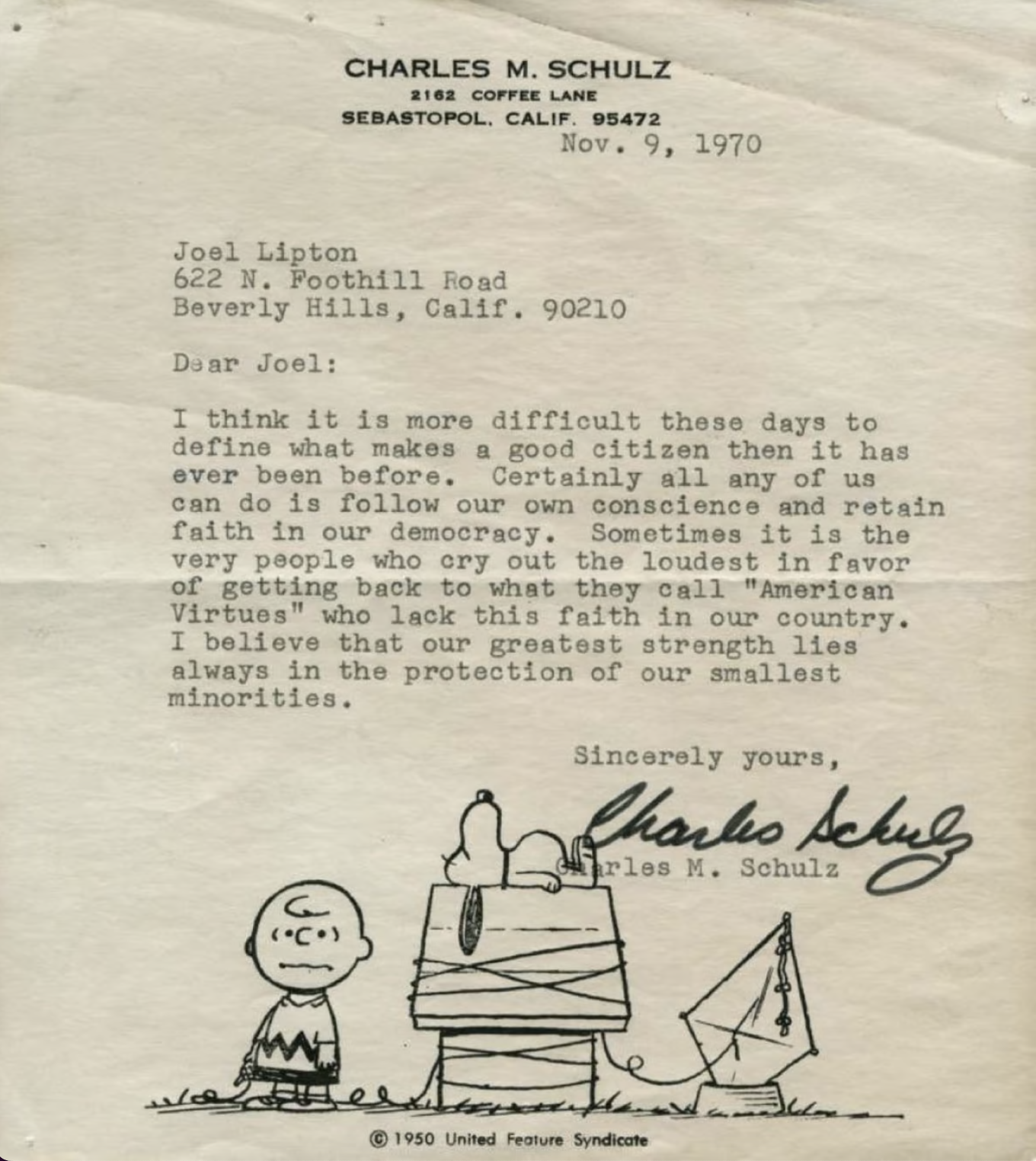
Anyone can learn to draw the cast of Peanuts, but few can do it every day for nearly half a century. The latter, as far as we know, amounts to a group of one: Charles Schulz, who not only created that world-famous comic strip but drew it single-handed throughout its entire run. He was, as a nineteen-sixties CBS profile put it, “a one-man production team: writer, humorist, social critic.” That clip opens the video above, which compiles footage of Schulz drawing Peanuts while making observations on the nature of his craft. “When you draw a comic strip, if you’re going to wait for inspiration, you’ll never make it,” he says. “You have to become professional enough at this so that you can almost deliberately set down an idea at will.”
Schulz’s dedication to his work may have been an inborn trait, but he didn’t find his way to that work only through his particular abilities. His particular inabilities also played their part: “I studied art in a correspondence course, because I was afraid to go to art school,” he says in a later BBC segment.
“I couldn’t see myself sitting in a room where everyone else in the room could draw much better than I.” With better writing skills, “perhaps I would have tried to become a novelist, and I might have become a failure.” With better drawing skills, “I might have tried to become an illustrator or an artist. I would’ve failed there. But my entire being seems to be just right for being a cartoonist.”
In drawing, he also found a medium of thought. “The really practical way of getting an idea, when you have nothing really to draw, is just taking a blank piece of paper and maybe drawing one of the characters in a familiar pose, like Snoopy sleeping on top of the doghouse,” he says. Then, you might naturally “imagine what would happen if, say, it began to snow. And so you’d doodle in a few snowflakes, something like that. Perhaps you would be led to wonder what would happen if it snowed very hard, and the snow covered him up completely.” If you continue on to draw, say, Snoopy’s loyal friend Woodstock being similarly snowed in, you’re well on your way to a complete strip. Now do it 17,897 times, and maybe you’ll qualify for Schulz’s league.
Based in Seoul, Colin Marshall writes and broadcasts on cities, language, and culture. His projects include the Substack newsletterBooks on Cities, the book The Stateless City: a Walk through 21st-Century Los Angeles and the video series The City in Cinema. Follow him on Twitter at @colinmarshall or on Facebook.
Donald Duck first appeared in Disney’s 1934 cartoon The Wise Little Hen (below). In his subsequent roles, he quickly developed into that still-familiar figure the New Yorker once described as “personified irritability.” But it would take him another decade or so to become more than an incompetent, quick-to-anger foil for Mickey Mouse. It would also take the mind and hand of Carl Barks, a former Disney artist who’d retreated to the edge of the California desert to raise chickens and draw a few comic books for extra money. That ostensible side gig lasted thirty years, during which Barks wrote and drew about 500 Donald Duck stories, building an entire world around him now regarded as one of the greatest works of American comic art.
Even as Barks’ comics became enormously popular, he labored on them in total anonymity; fans called him “the Good Duck Artist” (which now seems more of a commentary on the artistic standards of Disney comics at the time) or “the Duck Man.” As comics Youtuber matttt puts it in the video above, “in the early nineteen-fifties, the Duck Man was selling three million comics every single month, and yet no one knew his name,” because “Disney was intent on keeping alive the myth that Walt Disney himself personally drew the comics.” Despite that, it was clear to many readers, young and old, that one particular Donald Duck artist was producing material of exceptional ambition and “astoundingly high quality.” It would take the especially dedicated among them years and years of repeated attempts before finding out his name.
“The duck comics were, at their best, rip-roaring, edge-of-your-seat, globe-trotting comic adventures,” says matttt. “They feel less like Steamboat Willie and more like Indiana Jones or Star Wars — or, should I say, Indiana Jones and Star Wars feel like the duck comics, because both George Lucas and Steven Spielberg grew up reading, and are vocal fans of, the Duck Man.” Other avowed Barks enthusiasts include R. Crumb, Matt Groening, and even Osamu Tezuka, the “God of Manga” himself. “Even when I open manga from much later, like Dragon Ball or One Piece, by artists who, to my knowledge, have never read a Donald Duck comic, I see the Duck Man’s influence: in those half-page scene-setting splashes, the big eyes, expressive faces, the sense of motion and pacing.”
Barks only came into the public eye after his actual retirement, and in his later decades found himself fêted around the world. Generations of readers had grown up familiar with not just his sophisticated interpretation of Donald Duck and his nephews Huey, Dewey, and Louie, but also the city of Duckburg he created and the characters with whom he populated it: Gyro Gearloose, the Beagle Boys, Magica DeSpell, and most distinguished of all, Donald’s impossibly wealthy uncle Scrooge McDuck. Like most millennials, I first encountered them all through DuckTales, the Disney TV series with a Barksian penchant for exotic travels and ironic endings; this prepared me to appreciate Barks’ original stories as Gladstone Comics subsequently reprinted them in the nineties. And like all former young Barks fans, I’ve only come to appreciate them more in adulthood.
Based in Seoul, Colin Marshall writes and broadcasts on cities, language, and culture. His projects include the Substack newsletterBooks on Cities, the book The Stateless City: a Walk through 21st-Century Los Angeles and the video series The City in Cinema. Follow him on Twitter at @colinmarshall or on Facebook.
Early in his collecting odyssey, animation historian, archivist, and educator Tommy José Stathes earned the honorific Cartoon Cryptozoologist from Cinebeasts, a “New York-based collective of film nerds, vidiots, and programmers investigating the furthest reaches of the moving image universe.”
More recently, George Willeman, a nitrate film expert on the Library of Congress’ film preservation team dubbed him “the King of Silent Animation.”
The seed of Stathes’ enduring passion took root in his 90s childhood, when slapped together VHS anthologies of cartoons from the 30s and 40s could be picked up for a couple of bucks in groceries and drugstores. These finds typically included one or two silent-era rarities, which is how he became acquainted with Felix the Cat and other favorites who now dominate his Early Animation Archive.
He squeezed his parents and grandparents for memories of cartoons screened on television and in theaters during their youth, and began researching the history of animation.
Realizing how few of the early cartoons he was learning about could be widely viewed, he set out to collect and archive as many examples as possible, and to share these treasures with new audiences.
His collection currently consists of some 4,000 animated reels, truffled up from antique shops, flea markets, and eBay. In addition to his Cartoons on Film YouTube channel, he hosts regular in-person Cartoon Carnivals, often curated around holiday themes.
Stathes’ passion project is giving many once-popular characters a second and in some cases, third act.
Take Farmer Alfalfa, (occasionally rendered as Al Falfa), the star of 1923’s The Fable of the Alley Cat, an installment in the Aesop’s Fables series, which ran from 1921 to 1929.
His first appearance was in director Paul Terry’s Down on Phoney Farm from 1915, but as Stathes observes, baby boomers grew up watching him on TV:
Nearly all of these folks who mention the character will also reference ‘hundreds’ of mice. Few may have realized that, while the Farmer Alfalfa cartoons running on television at that time were already old, the films starred one of the earliest recurring cartoon characters, and one that enjoyed an incredibly long career compared with his cartoon contemporaries.
The Fable of the Alley Cat honks a lot of familiar vintage cartoon horns — slapstick, mayhem, David triumphing over Goliath… cats and mice.
Stathes describes it as “a rather sinister day in the life of Farmer Al Falfa — It’s clear that the animal kingdom tends to despise him! — and his documentation is meticulous:
The version seen here was prepared for TV distribution in the 1950s by Stuart Productions. The music tracks were originally composed by Winston Sharples for the Van Beuren ‘Rainbow Parade’ cartoons in the mid-1930s.
The mismatched duo, Mutt and Jeff, got their start in daily newspaper comics, before making the leap to animated shorts.
Animation connoisseurs go bananas for the perspective shift at the 14 second mark of Laughing Gas (1917), a rarity Stathes shares as a reference copy from the original 35mm nitrate form, with the promise of a full restoration in the future.
(A number of Stathes’ acquisitions have deteriorated over the years or sustained damage through improper storage.)
Dinky Doodle and his dog Weakheart were 1920s Bray Studios crowdpleasers whose stint on television is evidenced by the midcentury voice over that was added to Dinky Doodle’s Bedtime Story (1926).
The characters’ creator, director Walter Lantz appears as “Pop” in the above live sequences.
Stathes’ collection also dredges up some objectionable period titles and content, Little Black Sambo, Redskin Blues, and Korn Plastered in Africa to name a few.
Stathes is mindful of contemporary sensibilities, but stops short of allowing them to scrub these works from the historic record. He warns would-be viewers of The Chinaman that it contains a “racist speech balloon as well as an intertitle that was cut from the later TV version for obvious reasons:”
Such was the vulgar terminology in those days. To question or censor these films would be denying our history.
Bugs Bunny is a quick-thinking, fast-talking, wascally force of nature, and a preternaturally gifted physical comedian, too.
But unlike such lasting greats as Charlie Chapin and Buster Keaton, it took him a while to find his iconic look.
His first appearance, as “Happy Rabbit” in the 1938 black and white theatrical short, Porky’s Hare Hunt, might remind you of those yearbook photos of celebrities before they were famous.
In a video essay considering how Bugs Bunny’s look has evolved over his eight-decade career, animation fan Dave Lee of the popular YouTube series Dave Lee Down Under breaks down some early characteristics, from an undefined, small body and oval-shaped head to white fur and a fluffy cotton ball of a tail.
His voice was also a work in progress, more Woody Woodpecker than the hybrid Brooklyn-Bronx patois that would make him, and voice actor Mel Blanc, famous.
The following year, the rabbit who would become Bugs Bunny returned in Prest‑o Change‑o, a Merry Melodies Technicolor short directed by Chuck Jones.
A few months later character designer (and former Disney animator) Charlie Thorson subjected him to a pretty noticeable makeover for Hare-um Scare-um, another rabbit hunting-themed romp.
The two-toned grey and white coat, oval muzzle, and mischievous buck-toothed grin are much more aligned with the Bugs most of us grew up watching.
His pear-shaped bod’, long neck, high-rumped stance, and pontoon feet allowed for a much greater range of motion.
A notation on the model sheet alluding to director Ben Hardaway’s nickname — “Bugs” — gives some hint as to how the world’s most popular cartoon character came by his stage name.
For 1940’s Elmer’s Candid Camera, the pink-muzzled Bugs dropped the yellow gloves Thorsen had given him and affected some black ear tips.
Tex Avery, who was in line to direct the pair in the Academy Award-nominated short A Wild Hare, found this look objectionably cute.
He tasked animator Bob Givens with giving the rabbit, now officially known as Bugs Bunny, an edgier appearance.
In the Givens design, Bugs was no longer defined by Thorson’s tangle of curves. His head was now oval, rather than round. In that respect, Bugs recalled the white rabbit in Porky’s Hare Hunt, but Givens’s design preserved so many of Thorson’s refinements—whiskers, a more naturalistic nose—and introduced so many others—cheek ruffs, less prominent teeth—that there was very little similarity between the new version of Bugs and the Hare Hunt rabbit.
Barrier also details a number of similarities between the titular rabbit character from Disney’s 1935 Silly Symphonies short,The Tortoise and the Hare, and former Disney employee Givens’ design.
While Avery boasted to cartoon historian Milt Gray in 1977 that “the construction was almost identical”, adding, “It’s a wonder I wasn’t sued,” Givens insisted in an interview with the Animation Guild’s oral history project that Bugs wasn’t a Max Hare rip off. ( “I was there. I ought to know.”)
Whatever parallels may exist between Givens’ Bugs and Disney’s Hare, YouTuber Lee sees A Wild Hare as the moment when Bugs Bunny’s character coalesced as “more of a lovable prankster than a malicious deviant,” nonchalantly chomping a carrot like Clark Gable in It Happened One Night, and turning a bit of regional Texas teen slang — “What’s up, Doc?”- into one of the most immortal catch phrases in entertainment history.
A star was born, so much so that four directors — Jones, Avery, Friz Freleng and Bob Clampett — were enlisted to keep up with the demand for Bugs Bunny vehicles.
This multi-pronged approach led to some visual inconsistencies, that were eventually checked by the creation of definitive model sheets, drawn by Bob McKimson, who animated the Clampett-directed shorts.
Historian Barrier takes stock:
Bugs’s cheeks were broader, his chin stronger, his teeth a little more prominent, his eyes larger and slanted a little outward instead of in. The most expressive elements of the rabbit’s face had all been strengthened …but because the triangular shape of Bugs’s head had been subtly accentuated, Bugs was, if anything, futher removed from cuteness than ever before. McKimson’s model sheet must be given some of the credit for the marked improvement in Bugs’s looks in all the directors’ cartoons starting in 1943. Not that everyone drew Bugs to match the model sheet, but the awkwardness and uncertainty of the early forties were gone; it was if everyone had suddenly figured out what Bugs really looked like.
Now one of the most recognizable stars on earth, Bugs remained unmistakably himself while spoofing Charles Dickens, Alfred Hitchcock and Wagner; held his own in live action appearances with such heavy hitters as Doris Day and Michael Jordan; and had a memorable cameo in the 1988 feature Who Framed RogerRabbit, after producers agreed to a deal that guaranteed him the same amount of screen time as his far squarer rival, Mickey Mouse.
This millennium got off to a rockier start, owing to an over-reliance on low budget, simplified flash animation, and the truly execrable trend of shows that reimagine classic characters as cloying toddlers.
In 2011, on the strength of her 2‑minute animated short I Like Pandas, an initially reluctant 24-year-old Jessica Borutski was asked to “freshen up” Bugs’ look for The Looney Tunes Show,a series of longer format cartoons which required its cast to perform such 21st-century activities as texting:
I made their heads a bit bigger because I didn’t like [how] in the ’60s, ’70s Bugs Bunny’s head started to get really small and his body really long. He started to look like a weird guy in a bunny suit.
Lee’s Evolution of Bugs Bunny- 80 Years Explained was released in 2019.
In a push led by Looney Tunes Cartoons’ Alex Kirwan—who spearheads the franchise’s current slate of shorts on HBO Max—the beloved animation icons will soon expand into even more content. There’s the upcoming Tiny Toons Loooniversityrevival, a Halloween special, Cartoonito’s Bugs Bunny Builders for kids, and two feature-length animated movies on the way—and we have a feeling that’s not all, folks!
The artist admires the genre’s capacity for conveying subversive messages, explaining that “horror is where we think about the unthinkable and revel in the things that are bad for us:”
Drama can exalt the finest in humanity, but horror shows us who we really are. From The Golem to Frankenstein to The Shining to The Silence of the Lambs, horror uses metaphor to explore the darkest and most unforgivable aspects of human nature.
As he did with his Pulp Tarot deck, Alcott put in hundreds of research hours, studying movie posters, pulp magazines, fan mags, paperback books, and classic comics to get a feel for period design trends and execution:
I love seeing the different developments in printing, from etching to lithography to silkscreens to offset printing. All those different methods of creating images, all ridiculously complicated back then, are now taken care of easily with a few mouse clicks. In my own perverse way, I want to bring those days back. I want to see the flaws in the process, I want to see the limitations of reproduction, and, most of all, I want to be able to feel the paper the images are printed on.
The cards of the Major Arcana are inspired by film posters spanning the silent era to the present day. Each card has close ties to Horror Tarot Studios, a fictional production company that purports to have been in business since the dawn of the motion picture.
The Justice card references marketing tactics for gritty 70s drive-in staples like Last House on the Left and I Spit on Your Grave. The deck’s instruction booklet contains a few anecdotes about the production of these movies, a helpful bit of context for those who might have missed (or skipped) that fertile era of women’s revenge pictures:
I wanted the Horror Tarot Justice to be someone the reader can root for, even if they’re horrified by what Justice promises: not death, but “what you deserve.”
You may have no knowledge of that seminal publication, but you’d probably recognize some of the cover artwork by painter Basil Gogos, featuring such MVPs as Frankenstein’s monster, the Creature from the Black Lagoon, the Phantom of the Opera and Dracula. Alcott says that many of Gogos’ iconic monster portraits are more deeply ingrained in the public memory than the art the studios chose to promote their movies:
…for the Suit of Wands I wanted to create a series of portraits done in his style, featuring characters he never got around to painting. The Four of Wands is a card about homecoming and reconciliation, and I had the idea to paint Frederick March’s Dr. Jekyll and Mr. Hyde as two separate men, meeting for the first time in a back alley in Victorian London.
A homecoming doesn’t necessarily require a physical return to a physical home — it can be completely internal. I wanted to show Dr. Jekyll coming to terms with his inner struggle.
The Suit of Swords recreates the look of another indelible horror trope — the EC comics of the 1950s:
These comics were so lurid and perverse that they actually sparked a congressional investigation, which ended up putting them out of business. Again, before the internet, this is what horror fans had available to them, and comics publishers had to keep pushing the limits of what was acceptable in order to stay ahead of the competition.
For the Five of Swords, I parodied and gender-swapped the infamous cover of Crime SuspenStories #22. The Five of Swords is a card about being a bad winner, about gloating at your opponent’s defeat, about overkill. I figured that a housewife murdering her husband and then beheading him with a sword counted as overkill.
Note: Yesterday, Mad Magazine legend Al Jaffee died at the age of 102. Below, we present our 2016 post featuring Jaffee talking about how he invented the iconic Fold-ins for the satirical magazine.
Keep copying those Sunday funnies, kids, and one day you may beat Al Jaffee’s record to become the Longest Working Cartoonist in History.
You’ll need to take extra good care of your health, given that the Guinness Book of World Records notified Jaffee, above, of his honorific on his 95th birthday.
Much of his legendary career has been spent atMadMagazine, where he is best-known as the father of Fold-ins.
Conceived of as the satirical inverse of the expensive-to-produce, 4‑color centerfolds that were a staple of glossier mags, the first Fold-In spoofed public perception of actress Elizabeth Taylor as a man-eater. Jaffe had figured it as a one-issue gag, but editor Al Feldstein had other ideas, demanding an immediate follow up for the June 1964 issue.
Jaffe obliged with the Richard Nixon Fold-in, which set the tone for the other 450 he has hand-rendered in subsequent issues.
For those who made it to adulthood without the singular pleasure of creasing Mad’s back cover, you can digitally fold-in a few samples using this nifty interactive feature, courtesy of TheNew York Times.
With all due respect, it’s not the same, just enough to give a feel for the thrill of drawing the outermost panel in to reveal the visual punchline lurking within the larger picture. The print edition demands precision folding on the reader’s part, if one is to get a satisfactory answer to the rhetorical text posed at the outset.
Jaffe must be even more precise in his calculations. In an interview with Sean Edgar of Paste Magazine, he described how he turned a Republican primary stage shared by Nelson Rockefeller and Barry Goldwater into a surprise portrait of the man who would become president five years hence:
The first thing I did was draw Richard Nixon’s face, not in great detail, just a very rough establishment of where the eyes, nose and mouth would be, and the general shape. I did an exaggerated caricature of Nixon and then I cut it in half, and moved it apart. Once the face was cut in half, it didn’t have the integrity of a face anymore — it was sort of a half of face. Then I looked at what the eyes were like, and I said, ‘what can I make out of the eyes?’ He had these heavy eyebrows. I played around with many things, but I had to keep in mind all the time what the big picture was. So there they (Goldwater and Rockefeller) were up on a stage somewhere, doing a debate, and I thought, ‘What kind of stage prop can I put alongside these guys that would seem natural there?’ I decided that I could make eyes out of the lamps, and as far as the nose was concerned, that could come out of the figures — their clothing. Then I figured the mouth; I could use some sort of table that could give me those two sides. That’s how it all came about. You have to have some kind of visual imagination to see the possibilities. I had to concentrate on stuff that looked natural on a stage.
We're hoping to rely on loyal readers, rather than erratic ads. Please click the Donate button and support Open Culture. You can use Paypal, Venmo, Patreon, even Crypto! We thank you!
Open Culture scours the web for the best educational media. We find the free courses and audio books you need, the language lessons & educational videos you want, and plenty of enlightenment in between.