As David Bowie himself implied in a 1975 interview, “Young Americans” doesn’t have much of a narrative.
Rather, it’s a portrait of ambivalence, viewed at some remove.
The same cannot be said for Young Americans, the wholly imaginary midcentury pulp novel.
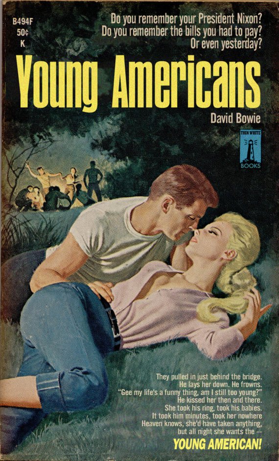
One look at the lurid cover, above, and one can guess the sort of steamy passages contained within. Bowie’s sweaty palmed classmates at Bromley Technical High School could probably have recited them from memory!
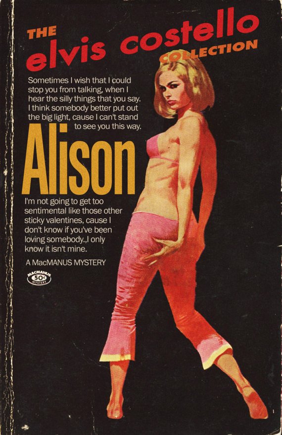
Ditto Alison. The tawdry paperback, not Elvis Costello’s evergreen 1977 ballad. There’s a reason its spine is falling apart, and it’s not because young lads like Elvis Costello are fearful their hearts might prove untrue. That skimpy pink bikini top and hip huggers get-up is appealing to an entirely different organ.
Here we must reiterate that these books do not exist and never did.
Though there’s a lot of fun to be had in pretending that they do.
Screenwriter Todd Alcott, the true author of these digital mashups, is keenly attuned to the overripe visual language of midcentury paperbacks.
He’s also got quite a knack for extracting lyrics from their original context and rendering them in the period font, magically retooling them as the sort of suggestive quotes that once beckoned from drugstore book racks.
Font has been important to him since the age of 13, when a school art project required him to combine text with an image:
I decided that I wanted the text to look like the text I’d seen in an ad for a John Lennon album, so I copied that font style. I didn’t know that the font style had a name, but I knew that my instincts for how to draw those letters didn’t match how the letters ended up looking. The font, as it turns out, was Franklin Gothic, and, as a 13-year-old, all I remember was that I would start to draw the “S” and then realize that my “S” didn’t look like Franklin Gothic’s “S,” and that the curvy letters, like “G” and “O,” didn’t look right when they sat on the lines I’d made for the other letters, because of course for a font, the curvy letters have to be a little bit bigger than the straight letters, or else they end up looking too small. I became fascinated with that kind of thing, how one font would give off one kind of feeling, and other one would give off a completely different feeling. And it turns out there’s a reason for all of that, that every font carries with it a specific cultural connotation whether the reader is aware of it or not. When I drive down the street in LA, I see billboards and I can’t just look at one and say “Okay, got it,” I get a whole other layer of meaning from them because their design and font choices tell me a whole history of the people who designed them.
While Alcott discovers many of his visuals online, he has a soft spot for the battered originals he finds in second hand shops. Their wear and tear confers the sort of verisimilitude he seeks. The rest is equal parts inspiration, Photoshop, and a growing understanding of a design form he once dismissed as the tawdry fruit of Low Culture:
I’d never understood pulp design until I started this project. As I started looking at it, I realized that the aesthetic of pulp is so deeply attached to its product that it’s impossible to separate the two. And that’s what great design is, a graphic representation of ideas. When I started examining the designs, to see why some work and some don’t, I was overwhelmed with the sheer amount of artistry involved in the covers. Pulp was a huge cultural force, there were dozens of magazines and publishers, cranking out stuff every month for decades, detective stories and police stories and noir stories and mysteries. It employed thousands of artists, writers and painters and illustrators. And the energy of the paintings is just off the charts. It had to be, because any given book cover had to compete with the ten thousand other covers that were on display. It had to grab the viewer fast, and make that person pick up the book instead of some other book. I love all kinds of midcentury stuff, but nothing grabs you the way a good pulp cover does.
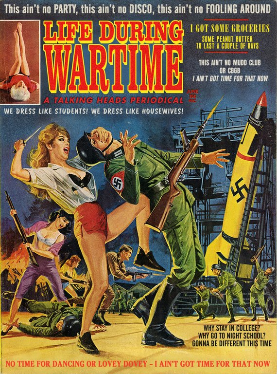
Not all of his mash ups traffic in mid-century drugstore rack nymphomania.
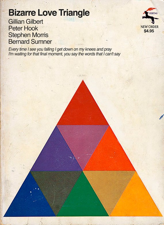
New Order’s “Bizarre Love Triangle” is the ideal recipient of the abstract approach so common to psychology and philosophy titles of the period.
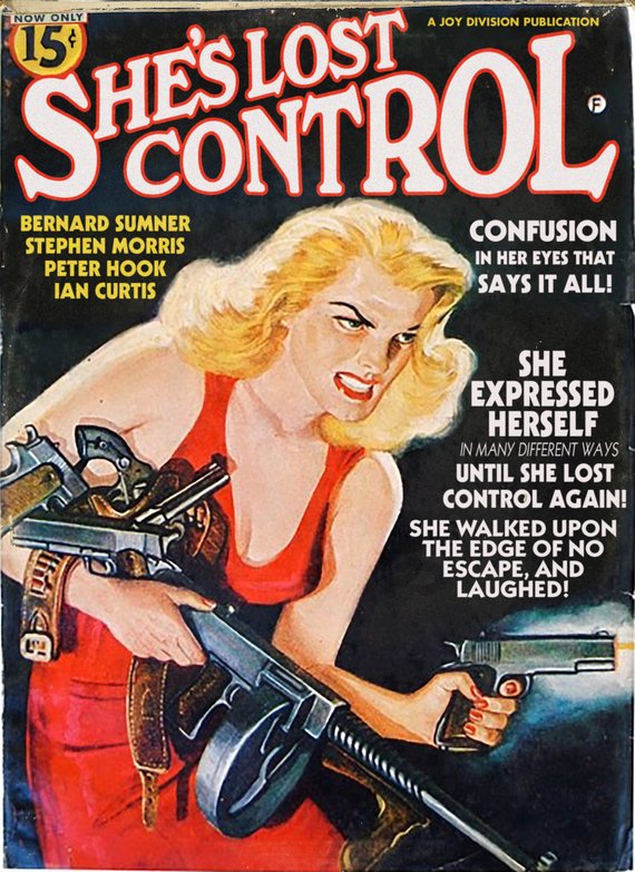
Needless to say, Alcott’s covers are also a tribute to the musicians he lists as authors, particularly those dating to his New Wave era youth—Bowie, Costello, Joy Division, Talking Heads, King Crimson…
I know I could find more popular contemporary artists to make tributes for, but these are the artists I love, I connect to their work on a deep level, and I try to make things that they would see and think “Yeah, this guy gets me.”
My favorite thing is when people think the pieces are real. That’s the highest compliment I can receive. I’ve had band members contact me and say “Where did you find this?” or “I don’t even remember doing this album” or “Where did you find this?” That’s when I know I’ve successfully combined ideas.
Todd Alcott’s Mid-Century Mash Up Book Covers can be purchased as prints from his Etsy store.
All images published with the permission of Todd Alcott.
Related Content:
French Bookstore Blends Real People’s Faces with Book Cover Art
Ayun Halliday is an author, illustrator, theater maker and Chief Primatologist of the East Village Inky zine. Join her in NYC on Monday, September 24 for another monthly installment of her book-based variety show, Necromancers of the Public Domain. Follow her @AyunHalliday.
Brilliant — would love to see some early Eno albums. Mx
“Blank Frank” — an Eno publication. He is the one who will set you up as nothing. The only time he speaks is in incomprehensible proverbs. He has a memory that’s as cold as an iceberg…
Songs by David Bowie, Elvis Costello, Talking Heads & More Re-Imagined as Pulp Fiction Book Covers,
No, only She’s Lost Control is pulp. One is a men’s adventure magazine, the others are paper back books.
Pulp fiction is called that because it was printed on cheap paper called pulpwood. Adventure was not the biggest catalog in pulp. Westerns and romance were. So, no.
Lighten up Francis. Christ ..Christ, you’re a horrible observer of the obvious.
Me (if that is your real name), do you have some issue with facts? Because you are a horrible observer of them.
More, please …