For instance, Moebius’s first tip is “When you draw, you must first cleanse yourself of deep feelings, like hate, happiness, ambition, etc.”
All of Stout’s annotations are like this. It should be required reading for anyone even vaguely interested in visual storytelling. Below are Moebius’ original observations. Stout’s thoughts on Moebius can be found here.
1) When you draw, you must first cleanse yourself of deep feelings, like hate, happiness, ambition, etc.
2) It’s very important to educate your hand. Make it achieve a level of high obedience so that it will be able to properly and fully express your ideas. But be very careful of trying to obtain too much perfection, as well as too much speed as an artist. Perfection and speed are dangerous — as are their opposites. When you produce drawings that are too quick or too loose, besides making mistakes, you run the risk of creating an entity without soul or spirit.
3) Knowledge of perspective is of supreme importance. Its laws provide a good, positive way to manipulate or hypnotize your readers.
4) Another thing to embrace with affection is the study of [the] human body — it’s anatomy, positions, body types, expressions, construction, and the differences between people.
Drawing a man is very different from drawing a woman. With males, you can be looser and less precise in their depiction; small imperfections can often add character. Your drawing of a woman, however, must be perfect; a single ill-placed line can dramatically age her or make her seem annoying or ugly. Then, no one buys your comic!
For the reader to believe your story, your characters must feel as if they have a life and personality of their own.
Their physical gestures should seem to emanate from their character’s strengths, weaknesses and infirmities. The body becomes transformed when it is brought to life; there is a message in its structure, in the distribution of its fat, in each muscle and in every wrinkle, crease or fold of the face and body. It becomes a study of life.
5) When you create a story, you can begin it without knowing everything, but you should make notes as you go along regarding the particulars of the world depicted in your story. Such detail will provide your readers with recognizable characteristics that will pique their interest.
When a character dies in a story, unless the character has had his personal story expressed some way in the drawing of his face, body and attire, the reader will not care; your reader won’t have any emotional connection.
Your publisher might say, “Your story has no value; there’s only one dead guy — I need twenty or thirty dead guys for this to work.” But that is not true; if the reader feels the dead guy or wounded guys or hurt guys or whomever you have in trouble have a real personality resulting from your own deep studies of human nature — with an artist’s capacity for such observation — emotions will surge.
By such studies you will develop and gain attention from others, as well as a compassion and a love for humanity.
This is very important for the development of an artist. If he wants to function as a mirror of society and humanity, this mirror of his must contain the consciousness of the entire world; it must be a mirror that sees everything.
6) Alejandro Jodorowsky says I don’t like drawing dead horses. Well, it is very difficult.
It’s also very difficult to draw a sleeping body or someone who has been abandoned, because in most comics it’s always action that is being studied. It’s much easier to draw people fighting — that’s why Americans nearly always draw superheroes. It’s much more difficult to draw people that are talking, because that’s a series of very small movements — small, yet with real significance.
His counts for more because of our human need for love or the attention of others. It’s these little things that speak of personality, of life. Most superheroes don’t have any personality; they all use the same gestures and movements.
7) Equally important is the clothing of your characters and the state of the material from which it was made.
These textures create a vision of your characters’ experiences, their lives, and their role in your adventure in a way where much can be said without words. In a dress there are a thousand folds; you need to choose just two or three — don’t draw them all. Just make sure you choose the two or three good ones.
8) The style, stylistic continuity of an artist and its public presentation are full of symbols; they can be read just like a Tarot deck. I chose my name “Moebius” as a joke when I was twenty-two years old — but, in truth, the name came to resonate with meaning. If you arrive wearing a T‑shirt of Don Quixote, that tells me who you are. In my case, making a drawing of relative simplicity and subtle indications is important to me.
9) When an artist, a real working artist, goes out on the street, he does not see things the same way as “normal” people. His unique vision is crucial to documenting a way of life and the people who live it.
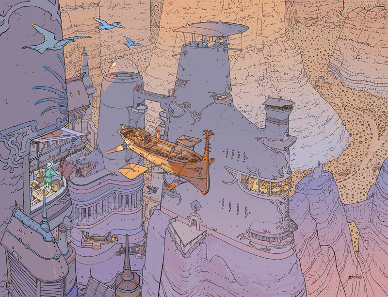
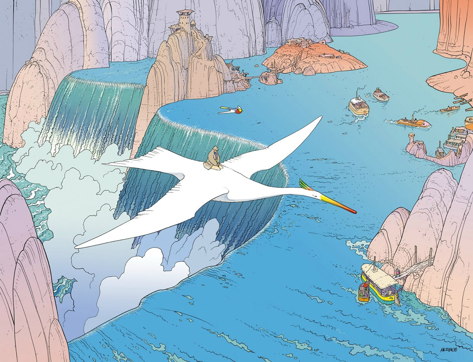
10) Another important element is composition. The compositions in our stories should be studied because a page or a painting or a panel is a face that looks at the reader and speaks to him. A page is not just a succession of insignificant panels. There are panels that are full. Some that are empty. Others are vertical. Some horizontal. All are indications of the artist’s intentions. Vertical panels excite the reader. Horizontals calm him. For us in the Western world, motion in a panel that goes from left to right represents action heading toward the future. Moving from right to left directs action toward the past. The directions we indicate represent a dispersion of energy. An object or character placed in the center of a panel focuses and concentrates energy and attention. These are basic reading symbols and forms that evoke in the reader a fascination, a kind of hypnosis. You must be conscious of rhythm and set traps for the reader to fall into so that, when he falls, he gets lost, allowing you to manipulate and move him inside your world with greater ease and pleasure. That’s because what you have created is a sense of life. You must study the great painters, especially those who speak with their paintings. Their individual painting schools or genres or time periods should not matter. Their preoccupation with physical as well as emotional composition must be studied so that you learn how their combination of lines works to touch us directly within our hearts.
11) The narration must harmonize with the drawings. There must be a visual rhythm created by the placement of your text. The rhythm of your plot should be reflected in your visual cadence and the way you compress or expand time. Like a filmmaker, you must be very careful in how you cast your characters and in how you direct them. Use your characters or “actors” like a director, studying and then selecting from all of your characters’ different takes.
12) Beware of the devastating influence of North American comic books. The artists in Mexico seem to only study their surface effects: a little bit of anatomy mixed with dynamic compositions, monsters, fights, screaming and teeth. I like some of that stuff too, but there are many other possibilities and expressions that are also worthy of exploration.
13) There is a connection between music and drawing. The size of that connection depends upon your personality and what’s going on at that moment. For the last ten years I’ve been working in silence; for me, there is music in the rhythm of my lines. Drawing at times is a search for discoveries. A precise, beautifully executed line is like an orgasm!
14) Color is a language that the graphic artist uses to manipulate his reader’s attention as well as to create beauty. There is objective and subjective color. The emotional states of the characters can change or influence the color from one panel to the next, as can place and time of day. Special study and attention must be paid to the language of color.
15) At the beginning of an artist’s career, he should principally involve himself in the creation of very high quality short stories. He has a better chance (than with long format stories) of successfully completing them, while maintaining a high standard of quality. It will also be easier to place them in a book or sell them to a publisher.
16) There are times when we knowingly head down a path of failure, choosing the wrong theme or subject for our capabilities, or choosing a project that is too large, or an unsuitable technique. If this happens, you must not complain later.
17) When new work has been sent to an editor and it receives a rejection, you should always ask for and try to discover the reasons for the rejection. By studying the reasons for our failure, only then can we begin to learn. It is not about struggle with our limitations, with the public or with the publishers. One should treat it with more of an aikido approach. It is the very strength and power of our adversary that is used as the key to his defeat.
18) Now it is possible to expose our works to readers in every part of the planet. We must always keep aware of this. To begin with, drawing is a form of personal communication — but this does not mean that the artist should close himself off inside a bubble. His communication should be for those aesthetically, philosophically and geographically close to him, as well as for himself — but also for complete strangers. Drawing is a medium of communication for the great family we have not met, for the public and for the world.
Note: An earlier version of this post appeared on our site in March 2015.