In 1835, the New England Institution for Education of the Blind (now known as Perkins School for the Blind) acquired a printing press.
Under the leadership of its first director, Samuel Gridley Howe, the press was customized in order to print in raised text that allowed blind and visually impaired people to read unassisted.
Inclusivity was a prime motivator for Howe, who strove to make sure his students would not be “doomed to inequality” or regarded as “mere objects of pity.”
After investigating European tactile printing systems, he developed Boston Line Type, an embossed Roman alphabet that could be read with the fingers.
It eschewed flourishes and capital letters, but reading it required a lot of training and even then, was likely to be slow going. Howe estimated that reading it would take three times as long as a sighted person would take to read an equivalent amount of traditionally printed text.
Ultimately it proved far less user-friendly than braille.
Text accompanying the exhibition Touch This Page! Making Sense of the Ways We Read, notes that braille had been in use in Great Britain and France for decades before being widely adopted in the US:
The amount of time and money that Perkins and other American schools had invested into Boston Line Type made them resistant to adopting a new system. Boston Line Type was, however, much harder to learn than braille, and only braille allowed individuals with visual impairments to read and write tactilely.
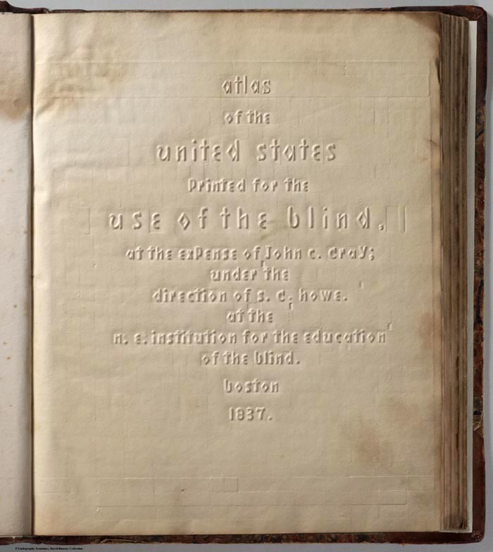
The school used its Boston Line Type press to publish history, grammar, and spelling books, as well as the New Testament, and a complete Bible.
After a visit to the school, Charles Dickens paid to have 250 Boston Line Type copies of his novel The Old Curiosity Shop printed for distribution to blind Americans.
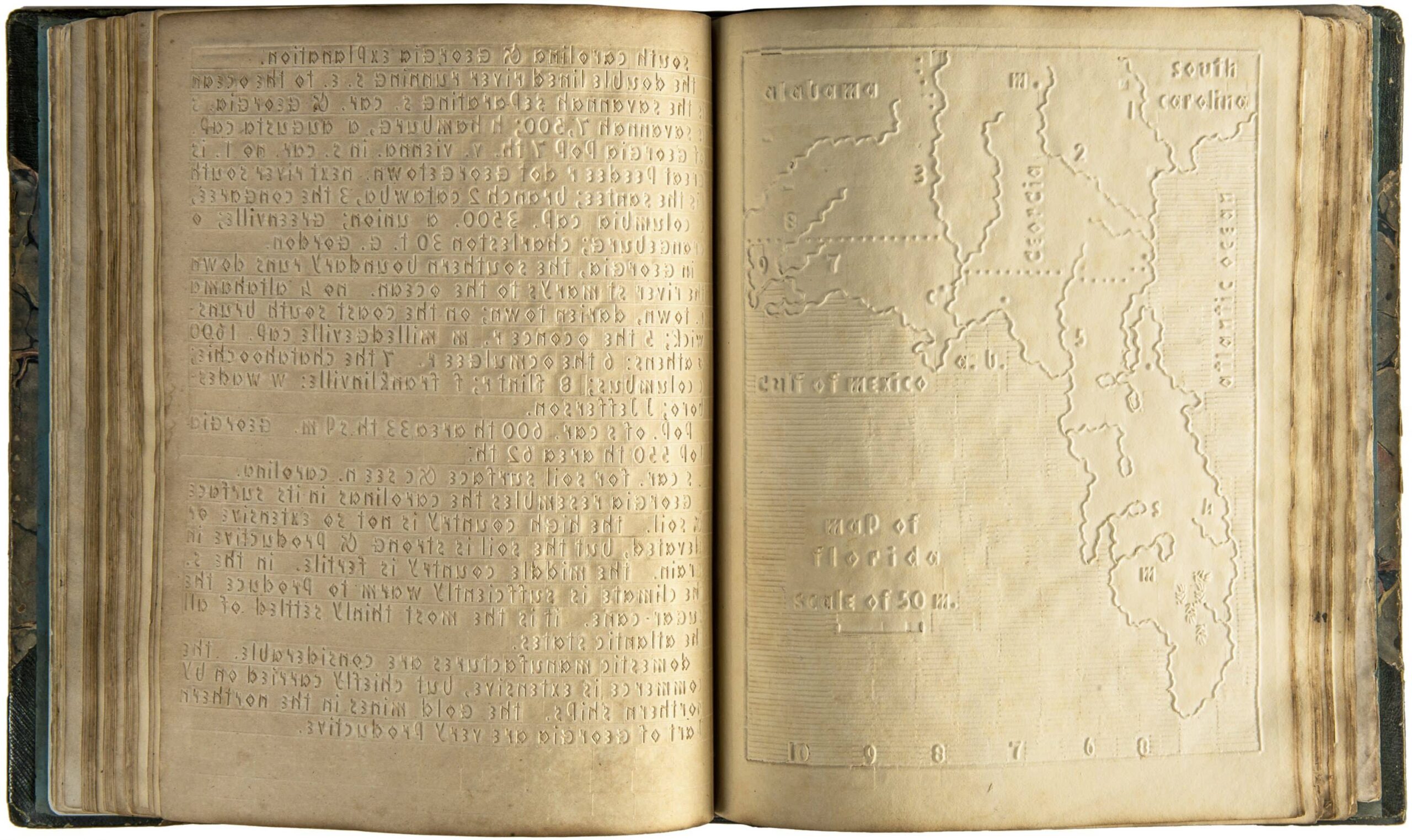
In light of Touch This Page!’s assertion that Boston Line Type’s print forms were “designed to be universally accessible rather than in those [print forms] most accessible to the touch”, we suspect that the school’s 1837 Atlas of the United States offered its readers the best value.
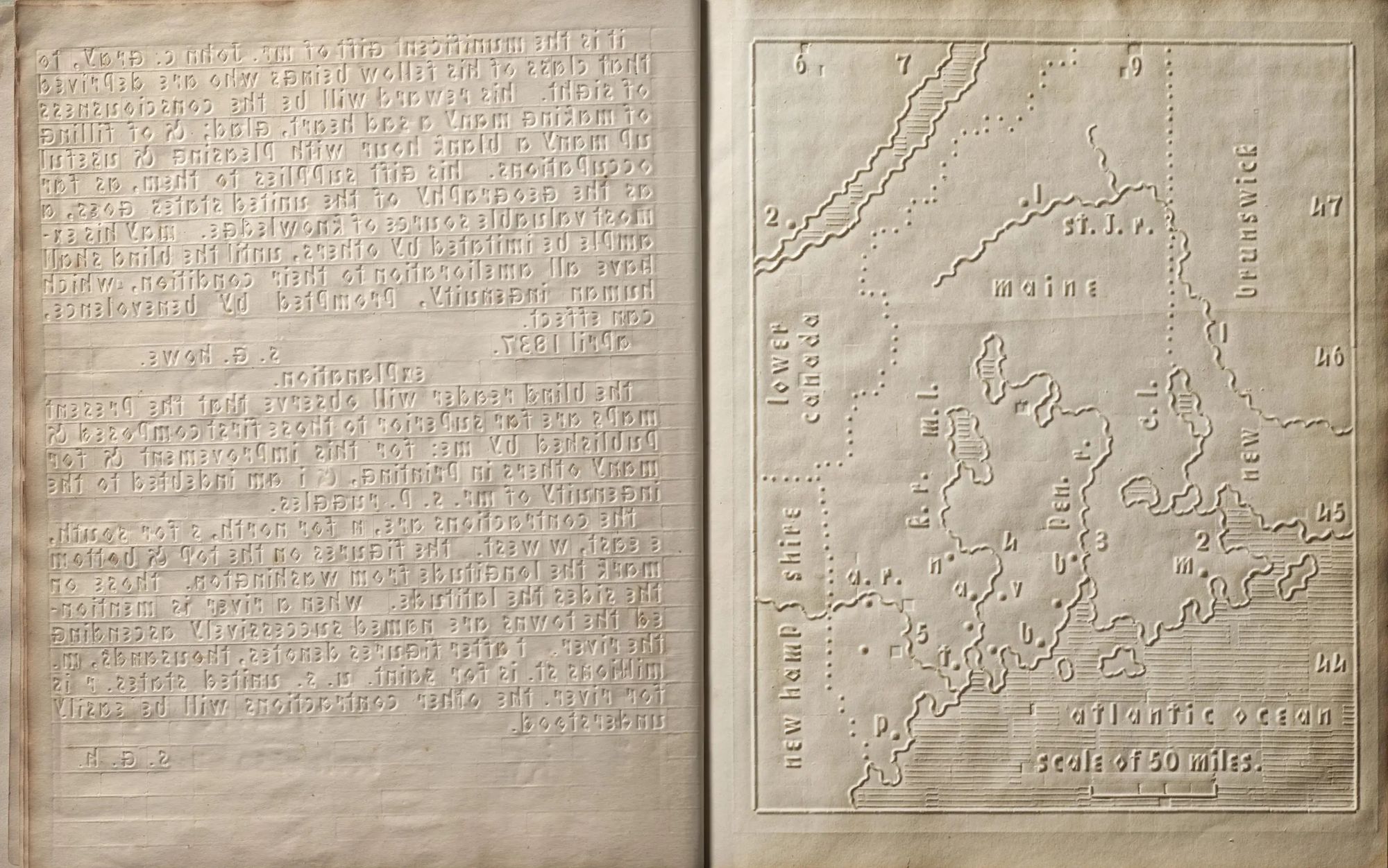
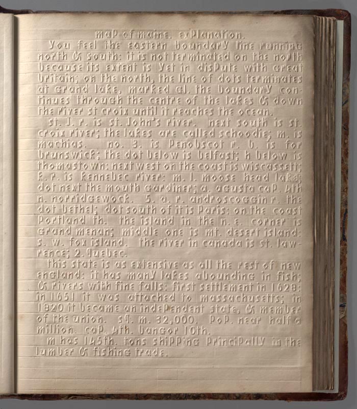
While there were many dense descriptive passages in Boston Line Type to wade through, it also boasted embossed maps to orient geography students with raised outlines of each state.
Rivers were charted as solid raised lines, while oceans were indicated with parallel lines. Sets of triangles represented mountains.
Longitudes, latitudes, and city locations were also noted, but the presence of negative space gave blind and low vision students the opportunity to grasp information quickly.
50 copies were printed, of which four survive.
Explore the Atlas of the United States Printed for the Use of the Blind here.
Related Content
Please Touch the Art: Watch a Blind Man Experience His Own Portrait for the First Time
Helen Keller Had Impeccable Handwriting: See a Collection of Her Childhood Letters
– Ayun Halliday is the Chief Primatologist of the East Village Inky zine and author, most recently, of Creative, Not Famous: The Small Potato Manifesto and Creative, Not Famous Activity Book. Follow her @AyunHalliday.
Leave a Reply