…he went away, and passing through what was called the house of Tiberius, went down into the forum, to where a gilded column stood, at which all the roads that intersect Italy terminate.”
- Plutarch, Life of Galba (XXIV.4)
No one can give you exact directions to Milliarium Aureum (aka the Golden Milestone). Just a few carved marble fragments of the gilded column’s base remain in the Roman Forum, where its original location is somewhat difficult to pinpoint.
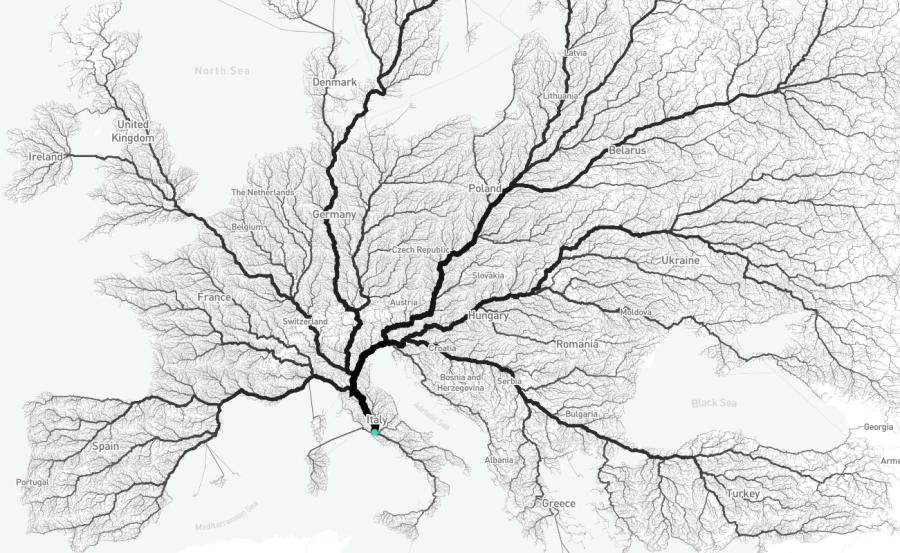
But as the image above, from interactive map Roads to Rome, shows (view it here), the motto Emperor Caesar Augustus’ mighty mile marker inspired still holds true.
All roads lead to Rome.
To illustrate, designers Benedikt Groß and Philipp Schmitt worked with digital geographer Raphael Reimann to select 486,713 starting points on a 26,503,452 km² grid of Europe.
From there, they created an algorithm to calculate the best route from each point to Rome.
(It beats typing a street address into Google Maps 486,713 times.)
From afar, the resulting map looks like a delicate piece of sea lettuce or an early exploration in neuroanatomy.
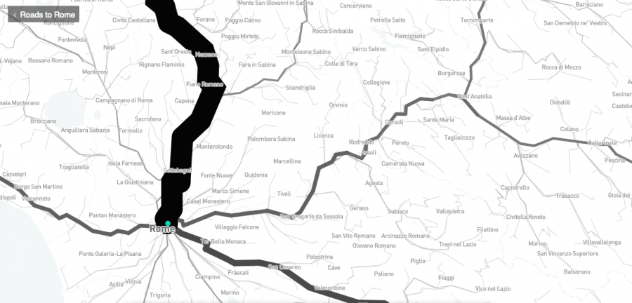
Zoom in as tight as you can and things become more traditionally cartographic in appearance, names and spatial relations of cities asserting themselves. A bold line indicates a busy route.
In a nod to map lovers outside of Europe, the mobility-obsessed team came up with another map, this one geared to stateside users.
Do you know which of the United States’ nine Romes you are closest to?
Now you do, from 312,719 distinct starting points.
To help them in their labor, the creative team made good use of the GraphHopper route optimization tool and the Open Street Map wiki. In their own estimation, the project’s outcome is “somewhere between information visualization and data art, unveiling mobility on a very large scale.”
Buy a poster of the All Roads Lead to Rome map here. Or view the interactive map here.
Related Content:
Watch the History of the World Unfold on an Animated Map: From 200,000 BCE to Today
An Interactive Map of Every Record Shop in the World
Ayun Halliday is an author, illustrator, theater maker and Chief Primatologist of the East Village Inky zine. Join her in NYC on Wednesday, May 16 for another monthly installment of her book-based variety show, Necromancers of the Public Domain. Follow her @AyunHalliday.
While pretty, the 9‑way US map seems exceedingly arbitrary in its breakdown. It’s neither oriented around major population centers (NYC, LA, Chicago, SF), nor balanced by population, nor aligned (or anti-aligned) with historical migration patterns, as far as I recall. (St. Louis was a major debarkation point for travelers heading west, but Des Moines or some random point in the middle of Wisconsin??)
I love it, but I sure don’t understand it. :-)
It shows roads leading to US cities named Rome, in the states of Georgia, Wisconsin, Kansas, Kentucky, Ohio, Pennsylvania, Iowa, Illinois, and Maine, close as I can figure out in the absence of state lines.
There are others not shown on the map.
Hope this clears things up.
And could anybody, please, make the same map for Constantinople so that we can compare the two trade networks and see the genius of the architects of our common past!
Why have you left Finland out of map in the visualisation at the top of this page?
On what grounds is Finland less important than the rest of Europe?
An outstanding Finnish historian Matti Klinge has written a collection of essays with title “Romanus sum”. But apparently the makers of this visualisation have been thinking otherwise.
“Digital geographer”? Hmm
So, would this make Rome the brain of Europe :)