Last week we brought you news of a world map purportedly more accurate than any to date, designed by Japanese architect and artist Hajime Narukawa. The map, called the AuthaGraph, updates a centuries-old method of turning the globe into a flat surface by first converting it to a cylinder. Winner of Japan’s Good Design Grand Award, it serves as both a brilliant design solution and an update to our outmoded conceptions of world geography.
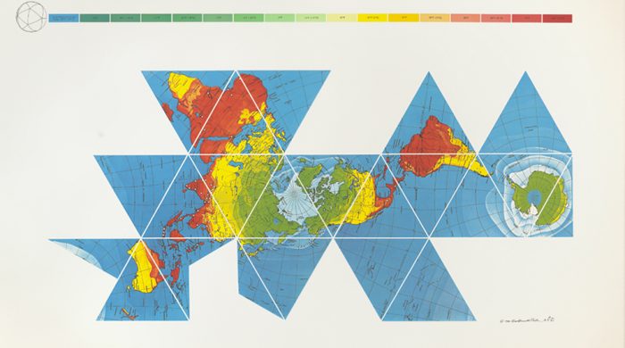
But as some readers have pointed out, the AuthaGraph also seems to draw quite heavily on an earlier map made by one of the most visionary of theorists and designers, Buckminster Fuller, who in 1943 applied his Dymaxion trademark to the map you see above, which will likely remind you of his most recognizable invention, the Geodesic Dome, “house of the future.”
Whether Narukawa has acknowledged Fuller as an inspiration I cannot say. In any case, 73 years before the AuthaGraph, the Dymaxion Map achieved a similar feat, with similar motivations. As the Buckminster Fuller Institute (BFI) points out, “The Fuller Projection Map is [or was] the only flat map of the entire surface of the Earth which reveals our planet as one island in the ocean, without any visually obvious distortion of the relative shapes and sizes of the land areas, and without splitting any continents.”
Fuller published his map in Life magazine, as a corrective, he said, “for the layman, engrossed in belated, war-taught lessons in geography…. The Dymaxion World map is a means by which he can see the whole world fairly at once.” Fuller, notes Kelsey Campell-Dollaghan at Gizmodo, “intended the Dymaxion World map to serve as a tool for communication and collaboration between nations.”
Fuller believed, writes BFI, that “given a way to visualize the whole planet with greater accuracy, we humans will be better equipped to address challenges as we face our common future aboard Spaceship Earth.” Was he naïve or ahead of his time?

We may have had a good laugh at a recent replica of Fuller’s nearly undriveable, “scary as hell,” 1930 Dymaxion Car, one of his first inventions. Many of Fuller’s contemporaries also found his work bizarre and impractical. Elizabeth Kolbert at The New Yorker sums up the reception he often received for his “schemes,” which “had the hallucinatory quality associated with science fiction (or mental hospitals).” The commentary seems unfair.

Fuller’s influence on architecture, design, and systems theory has been broad and deep, though many of his designs only resonated long after their debut. He thought of himself as an “anticipatory design scientist,” rather than an inventor, and remarked, “if you want to teach people a new way of thinking, don’t bother trying to teach them. Instead, give them a tool, the use of which will lead to new ways of thinking.” In this sense, we must agree that the Dymaxion map was an unqualified success as an inspiration for innovative map design.
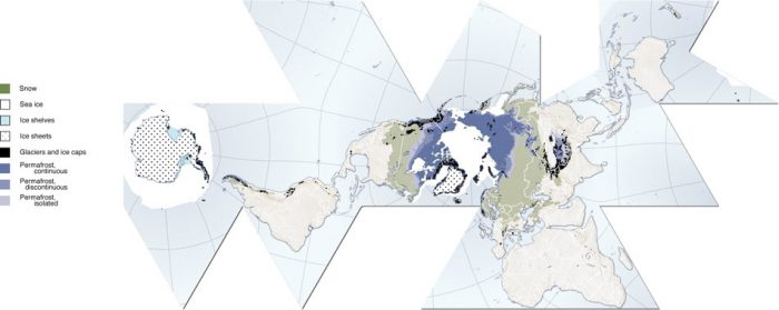
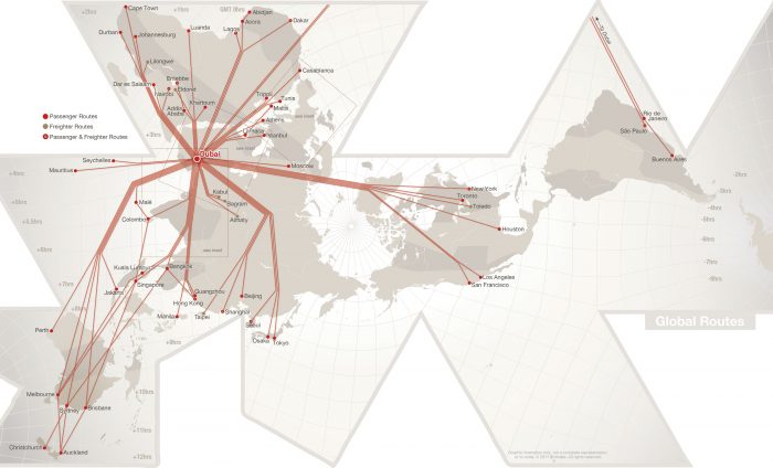
In addition to its possibly indirect influence on the AuthaGraph, Fuller’s map has many prominent imitators and sparked “a revolution in mapping,” writes Campbell-Dollaghan. She points us to, among others, the Cryosphere, further up, a Fuller map “arranged based on ice, snow, glaciers, permafrost and ice sheets”; to Dubai-based Emirates airline’s map showing flight routes; and to the “Googlespiel,” an interactive Dymaxion map built by Rehabstudio for Google Developer Day, 2011.
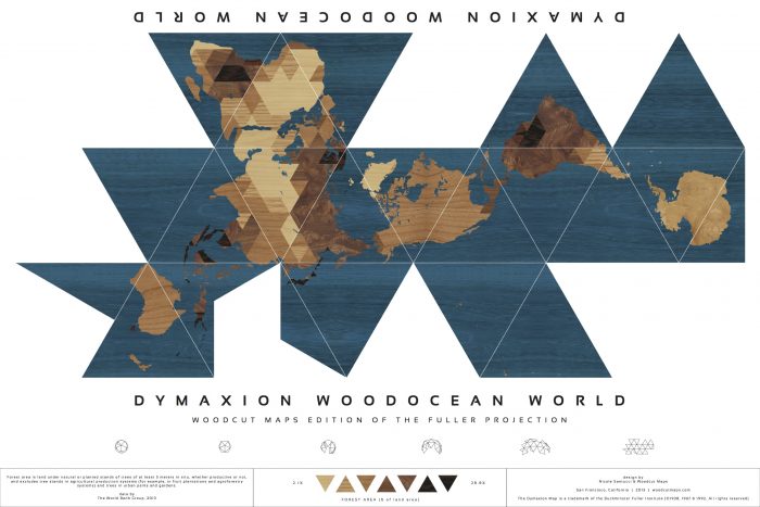
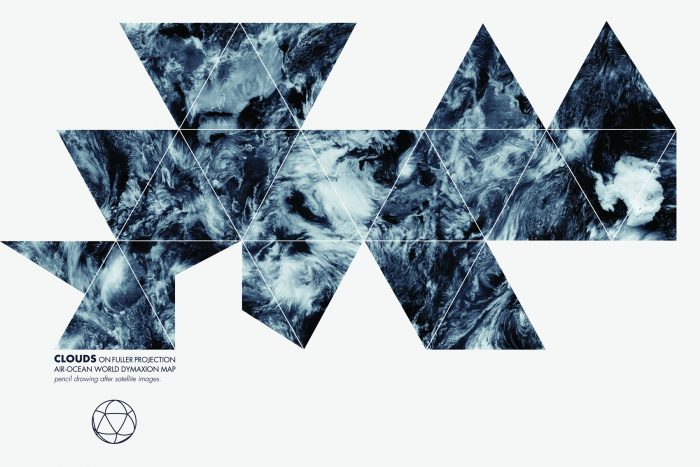
And, just above, we see the Dymaxion Woodocean World map by Nicole Santucci, winner of 2013’s DYMAX REDUX, an “open call to create a new and inspiring interpretation of Buckminster Fuller’s Dymaxion Map.” You’ll find a handful of other unique submissions at BFI, including the runner-up, Clouds Dymaxion Map, below, by Anne-Gaelle Amiot, an “absolutely beautiful hand-drawn depiction of a reality that is almost always edited from our maps: cloud patterns circling above Earth.”
Related Content:
Japanese Designers May Have Created the Most Accurate Map of Our World: See the AuthaGraph
Everything I Know: 42 Hours of Buckminster Fuller’s Visionary Lectures Free Online (1975)
Bertrand Russell & Buckminster Fuller on Why We Should Work Less, and Live & Learn More
Josh Jones is a writer and musician based in Durham, NC. Follow him at @jdmagness

Thanks, great post! I wasn’t aware of Fuller’s maps.
I can’t help but think criticisms of BF as “crazy” are superficial, based on unfamiliarity with his work. It seems a bit like criticising DaVinci because his aircraft design :-) Drive a 1950s car after spending time driving a contemporary BMW and the comments that come to mind are, “it’s a boat; it’s a nightmare.” We don’t realise how much better cars have gotten in the last 85, 60 or even 20 years.
If your theories about the strongest structures in nature using the least energy and materials leads to geodesic domes — let’s just pick this enormous structure up and move it over there — later to be reinforced by the existence of Fullerines, the bar for criticism is pretty high.
I see a lot of overlap in, for example, Fuller and the equally difficult Marshall McLuhan: “if you want to teach people a new way of thinking, don’t bother trying to teach them. Instead, give them a tool, the use of which will lead to new ways of thinking.” This is essentially the McLuhan’s premise. We change our tools and then our tools change us. Also, Frank Ghehry’s use of computer aircraft design software, ie. his buildings often look like dymaxion cars, ie. aircraft.
For obvious reasons, I’ve recently been thinking about these difficult people and their stated motivations. McLuhan seems to stem from the emotionally disturbing problem that our new tools allow us to bomb masses of people from 3 miles up and feel nothing. Similarly, Derrrida’s deconstruction appears to be a tool to prevent people from the kind of absolutist thinking that allows us to apply industrial processes to genocide — and feel nothing — so absolutely certain are we our simple, unimaginative, bullshit ideas are beyond question. Yet here we are all over again. (Well *that* got a bit dark.) I think we need more imaginative, somewhat impenetrable people. Knowledge is essentially familiarity, so it’s not surprising unfamiliar ideas are expressed with unfamiliar language and seem a bit crazy.
Though I am a student and fan of Bucky Fuller, I have posted a detailed and profusely illustrated history and critique of Fuller’s mapwork, especially as compared to B.J.S. Cahill’s 1909 octahedral design. The Cahill map, in my opinion, is far superior to Fuller’s.
http://www.genekeyes.com/FULLER/BF-1-intro.html