Most every dweller of a city with a robust public transit system comes to identify their boundaries with the lines, angles, and colors of its subway map. This is true of my hometown, Washington, DC, at least since the popular adoption of its Metro system in the 80s. It’s many times truer of my adopted city for ten years, New York, whose more than 100-year-old subway system has given urban historians enough material for lifelong study. The history of the NYC subway maps offers a specialized area for students of design, who must surely know the name Massimo Vignelli, the modernist designer who named the DC Metro and created the notorious 1972 NYC Transit map that, writes the MTA (Metro Transit Authority), “reimagined the MTA New York City Transit subway system as a neat grid of colored lines surrounded by a beige ocean.” The map will be familiar, and perhaps even a token of nostalgia, to New Yorkers from the era, who may also recall the complaints the MTA received for the map’s “geographic inaccuracies” and “aesthetic confusion.” Nonetheless, “design fans […] celebrated the map and made it a coveted souvenir of trips to New York. It later became part of the postwar design collection at the Museum of Modern Art.” In the video above, excerpted from the 2007 design documentary Helvetica, Vignelli revisits his transit map design (below), which he adopted from the London Underground map.
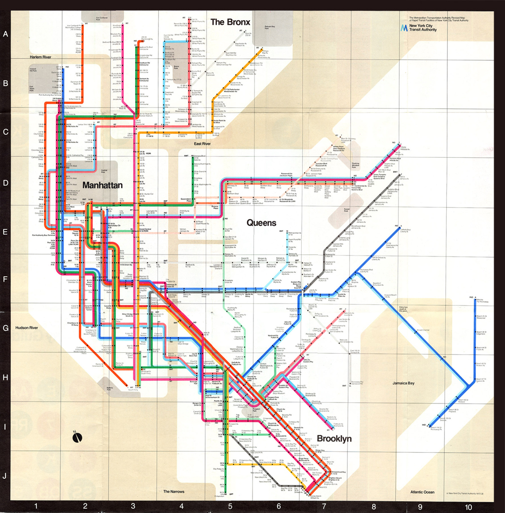
Click here to view in a larger format.
Vignelli, who passed away Tuesday at the age of 83, worked closely with his wife Leila on a wide range of design projects—his motto, “if you can design one thing, you can design everything.” A great many of those subway riders in 1972 may have disagreed. While previous and subsequent maps, including the current design, provide a geographically precise rendering of the five boroughs, with details of major avenues and parks and waterways in simple greens and blues, Vignelli’s map is formal and abstract, more art object than guidepost. As a newcomer to the city, I used my pocket-sized MTA map to guide me around on foot as well as by train (this was before smartphones, mind you), but this would be quite difficult if not impossible with the ’72 version. Yet in his reassessment of the design, Vignelli says that he should have stripped away even the few geographical references he did include because “the people couldn’t relate the geography with the stations.” For Vignelli, “there is no reason why this geography has to be literal, it could be completely abstract.” How this would better help riders navigate the hugely extensive system isn’t at all clear, but what is apparent is Vignelli’s commitment to form over utilitarian function. It’s a commitment that served him very well as a designer, though not, it seems, as a cartographer. For more on Vignelli’s design philosophy, see his 2012 interview with Big Think.
Related Content:
Undercity: Exploring the Underbelly of New York City
Vintage Video: A New York City Subway Train Travels From 14th St. to 42nd Street (1905)
Bauhaus, Modernism & Other Design Movements Explained by New Animated Video Series
Josh Jones is a writer and musician based in Durham, NC. Follow him at @jdmagness.
Melbourne’s current train map was definitely inspired by Vignelli.
He isn’t wrong in that the London Underground maps, hugely successful, only contain one abstract piece of geography (the river) which is inaccurate at key locations (eg Houses of Parliament).
There are problems with this abstraction and deformation (eg the number of people who get the Tube from Covent Garden to Leicester Square rather than walk) but overall as a network map (rather than proxy street map) it is excellent.
It looks like some of the Pantone colors for the subway lines were toyed with for that edition (which I have). They would appear to be as follows:
— PMS 109 Yellow — 6, N (PMS 130, as mandated in the 1970 Graphics Standards Manual, came across as more orangeish when printed on uncoated paper stock, uncoated 109 looked more like coated 116)
— PMS 165 Orange — 1, 7, D, EE
— PMS 185 Red — 2, QB
— PMS 239 Magenta — 4, AA, F
— PMS 300 Blue — A, K
— PMS 306 Turquoise — 3, 8, E, M (those lines appeared lighter than the 1970 Graphics Standards Manual’s mandate of PMS 312 — which in any case would later be used on the JFK Express; also, this with PMS 300 contrasted better in terms of the MTA’s two-tone blue ‘M’ logo as printed on these maps)
— PMS 355 Green — CC, GG, RR, SS (seems like it was more 355 than 354 used for this set, given that 355 would later be applied after 1979 to the IRT Lexington Avenue routes)
— PMS Black / PMS 401 — 5, B, J, LL (the lighter color was for application with a black background)