Satellite-connected devices do all the hard work of navigation for us: plan journeys, plot distances, tell us where we are and where we’re going. The age of the highly skilled cartographer may be coming to an end. But in the past few hundred years—since European states began carving the world between them—the winners of colonial contests, World War battles, and Cold War skirmishes were often those who had the best maps. In addition to their indispensable role in seafaring and battle strategy, “good maps,” writes Danny Lewis at Smithsonian, have been “an integral part of the tradecraft of espionage.”
The CIA will tell you as much… or they will now, at least, since they’ve declassified decades of once-secret maps from the days when they “relied on geographers and cartographers for planning and executing operations around the world” rather than on “digital mapping technologies and satellite images.”
Now celebrating its 75th anniversary, the CIA’s Cartography Center boasts of “a long, proud history of service to the Intelligence Community,” at the Agency’s friendly website; “Since 1941, the Cartography Center maps have told the stories of post-WWII reconstruction, the Suez crisis, the Cuban Missile crisis, the Falklands War, and many other important events in history.”
Whatever noble or nefarious roles the Agency may have played in these and hundreds of other events, we can now see–thanks to this new online gallery at Flickr–what presidents, Directors, and field agents saw when they planned their actions, beginning with the country’s first “non-departmental intelligence organization,” the COI (Office of the Coordinator of Information). Once the U.S. entered WWII, it became the Office of Strategic Services (OSS). The Cartography Center’s first chief, Arthur Robinson, was only 26 and a graduate student in geography when COI director William Donovan recruited him to lead the organization. The office rapidly expanded during the war, and by 1943, “geographers and cartographers amassed what would be the largest collection of maps in the world.”
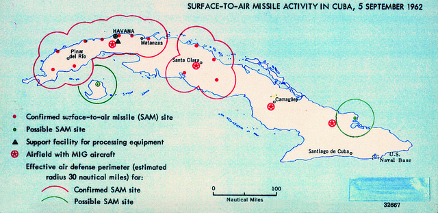
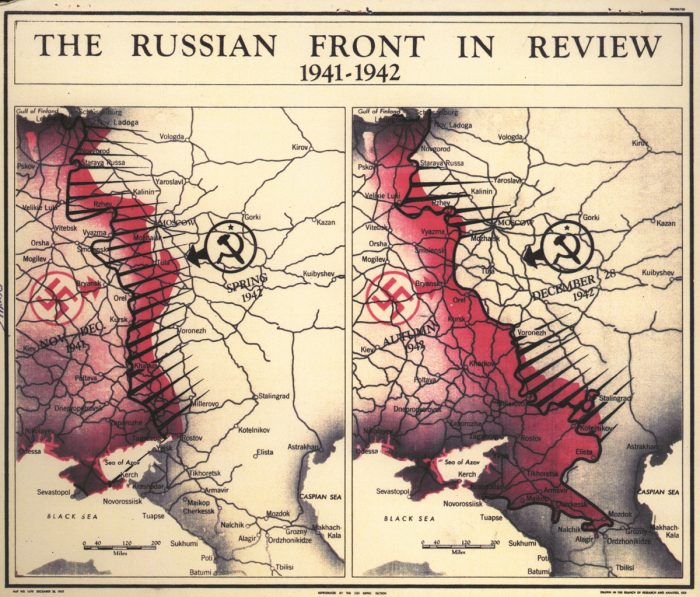
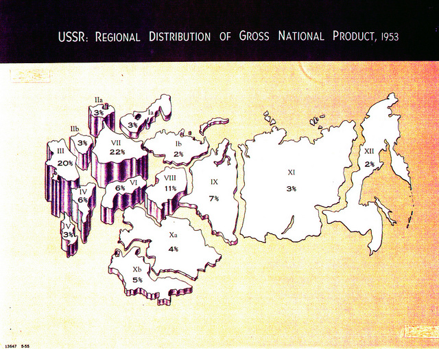
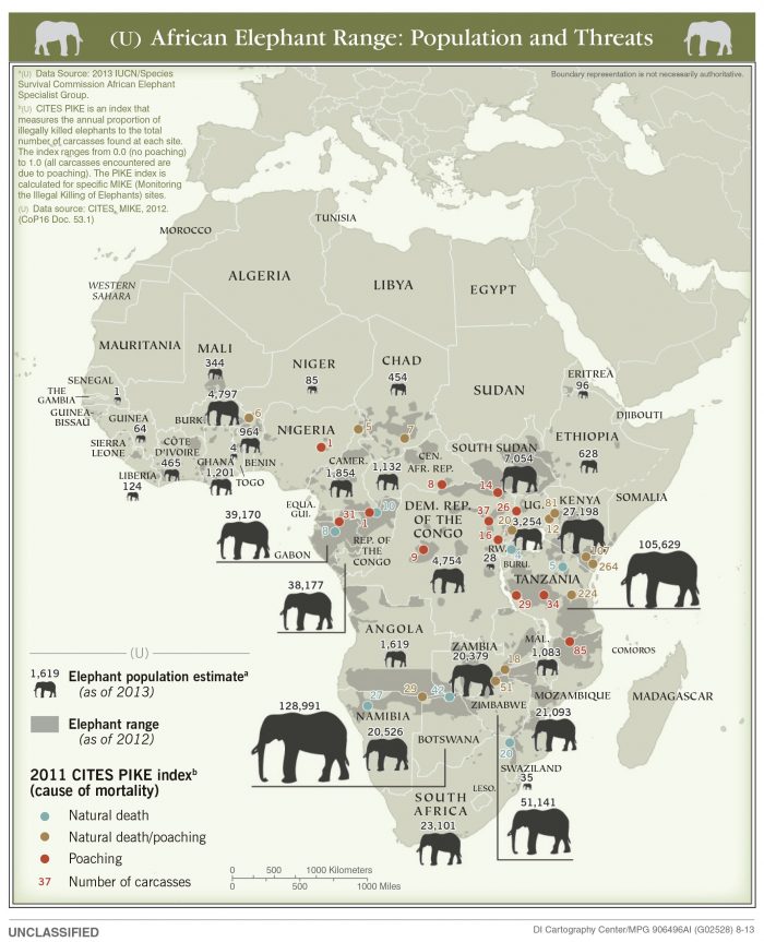
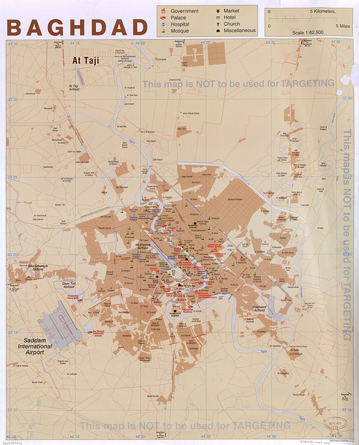
In the early forties, “map layers were drafted by hand using pen and ink on translucent acetate sheets mounted on large Strathmore boards.” These drafts were typically four times larger than the printed maps themselves, one of which you can see at the top of the post, “The Russian Front in Review.” In the fifties, “improved efficiency in map compilation and construction” produced visually striking documents like that further up from 1955, “USSR: Regional Distribution of Gross National Product.” Not a map, but what we would call an infographic, this image shows how the Cartography Center performed services far in excess of the usual map app—visualizing threats to the U.S. from Cuban surface-to-air missile sites in 1962 (above) and threats to the African elephant population from poachers in 2013 (below). Further down, you can see a 2003 map of Baghdad, with the ominously non-threatening note printed at the top and right, “This map is NOT to be used for TARGETING.”
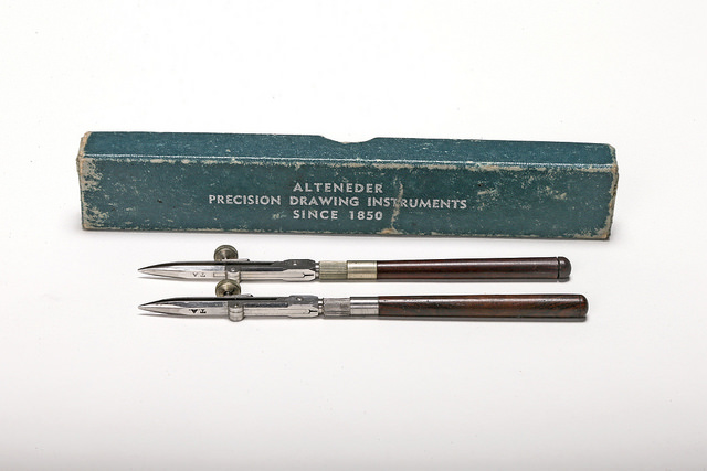
These maps and many more can be found at the CIA Cartography Flickr account, which has a category for each decade since the 1940s. Each map is downloadable in low to high resolution scans. In addition, one category, “Cartography Tools,” features high-quality photography of vintage draughtsman’s instruments, all of them, like the German-made ink pens further down, symbols of the painstaking handicraft mapmaking once required. While we can probably draw any number of political lessons or historical theses from a deep analysis of this deep state archive, what it seems to ask of us first and foremost is that we consider cartography as not only a useful discipline but as a fine art.
As the Cartography Center’s first director put it, “a map should be aesthetically pleasing, thought-provoking, and communicative.” Given these standards we might see how current technology, for all its tremendous ease of use and undeniable utility, might improve by looking to maps of the past. Visit the CIA’s flickr gallery here.
via Smithsonian
Related Content:
New York Public Library Puts 20,000 Hi-Res Maps Online & Makes Them Free to Download and Use
19th Century Maps Visualize Measles in America Before the Miracle of Vaccines
Josh Jones is a writer and musician based in Durham, NC. Follow him at @jdmagness
Very interesting site. I would like to add that Prof. Shlomo Dov Goitein of University of Pennsylvania, helped the US government during WWII by drawing maps of the Middle East as the US government lacked such maps.