We’ve got a thing for creative problem solvers here at Open Culture.
We also love a good community-spirited project.
Graphic designer Valery Marier ticks both boxes with archives.design, a free graphic design archive that was born of her frustrations with online research at a time when Covid restrictions shuttered libraries and archives.
The non-profit digital library Internet Archive is rich in interesting material, but its lack of curation can often leave the user feeling like they’re sorting through the world’s most disorganized junk shop, rooting for hidden treasure.
Marier was also discouraged by “a combination of confusing boolean operators and an absolute hodgepodge of different metadata tags and category names:
I figured that if I was having these problems, then there were likely other folks who were as well. So I decided to put my design skills to good use and work on a solution. The biggest issues that I felt needed to be solved were the user experience, and the content curation. For the archive’s curation, I opted to curate each item manually. While I could have likely figured out a way to curate these items using an automated script, I feel that there is an inherent value to human curation. When a collection is curated by a computer it can seem confusing and arbitrary. Whereas with human curation there is often a deliberate connection between each object in the collection. For the navigation I wanted to ensure that it was simple enough that anyone could understand it and operate it. So instead of having a ton of complex operators, I instead decided to organize them by their aspect in design.
Graphic design nerds, rejoice!
Marier determines which of the finds should make the cut by considering relevance and image quality.
A quick peek suggests graphic designers are not the only ones who stand to benefit from this labor of love.
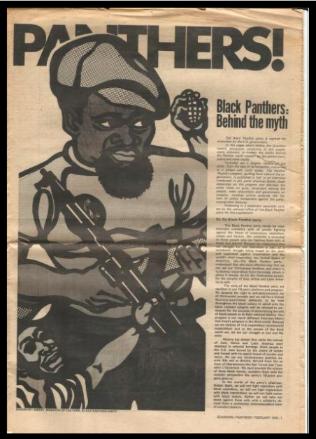
Educators, historians, and activists will be rewarded with a supplement to the Guardian from February 1970, which provided an overview of the Black Panther Party in their own words. There’s a ton of information and history packed into these 8 pages, from its formation and its 10-point program, to an interview with then-incarcerated party chairman Bobby Seale.
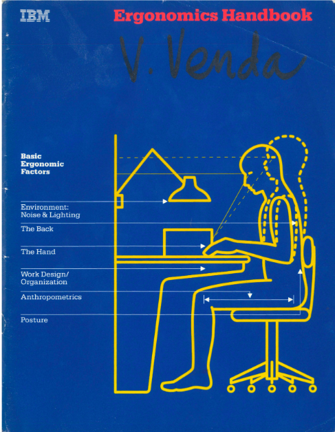
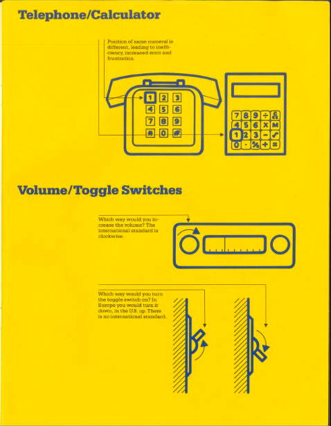
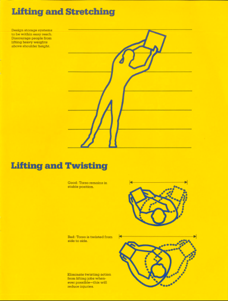
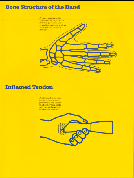
The IBM Ergonomics Handbook from 1989 addresses an evergreen topic. Office managers, physical therapists, and digital nomads should take note. Its recommendations on configuring the work space for maximum efficiency, productivity and employee comfort are solid. It’s not this handsome little yellow and blue employee manual’s fault that references to now-obsolete technology render it a bit quaint:
Think of two fairly recent innovations in our lives — the push button telephone and the pocket calculator. Both have a standard key set layout, but not the same layout.
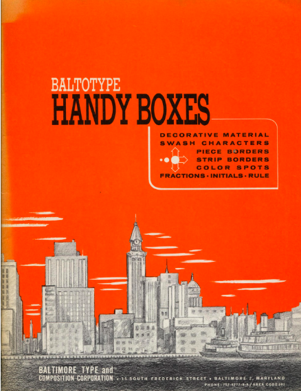
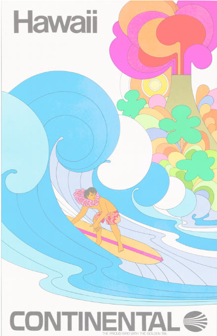
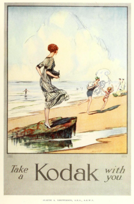
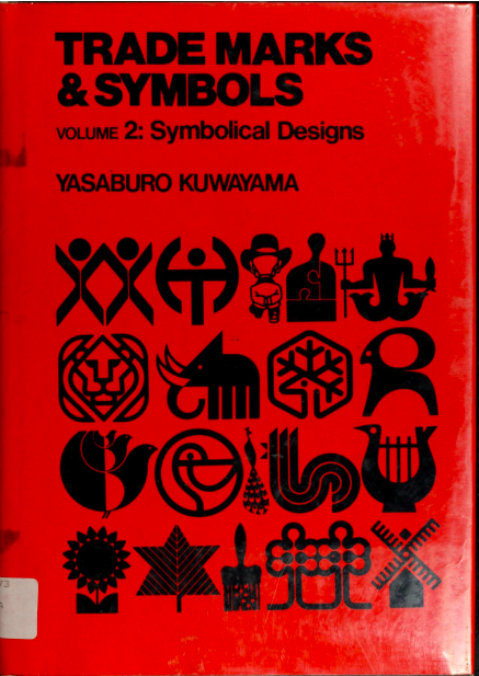
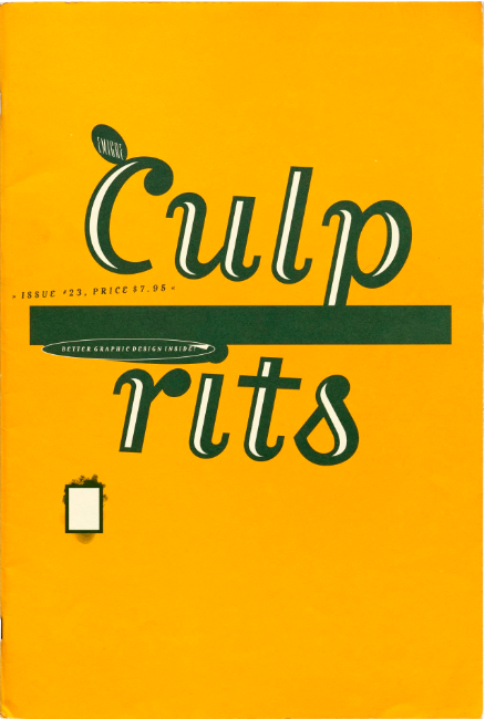
Marier elected to let each pick be represented by its covers, figuring “what better way to browse designed objects than by how they look.”
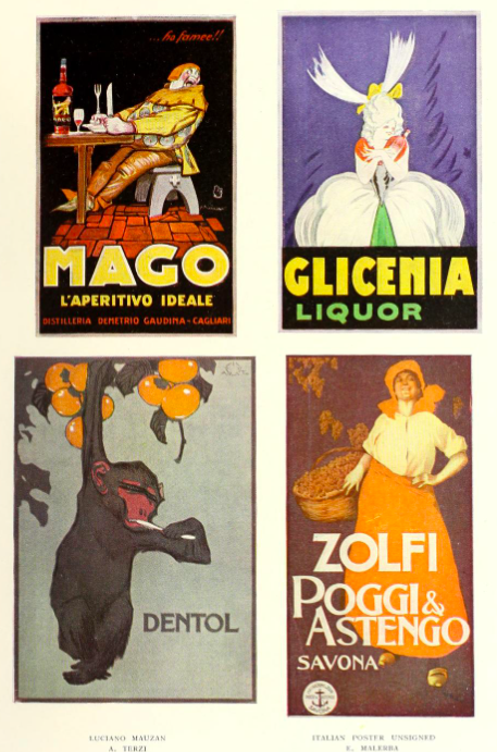
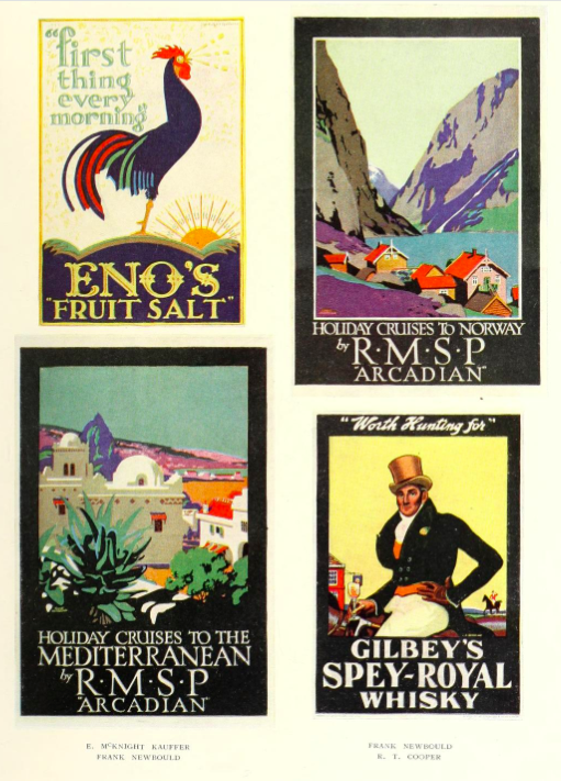
We agree, though we’re worried about where this might leave 1924’s Posters & Their Designers. How can its staid blue cover compete against its sexy neighbors in the posters category?
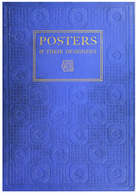
Small business owners, set dressers and public domain fans should give Posters & Their Designers a chance. Behind that discreet blue cover are a wide assortment of stunning early 20th century posters, including some full color reproductions.
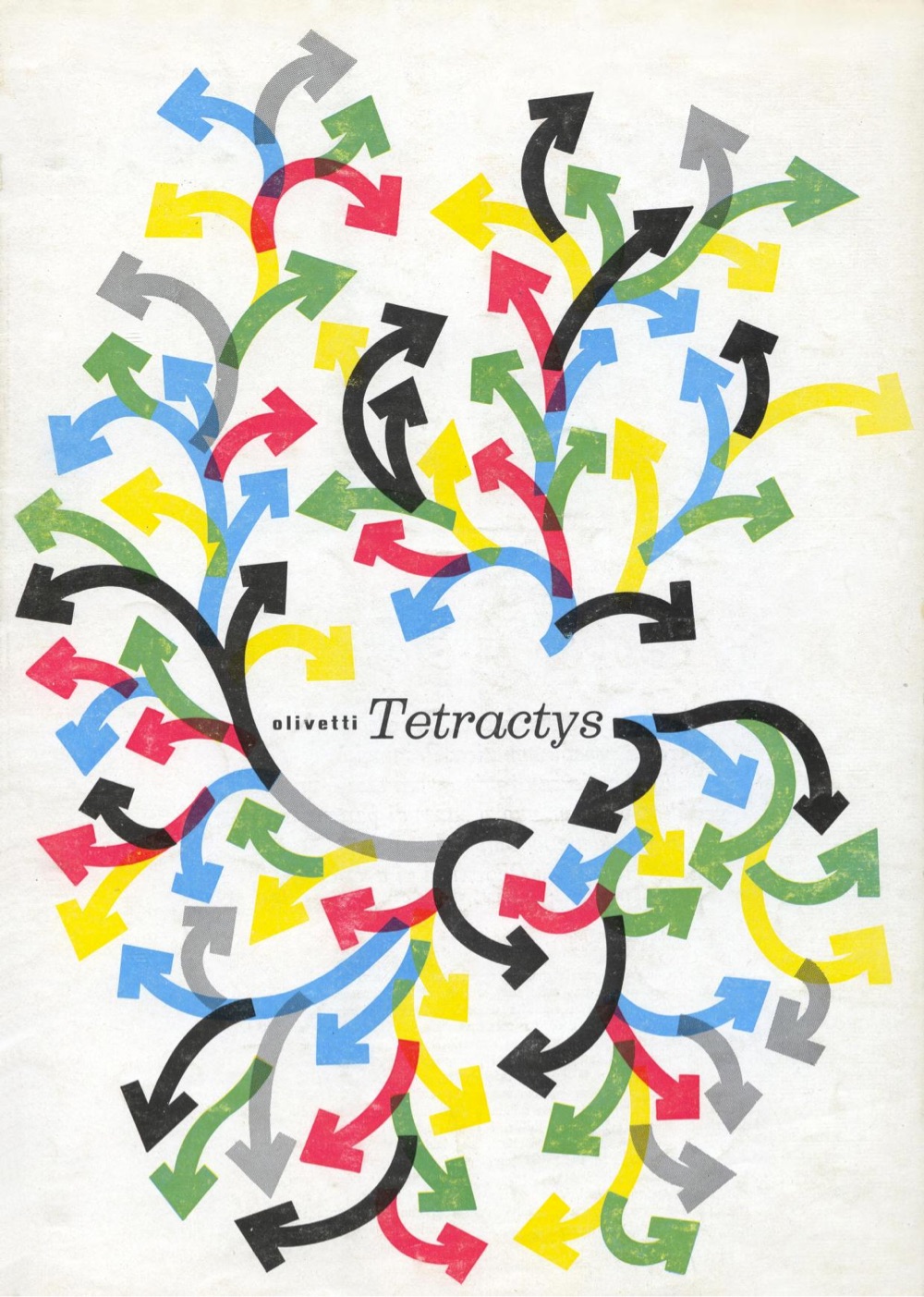
While not specifically typography related, Marier wisely gives this resource a typography tag. Hand lettering loyalists and font fanatics will find much to admire.
We hope to pique your interest with a few more of our favorite covers, below. Begin your explorations of archives.design here.
Related Content
40 Years of Saul Bass’ Groundbreaking Title Sequences in One Compilation
– Ayun Halliday is the Chief Primatologist of the East Village Inky zine and author, most recently, of Creative, Not Famous: The Small Potato Manifesto and Creative, Not Famous Activity Book. Follow her @AyunHalliday.
This digital archive is an absolute goldmine for design enthusiasts! The curation from the Internet Archive is a fantastic resource for anyone looking to explore the rich history of graphic design. It’s a treasure trove of inspiration, a journey through the evolution of design trends, and a window into the creative minds of the past. Kudos to the team for making this accessible to all for free.