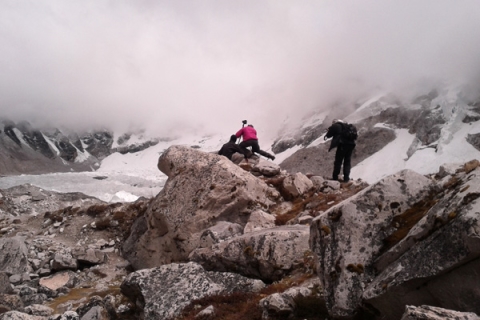
What’s surprising about Everest Base Camp is the color. It’s a flinty, gray place littered with shards of Himalayan sandstone and shale. Here and there appears a vivid green pool of alpine water. And then there’s the red, blue and green prayer flags hung by Himalayans to blow blessings in the wind.
Google Street View’s latest project, the World’s Highest Peaks, takes us to Everest and two other mountains included in the Seven Summits—the highest mountains on each of the seven continents.
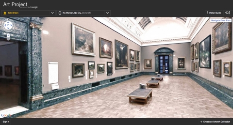
Teams of mountaineers toted digital cameras on treks to the top of each mountain and integrated their images into Google maps so we can trek along with them from the comfort of our laptops, iPhones or Android devices. Like Google Street View’s Ocean gallery, the mountain images bring us to places we may never see with our own eyes.
It’s easy to imagine the dry, cold climate at Camp Colera, where hikers wait for the weather to permit a climb of Aconagua, the highest mountain in the Andes. The views of Tanzania from Arrow Glacier are breathtaking. Hikers camp here before making the treacherous ascent to Uhuru—the “rooftop of Africa” and the summit of Mt. Kilimanjaro.
One of the things Google does really well is create galleries of images that are the kind we might take ourselves, not filtered-lens professional shots that belong on calendars. We see mountaineers resting and hanging out at the frosty Casa de Piedra, on the way up to Aconagua, hikers picnicking at Lemosho Glades as they switch from jeep to foot on the climb up Kilimanjaro, and the weird, abandoned diesel barrels that serve as shelter for folks climbing Mount Elbrus in Russia.
As usual, Google lets us in on the process of collecting all these images with a fun blog written by the photographers.
Related Content:
Reef View: Google Gives Us Stunning Underwater Shots of Great Coral Reefs
Google Presents an Interactive Visualization of 100,000 Stars
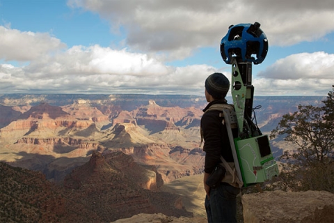
Google Street View Takes You on a Panoramic Tour of the Grand Canyon
Kate Rix writes about digital media and education. Read more of her work at .