
Not a day now goes by without the appearance of new infographics, each of them meant to bring its viewers a fuller understanding of a subject or phenomenon (or convince them of an argument) at a glance. Modern technology has made it possible for us to see, as well as create, a wider variety of infographics filled with more data than ever, but their creation as an artistic and intellectual pursuit began longer ago than you might think. Here we have two handmade infographics by the 18th-century English polymath Joseph Priestley, notable not just for their earliness, but for the fact that they remain among the most impressive examples of the form.
Priestley’s 1769 A New Chart of History appears at the top of the post (click for larger version or see this one too). Accompanied by a description and subtitles, “A View of the Principal Revolutions of Empire that have taken place in the World” literally illustrates its creator’s view, unconventional at the time, that to truly understand history requires more than just examining the history of one country or one people. It requires examining the history of all the civilizations of Earth, which he divided into Scandinavia, Poland, Russia, Great Britain, Spain, France, Italy, “Turkey in Europe” and “Turkey in Asia,” Germany, Persia, India, China, Africa, and America.
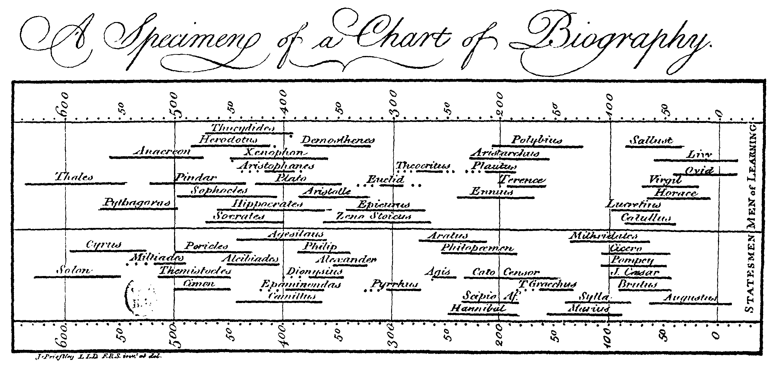
His earlier A Chart of Biography (1765), a piece of which appears just above, had visualized not the fortunes of empires but the fortunes of individuals, more than 2000 statesmen, warriors, divines, metaphysicians, mathematicians, physicians, poets, artists, orators, critics, historians, and antiquarians who lived between 1200 BC and his own day. “What makes this viz especially amazing,” says a presentation by Tableau Software on the five most influential data visualizations of all time, “is that we can still learn from it at the aggregate level when we combine it with the second part of his two-part visualization” — the New Chart of History.
“Together, they weave an intricate story. They explain and document both the rise and fall of empires, and the unique thinkers that defined those nations,” the leading lights of the Greeks, the Romans, the Enlightenment, and other civilizations and periods besides. They make history, at least as Priestley and his students knew it, quickly graspable at a combination of scales seldom considered before, and one which has influenced thinking ever since about how civilizations grow, collapse, expand, and collide. After their initial publication, the Chart of Biography and New Chart of History met with great acclaim and decades of popular demand, and they still read as not just historical, geographical, and political, but somehow poetic — poetic in the manner, specifically, of Shelly’s Ozymandias.
You can read more about both charts at MIT’s Digital Humanities site.
Related Content:
An Interactive Timeline Covering 14 Billion Years of History: From The Big Bang to 2015
10 Million Years of Evolution Visualized in an Elegant, 5‑Foot Long Infographic from 1931
4000 Years of History Displayed in a 5‑Foot-Long “Histomap” (Early Infographic) From 1931
5‑Minute Animation Maps 2,600 Years of Western Cultural History
The Tree of Languages Illustrated in a Big, Beautiful Infographic
Based in Seoul, Colin Marshall writes and broadcasts on cities and culture. He’s at work on a book about Los Angeles, A Los Angeles Primer, the video series The City in Cinema, the crowdfunded journalism project Where Is the City of the Future?, and the Los Angeles Review of Books’ Korea Blog. Follow him on Twitter at @colinmarshall or on Facebook.
This link has the history chart with a great zoom feature and the ability to export it in very big size, for those that, like me, couldn’t read a thing in the tiny print: http://www.davidrumsey.com/luna/servlet/detail/RUMSEY~8~1~254828~5519513:A‑new-chart-of-history–J–Priestle#