Those of us who think of ourselves as philosophy enthusiasts remain free to read and think about whatever we like, no matter how obscure, marginal, or out-of-fashion the ideas. But the academy presents a different picture, one fraught with political maneuvering, funding issues, and fretting about tenure. Does professionalization do philosophy a disservice by codifying the kinds of problems we should be thinking and writing about? Or do we need professional philosophy for exactly this reason? It depends on who you ask.
One argument against the academy consists in pointing out that many, if not most, of history’s influential philosophers have been amateurs in one sense or another: grinding away at day jobs, for example, like Baruch Spinoza, or living on family money, like Ludwig Wittgenstein, two radical philosophical outsiders whose Ethics and Tractatus, respectively, have been turned into data visualizations by Maximilian Noichl. It’s interesting to speculate about how these thinkers, both so visually-inclined, would respond to the treatment.
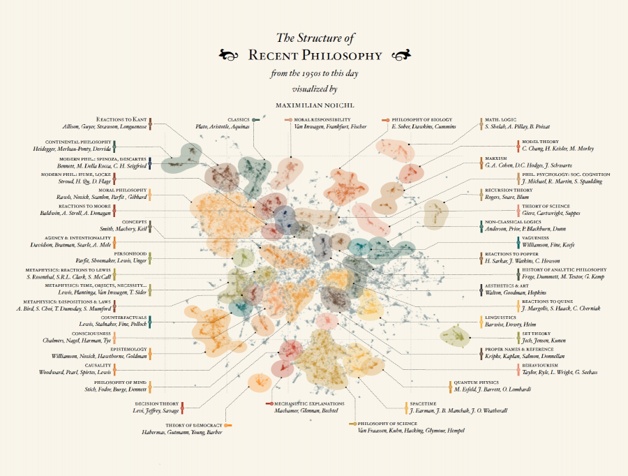
Noichl’s latest project, now in its third and, so far, final iteration, involves tracing “The Structure of Recent Philosophy from the 1950s to this day.” Clearly implied, but unstated in his description is that these maps chart only the specialized interests of academic philosophy, but the omission highlights the fact that contemporary philosophical work outside the academy receives no recognition in the literature and, therefore, hardly qualifies as philosophy at all under current strictures.
To construct the map at the top (click here to see the full infographic, then click it again for a high resolution version), Noichl aggregated over 50,000 articles “from various philosophy journals.” The journals all come from Clarivate Analytics Web of Science collection, which skews the selection. Noichl began with a “snow-ball-sampling (a few thousand papers),” then extended his sample by “repeatedly looking at the most cited publications.” The resulting papers were then “spatially distributed according to their citation-patterns.”
Every point on the graphic represents one article. Noichl used two different algorithms to sort and group the data, and his explanatory text on the original graphic at his site explains the technical details. The clusters are “a bit heterogenic in their nature,” he writes.
While some are thematic, others are determined strongly by specific persons or eras, which seems in itself to be an interesting observation about the structure of the literature….. [T]here is… a remarkable cleft between theory of science and epistemology. And the ways various historical clusters group themselves around moral philosophy suggests an internal relation. We can also observe that continental philosophy seems to split into two halves…
The exercise presents us with a summary image of some of the field’s most persistent concerns for the past 60 years or so. I can imagine historians of philosophy—and maybe critics of academic philosophy—making excellent use of this colorfully organized data. Noichl vaguely mentions a possible use of the map as a “reality check for some debates.” The question of what it contributes to philosophical thinking remains open. And we might ask whether big data does philosophy a disservice by algorithmically reproducing certain existing conditions, rather than critically interrogating them as philosophers have always done.
Yet it’s clear that data visualizations are now standard tools for teaching and learning any number of subjects, and in many cases, they offer helpful shorthand, as does another of Noichl’s interactive graphics, “Relationships Between Philosophers, 600 B.C.-160 B.C.,” a “delightful depiction,” writes Justin Weinberg at Daily Nous, “of the interrelation of the ideas of ancient philosophers over time.” See Noichl’s site for the three versions of “The Structure of Recent Philosophy” and other philosophy data visualizations.
And at the links below, see how others have used data visualization tools to organize the history of philosophy in different ways.
via Daily Nous
Related Content:
The History of Philosophy Visualized in an Interactive Timeline
The History of Philosophy Visualized
Josh Jones is a writer and musician based in Durham, NC. Follow him at @jdmagness
I teach human communication theory as an adjunct. Interested in examples of how significant thought moves from philosophers through popular culture i.e. music, art, etc to the massess. Are there case studies, or other forms of examples in open culture archives?