Looking for free, professionally-read audio books from Audible.com? Here’s a great, no-strings-attached deal. If you start a 30 day free trial with Audible.com, you can download two free audio books of your choice. Get more details on the offer here.
Much of the image we have of life in Japan in the 17th through the 19th century, we have because of woodblock prints, or specifically ukiyo‑e, or “pictures of the floating world,” which vividly capture a great variety of scenes and the people who inhabited them. The once-closed-off Japan has changed a great deal since that era, on most levels even more so than other countries, and the artistic portrayals of Japanese life have also multiplied enormously. Yet even in the 21st century, ukiyo‑e continue to provide a compelling image of Japan in its essence.
But that doesn’t mean that ukiyo‑e prints can’t be updated to reflect the present day. Filmmaker and animator Atsuki Segawa, writes Spoon & Tamago’s Johnny Waldman, “takes traditional Japanese Ukiyo‑e woodblock prints and sets them into motion through digital animation. He began his collection of ‘moving ukiyo‑e’ in 2015 and has been slowly adding to his collection.” At those two linked Spoon & Tamago posts you can see a selection of ten of Segawa’s creations, which hybridize not just art forms but eras.
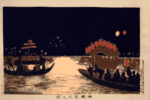
Here you can see Segawa’s take on, from top to bottom, Kiyochika Kobayashi’s Firework Show at Ryogoku, Katsushika Hokusai’s Yoshida at Tōkaidō, Toshusai Sharaku’s Nakamura Konozo and Nakajima Wadayemon (“If anyone has ever eaten oden you’ll know how this man feels,” adds Waldman), Hokusai’s Ejiri in Suruga Province, Hokusai’s Great Wave, and Utagawa Hiroshige’s Fujikawa. Keep your eye on that last and you’ll notice Doc Brown and Marty McFly cruising through the scene, only the most obvious of the anachronistic touches (though as time travelers, what really counts as anachronism?) Segawa has added to these classic ukiyo‑e and set into motion.
Segawa’s other “moving ukiyo” introduce flying drones into an Osaka marketplace, the multicolored lights of speeding cars down a quiet seaside road, a Shinkansen bullet train passing a resting place full of weary foot travelers, and violent motion to the waves and boats in Hokusai’s Great Wave off Kanazawa, quite possibly the most famous ukiyo‑e print of them all.
Sheer incongruity — incongruity between the times of the elements depicted and referenced, between the aesthetics of the past and the aesthetics of the present, and between the technologies used to create and display the originals and these light-hearted revisions — has much to do with the appeal of these images, but somehow it all makes them feel much more, not less, like Japan itself.
Based in Seoul, Colin Marshall writes and broadcasts on cities, language, and culture. His projects include the book The Stateless City: a Walk through 21st-Century Los Angeles and the video series The City in Cinema. Follow him on Twitter at @colinmarshall or on Facebook.
Pioneering filmmakers Auguste and Louis Lumière, the inventors of the projected motion picture, held their first private screening in Paris in March of 1895. The streets of the French capital would go on to provide the brothers with plenty of life in motion for their new technology to capture in the years thereafter, and you can watch eight such real scenes compiled in the video above. With its startling clarity — and its more recently corrected motion and added sound — this selection of pieces of Lumière footage offers a rich six-minute cinematic time-travel experience to the City of Light between the years of 1896 and 1900.
Guy Jones, the uploader of the video on Youtube, provides the following guide to the locations:
Notre-Dame Cathedral (1896)
Alma Bridge (1900)
Avenue des Champs-Élysées (1899)
Place de la Concorde (1897)
Passing of a fire brigade (1897)
Tuileries Garden (1896)
Moving walkway at the Paris Exposition (1900)
The Eiffel Tower from the Rives de la Seine à Paris (1897)
These places have continued to provide generation after generation of filmmakers with locations for their urban cinematic visions. (The Eiffel Tower now provides an immediate visual shorthand for the city, though it certainly wouldn’t have in this Lumière footage, when it was less than ten years old.) That goes for French filmmakers as well as those of many other nationalities: even the Coen Brothers used Tuileries Garden for their short film Tuileries, previously featured here on Open Culture.
Or at least they used the subway station underneath Tuileries Garden, which wouldn’t open until 1900, the same year as the Paris Métro itself — and the year of the Paris Exposition, also known as the Exposition Universelle, which gave Parisians the chance to ride the moving sidewalk seen in the second-to-last Lumière segment.
Anyone familiar with the Paris of the 21st century will be quick to observe the differences between the city now and the city 120 years ago. But a Parisian of the 1890s might well have said they were the ones who lived in a city made unrecognizable to earlier generations, given Georges-Eugène Haussmann’s complete revision of the central city commissioned by Napoléon III and carried out between 1853 and 1870. For good or for ill, it’s just as much Haussmann’s Paris today as it was Haussmann’s Paris in the 1890s, and criticisms that the city has remained frozen in time aren’t without merit. But to see what has most dramatically changed about modern Paris — that is, what has changed about how people see and interact with modern Paris — we must turn to cinema. Might I suggest the work of Éric Rohmer?
Based in Seoul, Colin Marshall writes and broadcasts on cities, language, and culture. His projects include the book The Stateless City: a Walk through 21st-Century Los Angeles and the video series The City in Cinema. Follow him on Twitter at @colinmarshall or on Facebook.
It can be both a blessing and curse for an artist to toil at the behest of an influential patron. Financial support and powerful connections are among the obvious perks. Being hamstrung by someone else’s ego and timeframe are some of the less welcome realities on the flip side.
Although af Klint was an accomplished botanical and landscape painter who trained at the Royal Academy in Stockholm, “Paintings for the Temple,” 193 works produced between 1906 and 1915 upon order of her spirit guide, are brightly colored abstractions.
In his 1920 essay, Creative Confession, Klee wrote, “art does not reproduce the visible; rather, it makes visible.”
It was a sentiment Klint shared, but the spiritual message encoded in her work was intended for a future audience. She instructed her nephew that her work was to be kept under wraps until twenty years after her death. (She died in 1944, the same year as Kandinsky and Mondrian, but her work was not publicly shown until 1986, when the Los Angeles County Museum of Art organized an exhibition titled The Spiritual in Art.)
Perhaps af Klint did not foresee how dramatically the respectability of spiritualism and seances—a popular pursuit of her time, and one shared by Mondrian and Kandinsky—would decline.
Her dedication to carrying out her spirit guide’s mission may remind some modern viewers of Henry Darger, the Chicago janitor who created hundreds of artworks and thousands of pages of text documenting the Glandeco-Angelinian War Storm, a strange and gory series of events taking place in an alternate reality that was very real to him.
Thus far no one has fully divined the spirit’s message af Klint devoted so much of her life to preserving.
As critic Roberta Smith notes in her New York Times review of the Guggenheim show, af Klint, a member of the Swedish Lodge of the Theosophical Society, was well versed in occult spiritualism, Rosicrucianism, Buddhism, Darwinism, and the science of subatomic particles.
Hints of these interests are threaded throughout her work.
Color also helps to unlock the narrative. She used blue and lilac to represent female energy, rose and yellow for male, and green for the unity of the two. The Guardian’s Kate Kellaway reports that the artist may have been influenced by Goethe’s 1810 Theory of Colours.
Moving on to geometry, overlapping discs also stand for unity. U‑shapes reference the spiritual world and spirals denote evolution.
Af Klint’s spiral obsession was not confined to the canvas. Roberta Smith reveals that af Klint envisioned a spiral-shaped building for the exhibition of The Paintings for the Temple. Visitors would ascend a spiral staircase toward the heavens, the exact configuration described by architect Frank Lloyd Wright’s interior ramps at the Guggenheim.
Perhaps we are getting closer to understanding.
It became fashionable during the European Renaissance for poets to write what is called an ars poetica, a “meditation on poetry using the form and techniques of a poem.” The form follows Horace’s 19th century, B.C.E. Ars Poetica, in which the Roman writer recommends that poetry should both “instruct and delight.”
Theories of poetry varied from one generation to the next, but the ars poetica persisted throughout modern literary history and into the modernism of Archibald Macleish, Ezra Pound, and Marianne Moore, all of whom issued magisterial dicta about poetry that has stuck to it ever since.
“A poem should be motionless in time / As the moon climbs,” writes Macleish in his “Ars Poetica,” famously concluding, “A poem should not mean / But be.” In Moore’s “Poetry,” which she revised throughout her life, finally whittling it down to just three lines, she writes of “imaginary gardens with real toads in them.”
Such cryptic images and elliptical aphorisms enact ambiguity as they prescribe it, but they make perfectly clear they are making critical judgments about the art of poetry. Then we have Emily Dickinson’s “Tell all the truth but tell it slant” (1263), a poem that serves as her ars poetica, argues Evan Puschak, the Nerdwriter, in his video essay above, but purports on its surface to be about truth, capital “T.”
Tell all the truth but tell it slant — Success in Circuit lies Too bright for our infirm Delight The Truth’s superb surprise As Lightning to the Children eased With explanation kind The Truth must dazzle gradually Or every man be blind —
Rarely is Dickinson so “direct,” says Puschak. “Known for ambiguity, odd manipulations in meter and rhyme” and “images that seem mysterious and sometimes out of place,” she wrote “poetry brimming with slant truth, poetry that’s seemingly laid out here, in perfect meter and matching rhymes.” The poem’s message is restated four times, from the thesis in the first line to the simile of the final four. “The meaning could not be more clear,” says Puschak.
But no, of course it’s not. A poem is not a manual or manifesto. Like those poems more explicitly about poetry, this one enacts the ambiguity it prescribes. Are we, for example, to “tell all the truth” as in “the whole truth?” or as in “tell everyone the truth”? Does “success” lie “in circuit” like a patient lies on a table? Or does it tell lies, like, well… like poetry? Does the word “circuit” refer to an uncertain, circuitous path? Or, as one critic has suggested, to “circumference” (a term Dickinson used to refer to one’s lifespan or proper sphere)?
The next couplet, whose reference to “infirm Delight” may or may not take Horace to task, pushes us further out to sea when we begin to read it carefully. What is this truth that can be told, slanted, but also comes as a “surprise,” like lightning—terrible, sudden, and blinding? Is this a poem about “Truth” or about poetry?
In the final, heavily truncated, version of “Poetry,” Marianne Moore concedes, grumpily, that “one discovers in / it, after all, a place for the genuine.” As Dickinson’s poem demonstrates, trying to find a “place” in poetry for any stable meaning may be impossible. Still she insists that truth should “dazzle gradually,” an oxymoronic phrase, says Puschak, but it’s as evocative, if more abstract, as real toads in made-up gardens—both are paradoxical means of describing what poetry does.
Dickinson realized that her poem “had to be the philosophy… that feeling of the text being destabilized from within, oscillating from meaning to the negation of that meaning.” Truth is inexpressible, perhaps inaccessible, and maybe even fatal. Yet it may strike us, nonetheless, in the dazzling ambiguities of poetry.
Pablo Ferro, who died last month after more than 60 years in graphic design, had such an impact on cinema that we’ve all felt it at one time or another, despite the fact that he never directed a single feature himself. Rather, he made his mark with title sequences and trailers, each of them exuding no small amount of then-revolutionary and still difficult-to-imitate style. Having emigrated from Cuba to New York at the age of twelve, Ferro taught himself to animate before finding his first freelance work in illustration and then his first real job in advertising. For his commercials he developed a signature style of rapid cutting, a new aesthetic made to sell new products, and that impressed many who saw them, including a certain Stanley Kubrick, then at work on Dr. Strangelove or: How I Learned to Stop Worrying and Love the Bomb.
“He said we could sell the movie as a product,” Ferro remembers Kubrick telling him in an in-depth three-part interview at Art of the Title. “I said that would be great.” The resulting trailer’s interplay of image, sound, voiceover, and especially text looked like nothing that had ever come before, and even it turned out not to be Ferro’s most memorable contribution to the film.
That honor belongs to the opening credits above, which layer Ferro’s signature hand lettering — an element requested by clients again and again throughout the rest of his career. (“He asked me what I thought about human beings,” Ferro remembers of Kubrick in the interview. “I said one thing about human beings is that everything that is mechanical, that is invented, is very sexual. We looked at each other and realized — the B‑52, refueling in midair, of course, how much more sexual can you get?!”)
Four years later, in 1968, Ferro would use cutting-edge split-screen image techniques to craft an even more visually stunning opening title sequence for Norman Jewison’s The Thomas Crown Affair, a masterpiece of style made to open a film itself celebrated as a masterpiece of style. Ferro describes it as an experience “where it was a challenge to make it both simple to watch and understand, and fitting for the film. I was lucky that the costumes and the cinematography had the look of, like, a bizarre magazine. The whole film felt like a theatrical show.”
Later that same year, another set of Ferro-designed titles would open another Steve McQueen-starring thriller, Bullitt, which needed each and every one of its visual elements to reflect the daredevil sensibility, albeit a controlled one, at its core. Ferro got a bit wilder when he worked for Kubrick again, cutting together the trailer below for 1971’s A Clockwork Orange. Though reminiscent of his Dr. Strangelove trailer in its use of onscreen text — “SATIRIC,” “BIZARRE,” “FRIGHTENING,” “METAPHORICAL,” and “BEETHOVEN,” among other suitable descriptors — it dispenses entirely with voices, those of the film’s characters or otherwise, relying entirely on the intricate layering of music and image for its considerable effect.
“Every frame is perfect with the music and it tells you the whole story at the same time without saying a word or reading words aloud,” as Ferro himself puts it. “I could see why nobody imitated it — it takes a lot of work.”
With all this on his résumé, it makes sense that more work continued to come his way until the end, including trailers and titles for Stop Making Sense, Beetlejuice, Men in Black, and L.A. Confidential, all of which, and much else besides, you can see in the Art of the Title retrospective video below. Though Pablo Ferro himself has gone, his influence on film will no doubt last for decades and decades to come.
Based in Seoul, Colin Marshall writes and broadcasts on cities, language, and culture. His projects include the book The Stateless City: a Walk through 21st-Century Los Angeles and the video series The City in Cinema. Follow him on Twitter at @colinmarshall or on Facebook.
In May of 1967,” writes Patrick Iber at The Awl, “a former CIA officer named Tom Braden published a confession in the Saturday Evening Post under the headline, ‘I’m glad the CIA is ‘immoral.’” With the hard-boiled tone one might expect from a spy, but the candor one may not, Braden revealed the Agency’s funding and support of all kinds of individuals and activities, including, perhaps most controversially, in the arts. Against objections that so many artists and writers were socialists, Braden writes, “in much of Europe in the 1950’s [socialists] were about the only people who gave a damn about fighting Communism.”
Whatever truth there is to the statement, its seeming wisdom has popped up again in a recent Washington Post op-ed by Sonny Bunch, editor and film critic of the conservative Washington Free Beacon. The CIA should once again fund “a culture war against communism,” Bunch argues. The export (to China) he offers as an example? Boots Riley’s hip, anti-neoliberal, satirical film Sorry to Bother You, a movie made by a self-described Communist.
Proud declarations in support of CIA funding for “socialists” may seem to take the sting out of moral outrage over covert cultural tactics. But they fail to answer the question: what is their effect on artists themselves, and on intellectual culture more generally? The answer has been ventured by writers like Joel Whitney, whose book Finkslooks deeply into the relationship between dozens of famed mid-century writers and literary magazines—especially The Paris Review—and the agency best known for toppling elected governments abroad.
In an interview with The Nation, Whitney calls the CIA’s containment strategies “the inversion of influence. It’s the instrumentalization of writing.… It’s the feeling of fear dictating the rules of culture, and, of course, therefore, of journalism.” According to Eric Bennett, writing at The Chronicle of Higher Educationand in his book Workshops of Empire, the Agency instrumentalized not only the literary publishing world, but also the institution that became its primary training ground, the writing program at the University of Iowa.
The Iowa Writer’s Workshop “emerged in the 1930s and powerfully influenced the creative-writing programs that followed,” Bennett explains. “More than half of the second-wave programs, about 50 of which appeared by 1970, were founded by Iowa graduates.” The program “attained national eminence by capitalizing on the fears and hopes of the Cold War”—at first through its director, self-appointed cold warrior Paul Engle, with funding from CIA front groups, the Rockefeller Foundation, and major corporations. (Kurt Vonnegut, an Iowa alum, described Engle as “a hayseed clown, a foxy grandpa, a terrific promoter, who, if you listened closely, talks like a man with a paper asshole.”)
Under Engle writers like Raymond Carver, Flannery O’Connor, Robert Lowell, and John Berryman went through the program. In the literary world, its dominance is at times lamented for the imposition of a narrow range of styles on American writing. And many a writer has felt shut out of the publishing world and its coteries of MFA program alums. When it comes to certain kinds of writing at least, some of them may be right—the system has been informally rigged in ways that date back to a time when the CIA and conservative funders approved and sponsored the high modernist fiction beloved by the New Critics, witty realism akin to F. Scott Fitzgerald’s (and later John Cheever), and magical realism (part of the agency’s attempt to control Latin American literary culture.)
These categories, it so happens, roughly correspond to those Bennett identifies as acceptable in his experience at the Iowa Writers’ Workshop, and to the writing one finds filling the pages of The Best American Short Stories annual anthologies and the fiction section of The New Yorker and The Paris Review. (Exceptions often follow the path of James Baldwin, who refused to work with the agency, and whom Paris Review co-founder and CIA agent Peter Matthiessen subsequently derided as “polemical.”)
Bennett’s personal experiences are merely anecdotal, but his history of the relationships between the Iowa Writers’ Workshop, the explosion of MFA programs in the last 40 years under its influence, and the CIA and other groups’ active sponsorship are well-researched and substantiated. What he finds, as Timothy Aubry summarizes at The New York Times, is that “writing programs during the postwar period” imposed a discipline instituted by Engle, “teaching aspiring authors certain rules of propriety.”
“Good literature, students learned, contains ‘sensations, not doctrines; experiences, not dogmas; memories, not philosophies.’” These rules have become so embedded in the aesthetic canons that govern literary fiction that they almost go without question, even if we encounter thousands of examples in history that break them and still manage to meet the bar of “good literature.” What is meant by the phrase is a kind of currency—literature that will be supported, published, marketed, and celebrated. Much of it is very good, and much happens to have sufficiently satisfied the gatekeepers’ requirements.
In a reductive, but interesting analogy, Motherboard’s Brian Merchant describes “the American MFA system, spearheaded by the infamous Iowa Writers’ Workshop” as a “content farm” first designed to optimize for “the spread of anti-Communist propaganda through highbrow literature.” Its algorithm: “More Hemingway, less Dos Passos.” As Aubry notes, quoting from Bennett’s book:
Frank Conroy, Engle’s longest-serving successor, who taught Bennett, “wanted literary craft to be a pyramid.” At the base was syntax and grammar, or “Meaning, Sense, Clarity,” and the higher levels tapered off into abstraction. “Then came character, then metaphor … everything above metaphor Conroy referred to as ‘the fancy stuff.’ At the top was symbolism, the fanciest of all. You worked from the broad and basic to the rarefied and abstract.”
The direct influence of the CIA on the country’s preeminent literary institutions may have waned, or faded entirely, who can say—and in any case, the institutions Whitney and Bennett write about have less cultural valence than they once did. But even so, we can see the effect on American creative writing, which continues to occupy a fairly narrow range and show some hostility to work deemed too abstract, argumentative, experimental, or “postmodern.” One result may be that writers who want to get funded and published have to conform to rules designed to co-opt and corral literary writing.
Chess Forum in Greenwich Village is, like Gramercy Typewriter and the Upper East Side’s Tender Buttons, the sort of shop New Yorkers feel protective of, even if they’ve never actually crossed the threshold.
“How can it still exist?” is a question left unanswered by “King of the Night,” Lonely Leap’s lovely short profile of Chess Forum’s owner, Imad Khachan, above, but no matter. We’re just glad it does.
The store, located a block and a half south of Washington Square, looks older than it is. Khachan, hung out his shingle in 1995, after five years as an employee of the now-defunct Village Chess Shop, a rift that riled the New York chess community.
Now, things are much more placid, though the film incorrectly suggests that Chess Forum is the only refuge where chess loving New Yorkers can avail themselves of an impromptu game, take lessons, and buy sets. (There are also shops in Brooklyn, Harlem, and the Upper East Side.) That said, Chess Forum might not be wrong to call itself “New York’s last great chess store.” It may well be the best of the last.
The narrow shop’s interior triggers nostalgia without seeming calculation, an organic reminder of the Village’s Bohemian past, when beret-clad folkies, artists, and students wiled away hours at battered wooden tables in its many cheap cafes and bars. (Two blocks away, sole survivor Caffé Reggio’s ambience is intact, but the prices have kept pace with the neighborhood, and the majority of its clientele are clutching guidebooks or the digital equivalent thereof.)
Khachan, born in Lebanon to Palestinian refugees, gives a warm welcome to tourists and locals alike, especially those who might make for an uneasy fit at tonier neighborhood establishments.
In an interview with the Greenwich Village Society for Historic Preservation, he recalled a “well-dressed and highly educated doctor who would come in wearing his Harvard logo sweater, and lose repeatedly to a homeless man who was a regular at Chess Forum and a chess master.”
The game also provides common ground for strangers who share no common tongue. In Jonathan Lord’s rougher New York City chess-themed doc,Passport Play, Khachan points out how diagrams in chess books speak volumes to experienced players, regardless of the language in which the book is written.
The store’s mottos also bear witness to the value its owner places on face-to-face human interaction:
Cool in the summer, warm in the winter and fuzzy all year long.
Chess Forum: An experience not a transaction
Smart people not smart phones. (You can play a game of chess on your phone, Khachan admits, but don’t fool yourself into thinking that it’s giving you a full chess experience.)
An hour of play costs about the same as a small latte in a coffeehouse chain (whose prevalence Khachan refers to as the Bostonization of NYC.) Senior citizens and children, both revered groups at Chess Forum, get an even better deal—from $1/hour to free.
Although the store’s official closing time is midnight, Khachan, single and childless, is always willing to oblige players who would stay later. His solitary musings on the neighborhood’s wee hours transformation supply the film’s title and meditative vibe, while reminding us that this gentle New York character was originally drawn to the city by the specter of a PhD in literature at nearby NYU.
Readers who would like to contribute to the health of this independently owned New York City establishment from afar can do so by purchasing a chess or backgammon set online.
Ayun Halliday is an author, illustrator, theater maker and Chief Primatologist of the East Village Inky zine. See her onstage in New York City through December 20th in the 10th anniversary production of Greg Kotis’ apocalyptic holiday tale, The Truth About Santa. Follow her @AyunHalliday.
We're hoping to rely on loyal readers, rather than erratic ads. Please click the Donate button and support Open Culture. You can use Paypal, Venmo, Patreon, even Crypto! We thank you!
Open Culture scours the web for the best educational media. We find the free courses and audio books you need, the language lessons & educational videos you want, and plenty of enlightenment in between.