There may be no more welcome sight to a New Yorker than their own Pantone-colored circle on an arriving subway train. (Provided it’s also the right train number or letter; is making local stops (or express stops); has not been rerouted due to track work, death or injury, etc.) The psychological effect is not unlike a preschooler spotting her brightly-colored cubby at the end of a long day. Therein lies the comforting lovey—screen time, climate control, maybe a nap in a window seat on the way home….
But as every New Yorker also knows, the color-coded subway system didn’t always have such a cheerful, Sesame Street-like look. Buried beneath the MTA’s modern exterior, with those colored circles adopted piecemeal over the chaotic 1970s, is a much older system—three systems, in fact—that had far less navigable signage. “The current New York subway system was formed in 1940,” writes Paul Shaw in a comprehensive history of subway sign fonts, “when the IRT (Interborough Rapid Transit), the BMT (Brooklyn-Manhattan Transit) and the IND (Independent) lines were merged.”
The first two lines were built by the city and leased to private owners, with some elevated sections dating all the way back to 1885. “The first ‘signs’ in the New York City subway system were created by Heins & LaFarge, architects of the IRT,” who established the tradition of mosaic tiles on platform walls. The BMT “followed suit under Squire J. Vickers, who took over the architectural duties in 1908.” The lettering and design of these tiled signs shifted, from 19th century gothic styles to 20th century art deco.
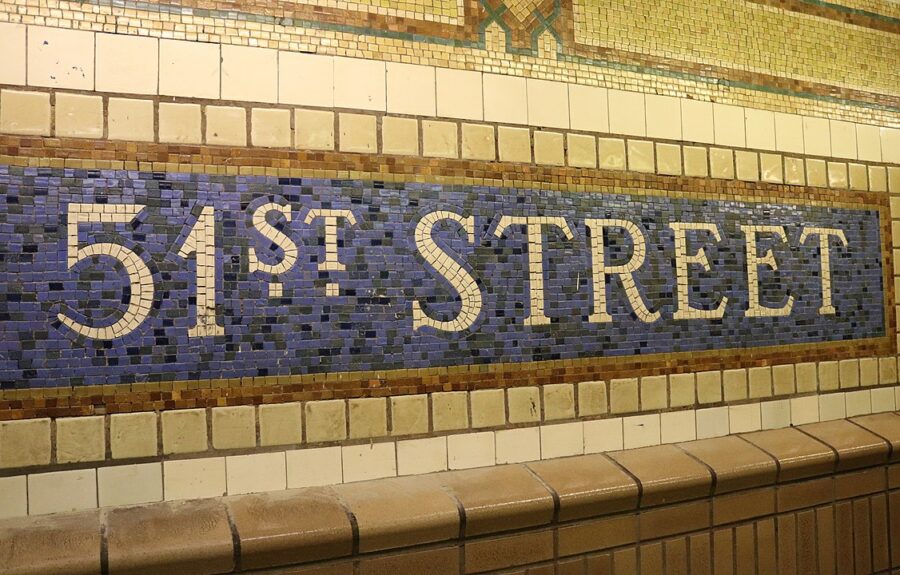
Image by Elvert Barnes, via Wikimedia Commons
.jpg)
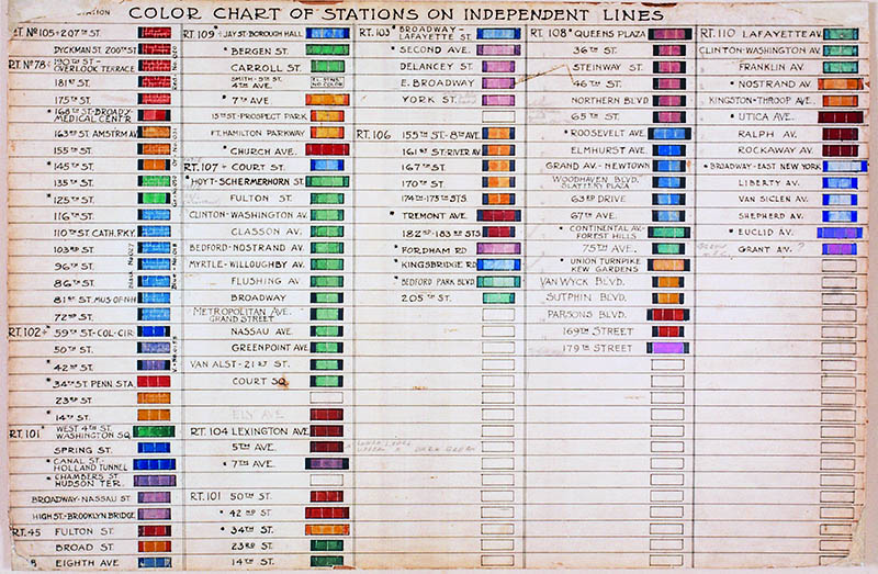
When construction on the IND system began, Vickers, now architect of the entire system and its lead designer, created a color-coding system to identify each station. (See the chart above from 1930.) “The color variations within this system are subtle,” notes 6sqft. “Though they’re grouped by color family, i.e. the five primary colors, different shades are used within those families. Color names are based on paint chips and Berol Prismacolor pencils. Red stations include ‘Scarlet Red’ ‘Carmine Red’ and ‘Tuscan Red,’ just to name a few.” This level of specificity continues through each of the primary and secondary colors.
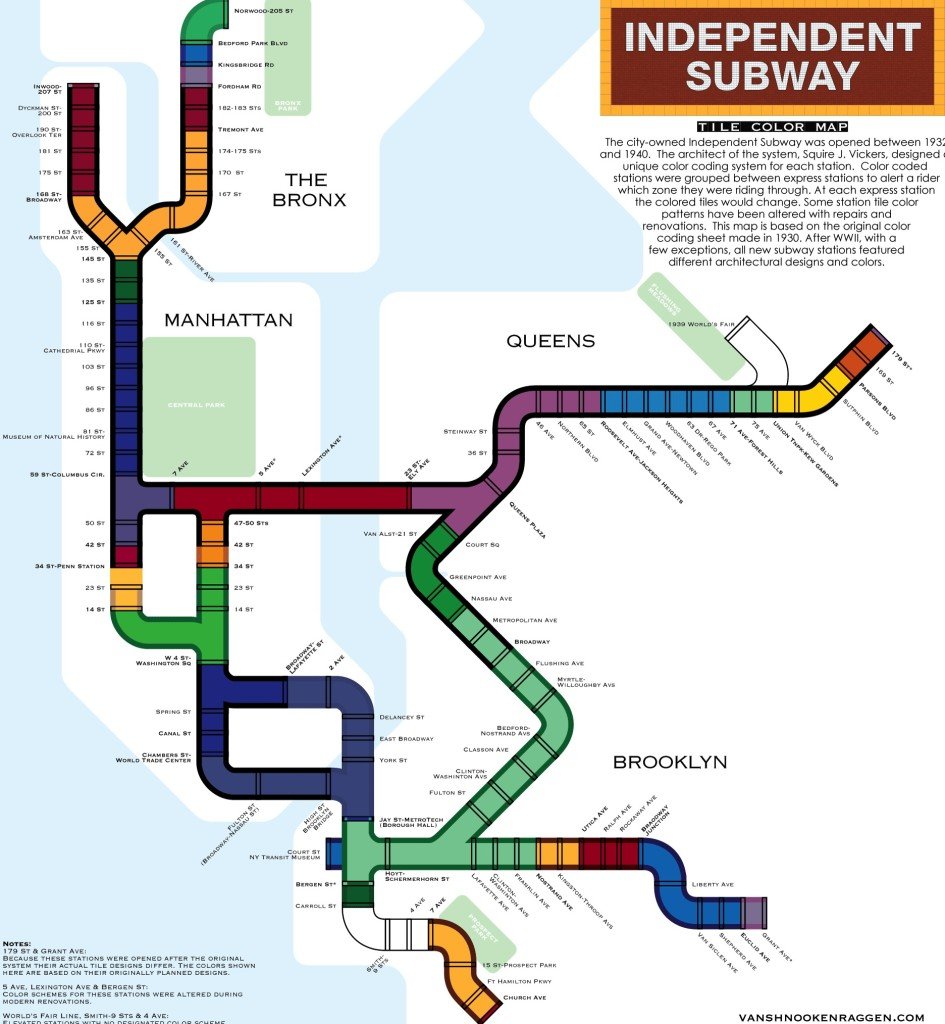
It’s not entirely clear why Vickers chose the color scheme he did. (See a subway map imagined with his color-coding system, above, by designer vanshnookenraggen.) One theory is that the system was designed to help non-English-speaking riders navigate the trains, but “there isn’t anything that we were able to find that says definitively ‘This is the reason why we are doing that,’” says New York Transit Museum curator Jodi Shapiro. The colors may have been chosen to stand out in artificial light, she speculates, and “not look dingy and have some kind of cheerful effect…. Yellow and blue are very natural colors: yellow like sunlight, green like grass, blue like water. I don’t think that’s an accident.”
Whatever the reasoning, the color-coding did not simplify signage in the rapidly expanding system, which became incomprehensible to riders when all three subways, and their different, numbering, and lettering systems, combined into an “untenable mess of overlapping sign systems,” Shaw writes. Confusion reigned into the 1960s, when Bob Noorda and Massimo Vignelli, creator of an iconic 1972 subway map, completed “the Bible” of NYC transit design, the New York City Transit Authority Graphics Standards Manual. The new designers used “a rainbow of 22 different colors to assign to each subway line,” Untapped Cities writes, “and gave the routes new names.”
Colors were further simplified in 1979 when John Tauranac and Michael Hertz designed the maps we know today. To solve the problem of different routes sharing the same colors, they assigned colors based on “trunk routes,” or the portion of the tracks that pass through Manhattan. “All trains that share a trunk route are the same color”—a system that works beautifully. And it only took eighty years to get there. The frustration designers have felt over the decades can be neatly summed up in one word offered by Tauranac at a recent NYC subway map symposium: “Basta!” Or in a New York English, “Enough with all these colors already!”
via Untapped Cities/6sqft
Related Content:
Designer Massimo Vignelli Revisits and Defends His Iconic 1972 New York City Subway Map
A Subway Ride Through New York City: Watch Vintage Footage from 1905
Undercity: Exploring the Underbelly of New York City
Josh Jones is a writer and musician based in Washington, DC. Follow him @jdmagness
Leave a Reply