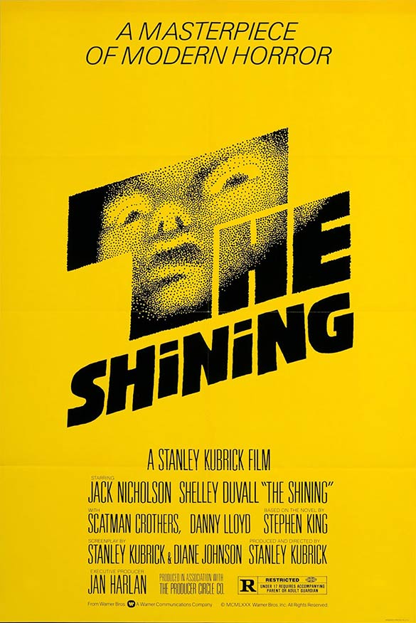
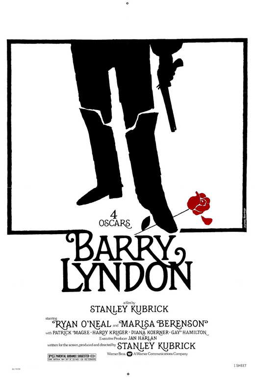
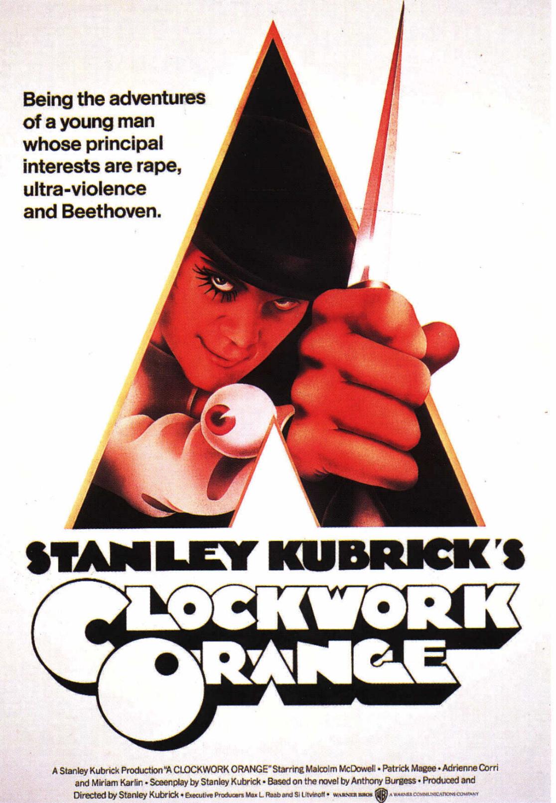
Stanley Kubrick’s perfectionism extended well beyond his films themselves. He even took pains to ensure the promotion of his projects with posters as memorable as the actual experience of watching them. The poster for Barry Lyndon remains perhaps the most elegant of all time, and who could forget the first time A Clockwork Orange’s promised audiences (or threatened audiences with the promise of) “the adventures of a young man whose principal interests are rape, ultra-violence, and Beethoven”? Though less often seen today, the bright yellow original poster for The Shining, with that unidentified pointillist face and its expression of shock, may well unsettle you more than even the film itself.
It came from the office of famous graphic designer Saul Bass, known not just for storyboarding Kubrick’s Spartacus but for creating the title sequences for movies like Otto Preminger’s The Man with the Golden Arm and Alfred Hitchcock’s Vertigo (whose poster Bass also designed), North by Northwest, and Psycho (whose immortal “shower scene” Bass may also have come up with). Kubrick rightly figured Bass had what it took to deliver the considerable impact of his psychological horror picture in graphic form.
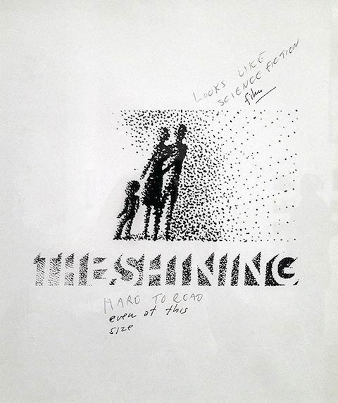
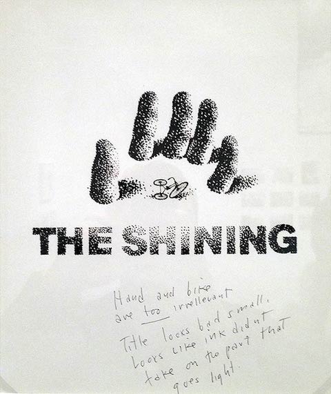
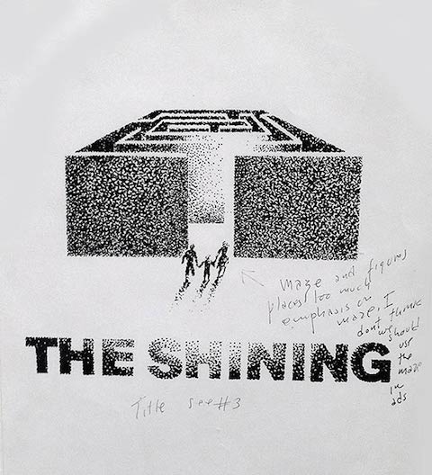
“This poster design wasn’t a ‘design and done’ deal however,” writes Derek Kimball in a DesignBuddy post on the evolution of the image. “Many of Bass’ concepts were rejected by Kubrick before settling on the final design.” You can see three of them here in this post, and the rest there. Each one includes Kubrick’s handwritten notes of objection: “hand and bike are too irrelevant,” “title looks bad small,” “too much emphasis on maze,” “looks like science fiction film,” “hotel looks peculiar.” You’ve got to admit that the man has a point in every case, although I suspect Bass knew in advance which design the auteur would, once through the wringer of revisions, have the least trouble with. “I am excited about all of them,” Bass writes, “and I could give you many reasons why I think they would be strong and effective identifiers for the film,” but one in particular, “provocative, scary, and emotional,” “promises a picture I haven’t seen before.”
You have to appreciate that kind of confidence in his team’s work when dealing with such a famously exacting client — and, looking at the letter itself, you really have to have to appreciate the kind of confidence it takes to sign your name with a caricature of your own face on the body of your namesake fish.

Related Content:
The Making of Stanley Kubrick’s The Shining (As Told by Those Who Helped Him Make It)
Stanley Kubrick’s Annotated Copy of Stephen King’s The Shining
Saul Bass’ Vivid Storyboards for Kubrick’s Spartacus (1960)
A Brief Visual Introduction to Saul Bass’ Celebrated Title Designs
Saul Bass’ Oscar-Winning Animated Short Ponders Why Man Creates
Colin Marshall hosts and produces Notebook on Cities and Culture and writes essays on cities, language, Asia, and men’s style. He’s at work on a book about Los Angeles, A Los Angeles Primer. Follow him on Twitter at @colinmarshall or on Facebook.
Hi there, these images are actually from my site: http://thefoxisblack.com/2012/12/11/saul-bass-poster-sketches-for-stanley-kubricks-the-shining/
Can you please properly credit me? Thanks!
In final poster of the word shining, whose face is in the letter T?