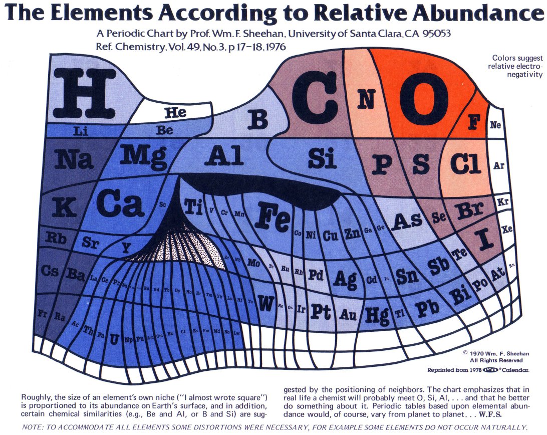
When you learned about The Periodic Table of Elements in high school, it probably didn’t look like this. Above, we have a different way of visualizing the elements. Created by Professor William F. Sheehan at Santa Clara University in 1970, this chart takes the elements (usually shown like this) and scales them relative to their abundance on the Earth’s surface. In the small print beneath the chart, Sheehan notes “The chart emphasizes that in real life a chemist will probably meet O, Si, Al [Oxygen, Silicon and Aluminum] and that he better do something about it.” Click here to see the chart — and the less abundant elements — in a larger format. Below we have a few more creative takes on the Periodic Table.
Follow Open Culture on Facebook and Twitter and share intelligent media with your friends. Or better yet, sign up for our daily email and get a daily dose of Open Culture in your inbox.
Related Content:
“The Periodic Table Table” — All The Elements in Hand-Carved Wood
World’s Smallest Periodic Table on a Human Hair
“The Periodic Table of Storytelling” Reveals the Elements of Telling a Good Story
Chemistry on YouTube: “Periodic Table of Videos” Wins SPORE Prize
Free Online Chemistry Courses
Open Culture. great site.
Are the sizes proportional to abundance directly, or the logarithms of the abundances?
Periodic Table with {wildly inaccurate} EMPHASIS
Totally wrong…
Cool, but not correct. Still continues to float around the internet…
http://chemreflux.blogspot.com/2014/12/periodic-table-with-wildly-inaccurate.html
Yeah. I’d think there should be more hydrogen and iron. Hydrogen is the most plentiful substance in the universe, and the earth is a whole lotta iron with some other stuff.
haha Si is silicium, not silicon !
I thinks this is incorrect because it does not have the atomic mass nor number.
About the table of elements.
http://hfilipen-talentedchildren.blogspot.com
This isn’t very accurate, as the least abundant element is Astatine at the bottom of group 17 and it doesn’t have even close to the smallest box.
There is not more Platinum (Pt) and Palladium (Pd) than Nickel and there isn’t more Gold (Au) and Silver (Ag) than copper.
https://en.wikipedia.org/wiki/Abundance_of_elements_in_Earth%27s_crust
cool concept but plain wrong.
This is nice but this is obviously wrong ! Unless there is almost the same amount of californium, neptunium, etc and of cobalt… there is not as much minor actinide as vanadium for exemple…
new numbers of any elements
http://matterdark-hfilipen.blogspot.com
How many times are you going to repost this without reading some of the legitimate criticism of this misleading graphic?
http://chemreflux.blogspot.ca/2014/12/periodic-table-with-wildly-inaccurate.html
sebagai pemain judi online pastinya anda mengenal ibet789 sebuah penyedia judi sportbook ternama di indonesia. tetapi karena perjudian dilarang, anda membutuhkan agen perantara untuk memainkannya. Oleh karna itu casino261 hadir untuk anda sebagai Agen Ibet789 Resmi dan Terpercaya di Indonesia dengan bonus besar
blah blah blah blah shutup idiot screw off get a life why u on this sit anyways kid get a life