If you stepped into a record store in the 1950s and 60s, you would likely be drawn almost immediately to a Blue Note release—whether or not you were a fan of jazz or had heard of the artist or even the label. “If you went to those record stores,” says Estelle Caswell in the Vox Earworm video above, “it probably wasn’t the sound of Blue Note that immediately caught your attention. It was their album covers.”
Now those designs are hallowed jazz iconography, with their “bold typography, two tone photography, and minimal graphic design.” Of course, it should go without saying that the sound of Blue Note is as distinctive and essential as its look, thanks to its founders’ musical vision, the faultless ear of producer and engineer Rudy Van Gelder, and the roster of unbelievably great musicians the label recruited and recorded.
But back to those covers….
“Their bold use of color, intimate photography, and meticulously placed typography came to define the look of jazz” in the hard bop era, and thus, defined the look of cool, a “refined sophistication” vibrating with restless, sultry, smoky, classy, moody energy. The rat pack had nothing on Blue Note. Their covers “have today become an epitome of graphic hip,” writes Robin Kinross at Eye magazine. (And lest we fetishize the covers at the expense of their contents, Kinross makes sure to add that they “are no more than the visible manifestation of an organic whole.”)
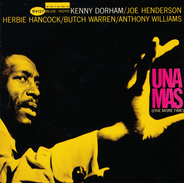
Flip over any one of those beautifully-designed Blue Note records from, say, 1955 to 65, the label’s peak years, and you’ll find two names credited for almost all of their designs: photographer Francis Wolff and graphic designer Reid Miles. Wolff, says producer and Blue Note archivist Michael Cuscuna in the Earworm video, shot almost every Blue Note session from “the minute he arrived.”
“One of the most impressive, and shocking things” about Wolff’s photo shoots, “was that the average success rate of those photos was really extraordinary. He was like the jazz artist of photography in that he could nail it immediately.” Once Wolff filled a contact sheet with great shots, it next came to Miles to select the perfect one—and the perfect crop—for the album cover. These saturated portraits turned Blue Note artists into immortal heroes of hip.
But Reid’s experiments with typography, “inspired by the ever present Swiss lettering style that defined 20th century graphic design,” notes Vox, provided such an important element that the lettering sometimes edged out the photography, such as in the cover of Joe Henderson’s In ‘n Out, which features only a tiny portrait of the artist in the upper left-hand corner, nestled in the dot of a lower-case “i.”
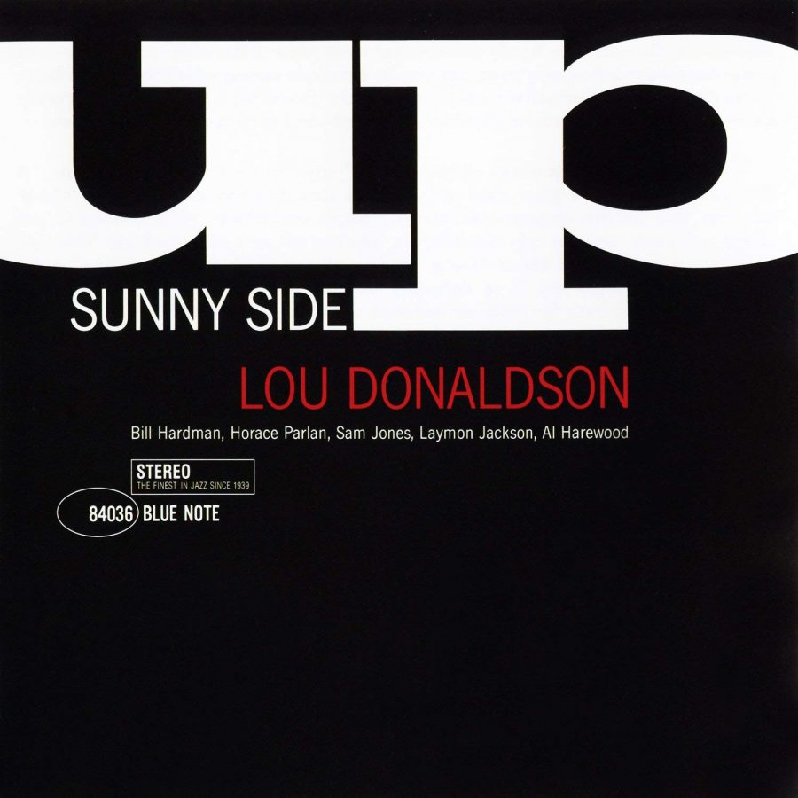
Miles pushed the exclamation point to absurd lengths on Jackie McLean’s It’s Time, which again relegates the artist’s photo to a tiny square in the corner while the rest of the cover is taken up with bold, black “!!!!!!!!!!!”s over a white background. It’s “startlingly getting your attention,” Cuscuna comments. On Lou Donaldson’s Sunny Side Up, Miles dispenses with photography altogether, for a striking black and white design that makes the title seem like it might up and float away.
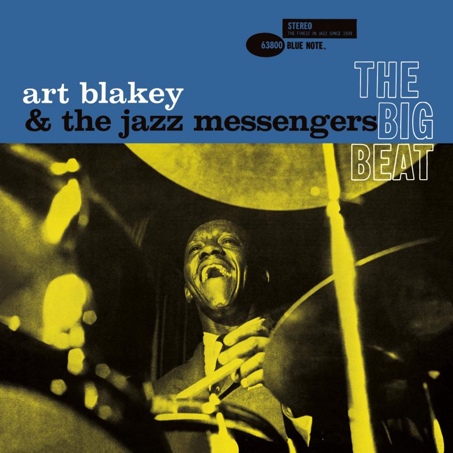
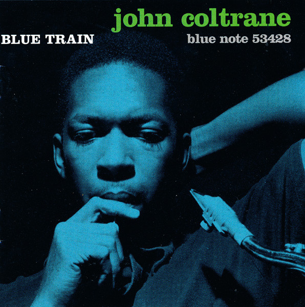
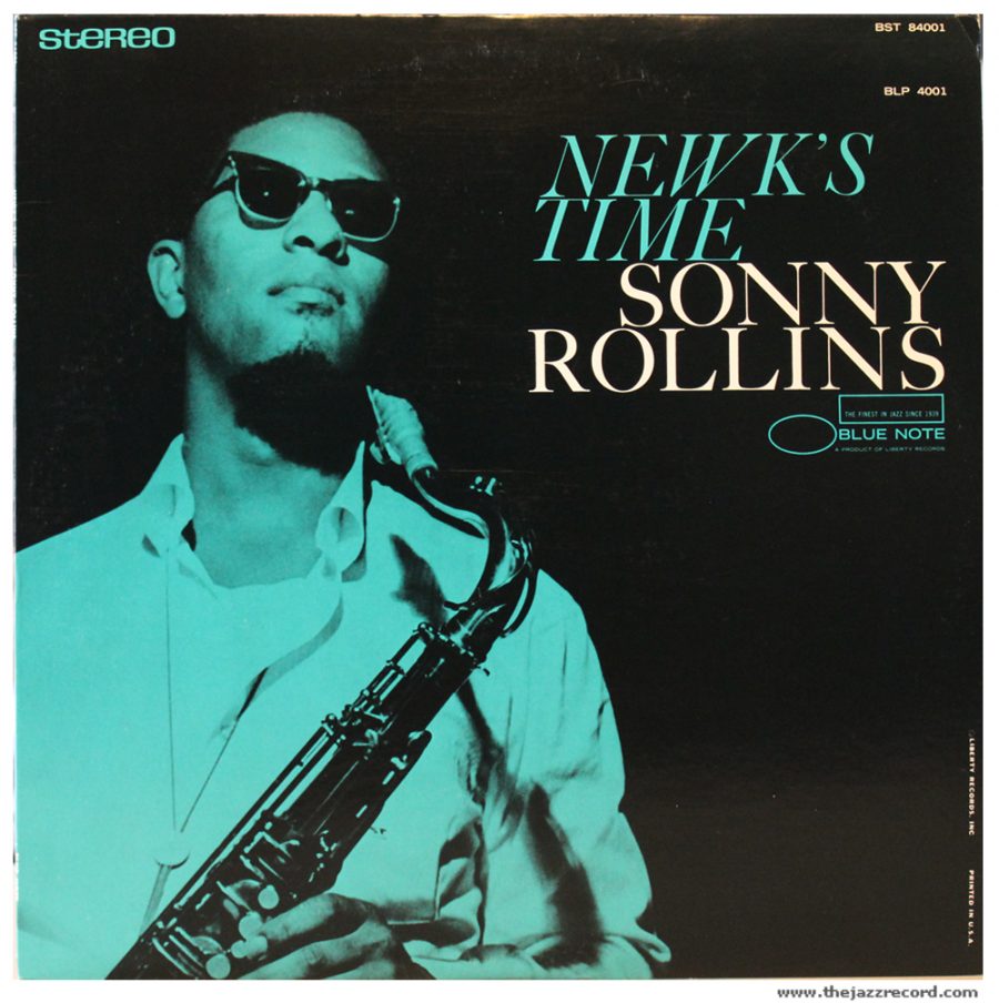
But Miles’ type-centric covers, though excellent, are not what we usually associate with the classic Blue Note look. The synthesis of Wolff’s impeccable photographic instincts and Miles’ surgically keen eye for framing, color, and composition combined to give us the pensive, mysterious Coltrane on Blue Train, the impossibly cool Sonny Rollins on the cover of Newk’s Time, the totally, wildly in-the-moment Art Blakey on The Big Beat, and so, so many more.
Reid Miles had the rare talent only the best art directors possess, says Cuscuna: the ability to “create a look for a record that was highly individual but also that fit into a stream that gave the label a look.” Learn more about his work with Wolff in Robin Kinross’s essay, see many more classic Blue Note album covers here, and make sure to listen to the music behind all that brilliant graphic design in this huge, streaming discography of Blue Note recordings. To view them in print format, see the definitive book, The Cover Art of Blue Note Records: The Collection.
Related Content:
The Groundbreaking Art of Alex Steinweiss, Father of Record Cover Design
Josh Jones is a writer and musician based in Durham, NC. Follow him at @jdmagness
I had a lot of these albums in my collection back in the day, it is what it is…
Been listening since the 60’s. Album covers were always so dope