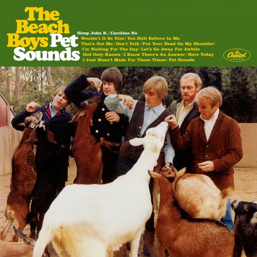
You know Times New Roman, you know Helvetica, you know Comic Sans — and though you may not realize it, you know Cooper Black as well. Just think of the “VOTE FOR PEDRO” shirt worn in Napoleon Dynamite (and in real life for years thereafter), or a few decades earlier, the cover of Pet Sounds. In fact, the history of Cooper Black extends well before the Beach Boys’ mid-1960s masterpiece; to see and hear the full story, watch the Vox video above. It begins, as narrator Estelle Caswell explains, in Chicago, at the turn of the 1920s when type designer Oswald Bruce Cooper created the series of fonts that bear his name. Nearly a century after the 1922 introduction of the variant Cooper Black, we see it everywhere, not just on album covers and T‑shirts but storefronts, movie posters, and candy wrappers all over the world.
The evolution of printing, specifically the evolution from carved wood type to cast metal, made Cooper Black possible. Its distinctive look — and the curved edges that made it forgiving to imperfect printing processes — made it a hit. And when film strips replaced metal type, allowing the kind of closely-spaced printing that Cooper thought best presented his font, the already-popular Cooper Black underwent a renaissance.
“It thrived, as always, in advertising,” says Caswell. “Its friendly curves fit the tongue-in-cheek aesthetic of the 1960s and 70s, but it also showed up in magazines, movies, and hundreds of album covers.” To typography enthusiasts, Pet Sounds seemingly remains Cooper Black’s finest hour: “Just look at the way the D works with the E and the Y, and ‘Boys’ fits so nicely over the O,” as art director Stephen Heller says in the video.
In the 1920s Cooper Black not only showcased cutting-edge printing technology, its aesthetic looked exhilaratingly modern as well. Now, of course, it looks comfortingly retro, evocative of the era of handmade graphic design slipping out of living memory in our digital 21st century. But the 21st century so far has also been a time of “retromania”: with all previous media increasingly at our fingertips, we draw inspiration (and even material) for our art and design more directly and instinctively than ever from the trends of the past. No wonder we continue to feel a resonance in Cooper Black, whose letters, as Caswell puts it, bring with them the weight of “a century’s worth of changes in technology and pop culture.” Nor is Cooper Black’s next century, whatever uses it sees the font put to, likely to diminish its appeal.
Related Content:
The History of Typography Told in Five Animated Minutes
Based in Seoul, Colin Marshall writes and broadcasts on cities, language, and culture. His projects include the book The Stateless City: a Walk through 21st-Century Los Angeles and the video series The City in Cinema. Follow him on Twitter at @colinmarshall, on Facebook, or on Instagram.
I’m a font snob. Goudy Heavyface is way better.