If you don’t floss or brush your teeth, they will rot and fall out. If you don’t eat fruits and vegetables, you will get scurvy or some other horrible disease. If you don’t use protection… well, you know the rest. These are facts of life we mostly accept if we care about ourselves and others because they are beyond disputing. But the idea of wearing a cloth mask when in public during a viral pandemic spread through droplets from the nose and mouth—a practice endorsed by the CDC, the World Health Organization, scientists at Stanford, Johns Hopkins, and pretty much every other research university—has become some kind of bizarre culture war.
Maybe some walk around mask-less because they’ve internalized the idea that the coronavirus is “over,” despite the fact it’s spreading at around 50,000 new cases per day in the US, and potentially heading toward double that number. Maybe some feel it won’t affect them because they aren’t elderly or immunocompromised, never mind that viruses mutate, and that the novel (meaning “new”) coronavirus has already demonstrated that it is far less discriminating (in purely biological terms) than previously thought. (In Florida, the median age for COVID-19 has dropped from 65 to 37 years old.) Never mind that spreading the virus, even if one is not personally at high risk, compromises everybody else.
Are masks uncomfortable, especially in hot, humid weather? Do they muffle speech and make it hard to have satisfying face-to-face interactions? Well, yes. But consider your hourlong masked trip to the grocery store against the 12 or 24 or 48 or whatever hour-long shifts medical personnel are pulling in emergency departments across the country.
It really is the least we can do. And we can do it in style—masks went from scarce, with armies of homebound neighbors sewing homely stacks of them, to truly overabundant and fashionable, on the rack of every grocery, pharmacy, and convenience store. It couldn’t be easier.
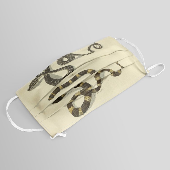
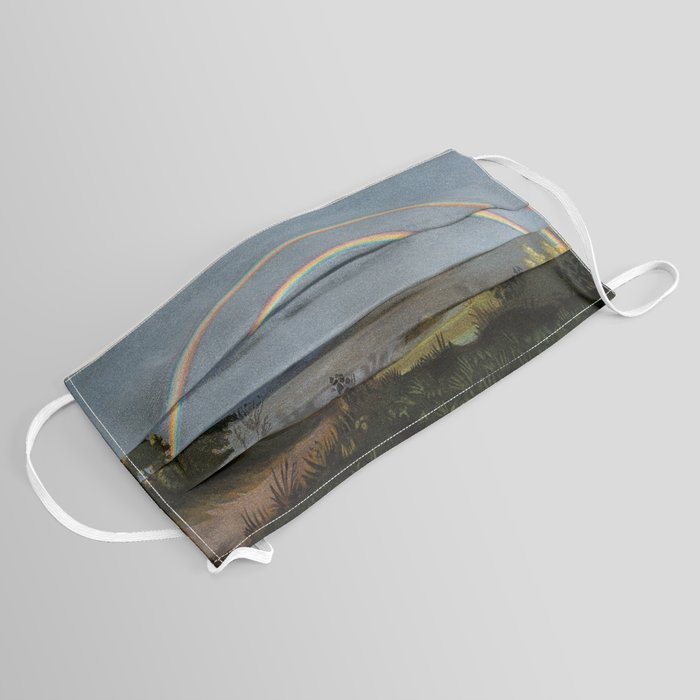
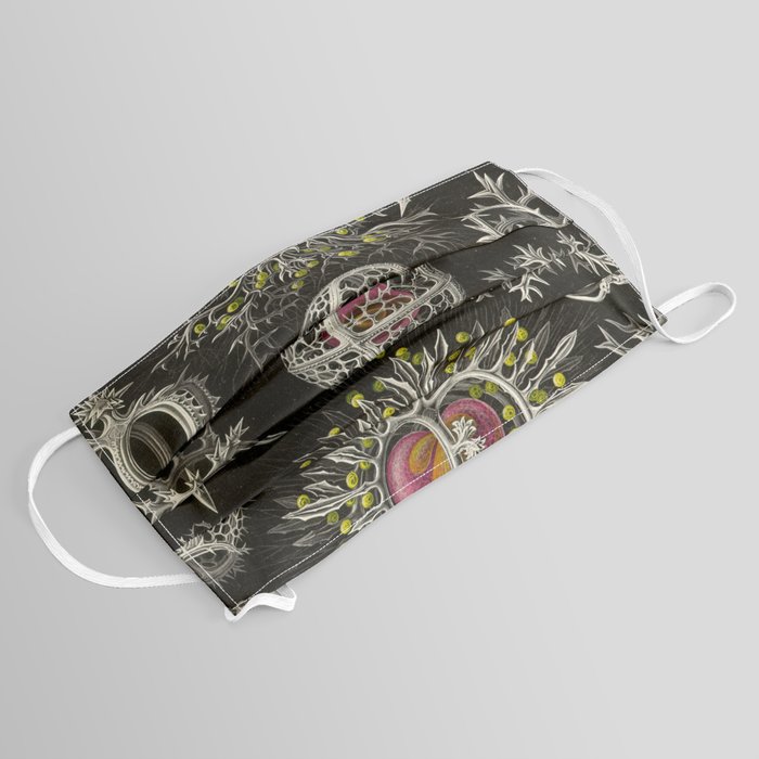
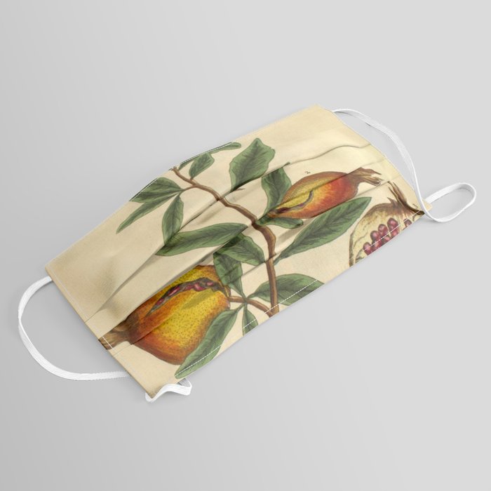
If you’re concerned about looking like every other masked weirdo out there, consider these masks created by Maria Popova of Brain Pickings, which she introduces with references to Rebecca Elson’s poem, “Antidotes to Fear of Death.” The science of public health may demand that we are grimly practical at the moment, but Popova wants to remind us that scientific thinking is equally invested in the experience of awe and the love of life. By wearing these masks, we can communicate to others, those who may be feeling despondent over the sea of masked faces in public places, that there is beauty in the world and we can fully experience if we get through this. Popova’s masks, printed and sold by Society6, illustrate the wonders of scientific curiosity with “wondrous centuries-old astronomical art and natural history illustrations.”
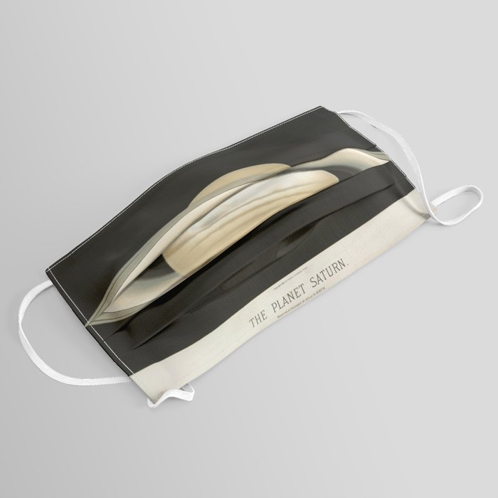
These include “treasures like the Solar System quilt Ella Harding Baker spent seven years crafting… gorgeous 18th-century illustrations from the world’s first encyclopedia of medicinal plants… astonishing drawings of celestial objects and phenomena…trailblazing 18th-century artist Sarah Stone’s stunning illustrations of exotic, endangered, and now-extinct animals; some graphically spectacular depictions of how nature works from a 19th-century French physics textbook; Ernst Haeckel’s heartbreak-fomented drawings of the otherworldly beauty of jellyfish…William Saville Kent’s pioneering artistic-scientific effort to bring the world’s awareness and awe to the creatures of the Great Barrier Reef; and art from the German marine biologist Carl Chun’s epoch-making Cephalopod Atlas — the world’s first encyclopedia of creatures of the deep.”

Society6 is donating a portion of its proceeds to World Center Kitchen, and Popova is donating to The Nature Conservancy. You can purchase your own vintage science illustration mask here and see some of these illustrations in their original context at the links further down.
Antidotes to Fear of Death
Sometimes as an antidote
To fear of death,
I eat the stars.Those nights, lying on my back,
I suck them from the quenching dark
Til they are all, all inside me,
Pepper hot and sharp.Sometimes, instead, I stir myself
Into a universe still young,
Still warm as blood:No outer space, just space,
The light of all the not yet stars
Drifting like a bright mist,
And all of us, and everything
Already there
But unconstrained by form.And sometime it’s enough
To lie down here on earth
Beside our long ancestral bones:To walk across the cobble fields
Of our discarded skulls,
Each like a treasure, like a chrysalis,
Thinking: whatever left these husks
Flew off on bright wings.
Related Content:
The Brilliant Colors of the Great Barrier Revealed in a Historic Illustrated Book from 1893
Josh Jones is a writer and musician based in Durham, NC. Follow him at @jdmagness

_(cropped).jpg)