I’ve long counted myself as a fan of Edward Tufte, the preeminent living expert on the visual display of quantitative information. I like to think this puts me in the company of Florence Nightingale, founder of modern nursing as well as a prolific writer and still today a household name. Having lived in the Victorian era, she of course never got to enjoy the work of Tufte himself, though her own zeal for data and statistics, in a time that valued such things less than ours, made her, in some sense, a Tufte of her day: the first female member of the Royal Statistical Society and an honorary member of the American Statistical Association. The video above, an outtake from Hans Rosling’s The Joy of Stats, offers a brief introduction to the statistical side of Nightingale’s career, and the important role data visualization played in her mission to save lives.
“When Florence Nightingale arrived at a British hospital in Turkey during the Crimean War, she found a nightmare of misery and chaos,” writes Science News’ Julie Rehmeyer. “By the time Nightingale left Turkey after the war ended in July 1856, the hospitals were well-run and efficient, with mortality rates no greater than civilian hospitals in England.”
But feeling great regret over all the lives lost there to preventable disease, she went on to save even more of them by bringing numbers into play. She specifically compiled “vast tables of statistics about how many people had died, where and why. Many of her findings shocked her. For example, she discovered that in peacetime, soldiers in England died at twice the rate of civilians — even though they were young men in their primes.”
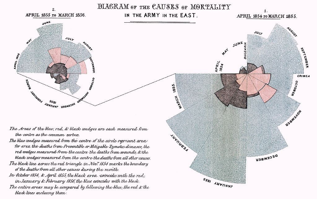
Nightingale’s most influential presentation of her data, which she called a “coxcomb,” appears just above. This Is Statistics describes “Diagram of the Causes of Mortality in the Army in the East” as “similar to a pie chart, but more intricate. In a pie chart the size of the ‘slices’ represent a proportion of data, while in a coxcomb the length, which the slice extends radially from the center-point, represents the first layer of data.” Her famous chart “was divided evenly into 12 slices representing months of the year, with the shaded area of each month’s slice proportional to the death rate that month. Her color-coded shading indicated the cause of death in each area of the diagram.” She stated the goal of her visualization clearly: “to affect thro’ the Eyes what we fail to convey to the public through their word-proof ears.”
We all try to do the very same thing when we present information today, though few of us—even armed with a degree of number-crunching and graphic design powers that would have seemed magical to Nightingale and her contemporaries—achieve the kind of results she did. She galvanized systemic change in hospital design and operation as well as prompted a revolution in sanitation which increased Britain’s average national life expectancy by 20 years—something to bear in mind when we start to get big ideas about how our Powerpoint slide shows will change the world.
If you would like to support the mission of Open Culture, consider making a donation to our site. It’s hard to rely 100% on ads, and your contributions will help us continue providing the best free cultural and educational materials to learners everywhere. You can contribute through PayPal, Patreon, and Venmo (@openculture). Thanks!
via @pourmecoffee
Related Content:
The Art of Data Visualization: How to Tell Complex Stories Through Smart Design
Slick Data Visualization Reveals Scientific Collaborations Taking Place Around the Globe
Watch a Cool and Creepy Visualization of U.S. Births & Deaths in Real-Time
Statistics Explained Through Modern Dance: A New Way of Teaching a Tough Subject
Based in Seoul, Colin Marshall writes and broadcasts on cities, language, and style. He’s at work on a book about Los Angeles, A Los Angeles Primer, the video series The City in Cinema, the crowdfunded journalism project Where Is the City of the Future?, and the Los Angeles Review of Books’ Korea Blog. Follow him on Twitter at @colinmarshall or on Facebook.
Not really impressed with the coxcomb… it’s clear as mud.
The visual impression is that the areas are what are to be compared, which is sort of true, but it’s the area of the entire wedge, not just the visible portion. Further, I don’t think people compare areas very well, which is why they make great optical illusions. A wedge with side twice as big as the wedge overlapping it actually covers 4x as much area, some of which is covered (see October 1954). It’s worth noting that the quotes you selected mis-interpret the chart, claiming that radial length (not area as it says right on the chart) represents the data. Then it contradicts itself AND the chart by referring to “the shaded area of each month’s slice”. It’s a good thing they didn’t call their website “This is Reading” because they can’t.
It’s also not clear where to begin. And apparently each piece is meant to be rotated around its own center, based on the way the months are labeled. What a hassle!
What was wrong with doing a simple line chart? If large numbers are a problem, you can use a logarithmic deaths axis. While the lines in the line chart would only be an approximation of the monthly death rates on a particular date, it’s visually very clear what’s happening month to month.
You are, sir, are what’s known as a “hater”. This is akin to dismissing Metropolis as a boring retread of robot movies.
Nightingale did remarkable work with what she had available, and we should laud her.
Snoopy, we certainly should. But not for the precision of her reporting her finding. Which I believe was not, in the first place, what she was trying to achieve. “Moving hearts” describes it better. However, what Randy notes in his comment (and he’s certainly not a “hater”) is perfectly correct. I also struggle to make “real”, quantitive sense of Nightingale’s chart. While, at the same time, being quite charmed by it. I will say that it works well on an emotional level, and only at that one. No useful quantitive information are easily extracted by it.