In the early 18th century, the novel was seen as a frivolous and trivial form at best, a morally corrupting one at worst. Given that the primary readers of novels were women, the belief smacks of patriarchal condescension and a kind of thought control. Fiction is a place where readers can imaginatively live out fantasies and tragedies through the eyes of an imagined other. Respectable middle-class women were expected instead to read conduct manuals and devotionals.
English novelist Samuel Richardson sought to bring respectability to his art in the form of Pamela in 1740, a novel which began as a conduct manual and whose subtitle rather bluntly states the moral of the story: “Virtue Rewarded.”
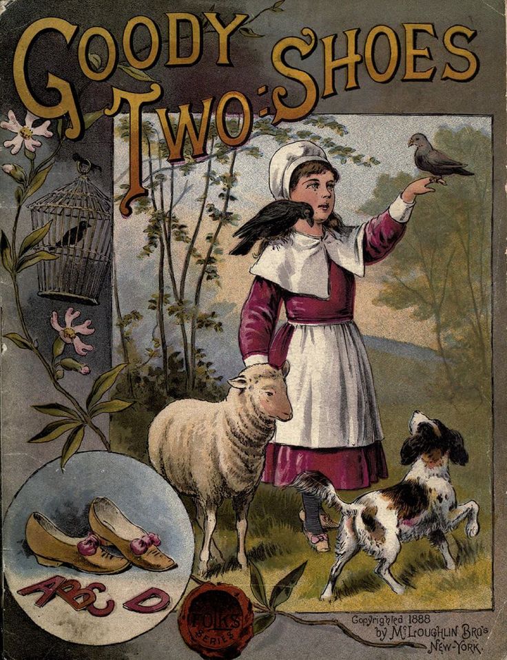
This moralizing expressed itself in another literary form as well. Children’s books, such as there were, also tended toward the moralistic and didactic, in attempts to steer their readers away from the dangers of what was then called “enthusiasm.”
“Prior to the mid-eighteenth century,” notes the UCLA Children’s Book Collection—a digital repository of over 1800 children’s books dating from 1728 to 1999—“books were rarely created specifically for children, and children’s reading was generally confined to literature intended for their education and moral edification rather than for their amusement. Religious works, grammar books, and ‘courtesy books’ (which offered instruction on proper behavior) were virtually the only early books directed at children.” But a change was in the making in the middle of the century.
Pamela attracted a ribald, even pornographic, response—most notably in Henry Fielding’s satire An Apology for the Life of Mrs. Shamela Andrews and the Marquis de Sade’s Justine Meanwhile, the world of children’s literature also underwent a radical shift. “The notion of pleasure in learning was becoming more widely accepted.” Illustrations, previously “consisting of small woodcut vignettes,” slowly began to move to the fore, and “innovations in typography and printing allowed greater freedom in reproducing art.”
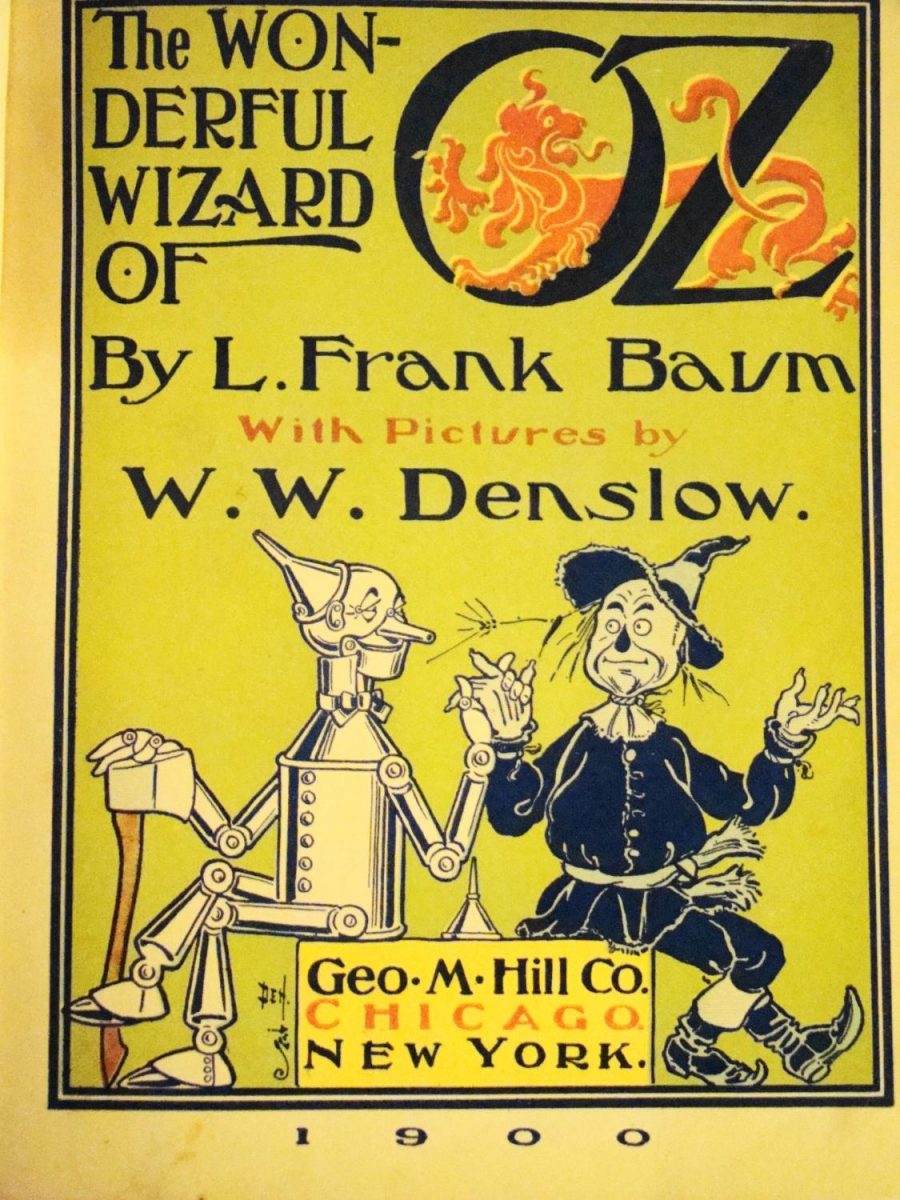
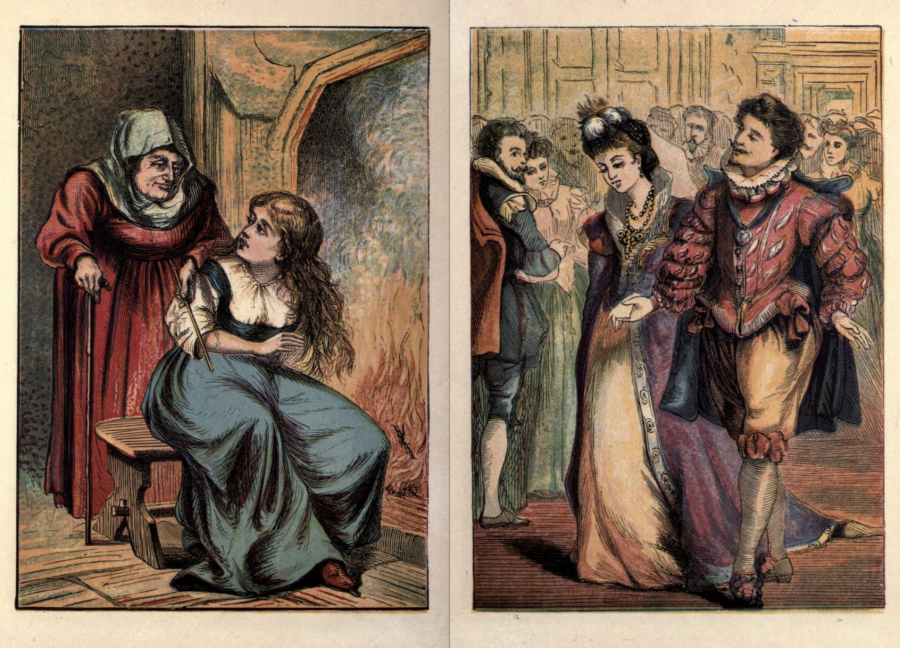
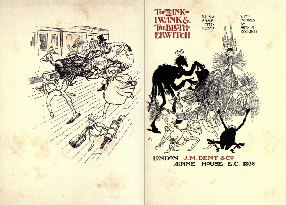
That’s not to say that the didactic attitude was dispelled—we see codes of conduct and overt religious themes embedded in children’s literature throughout the 19th century. But as we pointed out in a post on another children’s book archive from the University of Florida, the more staid and traditional books increasingly competed with adventure stories, works of fantasy, and what we call today Young Adult literature like that of Mark Twain and Louisa May Alcott. You can see this tension in the UCLA collection, between pleasure and duty, leisure and work, and education as moral and social training and as a means of achieving personal freedom.
Of the adult literary imagination of the time, Leo Bersani writes in A Future for Astyanax that “the confrontation in nineteenth-century works between a structured, socially viable and verbally analyzable self and the wish to shatter psychic and social structures produces considerable stress and conflict.” I think we can see a similar conflict, expressed much more playfully, in books for children of the past two hundred years or so. Enter the UCLA collection, which includes not only historic children’s books but present-day exhibit catalogs and more, here.
Related Content:
Enter an Archive of 6,000 Historical Children’s Books, All Digitized and Free to Read Online
The First Children’s Picture Book, 1658’s Orbis Sensualium Pictus
The Anti-Slavery Alphabet: 1846 Book Teaches Kids the ABCs of Slavery’s Evils
Josh Jones is a writer and musician based in Durham, NC. Follow him at @jdmagness