We all understand, on some level, that as adults we must go back and correct the oversimplifications we learned as schoolchildren. But for a sense of how large the scale of those quasi-truths, you must imagine the whole world: that is, you must imagine how you imagine the whole world, a mental picture probably taken straight from the map hung on the classroom wall. And the lines of that map came straight, in a sense, from the work of 16th-century cartographer Gerardus Mercator.
Though Mercator’s world-mapping method came as a revolution, it has also given generation after generation after generation very much the wrong idea about how big the world’s countries actually are. Mercator Projection, as Citymetric describes it, “re-imagines the earth as the surface of a cylinder.
When laid out flat, it’s pleasingly rectangular, and its eastern and western edges line up neatly.” But while “in reality, lines of longitude converge at the poles; on the map, they’re parallel. As a result, the closer you get to the poles, the more distorted the map becomes, and the bigger things look relative to their actual size.”
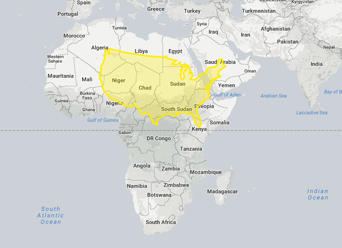
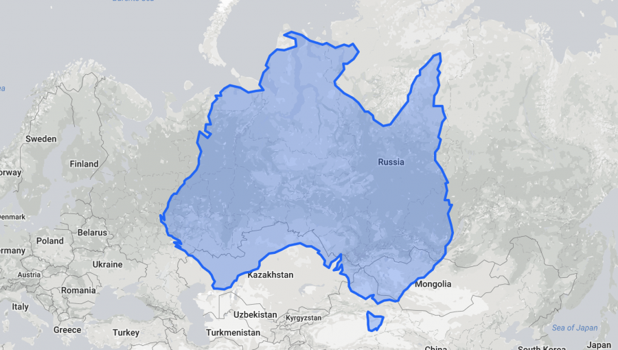
Hence the need for such re-imaginings of the world map as The True Size, “a website that lets you compare the size of any nation or US state to other land masses, by allowing you to move them around to anywhere else on the map.” Just search for any country in the box in the map’s upper-left corner, and that country’s borders will appear highlighted in color. When you click and drag those borders to another part of the world, specifically a part of the world at a different latitude, you’ll notice that the shape of the dragged country seems to deform.
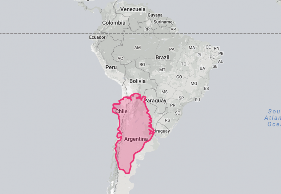
But that appearance of distortion is only relative to the shapes and sizes we’ve long internalized from the Mercator map: when you move Australia up and it covers a third of Russia, or when you move the vast-looking Greenland down and it doesn’t even cover Argentina, you’re looking — perhaps for the first time — at a geographically accurate size comparison. Does that (to quote the humorless representative of the Organization of Cartographers for Social Equality in the West Wing episode cited as one inspiration for the True Size Map) blow your mind?
Explore the True Size Map here.
Related Content:
Japanese Designers May Have Created the Most Accurate Map of Our World: See the AuthaGraph
The History of Cartography, the “Most Ambitious Overview of Map Making Ever,” Now Free Online
New York Public Library Puts 20,000 Hi-Res Maps Online & Makes Them Free to Download and Use
Why Making Accurate World Maps Is Mathematically Impossible
Based in Seoul, Colin Marshall writes and broadcasts on cities and culture. His projects include the book The Stateless City: a Walk through 21st-Century Los Angeles and the video series The City in Cinema. Follow him on Twitter at @colinmarshall or on Facebook.
… Well I just fell down a rabbit hole for the past two hours. You guys literally turned my view of the universe upside down, surely the purpose of this whole website! Thanks.
super
This was a fantastic site that I used with my geography students constantly. It is a shame that I am unable to use it as a teaching tool anymore. If anyone knows of a similar site that compares size through the overlay function, I’d love to know.
Show it at sreet