What if I said the problem with STEM education is that it doesn’t include nearly enough art? For one thing, I would only echo what STEAM proponents have said for years. This doesn’t only mean that students should study the arts with the same seriousness as they do the sciences. But that science should be taught through the arts, as it was in the 19th century when Naturalists relied on fine art illustration.
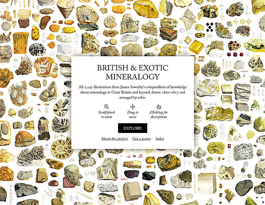
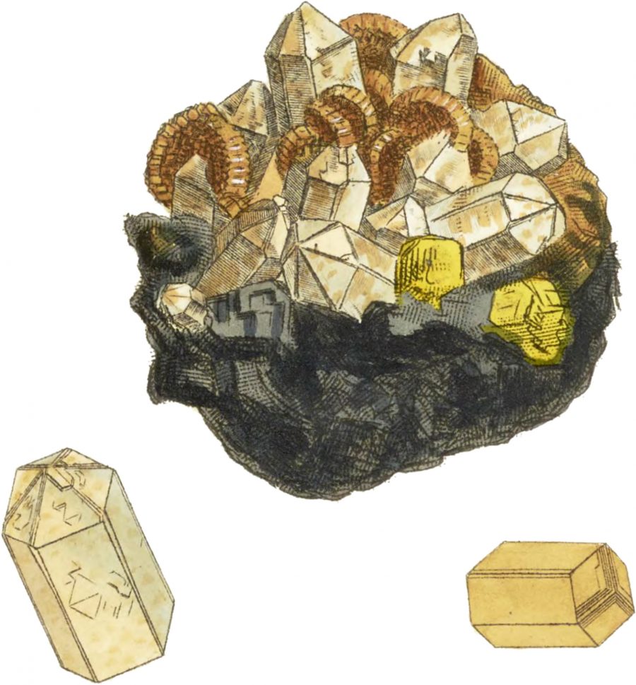
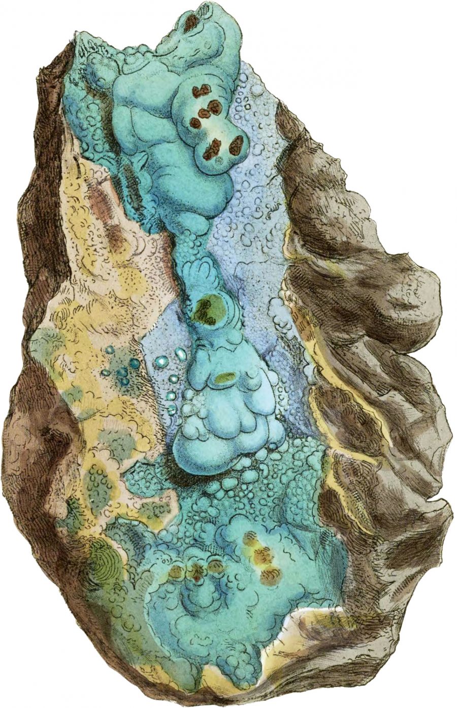
Maybe increasing complexity demands charts and graphs, but there are reasons other than hip antiquarianism to cherish 19th century scientific art, and to aim for something close to its high aesthetic standards. Humans seem to find nature far more awe-inspiring when it’s mediated by painting, poetry, narrative, music, fine art photography, etc. We want to be emotionally moved by science. As such, few guides to the natural world have elevated their subjects as highly as British & Exotic Mineralogy, a multivolume reference work for… well, rocks, to put it vulgarly, published between 1802 and 1817.
During these years, “notable naturalist, illustrator, and mineralogist James Sowerby drew intricate pictures of minerals in an effort to illustrate the topographic mineralogy of Great Britain and minerals not yet known to it,” writes Nicholas Rougeux. “These illustrations were some of the finest on the subject and are still considered by some to be to this day.” Though he was surely compensated for his work, Sowerby’s detailed drawings come across as labors of devotion.
Rather than just printing them on postcards or tote bags (though he does sell posters), Rougeux has done for Sowerby’s minerals what he had previously done for other classic textbooks and taxonomies from the past, such as the 200-year-old Werner’s Nomenclature of Colours and Euclid’s Elements from 1847. Digitizing the 718 illustrations on one sprawling interactive page allows him to retain their educational value: click on any individual mineral and you’ll bring up an enlarged image followed by excerpts from the text.
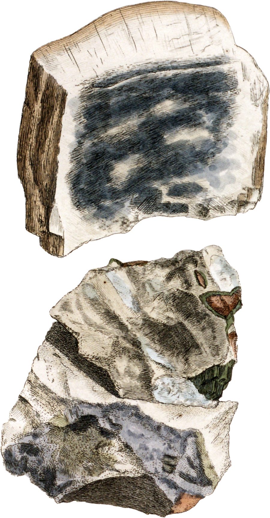
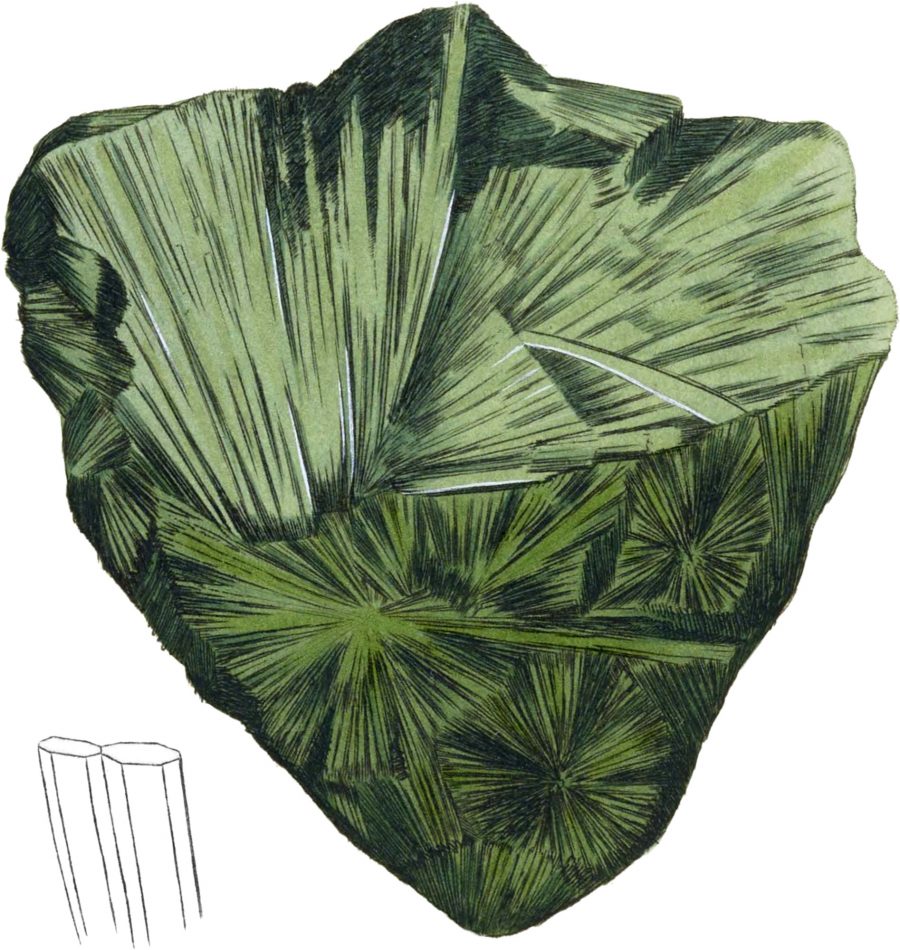
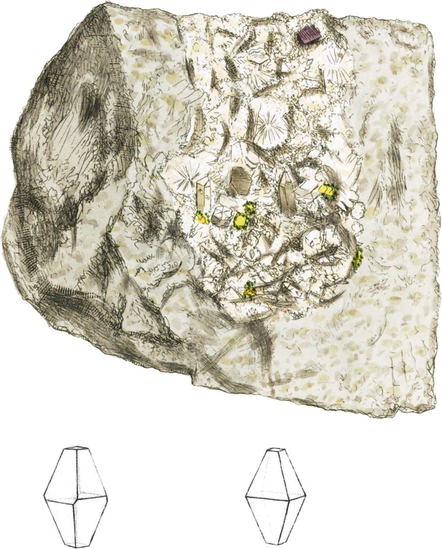
You have never seen such rocks as these, no matter how many uncut gems you’ve held in your hand. Because these illustrations turn them into something else—crystalline palaces, alien organs, petrified explosions, moldy loaves of bread… all the many shapes that time can take in rock form. They aren’t all beautiful rocks, but they are each beautifully-rendered with lines that might remind us of the most skilled comic artists, who are perhaps some of the last inheritors of this kind of graphic style. Sowerby himself illustrated several other scientific works, including series on biology, mycology, and a color system of his own devising.
“We feel much pleasure in presenting our friends with a figure and account of the most perfect and rare specimen yet found of this substance,” begins the text accompanying Hydrargillite, above, which resembles a small, misshapen moon or asteroid. Rougeux also takes quite a bit of pleasure in his work of recovering these reference books and making them beautifully useful once again for 21st century readers. You can read his detailed account of the original illustrations and his adaptation of them for use on the web here.
While appreciating the finer points of color, line, and composition in Rougeux’s tapestry of vintage mineral illustrations, you might just inadvertently expand your knowledge and appreciation of mineralogy. You can also read the entire British & Exotic Mineralogy, if you’ve got the time and inclination, at the Internet Archive.
via Kottke
Related Content:
Josh Jones is a writer and musician based in Durham, NC. Follow him at @jdmagness


