We tend to take a very special interest in archives and maps on this site—and especially in archives of maps. Yet it is rare, if not unheard of, to discover a map archive in which every single entry repays attention. The PJ Mode Persuasive Cartography Collection at Cornell University Library is such an archive. Each map in the collection, from the most simplified to the most elaborate, tells not only one story, but several, overlapping ones about its creators, their intended audience, their antagonists, the conscious and unconscious processes at work in their political psyches, the geo-political view from where they stood.
Maps drawn as propaganda must be broad and bold, casting aside precision for the pressing matter at hand. Even when finely detailed or laden with statistics, such maps press their meaning upon us with unsubtle force.
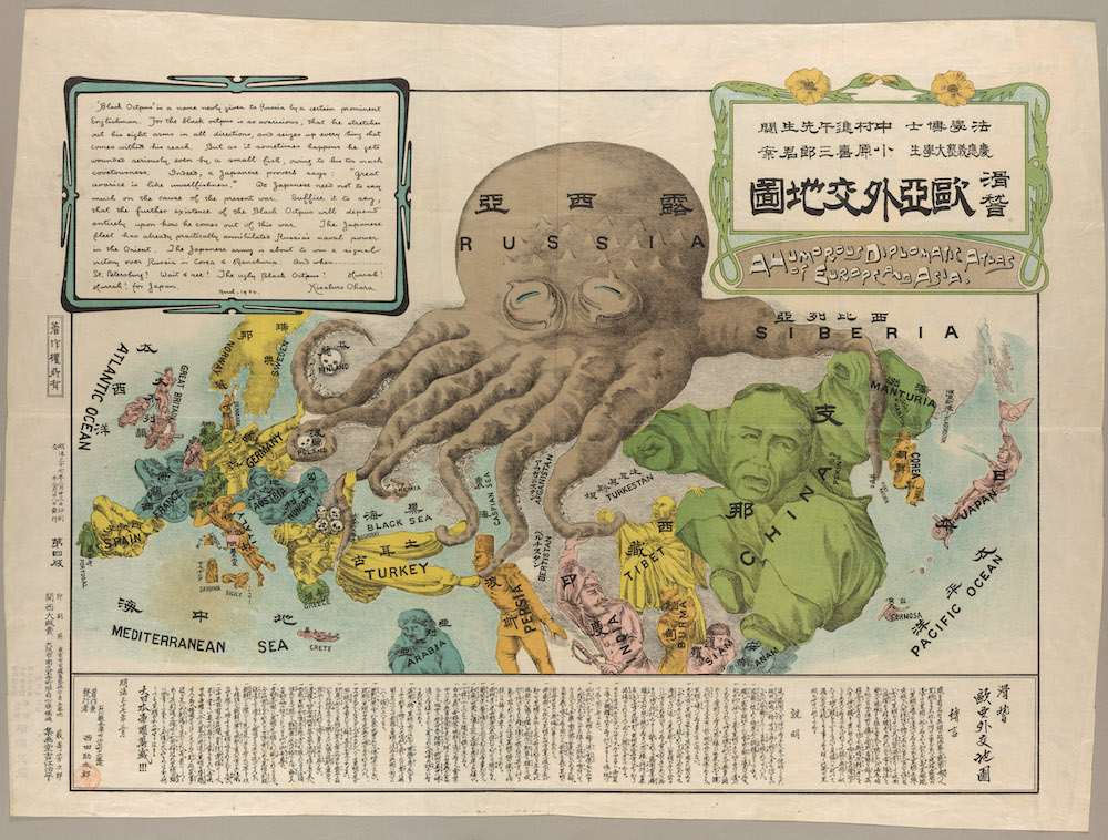
One especially resonant example of persuasive cartography, for example, at the top shows us an early version of a widely-used motif—the “Cartographic Land Octopus,” or CLO, as Frank Jacobs dubs it at Big Think. The CLO has never gone out of style since its likely origin in J.J. van Brederode’s “Humorous War Map” of 1870, which depicts Russia as a monstrous mollusk. Later, Caricaturist Fred W. Rose printed a reprise, the “Serio-Comic War Map for the Year 1877.”
A full twenty-seven years later, a Japanese student used the very same design for his satirical map of Russia-as-Octopus, the occasion this time the Russo-Japanese War. Titled “A Humorous Diplomatic Atlas of Europe and Asia,” the Japanese map cites Rose, or “a certain prominent Englishman,” as its inspiration. Its text reads, in part:
The black octopus is so avaricious, that he stretches out his eight arms in all directions, and seizes up every thing that comes within his reach. But as it sometimes happens he gets wounded seriously even by a small fish, owing to his too much covetousness.
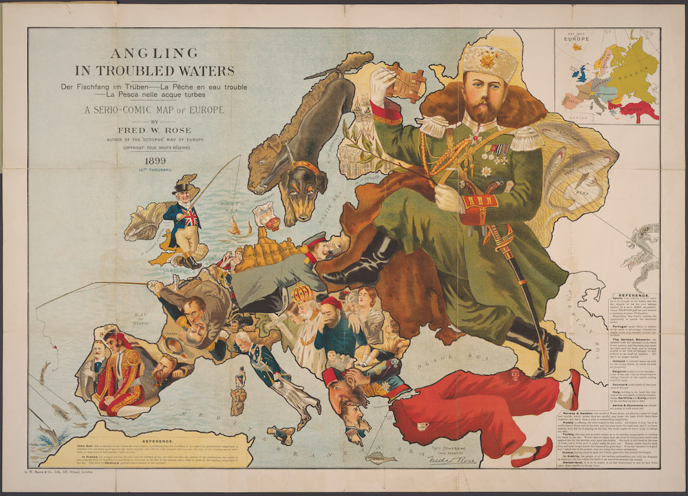
No doubt Russian persuasive cartographers had a different view of who was or wasn’t an octopus. Many years after his octopus map, Fred Rose dropped sea creatures for fishing in another of his serio-comic maps, “Angling in Troubled Waters,” above, this one from 1899, and showing Russia as a massive incarnation of the tsar, his boots posed to walk all over Europe. After the revolution, the Russian octopus returned, bearing different names but no less menacing a beast.
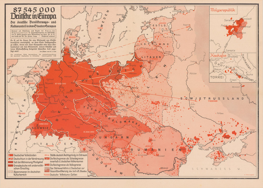
Many maps in the collection show contradictory views of Russia, or Great Britain, or whatever world power at the time threatened to overrun everyone else. It’s interesting to see the continuity of such depictions over decades, and centuries (Jacobs shows examples of Russian octopi from 1938 and 2008). The map above from 1938 reflects “Nazi expansionist goals,” notes Cornell’s digital collections, by showing the supposed “German” populations scattered all over Europe and the need, as Hitler argued in the quoted speech, to protect and liberate “national comrades” by means of annexation, bombing, and invasion.
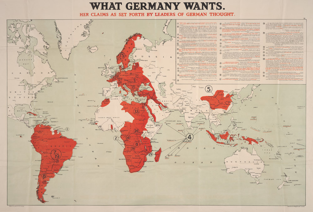
Where the blood red of the German map represents the “blood” of the volk, in the map above, from 1917, it stands in for the blood of everyone else if the “leaders of German thought” get what they want. Where the Reich map took aim at Europe, the quoted “former generals,” notes Cornell, “and well-known Pangermanists” in the WWI-era map above wanted to colonize most of the world, a particular affront to the British, who were well on their way to doing so, and to a lesser degree, the French, who wanted to. These two world powers had been at it far longer, however, and not without fierce opposition at home as well as in the colonies.
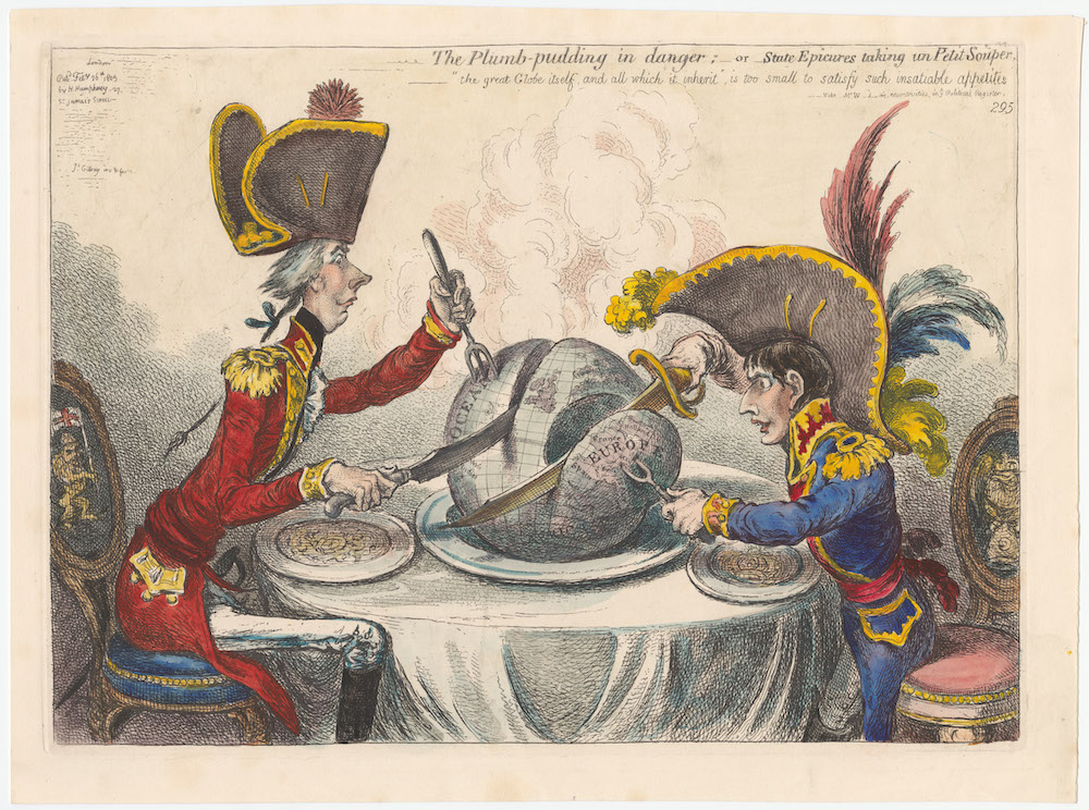
The famous eighteenth century British caricaturist James Gillray’s most famous print, from 1805, shows William Pitt and Napoleon seated at table, carving up the world between them to consume it.
A steaming ‘plum-pudding’ globe, both intent on carving themselves a substantial portion…. Pitt appears calm, meticulous and confident, spearing the pudding with a trident indicative of British naval supremacy. He lays claim to the oceans and the West Indies. In contrast Napoleon Bonaparte reaches from this chair with covetous, twitching eyes fixed on the prize of Europe and cuts away France, Holland, Spain, Switzerland, Italy and the Mediterranean.
Gillray’s cartoon hardly counts as a “map” but it deserves inclusion in this fine collection. Other notable maps featured include the 1904 “Distribution of Crime & Drunkenness in England and Wales,”a study in the persuasive use of correlation; the 1856 “Reynold’s Political Map of the United States,” illustrating the “stakes involved in the potential spread of slavery to the Western States” in support of the Republican Presidential candidate John Fremont; and the French Communist Party’s 1951 “Who is the Aggressor?” which shows American military bases around the world, their guns—or big black arrows—pointed at China and the U.S.S.R.
There are hundreds more persuasive maps, illustrating views theological, political, social, mechanical, and otherwise, dating from the 15th century to the 2000s. You can browse the whole collection or by date, creator, subject, repository, and format. All of the maps are annotated with catalog information and collector’s notes explaining their context. And all of them, from the frivolous to the world-historical, tell us far more than they intended with their peculiar ways of spatializing prejudices, fears, desires, beliefs, obsessions, and overt biases.
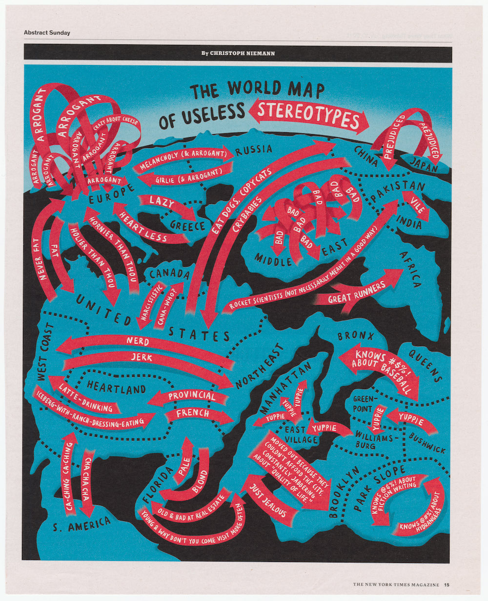
“Every map has a Who, What, Where and When about it,” as collector PJ Mode writes on the Cornell site. “But these maps had another element: Why? Since they were primarily ‘about’ something other than geography, understanding the map required finding the reasoning behind it.” The most recent entry in the archive, Christopher Neiman’s 2011 “World Map of Useless Stereotypes” from The New York Times Magazine turns the persuasive map in on itself, using its satirical devices to poke fun at propaganda’s reductive effects.
Related Content:
Josh Jones is a writer and musician based in Durham, NC. Follow him at @jdmagness
One man’s meat, is another man’s poison!