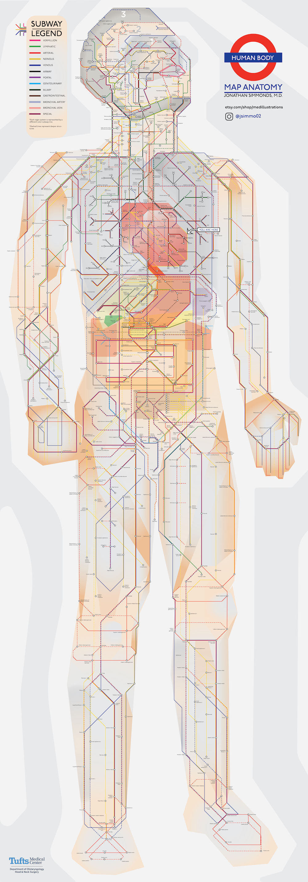
We all have bodies, but how many of us truly know our way around them? Plenty of books explain in detail the functions of and relationships between each and every part of our anatomy, but few of them do it in a way the layman — and especially the layman not yet accustomed to the sight of human viscera laid bare — can readily grasp. We need a visualization of the human body, but what kind of visualization can best represent it with a maximum of clarity and a minimum of misleading distortion?
“Most people might imagine an intricate network of blood vessels or the complex neural circuits of the brain,” writes Visual Capitalist’s Iman Ghosh. “Or we might picture diagrams from the iconic medical textbook, Gray’s Anatomy.” But how about a visualization of the body in the style of a classic piece of information design we’ve all seen at least once, the London Underground map? “Created by Jonathan Simmonds M.D., a resident physician at Tufts Medical Center,” Ghosh writes, “it’s a simple yet beautifully intuitive demonstration of how efficiently our bodies work.”
Just as Harry Beck’s original 1933 London Underground map straightened out and color-coded each of the lines then in operation, Simmonds’ anatomical map traces thirteen different “lines” through the body, each of which represents a different system of the body: the nervous system in yellow, for example, the airway system in black, and the lymphatic system in green. “While dashed lines represent deeper structures, sections with ‘transfers’ show where different organ systems intersect,” Ghosh writes. If you’re wondering where to start, she adds, “there’s a helpful ‘You Are Here’ at the heart.”
You can take a close look at Simmonds’ work in a large, high-resolution version here. Not only does following the model of the London Underground map introduce a degree of immediate legibility seldom seen (at least by non-medical students) in anatomical diagrams, it also underscores an aspect of the very nature of our human bodies that we don’t often consider. We might instinctively think of them as sets of discrete organs all encased together and functioning independently, but in fact they’re more like cities: just as busy, just as interconnected, just as dependent on connections and routines, and just as improbably functional.
Related Content:
The Roman Roads of Britain Visualized as a Subway Map
A Wonderful Archive of Historic Transit Maps: Expressive Art Meets Precise Graphic Design
Based in Seoul, Colin Marshall writes and broadcasts on cities, language, and culture. His projects include the book The Stateless City: a Walk through 21st-Century Los Angeles and the video series The City in Cinema. Follow him on Twitter at @colinmarshall, on Facebook, or on Instagram.


I love this clever diagram. As a former designer and now working as a medic, I searched this concept on the web to see if anyone was clever enough to have designed a london underground map for the heart… found the whole shooting box. Well done.