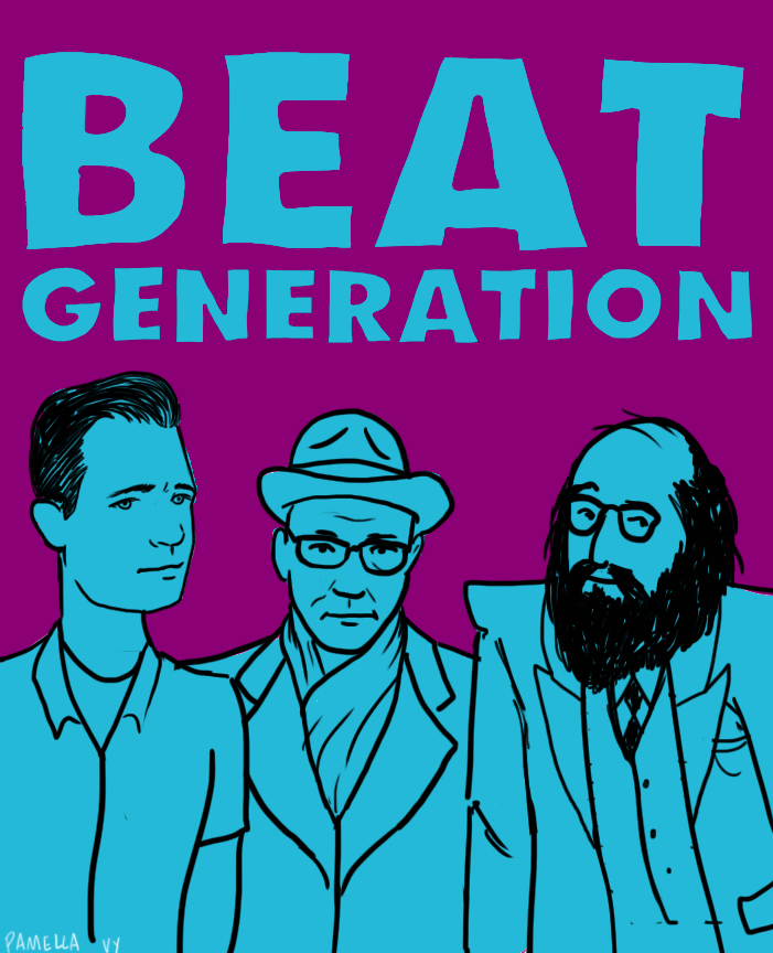
Plenty of us get tuned in to the Beats through print — maybe a yellowed copy of Howl, a mass-market Naked Lunch, a fifth- or sixth-handOn the Road — but sometimes the verse or prose that so thrills us on those pages fairly demands to be spoken aloud, preferably by the Beat in question. That may have proven a tricky desire to fulfill in decades past, but now Spotify has made it nearly effortless to hear the Beats whenever we like: you can find over eighteen hours of material on a playlist called, straightforwardly enough, The Beats.
These 249 tracks include not just figures like the previously alluded to Allen Ginsberg, William S. Burroughs, and Jack Kerouac, but other beloved Beats such as Gregory Corso, Peter Orlovsky — and Charles Bukowski, not a figure one necessarily associates closely with that movement. Some Bukowski and/or Beat enthusiasts will tell you that each would have nothing to do with the other. Yet the hard-living poet and self-confessed “dirty old man” occasionally admitted to something approaching fondness for certain members of the supposedly higher-minded counterculture: “He’s better to have around than not to have around,” Bukowski once said of Ginsberg. “Without his coming through, none of us would be writing as well as we are doing now, which is not well enough, but we hang on.”
With the Beats’ Spotify playlist, you can judge for yourself not only whether they and Bukowski wrote “well enough” (though literary history seems to have proven that piece of self-deprecation wrong), but also whether they spoke well enough — or rather, whether they performed their own work in the way you’d always imagined it in your head. Whatever your assessment, rest assured you won’t hear voices like Ginsberg’s, Burroughs’ and especially Bukowski’s anywhere else. If you don’t have the Spotify software itself yet, no problem: you can download it free here.
When Martin Scorsese isn’t making films, he’s busy preserving them, from helping fund the restoration of classics to collecting the ephemera of his youth, especially posters. A selection of his movie poster collection, representing the height of film advertising from the 1930’s to the 1960s, currently hangs at MoMA through October 25, 2015.
The power that a poster held in the imagination decades ago should not be understated. For many it was the only knowledge they had about the film they were about to see, and many artists, hired in house by the studios, hyped up the sexiest parts of the films. It sold tickets.
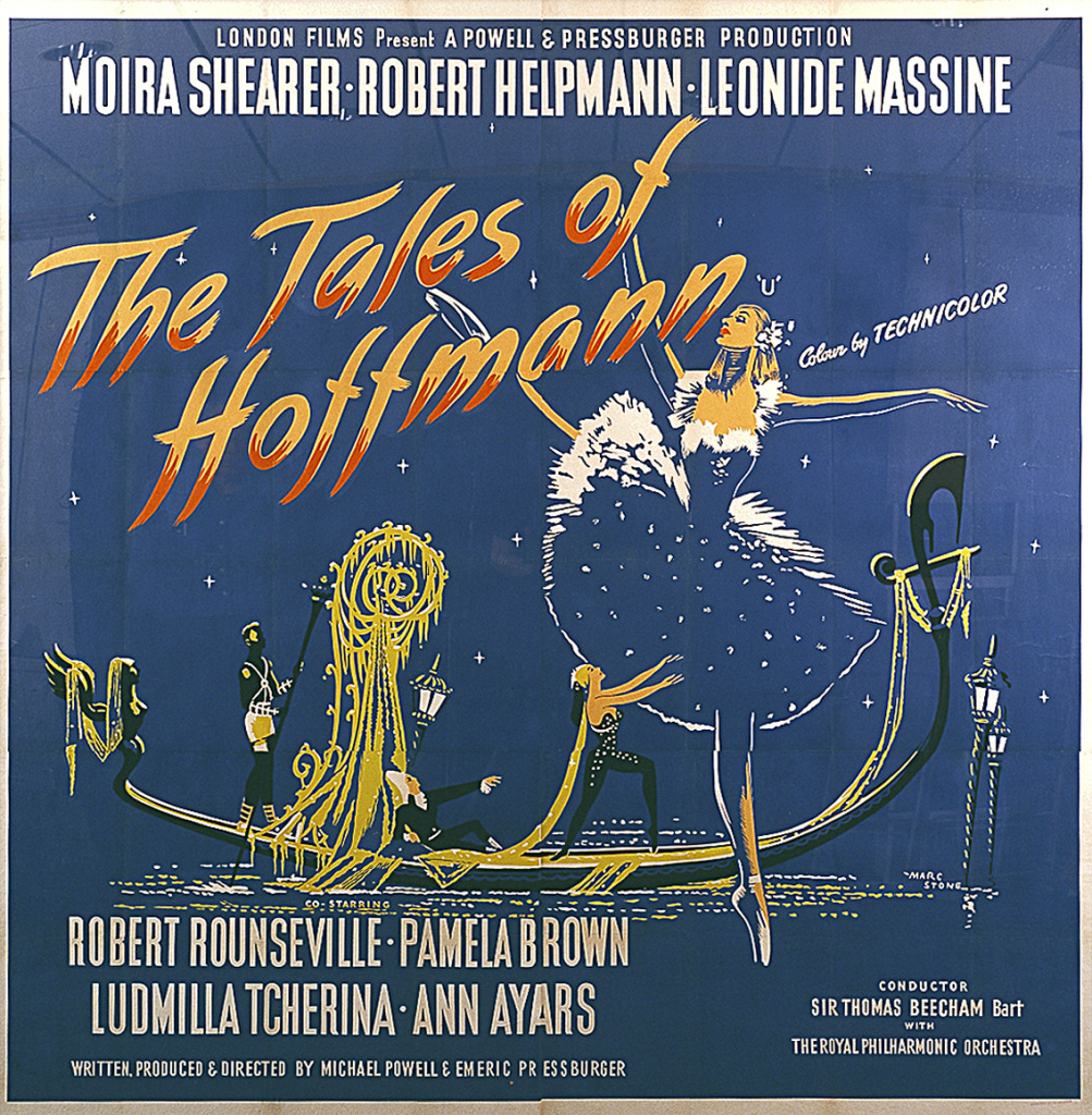
The MoMA exhibit is centered on the billboard sized poster for Powell and Pressburger’s Tales of Hoffmann(1951), a stunning work when seen large. (For an understanding about the impressive size of most posters, check out this graphic.)
It’s only because of collectors like Scorsese and Ira. M. Resnick (for whose book Scorsese wrote an introduction) that the artists behind these posters have been named and recognized.
Although the MoMA web page promoting the exhibition is surprisingly stingy when it comes to naming all the artists in the show, some internet sleuthing brings up some names. The illustrator behind the Hoffmann poster, Marc Stone, was also a painter of World War II propaganda posters in the UK.
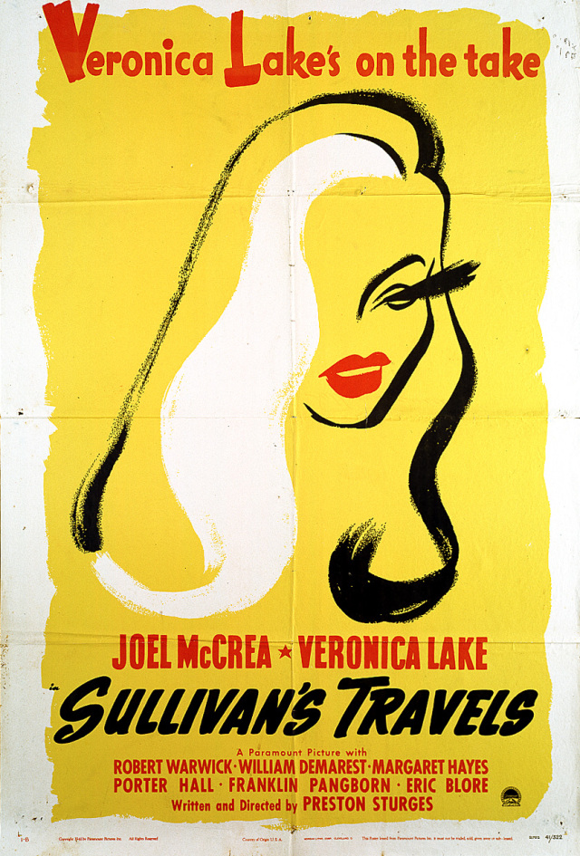
The minimal, Risko-esque rendering of Veronica Lake for Sullivan’s Travels (1941) is credited to Maurice Kallis, though an anonymous comment on the movie poster blog Citizen K. credits it to Fritz Siebel, the commenter’s father. Siebel, who immigrated to the U.S. from Vienna, wound up illustrating A Fly Went By for Dr. Seuss’ children’s book imprint and creating the famous Yul Brynner-lookalike and cleaning product mascot Mr. Clean.
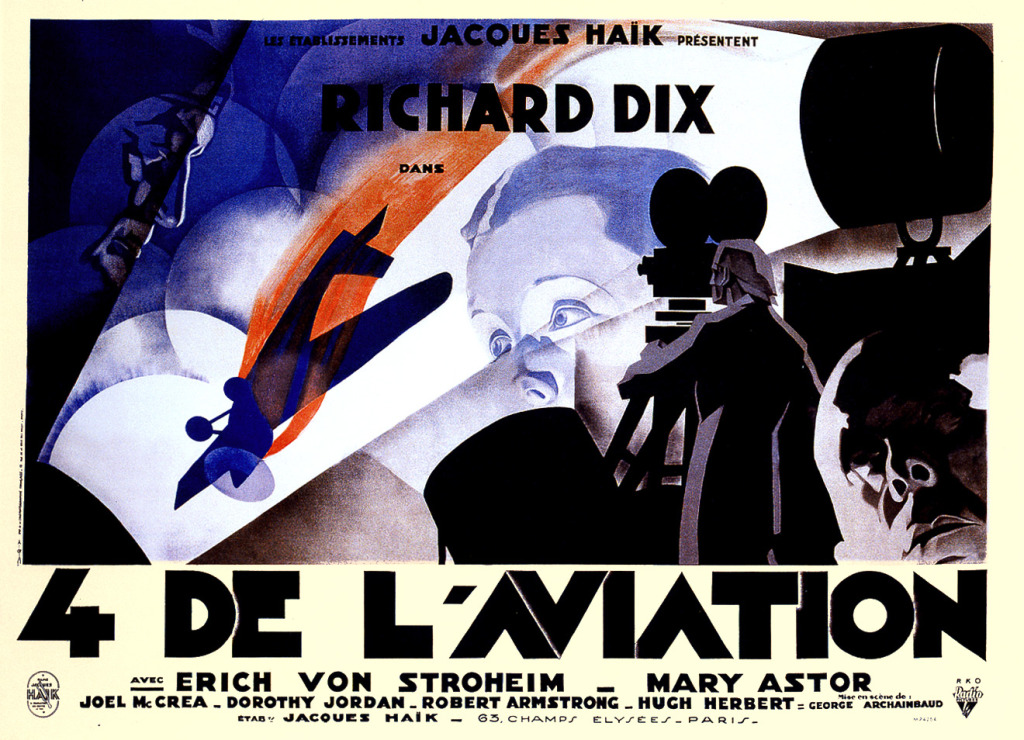
René Péron, who created the beautiful Expressionistic design for Erich von Stroheim’s The Lost Squadron (1932) started his career with posters for silent classics like Abel Gance’s Napoleon and Carl Theodor Dreyer’s The Passion of Joan of Arc (1928). But he’s probably best known for the iconic caricature of Jacques Tati gracing the poster for Mr. Hulot’s Holiday.
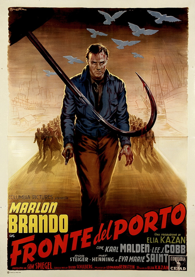
Both the poster for Powell and Pressburger’s Black Narcissus and Kazan’s On the Waterfront are by one of the Italian kings of movie posters, Anselmo Ballester. His style is lurid and pulpy, and if there is one dame in distress in a movie, he would make her the selling point of the poster. He was also known for his love of Rita Hayworth, for whom he would produce his best work. (Just look at this poster for Salome, which is way more interesting than the picture it represents.)
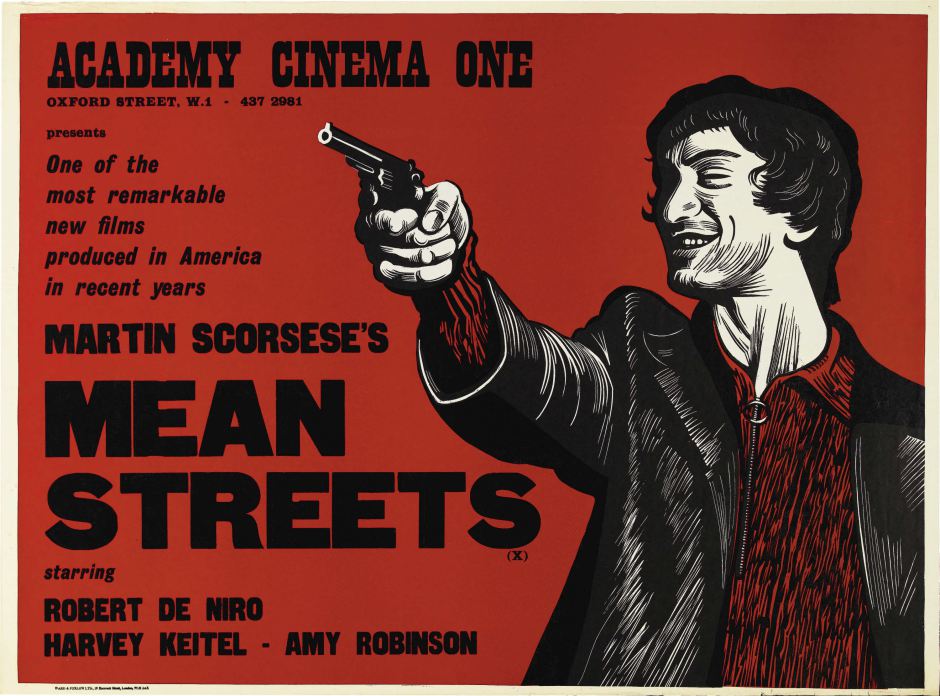
Lastly, Scorsese has added one of his own film’s posters: Peter Strausfeld’s stunning woodblock poster for Mean Streets. The British artist had a very particular style (text on one side, graphic on the other), and was hired by the Academy Cinema in London as their designer. (Now, *that’s* a job.)
The fact that we can watch trailers on our televisions and now iPhones has long diminished the power of the poster. However, there are still signs of life in the industry, and the amount of artists creating beautiful limited edition prints of posters for their favorite films increases every year.
Ted Mills is a freelance writer on the arts who currently hosts the FunkZone Podcast. You can also follow him on Twitter at @tedmills, read his other arts writing at tedmills.com and/or watch his films here.
At first blush, Yasujiro Ozu and Wes Anderson would seem to be miles apart. Ozu is the “most Japanese” of all directors. His films are small, quiet, finely calibrated works that document the slow reordering of the family unit in the face of Japan’s rapid modernization. Anderson’s movies are twee and whimsical, filled with wry humor and a shocking amount of violence against dogs.
Yet video essayist Anna Catley in her piece Wes Anderson & Yasujiro Ozu: A Visual Essay makes a pretty compelling case that these two auteurs are more similar than you might think. Both filmmakers have a clear and highly stylized manner of constructing their movies: Ozu’s films are characterized by symmetrical compositions and an unmoving camera that remains about two and a half feet off of the ground. Anderson’s movies are marked by symmetrical compositions, long complex camera moves and lots of overhead shots. Both Ozu and Anderson have a stable of actors that they work with repeatedly — Chishu Ryu and Setsuko Hara for Ozu, Jason Schwartzman and Bill Murray for Anderson. Both filmmakers’ movies are about the complex, often fraught, relationships between parents and children. And both directors often employed the point of view of children to highlight adult hypocrisy and disappointment.
Ozu’s movies, however, were relatively free of Cat Stevens songs.
You can watch the full video above. It might just make you watch a double feature of Ohayo and Moonrise Kingdom.
Jonathan Crow is a Los Angeles-based writer and filmmaker whose work has appeared in Yahoo!, The Hollywood Reporter, and other publications. You can follow him at @jonccrow. And check out his blog Veeptopus, featuring lots of pictures of vice presidents with octopuses on their heads. The Veeptopus store is here.
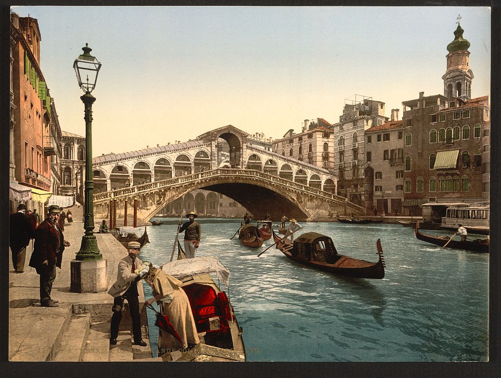
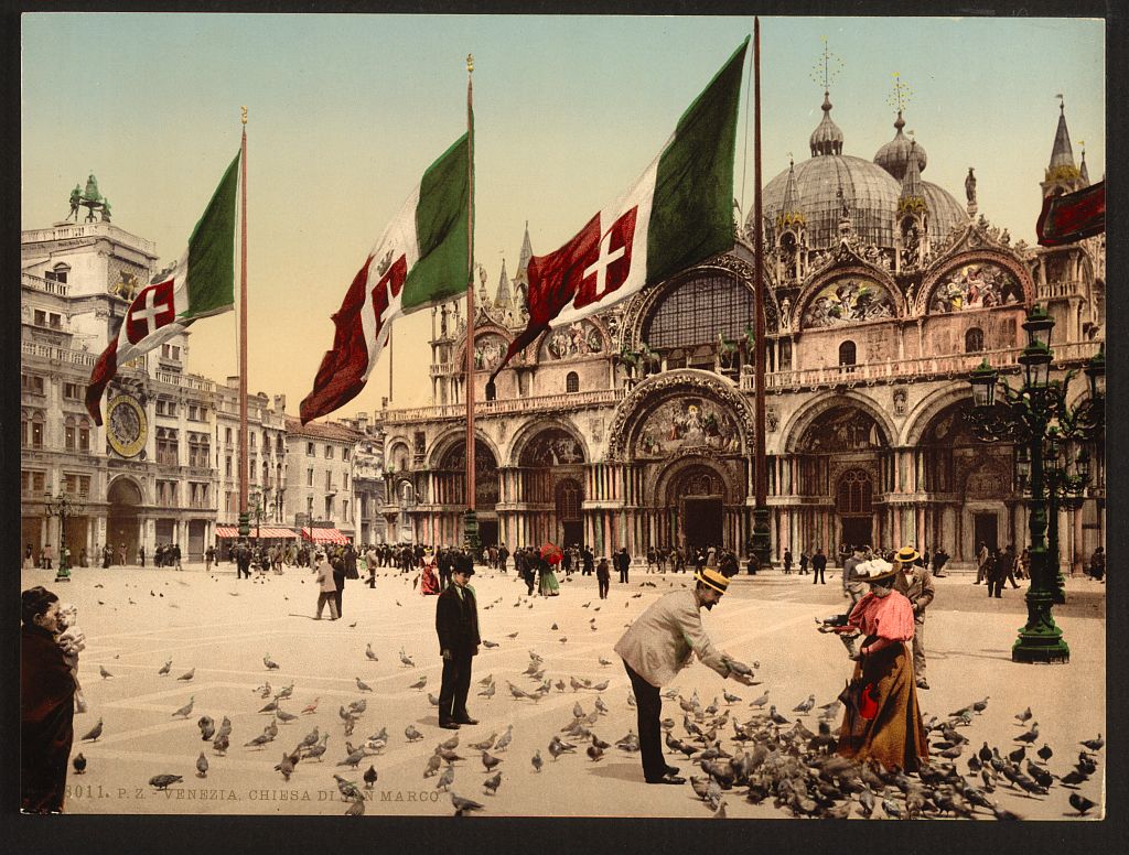
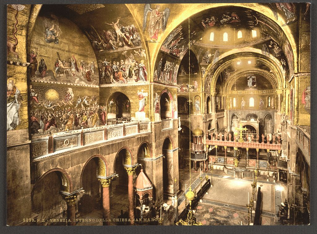
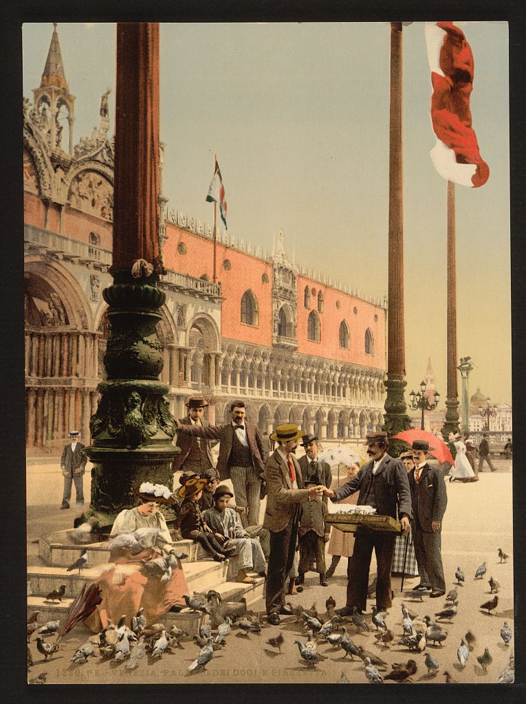
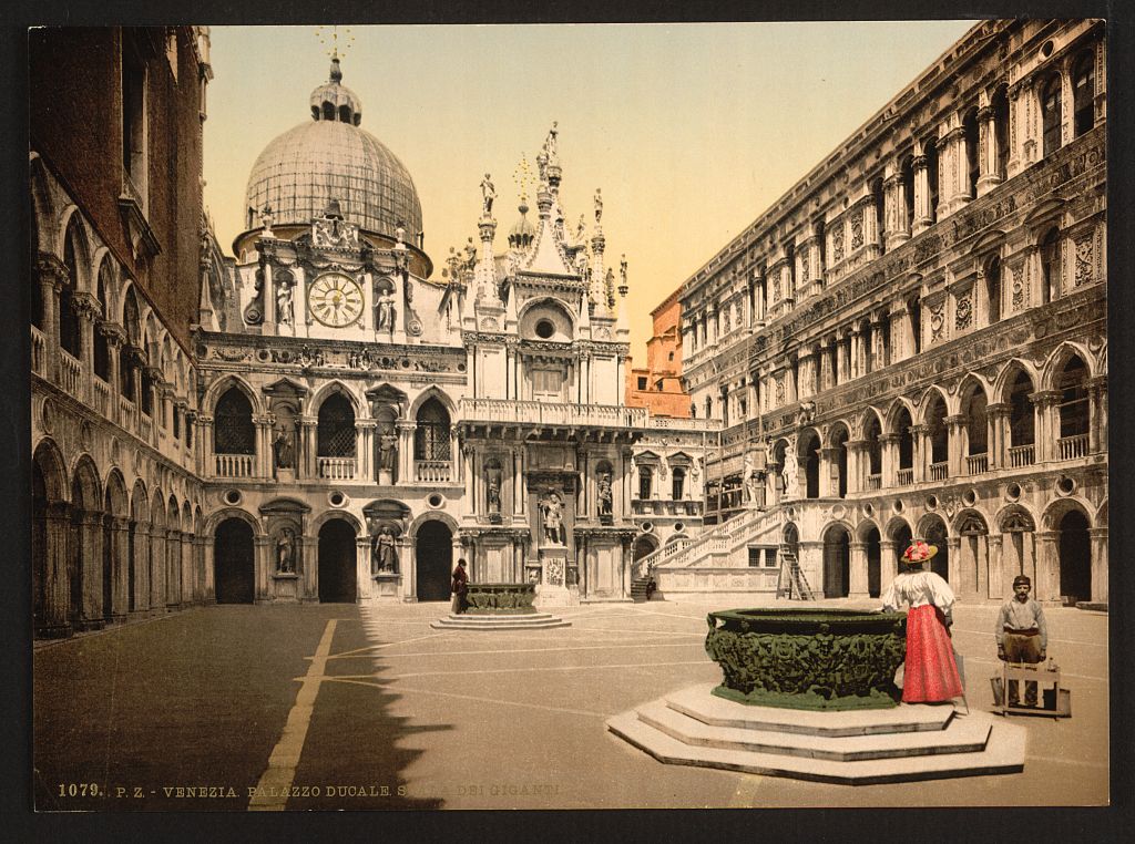
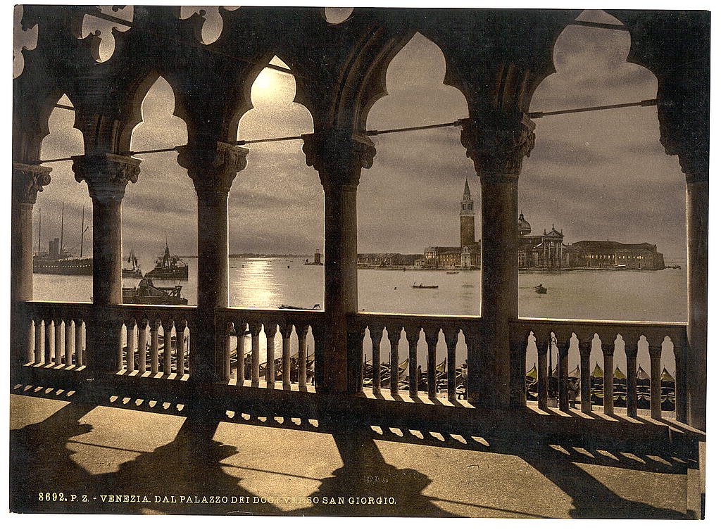
A few months ago, Mental Floss put up a post of “Fantastic 120-Year-Old Color Pictures of Ireland.” Fantastic pictures indeed, although the nature of the technology that produced them seems as interesting to me as the 19th-century Irish life captured in the images themselves. They came from the Library of Congress’ geographically organized archive of photocrom prints, a method perhaps known only to die-hard historical photography enthusiasts. For the rest of us, the Library of Congress’ page on the photocrom process explains it: “Photochrom prints are ink-based images produced through ‘the direct photographic transfer of an original negative onto litho and chromographic printing plates.’ ”
Its inventor Hans Jakob Schmid came up with the technique in the 1880s, a decade that began with color photography consigned to the realm of theory. While Photocrom prints may look an awful lot like color photographs, look at them through a magnifying glass and “the small dots that comprise the ink-based photomechanical image are visible.” “The photomechanical process permitted mass production of the vivid color prints,” each color requiring “a separate asphalt-coated lithographic stone, usually a minimum of six stones and often more than ten stones.”
But that unwieldy-sounding technology and laborious-sounding process has given us, among other striking pieces of visual history, these lush images of fin de siècle Venice, which the writer of place Jan Morris once described as “less a city than an experience.”
We may not consider these “real” color photographs, but the colors they present, vividly applied in the printing process, somehow more accurately represent the spirit of late 19th-century Europe — one of history’s truly vivid periods, in one of its enduringly vivid human environments. More color images of fin-de-siecle Venice can be viewed here.
With her buttoned-up style, work with the UN, and name like a plucky character in a certain English wizard series, Delia Derbyshire may not seem a likely pioneer of experimental electronic music. But her work in the sixties and seventies indeed made her a forerunner of so much contemporary electronic music that most every current legend in the business—from Aphex Twin and the Chemical Brothers to Paul Hartnoll of Orbital, who calls her work “quite amazing” and “timeless”—credits her in some way or another. If you’ve never heard of Derbyshire, you can learn about her life and work in the 2010 BBC Radio 4 documentary above, “Sculptress of Sound.”
As we recently noted in an earlier post, Derbyshire occupies a prominent place in the history of women in the field. She has also worked with everyone from Doctor Who composer Ron Grainer (who took sole credit for their work together) to Paul McCartney. Well almost. McCartney—a huge fan of Derbyshire’s work with the BBC’s Radiophonic Workshop—considered collaborating with her on an early version of “Yesterday,” then went with strings instead. But her near hit with the Beatles showed just how far she had come since joining the BBC as a trainee studio manager in 1960. The previous year, Decca records rejected her application, telling her point blank that they did not hire women for studio work.
For contractual reasons, Derbyshire made many of her radio compositions under pseudonyms, and she may have been frustrated by her near-obscurity. She did withdraw from music in the mid-seventies, not to reappear until a few years before her death in 2001. But perhaps her departure had nothing to do with lack of fame. Derbyshire had the highest of technical standards and a mathematical approach to making music. Once commercial synthesizers became available, she felt that making electronic music had become too easy and her enthusiasm waned. The new music bored her, and instead of trying to hold on to her relevance, she made a graceful exit.
It’s only in recent years that Derbyshire has become recognized for the pioneer she was. See her above profiled in a 2009 short documentary, “The Delian Mode,” by Kara Blake. Featured are Derbyshire’s innovative techniques with manipulated tape machines and found sounds for her TV and film scores and her original compositions under her own name and with influential early electro-pop band White Noise. The Guardian called Derbyshire’s way of making music “an analytical approach to synthesiz[ing] complex sounds from electronic sources.” Her degree in mathematics informed her way of working, as did her conception of herself not primarily as a composer, but also as a scientist. “I suppose in a way,” she said of her painstakingly-created scores, “I was experimenting in psycho-acoustics.” Many of her experiments sound as fresh today as they did at the time, ready to inspire several more generations of composers and musicians.
We're hoping to rely on loyal readers, rather than erratic ads. Please click the Donate button and support Open Culture. You can use Paypal, Venmo, Patreon, even Crypto! We thank you!
Open Culture scours the web for the best educational media. We find the free courses and audio books you need, the language lessons & educational videos you want, and plenty of enlightenment in between.