Founded in London in 1787, The Marylebone Cricket Club (MCC) began publishing The Laws of Cricket in 1788, and later became the governing body of the game. More than two centuries later, the MCC has passed governing responsibilities to The International Cricket Council. But it still publishesThe Laws of Cricket and helps young players and casual fans learn more about the bat-and-ball game that dates back to early 16th-century England, if not before. And let’s face it, if you didn’t grow up in a country that figured into the British Empire, you can probably use a primer. Or maybe 10 animated ones narrated by actor, writer, cricket lover and occasional umpire Stephen Fry. Click the play button on the video above, and you can watch the collection of animations, covering everything from what happens when a “wicket is down” to when the “batsman is out his ground.” When you’re done, you can enjoy some other Fry narrations we’ve featured in blog posts past. See the “relateds” below.
Before he directed such mind-bending masterpieces as Time Bandits, Brazil and Fear and Loathing in Las Vegas, before he became short-hand for a filmmaker cursed with cosmically bad luck, before he became the sole American member of seminal British comedy group Monty Python, Terry Gilliam made a name for himself creating odd animated bits for the UK series Do Not Adjust Your Set. Gilliam preferred cut-out animation, which involved pushing bits of paper in front of a camera instead of photographing pre-drawn cels. The process allows for more spontaneity than traditional animation along with being comparatively cheaper and easier to do.
Gilliam also preferred to use old photographs and illustrations to create sketches that were surreal and hilarious. Think Max Ernst meets Mad Magazine. For Monty Python’s Flying Circus, he created some of the most memorable moments of a show chock full of memorable moments: A pram that devours old ladies, a massive cat that menaces London, and a mustached police officer who pulls open his shirt to reveal the chest of a shapely woman. He also created the show’s most iconic image, that giant foot during the title sequence.
On Bob Godfrey’s series Do It Yourself Film Animation Show, Gilliam delved into the nuts and bolts of his technique. You can watch it above. Along the way, he sums up his thoughts on the medium:
The whole point of animation to me is to tell a story, make a joke, express an idea. The technique itself doesn’t really matter. Whatever works is the thing to use. That’s why I use cut-out. It’s the easiest form of animation I know.
He also notes that the key to cut-out animation is to know its limitations. Graceful, elegant movement à la Walt Disney is damned near impossible. Swift, sudden movements, on the other hand, are much simpler. That’s why there are far more beheadings in his segments than ballroom dancing. Watch the whole clip. If you are a hardcore Python enthusiast, as I am, it is pleasure to watch him work. Below find one of his first animated movies, Storytime, which includes, among other things, the tale of Don the Cockroach. Also don’t miss, this video featuring All of Terry Gilliam’s Monty Python Animations in a Row.
Jonathan Crow is a Los Angeles-based writer and filmmaker whose work has appeared in Yahoo!, The Hollywood Reporter, and other publications. You can follow him at @jonccrow.
The Sonny and Cher Show aired in the years right before I was born. Not only do I have no memory of it, of course, but I don’t believe I’ve ever seen an entire episode, either in re-runs or on the internet. Nevertheless, I immediately recognized the style of the show’s animator, English artist John David Wilson, when I encountered these music videos Wilson made for the singing comedy duo’s variety hour. Though a much less famous name, Wilson’s work seems to have animated the 70s in the way that R. Crumb’s illustrated the 60s. The opening sequences to iconic productions Grease and The Carol Burnett Show are Wilson’s, as are animations for Laugh In and cheesy Saturday morning kids’ show The Hudson Brothers Razzle Dazzle Show (best known now, perhaps, because of Hudson brother progeny Kate Hudson). Though Wilson’s career stretches back to the 50s—with work on Mr. Magoo, Peter Pan, and Lady and the Tramp—and into the 90s, with FernGully: The Last Rainforest, he seems to belong to the decade of “I Got You Babe” more so than any other.
Drawn “in a simplistic, funky-looking style” and with goofy sound effects added (probably by the Sonny and Cher producers), Wilson’s animated films for Joni Mitchell’s “Big Yellow Taxi” (top), Jim Croce’s “Bad, Bad Leroy Brown” (above), and The Kinks “Demon Alcohol” (below, sung by Wayne Carpenter) enhance songs already rich with narrative. This, the blog Media Funhouse points out, was by design: “Wilson was wise to concentrate on the ‘story songs’ of the time, in order to create repeating characters and have the viewer ‘connect’ with the piece in a very short span of time.”
In most cases, Sonny and Cher’s vocals were dubbed over the original tracks, but in many of the animations that surfaced on VHS in the eighties and now appear on Youtube, the original songs have been restored, as in the two above. If you grew up with the show, you’ve surely seen at least a couple of these early music videos, a form Wilson is widely credited with pioneering. Beginning in the second season, Wilson’s company, Fine Arts Films, produced a total of fourteen animated shorts for the show.
The story-songs above of environmental degradation, tough street characters, and the depths of addiction seem so very characteristic of the period, though Wilson certainly animated more lighthearted pop fare, such as Melanie’s “Brand New Key” (sung here by Cher). For more of Wilson’s animated music videos, see Dangerous Minds or Media Funhouse, and for the full range of Wilson’s long career in animation, check out the website of the production company he founded, Fine Arts Films.
Bill Watterson, creator of arguably the last great comic strip, Calvin and Hobbes, wrote the following about perhaps the greatest comic strip ever. “Peanuts pretty much defines the modern comic strip, so even now it’s hard to see it with fresh eyes. The clean, minimalist drawings, the sarcastic humor, the unflinching emotional honesty….” Charles Schulz, the artistic force behind Peanuts, funneled a lifetime of loneliness and emotional pain into these spare little drawings, creating a strip that was bleakly funny, philosophical and real. Characters like the socially inept Charlie Brown or the bossy though oddly tragic Lucy connected with audiences in a way that few ever did.
The one way that Watterson and Schulz differed, and differed greatly, was in the area of merchandising. While Watterson famously refused to license any of his characters (those praying/peeing Calvin car decals, it might surprise you to learn, are not officially sanctioned), Schulz licensed his creations far and wide. For those who grew up in the ‘70s, a Snoopy plush toy was simply de rigueur. The Peanuts characters hawked Dolly Madison snack cakes, MetLife insurance, and Wendy’s kids meals. And those sponsorship deals paid spectacularly well. By the time that Schulz died in February 2000 — the night before the final Peanuts strip was to go to print — he had reportedly earned over the course of his life $1.1 billion dollars.
The first instance of Charlie, Snoopy and the gang being corporate spokescharacters happened to be also the first time they were animated. The Ford Motor Company licensed them in 1959 to do TV commercials along with intros to the Tennessee Ernie Ford Show. You can watch them above. Probably the most striking thing about the commercials is that the adults are intelligible, not the incomprehensible muted trumpet bleats of the Peanuts movies.
The spots proved to be such a success that Schulz and animator Bill Meléndez were soon producing half-hour long TV specials, including the Emmy-winning A Charlie Brown Christmas in 1965. In a 1984 interview, Meléndez talked about working with Schulz, who went by the nickname of “Sparky,” for those first Ford spots.
Well, I was doing Ford commercials at J. Walter Thompson when it was decided that Charlie Brown would be the spokesman for the Ford Falcon. I was told Charles Schulz was very shy and reticent about commercializing his strip. So I went to San Francisco and met Sparky and we hit it off. I told him what we did, and he nodded and said, “All right, we’ll try it.” He was very leery of getting involved with “Hollywood types” as he used to call us.
Of course he understands that his drawings are flat, two-dimensional designs, and that, for example, the front view is very different from the side view. They are not three-dimensional characters. You can’t turn them around the way we used to turn the Walt Disney characters, who were designed to be round and three-dimensional. To animate Peanuts characters we have to be more inventive, because we tend not to be realistic. We don’t try to ape real live action as we did in animating Donald Duck and Mickey Mouse.
I imagine Sparky must have been curious about how we were going to do it, but he never gave us any kind of a hint or anything at all about what he wanted. So we showed him how we thought it should move, how we thought they should turn, how we thought they should walk and he accepted everything. From then on we hit it off pretty well.
Jonathan Crow is a Los Angeles-based writer and filmmaker whose work has appeared in Yahoo!, The Hollywood Reporter, and other publications. You can follow him at @jonccrow.
The CIA fought most of the Cold War on the cultural front, recruiting operatives and placing agents in every possible sphere of influence, not only abroad but at home as well. As Francis Stoner Saunders’ book The Cultural Cold War: the CIA and the World of Arts and Letters details, the agency funded intellectuals across the political spectrum as well as producers of radio, TV, and film. A well-financed propaganda campaign aimed at the American public attempted to persuade the populace that their country looked exactly like its leaders wished to see it, a well-run capitalist machine with equal opportunity for all. In addition to the agency’s various forays into jazz and modern art, the CIA also helped finance and consulted on the production of animated films, like the 1954 adaptation of George Orwell’s Animal Farm we recently featured. We’ve also posted on other animated propaganda films made by government agencies, such as A is for Atom, a PR film for nuclear energy, and Duck and Cover, a short suggesting that cleanliness may help citizens survive a nuclear war.
Today we bring you three short animations funded and commissioned by private interests. These films were made for Arkansas’ Harding College (now Harding University) and financed by longtime General Motors CEO Alfred P. Sloan. The name probably sounds familiar. Today the Alfred P. Sloan Foundation generously supports public radio and television, as well as medical research and other altruistic projects. In the post-war years, Sloan, widely considered “the father of the modern corporation,” writes Karl Cohen in a two-part essay for Animation World Network, supposedly took a shine to the bootstrapping president of Harding, George S. Benson, a Christian missionary and crusading anti-Communist who used his position to promote God, family, and country. According to Cohen, Sloan donated several hundred thousand dollars to Harding as funding for “educational anti-Communist, pro-free enterprise system films.” Contracted by the college, producer John Sutherland, former Disney writer, made nine films in all. As you’ll see in the title card that opens each short, these were ostensibly made “to create a deeper understanding of what has made America the finest place in the world to live.” At the top, watch 1949’s “Why Play Leap Frog?” and just above, see another of the Harding films, “Meet King Joe,” also from 1949.
Just above, watch a third of the Harding propaganda films, “Make Mine Freedom,” from 1948. Each of these films, calling themselves “Fun and Facts about America,” present simplistic patriotic stories with an authoritative narrator who patiently explains the ins and outs of American exceptionalism. “Why Play Leapfrog?” tells the story of Joe, a disgruntled doll-factory worker who learns some important lessons about the supply chain, wages, and prices. He also learns that he’d better work harder to increase his productivity (and cooperate with management) if he wants to keep up with the rising cost of living. “Meet King Joe” introduces us to the “king of the workers of the world,” so called because he can buy more stuff than the poor schlubs in other countries. Joe, “no smarter” and “no stronger than workers in other lands” has such advantages only because of, you guessed it, the wonders of capitalism. “Make Mine Freedom” reminds viewers of their Constitutional rights before introducing us to a snake oil charlatan selling “ism,” a Commie-like tonic, to a group of U.S. labor disputants—if only they’ll sign over their rights and property. The assembled crowd jumps at the chance, but then along comes John Q. Public, who won’t give up his freedom for “some imported double-talk.”
You can read much more about the relationship between Sloan and Benson and the other films Sutherland produced with Sloan’s money, in Cohen’s essay, which also includes information on Cold War animated propaganda films made by Warner Brothers and Disney.
Actually, hold up a sec. We’ll all be more happy and productive if we take a moment to start our work day with Confidence, a peppy musical animation from 1933, starring newly elected PresidentFranklin Delano Roosevelt and Mickey Mouse precursor, Oswald the Lucky Rabbit.
Few Americans—today we’d refer to them as the 1%—could escape the privation of the Great Depression. The movies were one industry that continued to thrive through this dark period, precisely because they offered a few hours of respite. No one went to the pictures to see a reflection of their own lives. Gorgeous gowns, glamorous Manhattan apartments and romantic trouble certain to be resolved in happy endings…remember Mia Farrow’s beleaguered waitress basking in the Purple Rose of Cairo’s reassuring glow?
Given the public’s preference for escapist fare, director Bill Nolan, the Father of Rubber Hose Animation, could have played it safe by glossing over the backstory that leads Oswald to seek out advice from the Commander in Chief. Instead, Nolan delivered his joyful cartoon animals into nightmare territory, the Depression personified as a cowled Death figure laying waste to the land. It’s weirdly upsetting to see those hyper-cheerful vintage barnyard animals (and a rogue monkey) undergo this graphic enervation.
Oh, for some oral history—I’d love to know how matinee crowds reacted as Oswald raced screaming before a spinning vertigo background, seeking a remedy for a host of non-cartoon problems. Irony is a luxury they didn’t have.
Unsurprisingly, the can-do spirit so central to FDR’s New Deal quickly turned Oswald’s frown upside down. As presidential campaign promises go, this one’s uniquely tailored to the demands of musical comedy. Witness Annie, in which the 32nd president was again called upon to Rex Harrison his way into audience hearts, this time from the wheelchair the creators of Confidence didn’t dare show, some forty years earlier.
Accordingly, what really sets this cartoon apart for me is the use of a Presidentially-sanctioned giant syringe as a tool to get Depression-era America back on its feet. A figurative injection of confidence is all well and good, but nothing gets the barnyard back on its singing, dancing feet like a liberal dose, delivered in the most literal way.
Bugs Bunny, that carrot-chomping, cross-dressing rascal, might have been created by Tex Avery in the 1940 cartoon A Wild Hare, but he really came into his own under the direction of Chuck Jones. In cartoons like What’s Opera, Doc and Rabbit Season, Jones refined Bugs’ character, turning him into someone who was witty, resourceful and, most of all, cool. Whether or not he was going up against Elmer Fudd, Yosemite Sam or Marvin the Martian, Bugs always seemed to have the upper hand. Jones once compared Bugs with his vain, self-aggrandizing rival Daffy Duck by saying, “Bugs is who we want to be. Daffy is who we are.”
In the video above, Jones shows you how to draw Bugs, and, of course, he makes it look like a cinch. “If you were to draw Bugs,” says Jones in his clipped, precise diction, “the best way to do it is learn how to draw a carrot and then you can hook a rabbit on to it.” Not the most helpful advice for aspiring animators. Yet watching Jones sketch out the world’s most famous rabbit in a mere couple of minutes is a joy to see.
The trick to drawing Bugs, apparently, is the nose. After roughing out a circle for the head and a reniform oval for the body, Jones draws a tiny triangle for the nose. From there, he sketches out two lines, radiating outward from the nose, which determines the location of Bugs’ ears and eyes. As Jones fills in the rest of the face, he reveals that the inspiration of Bugs’ broad, toothy grin was Norwegian figure skater turned 1930s Hollywood star Sonia Henie. Not, perhaps, the first person to come to mind.
Jonathan Crow is a Los Angeles-based writer and filmmaker whose work has appeared in Yahoo!, The Hollywood Reporter, and other publications. You can follow him at @jonccrow.
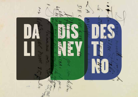
Unlikely collaborations in pop music abound: Run DMC and Aerosmith? It works! U2 and Luciano Pavarotti? Why not? Robert Plant and Alison Krauss? Sure! Anyone and Kermit the Frog? Yes. They don’t always work out, but the attempts, whether kismet or trainwreck, tend to reveal a great deal about the partners’ strengths and weaknesses. Unlikely collaborations in feature film are somewhat rarer, though not for lack of wishing. I would guess the high financial stakes have something to do with this, as well as the sheer number of people required for the average production. One particularly salient example of an ostensible mismatch in animated movies—a planned co-creation by surrealist Salvador Dalí and populist Walt Disney—offers a fascinating look at how the two artists’ careers could have taken very different creative directions. The collaboration may also have fallen victim to a film industry whose economics discourage experimental duets.
We’ve previously featured the animated short— Destino—at the top of the post. The 6 and a half minute film shows us what Dalí and Disney’s planned project might have looked like. Recreated from 17 seconds of original animation and storyboards drawn by Dalí and released in 2003 by Disney’s nephew Roy, Destino gives us an almost perfect symbiosis of the two creators’ sensibilities, with Walt Disney’s Fantasia-like flights smoothly animating Dalí’s fluid dream imagery. According to Chris Pallant, author of Demystifying Disney, work between the two on the original project also moved smoothly, with little friction between the two artists. Meeting in 1945, Dalí and Disney “quickly developed an industrious working relationship” and “ease of collaboration.” Pallant writes that “Disney’s desire for absolute creative control changed, and, for the first time, the animators working within the studio felt the influence of other artistic forces.” I imagine it might prove difficult, if not impossible, to micromanage Salvador Dalí. In any case, the fruitful relationship produced results:
Destino reached a relatively advanced stage before being abandoned. By mid-1946 the Disney- Dalí collaboration encompassed approximately ’80 pen-and-ink sketches’ and numerous ‘storyboards, drawings and paintings that were created over nine months in 1945 and 1946.’
Roy E. Disney discovered Dalí’s Destino artwork in the late 90s, leading to his short re-creation of what might have been. Above, you can flip through a slideshow of twelve of those drawings and storyboards, courtesy of Park West Gallery, who represent the work. The Destino materials went on display at the Drawings Room in Figueres, Spain. The exhibition featured “1 oil painting, 1 watercolour, 15 preparatory drawings—10 of which are unpublished—and 9 photographs of Dalí in the creative process of this material, of the Disney couple in Port Lligat in 1957, and the Dalí couple in Burbank.” You can see many of those photographs in the exhibit’s pamphlet (in pdf here, in Spanish and English; cover image below), which offers a detailed description of the original project, including its narrative concept, a “love story” between a dancer and “baseball-player-cum-god Cronos” meant to represent “the importance of time as we wait for destiny to act on our lives.”
Inspired by a Mexican song by Armando Dominguez, Destino, on its face, seems like a very strange choice for Disney, who generally trafficked in more recognizable (and European) folk-tale sources. And yet, the exhibition pamphlet asserts, the co-production made a great deal of sense for Dalí, “if we consider that one Dalinian constant is his bringing together of the elitist artistic idea and mass culture (and vice versa) […]. Destino becomes a unique artistic product in which Dalinian expressiveness is combined with Disney’s fantasy and sonority, making it a film in which Dalí’s images take on movement and Disney’s figures become ‘Dalinised.’ ”
And yet, while both Dalí and Disney worked excitedly on the project, it was ultimately not to be, at least until almost sixty years later. Destino would have been part of a “package film,” like Fantasia, a compilation of short vignettes. John Hench, a Disney artist who worked on the project with Dalí, speculated that the company “foresaw the end” of such features. Pallant, however, goes further in speculating the film “would have resembled a potential box-office bomb” for Disney, who remarked later that is was “no fault of Dalí’s that the project… was not completed—it was simply a case of policy changes in our distribution plans.”
This cryptic remark, writes Pallant, alludes to Disney’s plans to focus his creative energy on “safe” feature-length projects “to strengthen the company’s position within the film industry.” While such a decision might have made good business sense, it probably doomed many more Destino-like ideas that might have made the Walt Disney company a very different entity indeed. One can only imagine what the studio might have become had Disney opted to pursue experiments like this instead of taking the more profitable route. Of course, given the market pressures on the movie industry, it’s also possible the studio might not have survived at all.
We're hoping to rely on loyal readers, rather than erratic ads. Please click the Donate button and support Open Culture. You can use Paypal, Venmo, Patreon, even Crypto! We thank you!
Open Culture scours the web for the best educational media. We find the free courses and audio books you need, the language lessons & educational videos you want, and plenty of enlightenment in between.