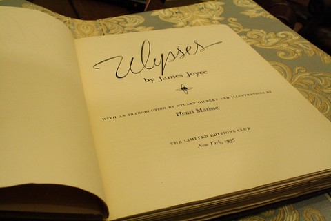
Last year, fans of modernist Irish literature and impressionist art saw a must-own volume go under the hammer at Bonhams. “In 1935 the French artist, Henri Matisse, was commissioned to illustrate an edition of Ulysses for subscribers to the Limited Edition Club in America,” announced Artlyst. “Each of the 1,000 copies was signed by Matisse and 250 were also signed by James Joyce. A copy of the book signed by both men is estimated at £6,000 to £8,000.”
In the event it went for £6,250, not a bad deal considering the hands that wrote those signatures and the rarity, signed or unsigned, of this unusual book itself. (It certainly beats, say, $37,000.) Brainpickings’ Maria Popova writes that, after first spotting the Matisse-illustrated Ulysses here on Open Culture, “I gathered up my year’s worth of lunch money and was able to grab one of the last copies available online — a glorious leather-bound tome with 22-karat gold accents, gilt edges, moire fabric endpapers, and a satin page marker.” Versions signed by Matisse are apparently available–at a steep price–on Amazon.
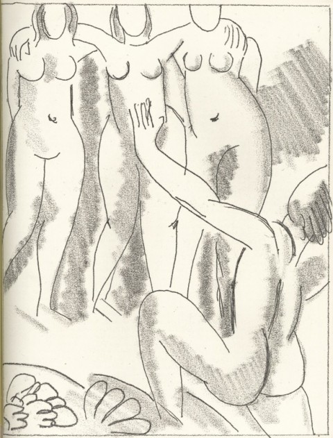
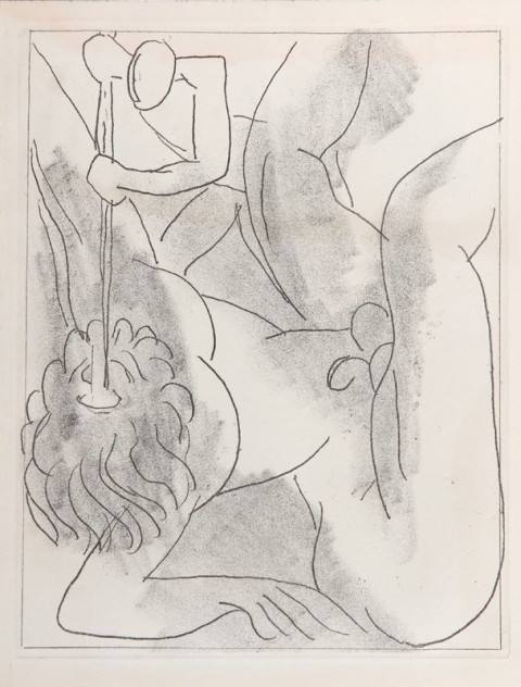
Popova adds that “the Matisse drawings inside it, of course, are the most priceless of its offerings — doubly so because, for all their beauty, they’re a tragicomedy of quasi-collaboration.” From whence the tragicomedy? Publishing lore has it that, despite the provision of a full French translation of the Ulysses text, Matisse made his illustrative etchings — in the fashion of many an undergraduate with a paper due — without ever having got around to reading the book himself.
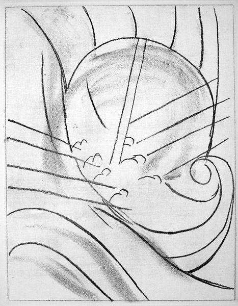
“I’ve never ‘read’ Joyce’s Ulysses, and it’s quite plausible that I never will,” Matisse’s countryman Pierre Bayard would write seventy years later in his bestselling How to Talk About Books You Haven’t Read. Yet “I feel perfectly comfortable when Ulysses comes up in conversation, because I can situate it with relative precision in relation to other books. I know, for example, that it is a retelling of the Odyssey, that its narration takes the form of a stream of consciousness, that its action unfolds in Dublin over the course of a single day, etc.” — all things that Matisse, too, probably knew about Ulysses.

He certainly knew that it supposedly retold the story of the Odyssey, and so, in a now-ingenious-looking strategy to not just talk about an unread book but to illustrate it, he went to the source. Or rather, he went to one of the countless cultural, literary, historical, and linguistic sources upon which Joyce drew to compose his masterpiece, basing his art directly on Homer’s epic poem, in its own way a work more talked about than read. Joyce himself, who once described much of the textual content of Ulysses as intended to “keep the professors busy for centuries arguing over what I meant,” may well have admired Matisse’s clarity of vision, no matter how much-non reading it took to refine.
Related Content:
James Joyce’s Ulysses: Download as a Free Audio Book & Free eBook
Vladimir Nabokov Creates a Hand-Drawn Map of James Joyce’s Ulysses
Read Ulysses Seen, A Graphic Novel Adaptation of James Joyce’s Classic
Henri Matisse Illustrates Baudelaire’s Censored Poetry Collection, Les Fleurs du Mal
Vintage Film: Watch Henri Matisse Sketch and Make His Famous Cut-Outs (1946)
Based in Seoul, Colin Marshall writes and broadcasts on cities and culture. He’s at work on a book about Los Angeles, A Los Angeles Primer, the video series The City in Cinema, the crowdfunded journalism project Where Is the City of the Future?, and the Los Angeles Review of Books’ Korea Blog. Follow him on Twitter at @colinmarshall or on Facebook.