How to Make a Replica of 1900-Year-Old Glass Fish: A Brilliant Video from the British Museum

All due respect to the British Muse­um, but the title of its “How to Make a Glass Fish Repli­ca” video, above is a tad mis­lead­ing.

I’m sure no mal­ice was intend­ed, but “mak­ing” a DIY fish-shaped ves­sel rem­i­nis­cent of some 22 found in the ancient Kushan store­rooms at Begram, Afghanistan is no one’s def­i­n­i­tion of an easy craft project. (Unless you’re will­ing to fudge with some Elmer’s, some blue felt, and an emp­ty peanut but­ter jar…)

Glass Spe­cial­ist Bill Guden­rath of the Corn­ing Muse­um of Glass is an his­to­ri­an of glass­work­ing tech­niques from ancient Egypt through the Renais­sance and clear­ly expert at his craft, but he doesn’t appear to be too keen on sup­ply­ing explana­to­ry blow-by-blows. Nor would I be, bustling around a red hot glass oven, with­out so much as a John­ny Tremain-style leather apron to pro­tect me. I’m not even sure I’d want the dis­trac­tion of a video cam­era in my face.

But if, as the title implies, the goal is to pro­duce a dupli­cate of this whim­si­cal 1900-year-old gup­py, the process must be bro­ken down.

From what this casu­al view­er was able to piece togeth­er, the steps would go some­thing like:

1. Twirl a red hot met­al pipe in the forge until you have a healthy glob of molten glass. Appar­ent­ly it’s not so dif­fer­ent from mak­ing cot­ton can­dy.

2. Roll the glass blob back and forth on a met­al tray.

3. Blow into the pipe’s non-glow­ing end to form a bub­ble.

4. Repeat steps 1–3

5. Roll the pipe back and forth on a met­al sawhorse while seat­ed, apply­ing pinch­ers to taper the blob into a rec­og­niz­ably fishy-shape.

(Don’t wor­ry about its prox­im­i­ty to your bare fore­arms and kha­ki-cov­ered thighs! What could pos­si­bly go wrong?)

6. Twirl it like a baton.

(Depend­ing on the length of your arms, your nascent glass fish may come dan­ger­ous­ly close to the cement floor. Try not to sweat it.)

7. Use scis­sors and pinch­ers to tease out a nip­ple-shaped appendage that will become the fish’s lips.

8. Use anoth­er pok­er to apply var­i­ous bloops of molten glass. (Novices may want to prac­tice with a hot glue gun to get the hang of this — it’s trick­i­er than it looks!)  Pinch, prod and drape these bloops into eye and fin shapes. A non-elec­tric crimp­ing iron will prove handy here.

9. Use blue glass, tweez­ers and crimp­ing iron to per­son­al­ize your fish-shaped vessel’s dis­tinc­tive dor­sal and anal fins.

10. Tap on the pipe to crack the fish loose. (Care­ful!)

11. Score the dis­tal end with a glass cut­ting tool.

 (This step should prove a cinch for any­one who ever used a craft kit to turn emp­ty beer and soda bot­tles into drink­ing glass­es!)

12. Smooth rough edges with anoth­er loop of molten glass and some sort of elec­tric under­wa­ter grind­ing wheel.

Option­al 13th step: Read this descrip­tion of a fur­nace ses­sion, to bet­ter acquaint your­self with both best glass­blow­ing prac­tices and the prop­er names for the equip­ment. Or get the jump on Christ­mas 2017 with this true how-to guide to pro­duc­ing hand blown glass orna­ments.

Not plan­ning on blow­ing any glass, fish-shaped or oth­er­wise, any time soon?

Explore the some­what mys­te­ri­ous his­to­ry of the 1900-year-old fish-shaped orig­i­nal here, com­pli­ments of the British Museum’s St John Simp­son, senior cura­tor for its pre-Islam­ic col­lec­tions from Iran and Ara­bia.

Relat­ed Con­tent:

Mod­ern Artists Show How the Ancient Greeks & Romans Made Coins, Vas­es & Arti­sanal Glass

Glass: The Oscar-Win­ning “Per­fect Short Doc­u­men­tary” on Dutch Glass­mak­ing (1958)

How to Bake Ancient Roman Bread Dat­ing Back to 79 AD: A Video Primer

Ayun Hal­l­i­day is an author, illus­tra­tor, the­ater mak­er and Chief Pri­ma­tol­o­gist of the East Vil­lage Inky zine.  Her play Zam­boni Godot is open­ing in New York City in March 2017. Fol­low her @AyunHalliday.

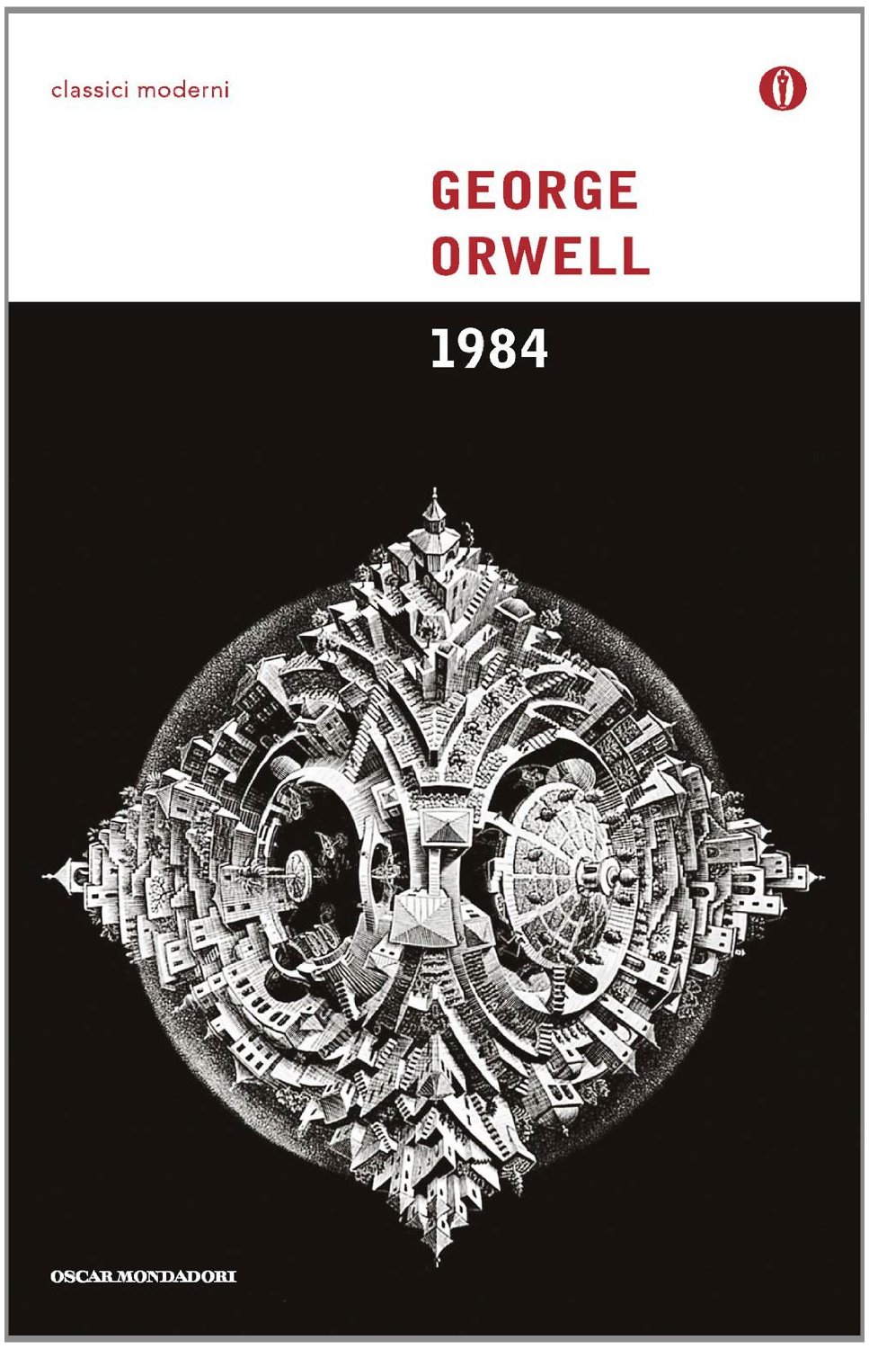
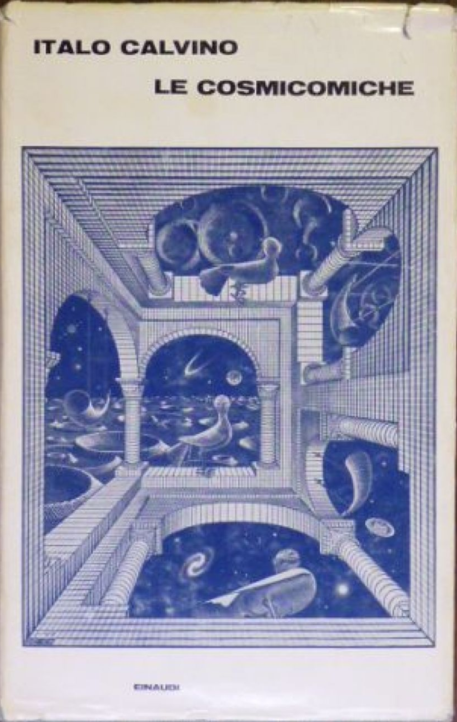
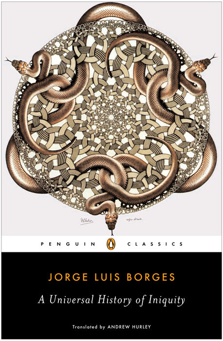
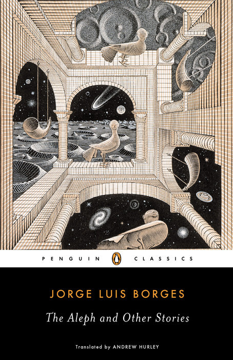
M.C. Escher Cover Art for Great Books by Italo Calvino, George Orwell & Jorge Luis Borges

The writer David Auer­bach once post­ed a fas­ci­nat­ing inquest on left-brained lit­er­a­ture, an exam­i­na­tion of what he calls “a par­al­lel track of lit­er­a­ture that is pop­u­lar specif­i­cal­ly among engi­neers,” exclud­ing genre fic­tion (sci­ence- or oth­er­wise), with an eye toward “which nov­els of some noto­ri­ety and good PR hap­pen to attract mem­bers of the engi­neer­ing pro­fes­sions.” Favored author names turn out to include Richard Pow­ers, Umber­to Eco, Haru­ki Muraka­mi, William Gib­son, Ita­lo Calvi­no, and Jorge Luis Borges.

More of these lit­er­ar­i­ly inclined left-brain­ers exist than one might imag­ine. From the pub­lish­er’s point of view, what cov­er art could best attract them? Books tar­get­ed toward that demo­graph­ic could do far worse than to use the work of M.C. Esch­er, who spent his career with one foot in art and the oth­er in math­e­mat­ics.

In the hith­er­to unseen (and even unimag­ined) worlds pic­tured in his wood­cuts, lith­o­graphs, and mez­zot­ints, he made use of math­e­mat­i­cal con­cepts from tes­sel­la­tion to reflec­tion to infin­i­ty in ways at once impos­si­ble and some­how plau­si­ble, all of them still intel­lec­tu­al­ly and aes­thet­i­cal­ly com­pelling today.

The non-nov­el­ist Dou­glas Hof­s­tadter appears in Auer­bach’s inquest since his best-known work, Gödel, Esch­er, Bach: an Eter­nal Gold­en Braid, “which part­ly uses fic­tion­al forms, is too great not to list.” Not only does Escher’s name appear in Hof­s­tadter’s book title, his art informs its cen­tral con­cepts. “Hof­s­tadter wove a net­work of con­nec­tions link­ing the math­e­mat­ics of Gödel, the art of Esch­er, and the music of Bach,” writes Allene M. Park­er in the paper “Draw­ing Borges: a Two-Part Inven­tion on the Labyrinths of Jorge Luis Borges and M.C. Esch­er.” In Gödel, Esch­er, Bach he describes their com­mon denom­i­na­tor as a “strange loop,” a phe­nom­e­non that “occurs when­ev­er, by move­ment upwards (or down­wards) through the lev­els of some hier­ar­chi­cal sys­tem, we unex­pect­ed­ly find our­selves right back where we start­ed.”

Park­er iden­ti­fies 1948’s “Draw­ing Hands” as a “par­tic­u­lar­ly strik­ing and famil­iar exam­ple” of a strange loop in Escher’s work. We can inter­pret that image by rec­og­niz­ing that “it is Esch­er, the artist, who is draw­ing both hands and who stands out­side this par­tic­u­lar puz­zle.” Or we can “adopt a Zen-inspired solu­tion and let mys­tery be mys­tery by choos­ing to embrace a uni­ty which con­tains oppo­si­tions,” such as one described by the open­ing of Borges’ poem “Labyrinths”:

There’ll nev­er be a door. You’re inside

and the keep encom­pass­es the world

and has nei­ther obverse nor reverse

nor cir­cling in secret cen­ter.

The Esch­er-Borges con­nec­tions go deep­er beyond, and as you can see in John Coulthart’s orig­i­nal post, the selec­tion of Esch­er-cov­ered books extends far­ther.

Aside from count­less non­fic­tion pub­li­ca­tions, the Dutch math­e­mat­i­cal mas­ter’s work has graced sci­ence-fic­tion and fan­ta­sy mag­a­zines, one edi­tion of Flat­land, a col­lec­tion of “Forteana, weird fic­tion, occultism and his­tor­i­cal spec­u­la­tion,” Clive Bark­er’s The Damna­tion Game, and George Orwell’s 1984, a nov­el more wide­ly read than ever by the left- and right-brained alike. But no mat­ter which hemi­sphere we favor, Esch­er — like Orwell, Borges, and Calvi­no — shows us how to see real­i­ty in more inter­est­ing ways.

via John Coulthart

Relat­ed Con­tent:

Watch M.C. Esch­er Make His Final Artis­tic Cre­ation in the 1971 Doc­u­men­tary Adven­tures in Per­cep­tion

Meta­mor­phose: 1999 Doc­u­men­tary Reveals the Life and Work of Artist M.C. Esch­er

Inspi­ra­tions: A Short Film Cel­e­brat­ing the Math­e­mat­i­cal Art of M.C. Esch­er

The Cov­er of George Orwell’s 1984 Becomes Less Cen­sored with Wear and Tear

Based in Seoul, Col­in Mar­shall writes and broad­casts on cities and cul­ture. He’s at work on a book about Los Ange­les, A Los Ange­les Primer, the video series The City in Cin­e­ma, the crowd­fund­ed jour­nal­ism project Where Is the City of the Future?, and the Los Ange­les Review of Books’ Korea Blog. Fol­low him on Twit­ter at @colinmarshall or on Face­book.

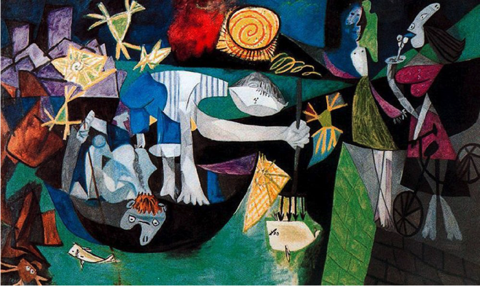
How To Understand a Picasso Painting: A Video Primer

night-fishing-picasso

Some­times it’s hard for the untrained eye to fig­ure out what exact­ly is going on in a Picas­so.

For­tu­nate­ly, the artist leaned toward infor­ma­tive, work­man­like titles.

Had he titled “Night Fish­ing at Antibes,” below, some­thing a bit more opaque—“Untitled No. 2,” say—the une­d­u­cat­ed eye might well per­ceive the nar­ra­tive as some­thing clos­er to “Drunk­en Night in a Con­vey­er Belt Sushi Joint.”

Even know­ing the cor­rect title, my gut still argues that the boomerang-head­ed lady with boobs like lips is singing karaoke…

But after watch­ing the above video by Evan Puschak, aka The Nerd­writer, I’m will­ing to con­cede that she’s stand­ing on a jet­ty, a like­ly amal­ga­ma­tion of two of Picas­so’s lovers.

(The less volup­tuous crea­ture stand­ing next to her is his wife, and my gut is eager to know why it looks like she’s top­less, a point on which Pushak is frus­trat­ing­ly mum.)

His process for under­stand­ing a Picas­so takes the gut response into account, but then flesh­es things out with four addi­tion­al steps. You can apply them to many oth­er artists’ work too.

  1. First reac­tion
  2. Con­tent
  3. Form
  4. His­tor­i­cal con­text
  5. Per­son­al con­text

It’s cer­tain­ly help­ful to know that the paint­ing was made in 1939.

You prob­a­bly don’t need the Inter­net to guess what world events were like­ly a source of pre­oc­cu­pa­tion for the artist, whose “Guer­ni­ca” was com­plet­ed just two years ear­li­er.

Con­tent-wise, Puschak truf­fles up some inter­est­ing geo­graph­i­cal ref­er­ences that elude most online analy­sis of the work. For instance, those pur­ple blocks in the upper left cor­ner now house the Musée Picas­so.

There may well be a sixth step. Ear­li­er, when a fan of the Nerdwriter’s week­ly video essay series asked Puschak how to under­stand art, he respond­ed:

All good art is try­ing to tell you some­thing about your life. Your life… specif­i­cal­ly. So under­stand­ing art is a process of under­stand­ing your­self, and vice ver­sa. In both cas­es, you only learn by engag­ing. Watch­ing isn’t enough, nei­ther is read­ing or lis­ten­ing or think­ing for that mat­ter. From my per­spec­tive, engage­ment means writ­ing. An idea that’s been snaking around in my videos for a long time is that we learn by say­ing, not think­ing. You know some­thing when you can artic­u­late it, and for that you need words and sen­tences and para­graphs. So intro­spect, write down what your mind is doing. And when you watch a movie or look at a paint­ing, write down how you feel about it. You’ll be amazed how one informs the oth­er, and before long you’ll see some beau­ti­ful sparks. 

Below are some of the resources Puschak cred­its with inform­ing this Nerd­writer episode:

Rudolf Arn­heim, “Picas­so’s Night Fish­ing at Antibes” The Jour­nal of Aes­thet­ics and Art Crit­i­cism — Vol. 22, No. 2 (Win­ter, 1963), pp. 165–167

Dou­glas N. Mor­gan, “Picas­so’s Peo­ple: A Les­son in Mak­ing Sense” The Jour­nal of Aes­thet­ics and Art Crit­i­cism Vol. 22, No. 2 (Win­ter, 1963), pp. 167–171

Nina Coraz­zo, “Picas­so’s ‘Night Fish­ing at Antibes’: A New Source” The Burling­ton Mag­a­zine Vol. 132, No. 1043 (Feb., 1990), pp. 99–101

Mark Rosen­thal, “Picas­so’s Night Fish­ing at Antibes: A Med­i­ta­tion on Death” The Art Bul­letin Vol. 65, No. 4 (Dec., 1983), pp. 649–658

Albert Boime, “Picas­so’s “Night Fish­ing at Antibes”: One More Try” The Jour­nal of Aes­thet­ics and Art Crit­i­cism Vol. 29, No. 2 (Win­ter, 1970), pp. 223–226

Tim­o­thy Anglin Bur­gard, “Picas­so’s Night Fish­ing at Antibes: Auto­bi­og­ra­phy, Apoc­a­lypse, and the Span­ish Civ­il War” The Art Bul­letin Vol. 68, No. 4 (Dec., 1986), pp. 657–672

Lawrence D. Steefel, Jr., “Body Imagery in Picas­so’s “Night Fish­ing at Antibes” Art Jour­nal Vol. 25, No. 4 (Sum­mer, 1966), pp. 356–363+376

You can view the Nerdwriter’s oth­er videos on his web­site or sub­scribe to his YouTube chan­nel where a new video is pub­lished every Wednes­day.

Relat­ed Con­tent:

Watch Picas­so Cre­ate Entire Paint­ings in Mag­nif­i­cent Time-Lapse Film (1956)

The Mys­tery of Picas­so: Land­mark Film of a Leg­endary Artist at Work, by Hen­ri-Georges Clouzot

How to Look at Art: A Short Visu­al Guide by Car­toon­ist Lyn­da Bar­ry

Ayun Hal­l­i­day is an author, illus­tra­tor, the­ater mak­er and Chief Pri­ma­tol­o­gist of the East Vil­lage Inky zine.  Her play Zam­boni Godot is open­ing in New York City in March 2017. Fol­low her @AyunHalliday.

The Velvet Underground & Andy Warhol Stage Proto-Punk Performance Art: Discover the Exploding Plastic Inevitable (1966)

Punk rock, an art­less pro­le­tar­i­an sneer, a work­ing-class revolt against bour­geois tastes, good man­ners, and cor­rupt sys­tems of con­sump­tion. Right? Sure… and also pure per­for­mance art. Or do we for­get that its fore­bears were avant-garde fringe artists: whether Iggy Pop onstage fight­ing a vac­u­um clean­er and blender and smear­ing peanut but­ter on him­self, or Pat­ti Smith read­ing her Rim­baud-inspired poet­ry at CBGB’s. And before rock crit­ic Dave Marsh first used the word “Punk” (to describe Ques­tion Mark and the Mysterians)—before even Sgt. Pepper’s and the death of Jimi Hendrix—there came the Vel­vet Under­ground, pro­tégés of Andy Warhol and dark psy­che­del­ic pio­neers whose ear­ly songs were as punk rock as it gets.

Some evi­dence: a dog-eared copy of Please Kill Me, the “uncen­sored oral his­to­ry of punk,” which begins with the Vel­vets and, specif­i­cal­ly John Cale remem­ber­ing 1965: “I couldn’t give a shit about folk music… The first time Lou Played ‘Hero­in’ for me it total­ly knocked me out. The words and music were so raunchy and dev­as­tat­ing.… Lou had these songs where there was an ele­ment of char­ac­ter assas­si­na­tion going on.” Now these days, every­one from the may­or of Lon­don to Shake­speare has been asso­ci­at­ed with punk, but maybe Lou Reed first defined its raunch­i­ness and dev­as­ta­tion back in the mid-six­ties. And the per­for­mances of those songs were sheer art-rock spec­ta­cle, thanks to Andy Warhol’s Explod­ing Plas­tic Inevitable, or EPI.

Crit­ic Wayne McGuire described these Explod­ing Plas­tic Inevitable per­for­mances, orga­nized in 1966 and 1967, as “elec­tron­ic: inter­me­dia: total scale.” The Explod­ing Plas­tic Inevitable enveloped the Vel­vets in a dark, hazy, strobe-lit cir­cus. Writer Bran­den Joseph describes it in detail:

… the Explod­ing Plas­tic Inevitable includ­ed three to five film pro­jec­tors, often show­ing dif­fer­ent reels of the same film simul­ta­ne­ous­ly: a sim­i­lar num­ber of slide pro­jec­tors, mov­able by hand so that their images swept the audi­to­ri­um; four vari­able-speed strobe lights; three mov­ing spots with an assort­ment of coloured gels; sev­er­al pis­tol lights; a mir­ror ball hung from the ceil­ing and anoth­er on the floor; as many as three loud­speak­ers blar­ing dif­fer­ent pop records at once; one or two sets by the Vel­vet Under­ground and Nico…

… and so on. “It doesn’t go togeth­er,” wrote Lar­ry McCombs in a 1966 review, “But some­times it does.” Warhol had attempt­ed to stage sim­i­lar events since 1963, with a short-lived band called the Druids, which includ­ed New York avant-garde com­pos­er La Monte Young (“the best drug con­nec­tion in New York,” remem­bered Bil­ly Name). Then Warhol met the Vel­vet Under­ground at the Café Bizarre, forced the broody Nico on them, and it sud­den­ly came togeth­er. The new, Warhol-man­aged band first launched at film­mak­er Jonas Mekas’ Ciné­math­èque the­ater. “Andy would show his movies on us,” remem­bers Reed, “We wore black so you could see the movie. But we were all wear­ing black any­way.”

As you can see in the 1966 film at the top of an EPI/Velvets per­for­mance, Reed’s pro­to-punk odes to intra­venous drugs and sado­masochism pro­vid­ed the ide­al sound­track to Warhol’s cel­e­bra­tions of the trag­i­cal­ly hip and pret­ty. The expe­ri­ence (at least as recre­at­ed by the Warhol Muse­um) put art stu­dent Karen Lue in mind of “Wagner’s gesamtkunst­werk, or a total work of art.” The film we expe­ri­ence here was shot by direc­tor Ronald Nameth at an EPI hap­pen­ing at Poor Richards in Chica­go.

The over­dubbed sound­track blends record­ings of “I’ll Be Your Mir­ror” and “Euro­pean Son,” “It Was a Plea­sure” from Nico’s Chelsea Girl, and live ver­sions of “Hero­in” and “Venus in Furs,” with John Cale on vocals. This par­tic­u­lar hap­pen­ing fea­tured nei­ther Reed nor Nico, so Cale took the lead. Nonethe­less, as Ubuweb writes, Nameth’s film “is an expe­ri­ence” ful­ly rep­re­sen­ta­tive of “Warhol’s hell­ish sen­so­ri­um… the most unique and effec­tive dis­cotheque envi­ron­ment pri­or to the Fillmore/Electric Cir­cus era.” The short “ris­es above a mere graph­ic exer­cise,” mak­ing “kinet­ic empa­thy a new kind of poet­ry” and a visu­al record of how punk arose as much from art-house the­aters and gal­leries as it did from dive bars and garages.

Relat­ed Con­tent:    

A Sym­pho­ny of Sound (1966): Vel­vet Under­ground Impro­vis­es, Warhol Films It, Until the Cops Turn Up

Nico, Lou Reed & John Cale Sing the Clas­sic Vel­vet Under­ground Song ‘Femme Fatale’ (Paris, 1972)

Pat­ti Smith Plays at CBGB In One of Her First Record­ed Con­certs, Joined by Sem­i­nal Punk Band Tele­vi­sion (1975)

Josh Jones is a writer and musi­cian based in Durham, NC. Fol­low him at @jdmagness

500+William S. Burroughs Book Covers from Across the Globe: 1950s Through the 2010s

burroughs-hungary

William S. Bur­roughs has shown gen­er­a­tions of read­ers that the writ­ten word can pro­vide expe­ri­ences they’d nev­er before imag­ined. But to get to Bur­roughs’ writ­ten words, most of those read­ers have entered through his covers—or rather, through the cov­ers that a host of pub­lish­ers, all over the world and for over six­ty years now—have con­sid­ered suf­fi­cient­ly appeal­ing rep­re­sen­ta­tions of Bur­roughs’ dar­ing, exper­i­men­tal, and not-espe­cial­ly-rep­re­sentable lit­er­ary work. You can see over 500 of these efforts at the Bur­roughs page of beatbookcovers.com.

burroughs-covers-2

As mild-man­nered as he could seem in per­son, Bur­roughs’ life and work, what with the drugs, the acquain­tance with the homo­sex­u­al under­world, and the reck­less gun­play, has always attract­ed an air of the sor­did and sen­sa­tion­al. Pub­lish­ers did­n’t hes­i­tate to exploit that, as we can see in the first edi­tion of Bur­roughs’ first pub­lished work Junkie just above. Not only did it come out as a 35-cent mass-mar­ket two-in-one paper­back, it promised the “con­fes­sions of an unre­deemed drug addict,” and with that lurid illus­tra­tion implied so much more besides. No mat­ter how much read­er­ly curios­i­ty it piqued, how much of an artis­tic future could some­one impulse-buy­ing it at the drug­store have imag­ined for this “William Lee” fel­low?

burroughs-covers-3

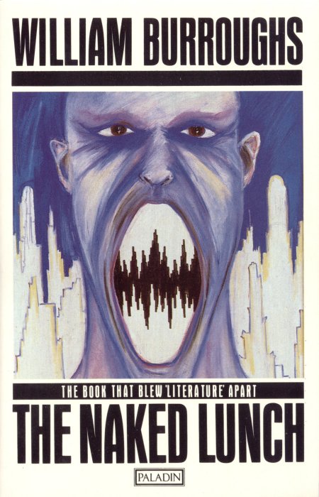
More curi­ous read­ers have prob­a­bly become Bur­roughs fans by pick­ing up The Naked Lunch, his best-known nov­el but a more con­tro­ver­sial and much less con­ven­tion­al­ly com­posed one than Junkie. This sto­ry of William Lee (now just the name of the pro­tag­o­nist, not an autho­r­i­al pseu­do­nym) and his sub­stance-fueled odyssey through Amer­i­ca, Mex­i­co, Moroc­co, the fic­tion­al Annex­ia and far beyond has had many and var­ied visu­al rep­re­sen­ta­tions, all of which try to con­vey how stren­u­ous­ly the text strug­gles against the stric­tures of tra­di­tion­al forms of writ­ing. Some­times, as in the 1986 U.K. edi­tion from Pal­adin above, they resort to telling rather than just show­ing you that you hold in your hands “the book that blew ‘lit­er­a­ture’ apart.”

burroughs-covers-4

Those of us who get deep into Bur­roughs’ work often do so because it tran­scends genre. Still, that has­n’t stopped mar­ket­ing depart­ments from try­ing to place him in one genre or anoth­er, or at least to sell cer­tain of his books as if they belonged in one genre or anoth­er. The “Nova tril­o­gy” with which Bur­roughs fol­lowed up Naked Lunch, has tend­ed to appear on the sci­ence-fic­tion shelves of book­stores around the world, not com­plete­ly with­out rea­son. Still, the sen­si­bil­i­ties of the sci-fi world and Bur­roughs’ mind do clash some­what, pro­duc­ing such intrigu­ing results as the 1978 Japan­ese edi­tion of Nova Express above.

burroughs-covers-5

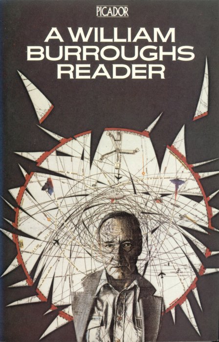
Ulti­mate­ly, the only image that reli­ably con­veys the work of William S. Bur­roughs is the image of William S. Bur­roughs, which appears on the cov­er of this 1982 Pic­a­dor William Bur­roughs Read­er as well as many oth­er books besides. As any­one who’s gone deep into his bib­li­og­ra­phy knows, the work and the man don’t come sep­a­rate­ly, but they’ll sure­ly always remem­ber the cov­er that led them into his world in the first place, whether it bore images sub­dued or sen­sa­tion­al­is­tic, a design grim­ly real or for­bid­ding­ly abstract, or a prop­er warn­ing about just what it was they were get­ting into.

Vis­it all 500+ William S. Bur­roughs books cov­ers here.

Relat­ed Con­tent:

The Visu­al Art of William S. Bur­roughs: Book Cov­ers, Por­traits, Col­lage, Shot­gun Art & More

Loli­ta Book Cov­ers: 100+ Designs From 37 Coun­tries (Plus Nabokov’s Favorite Design)

Hear a Great Radio Doc­u­men­tary on William S. Bur­roughs Nar­rat­ed by Iggy Pop

83 Years of Great Gats­by Book Cov­er Designs: A Pho­to Gallery

600+ Cov­ers of Philip K. Dick Nov­els from Around the World: Greece, Japan, Poland & Beyond

Down­load 650 Sovi­et Book Cov­ers, Many Sport­ing Won­der­ful Avant-Garde Designs (1917–1942)

The Art of the Book Cov­er Explained at TED

Based in Seoul, Col­in Mar­shall writes and broad­casts on cities and cul­ture. He’s at work on a book about Los Ange­les, A Los Ange­les Primer, the video series The City in Cin­e­ma, the crowd­fund­ed jour­nal­ism project Where Is the City of the Future?, and the Los Ange­les Review of Books’ Korea Blog. Fol­low him on Twit­ter at @colinmarshall or on Face­book.

Man Ray Designs a Supremely Elegant, Geometric Chess Set in 1920–and It Now Gets Re-Issued

Yes­ter­day, Col­in Mar­shall fea­tured Man Ray’s “Sur­re­al­ist Chess­board” from 1934, which paid homage to the lead­ers of the Sur­re­al­ist move­ment. Though artis­ti­cal­ly sig­nif­i­cant, the chess­board had some prac­ti­cal lim­i­ta­tions. Made up of only 20 squares (as com­pared to the tra­di­tion­al 64), the “Sur­re­al­ist Chess­board” would­n’t let you play an actu­al game of chess.

For that, we need to turn to Man Ray’s chess set fash­ioned in 1924. Made of abstract geo­met­ric forms, this set (on dis­play above, jump to the 3:30 mark to real­ly see it) fea­tured some uncon­ven­tion­al chess pieces: the king is a pyra­mid; the queen, a cone; the cas­tle, a cube; the bish­op, a bot­tle; the knight, the head scroll of a vio­lin; and the pawn, an ele­gant sphere.

We said you could actu­al­ly play chess on this board. And indeed you can. In 2012, the Man Ray Trust autho­rized a new edi­tion of this set, mak­ing it avail­able to chess enthu­si­asts look­ing for a hand­some set. Craft­ed in Ger­many, it’s made of sol­id beech wood.

This chess­board you can obtain.

As for the oth­er mod­ern chess­board Man Ray designed in 1945, it may be out of your league. David Bowie owned one of the few exist­ing copies of that 1945 board, and, ear­li­er this month, it sold for $1.3 mil­lion at a Sothe­by’s auc­tion in Lon­don.

For more infor­ma­tion on Man Ray’s chess­boards, read this short arti­cle from Chess Col­lec­tors Inter­na­tion­al (see page 18). Or see The Imagery of Chess Revis­it­ed, which cov­ers Man Ray’s boards and beyond.

If you would like to sup­port the mis­sion of Open Cul­ture, con­sid­er mak­ing a dona­tion to our site. It’s hard to rely 100% on ads, and your con­tri­bu­tions will help us con­tin­ue pro­vid­ing the best free cul­tur­al and edu­ca­tion­al mate­ri­als to learn­ers every­where. You can con­tribute through Pay­Pal, Patre­on, and Ven­mo (@openculture). Thanks!

Relat­ed Con­tent:

Man Ray Cre­ates a “Sur­re­al­ist Chess­board,” Fea­tur­ing Por­traits of Sur­re­al­ist Icons: Dalí, Bre­ton, Picas­so, Magritte, Miró & Oth­ers (1934)

Man Ray’s Por­traits of Ernest Hem­ing­way, Ezra Pound, Mar­cel Duchamp & Many Oth­er 1920s Icons

Man Ray and the Ciné­ma Pur: Four Sur­re­al­ist Films From the 1920s

Watch Dreams That Mon­ey Can Buy, a Sur­re­al­ist Film by Man Ray, Mar­cel Duchamp, Alexan­der Calder, Fer­nand Léger & Hans Richter

Mar­cel Duchamp, Chess Enthu­si­ast, Cre­at­ed an Art Deco Chess Set That’s Now Avail­able via 3D Print­er

by | Permalink | Make a Comment ( 2 ) |

Blade Runner Gets Re-Created, Shot for Shot, Using Only Microsoft Paint

msp-blade-runner2

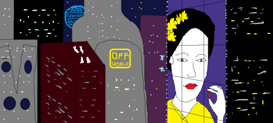
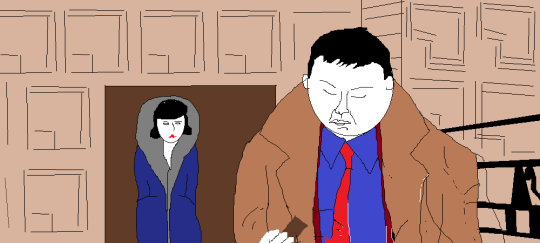
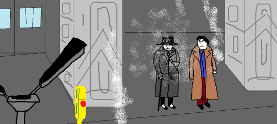
Blade Run­ner came out in June 1982. Microsoft­’s Paint came out in Novem­ber 1985. Lit­tle could the design­ers of that rebrand­ed ver­sion of ZSoft­’s PC Paint­brush pack­aged in with Win­dows 1.0 know that the paths of their hum­ble graph­ics appli­ca­tion and that elab­o­rate sci-fi cin­e­mat­ic vision would cross just over 30 years lat­er. Sure­ly nobody involved in either project could have imag­ined the form the inter­sec­tion would take: MSP Blade Run­ner, a fan’s shot-by-shot Tum­blr “remake” (and gen­tle par­o­dy) of the film using only Microsoft Paint, start­ing with the Ladd Com­pa­ny tree logo.

msp-blade-runner

Why make such a thing? “I like the idea of hav­ing a blog but basi­cal­ly feel as if I have very lit­tle to say about things, at least things that are orig­i­nal or inter­est­ing,” cre­ator David Mac­Gowan told Moth­er­board­’s Rachel Pick. “I grav­i­tat­ed to Tum­blr with some idea of just post­ing pic­tures, but still felt I need­ed to be post­ing some­thing I’d actu­al­ly made myself… [Y]ears ago I used to draw real­ly crap­py basic MS Paint pics for a favourite pop group’s fan site, and they always seemed to raise a smile. The idea of doing some­thing else with MS Paint, a kind of cel­e­bra­tion of my not being deterred by lack of artis­tic tal­ent, nev­er real­ly went away.”

msp-blade-runner-3

The mix­ture of tech­no­log­i­cal and aes­thet­ic sen­si­bil­i­ties inher­ent in using a severe­ly out­dat­ed but ever-present dig­i­tal tool to re-cre­ate the endur­ing­ly com­pelling ana­log visu­als of a movie from that same era goes well with the orig­i­nal Blade Run­ner’s project of updat­ing the con­ven­tions of film noir to depict a then-new­ly imag­ined future. Even more fit­ting­ly, a work like MSP Blade Run­ner could only make sense in the 2010s, the very decade the movie tried to envi­sion. Will it go all the way to the shot of Deckard and Rachel’s final exit into the ele­va­tor? “I don’t real­ly think about giv­ing up,” McGowan told Pick. “The idea of actu­al­ly com­plet­ing some­thing I start out to do (for once in my life) is very appeal­ing.” Spo­ken like a 21st-cen­tu­ry man indeed.

msp-blade-runner

You can find every frame paint­ed so far, and every new one to come, here.

Relat­ed Con­tent:

Watch an Ani­mat­ed Ver­sion of Rid­ley Scott’s Blade Run­ner Made of 12,597 Water­col­or Paint­ings

What Hap­pens When Blade Run­ner & A Scan­ner Dark­ly Get Remade with an Arti­fi­cial Neur­al Net­work

The Art of Mak­ing Blade Run­ner: See the Orig­i­nal Sketch­book, Sto­ry­boards, On-Set Polaroids & More

Based in Seoul, Col­in Mar­shall writes and broad­casts on cities and cul­ture. He’s at work on a book about Los Ange­les, A Los Ange­les Primer, the video series The City in Cin­e­ma, the crowd­fund­ed jour­nal­ism project Where Is the City of the Future?, and the Los Ange­les Review of Books’ Korea Blog. Fol­low him on Twit­ter at @colinmarshall or on Face­book.

Man Ray Creates a “Surrealist Chessboard,” Featuring Portraits of Surrealist Icons: Dalí, Breton, Picasso, Magritte, Miró & Others (1934)

surrealist-chess-board-1

Like most artists, Emmanuel Rad­nitzky had more than one major inter­est in his life. We who know him as Man Ray usu­al­ly first encounter him through his pho­tog­ra­phy, such as the artist and writer por­traits fea­tured here at Open Cul­ture last year. But Man Ray him­self ulti­mate­ly con­sid­ered paint­ing his main cre­ative field. And, apart from his work, he had chess–or at least his friend and fel­low con­cep­tu­al artist Mar­cel Duchamp had chess. Duchamp seems to have turned Man Ray on to it as well, and they even appear play­ing togeth­er in Rene Clair’s 1924 film Entr’acte.

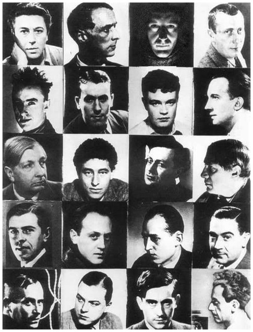
Ducham­p’s pas­sion for chess ran deep enough that, for a time, he all but aban­doned art to devote him­self to the game. Lat­er he came to the real­iza­tion that “chess was art; art was chess,” hav­ing pur­sued both of those inter­ests at once in the cre­ation of an art deco chess­board. Man Ray, for his part, brought art and chess togeth­er in 1934’s Sur­re­al­ist Chess­board, a mosa­ic of his por­traits of artists asso­ci­at­ed with the Sur­re­al­ist move­ment, includ­ing Sal­vador Dalí, Andre Bre­ton, Pablo Picas­so, René Magritte, Joan Miró, and of course him­self — but with the chess-lov­ing Duchamp nowhere to be seen.

“Sur­re­al­ist exhi­bi­tion group pho­tographs include the fre­quent par­tic­i­pa­tion of Man Ray but rarely Duchamp,” writes Lewis Kachur in aka Mar­cel Duchamp: Med­i­ta­tions on the Iden­ti­ties of an Artist, his non-appear­ance on the Sur­re­al­ist Chess­board being the “most aston­ish­ing” exam­ple. “The struc­ture is the demo­c­ra­t­ic grid for­mat of the chess­board, with each of twen­ty sur­re­al­ists or fel­low trav­el­ers as a head shot against a black or light-col­ored back­ground, alter­nat­ing to sug­gest the black and white squares of the board. Man Ray had a neg­a­tive of an appro­pri­ate pro­file bust of Duchamp (1930), strik­ing for its absence here.”

Kachur imag­ines that Duchamp “chose not to take part,” in keep­ing with his “some­what shad­owy” posi­tion in rela­tion to the Sur­re­al­ists, “on the mar­gins of the move­ment group’s iden­ti­ty.” Or he may sim­ply have want­ed to save his friend the trou­ble of fig­ur­ing out a shape in which to arrange 21 por­traits instead of 20. What­ev­er Duchamp thought of this project that used the chess­board only as visu­al struc­ture, he prob­a­bly pre­ferred the chess set Man Ray designed a decade ear­li­er using his­tor­i­cal­ly inspired pure geo­met­ric forms — and one that he could actu­al­ly play chess with. You can still pur­chase own copy of that chess set today.

Relat­ed Con­tent:

Man Ray Designs a Supreme­ly Ele­gant, Geo­met­ric Chess Set in 1920 (and It’s Now Re-Issued for the Rest of Us)

Man Ray’s Por­traits of Ernest Hem­ing­way, Ezra Pound, Mar­cel Duchamp & Many Oth­er 1920s Icons

Man Ray and the Ciné­ma Pur: Four Sur­re­al­ist Films From the 1920s

Watch Dreams That Mon­ey Can Buy, a Sur­re­al­ist Film by Man Ray, Mar­cel Duchamp, Alexan­der Calder, Fer­nand Léger & Hans Richter

Mar­cel Duchamp, Chess Enthu­si­ast, Cre­at­ed an Art Deco Chess Set That’s Now Avail­able via 3D Print­er

Based in Seoul, Col­in Mar­shall writes and broad­casts on cities and cul­ture. He’s at work on a book about Los Ange­les, A Los Ange­les Primer, the video series The City in Cin­e­ma, the crowd­fund­ed jour­nal­ism project Where Is the City of the Future?, and the Los Ange­les Review of Books’ Korea Blog. Fol­low him on Twit­ter at @colinmarshall or on Face­book.

« Go BackMore in this category... »
Quantcast