Unless they’ve got fans among penguins, there’s no practical reason for a band to make the journey to Antarctica to play. So why did Metallica do exactly that in 2013? Because they could, and because it made them the first musical act to play all seven continents — a Guinness World Record — doing it all in the same calendar year, no less. They’re also the only rock band to travel to Antarctica. (With the exception of Nunatak, an indie rock band made up of British climate scientists, who played a “sold-out” show to 17 people at the Rothera Research Station where they worked in 2007.)
If those aren’t reasons enough, the concert was a dream realized for the 120 fans in attendance, including research station scientists and Coca Cola contest winners from all over Latin America who were able to see Metallica in a transparent dome near the heliport of Argentina’s Carlini Base after a week-long cruise. “Due to the continent’s fragile environment,” notes Guinness, the band’s amps were placed in “isolation cabinets” and the audience heard everything through headphones, sort of like a silent rave. Called “Freeze ‘Em All,” the show was live-streamed and is now fully available online (see it above).
“The energy in the little dome was amazing!” the band writes on their Facebook page. “Words can not describe how happy everyone was.” But how cold were they? More sponsorship, in the form of outerwear from snowboard and ski giant Burton, kept the band bundled up throughout. Metallica has uploaded the audio of “Freeze ‘Em All” in MP3 and various high-end lossless formats at LiveMetallica.com. It’s a very cool idea, but is the concert video an hour-long Coke Zero ad? I don’t know.… I am a little curious about what might have happened if their amps had been at full blast in the Antarctic wild….
Here’s the full setlist, with timestamps, of the record-setting gig:
Creeping Death (1:25) For Whom the Bell Tolls (7:47) Sad But True (12:28) Welcome Home (Sanitarium) (18:58) Master of Puppets (25:58) One (34:12) Blackened (41:58) Nothing Else Matters (50:01) Enter Sandman (55:06) Seek & Destroy (1:02:20)
You too, like many a commenting fan, may feel betrayed by the lack of “Trapped Under Ice” in the setlist. Maybe too on-the-nose, they thought, too cute. But surely a missed opportunity that won’t come again. Fill in the gap yourself with the live take below.
Billing himself as “among NYC’s top slingers of folk / garagerock / antifolk,” Lewis pairs his songs with comics during live shows, projecting original illustrations or flipping the pages of a sketchbook large enough for the audience to see, a practice he refers to as “low budget films.”
While Lewis isn’t a contemporary of Haring’s, they definitely breathed the same air:
While Haring was spending a couple of formative years involved with Club 57 and PS 122, there was little six-year-old me walking down the street, so I can remember and draw that early ’80s Lower East Side/East Village without much stretch. My whole brain is made out of fire escapes and fire hydrants and tenement cornices.
Lewis gives then-rising stars Jean-Michel Basquiat and performance artist Klaus Nomi cameo appearances, before escorting Haring down into the subway for a literal lightbulb moment.
…It seemed obvious to me when I saw the first empty subway panel that this was the perfect situation. The advertisements that fill every subway platform are changed periodically. When there aren’t enough new ads, a black paper panel is substituted. I remember noticing a panel in the Times Square station and immediately going aboveground and buying chalk. After the first drawing, things just fell into place. I began drawing in the subways as a hobby on my way to work. I had to ride the subways often and would do a drawing while waiting for a train. In a few weeks, I started to get responses from people who saw me doing it.
After a while, my subway drawings became more of a responsibility than a hobby. So many people wished me luck and told me to “keep it up” that it became difficult to stop. From the beginning, one of the main incentives was this contact with people. It became a rewarding experience to draw and to see the drawings being appreciated. The number of people passing one of these drawings in a week was phenomenal. Even if the drawing only remained up for only one day, enough people saw it to make it easily worth my effort.
Towards the end of his jam-packed, 22-page “low budget film,” Lewis wanders from his traditional approach to cartooning, revealing himself to be a keen student of Haring’s bold graphic style.
The final image, to the lyric, “Keith’s explosive short lifetime and generous heart speak like an infinite fountain from some deep wellspring of art,” is breathtaking.
It would be difficult to think of two artists who appear to have less in common than Bob Ross and Banksy. One of them creates art by pulling provocative stunts, often illegal, under the cover of anonymity; the other did it by painting innocuous landscapes on public television, spending a decade as one of its most recognizable personalities. But game recognize game, as they say, in popular art as in other fields of human endeavor. In the video above, Banksy pays tribute to Ross by layering narration from an episode of The Joy of Painting over the creation of his latest spray paint strike, Create Escape: an image of Oscar Wilde, typewriter and all, breaking out jail — on the actual exterior wall of the decommissioned HM Prison Reading.
“The expansive and unblemished prison wall was a daring and perfect spot for a Banksy piece,” writes Colossal’s Christopher Jobson. “It’s best known for its most famous inmate: Oscar Wilde served two years in the prison from 1895–1897 for the charge of ‘gross indecency’ for being gay.” This experience resulted in the poem The Ballad of Reading Gaol, which we’ve previously featured here on Open Culture as read by Wilde himself.
Where Wilde converted his misfortune into verbal art, Banksy references it to make a visual statement of characteristic brazenness and ambiguity. As with most of his recent pieces, Create Escape has clearly been designed to be seen not just by passersby in Reading, but by the whole world online, which The Joy of Painting with Bob Ross & Banksy should ensure.
“I thought we’d just do a very warm little scene that makes you feel good,” says Ross in voiceover. But what we see are the hands of a miner’s-helmeted Banksy, presumably, preparing his spray cans and putting up his stencil of Wilde in an inmate’s uniform. “Little bit of white,” says Ross as a streak of that color is applied to the prison wall. “That ought to lighten it just a little.” In fact, every sample of Ross’ narration reflects the action, as when he urges thought “about shape and form and how you want the limbs to look,” or when he tells us that “a nice light area between the darks, it separates, makes everything really stand out and look good.” With his signature high-contrast style, Banksy could hardly deny it, and he would seem also to share Ross’ feeling that in painting, “I can create the kind of world that I want to see, and that I want to be part of.”
Based in Seoul, Colin Marshall writes and broadcasts on cities, language, and culture. His projects include the Substack newsletterBooks on Cities, the book The Stateless City: a Walk through 21st-Century Los Angeles and the video series The City in Cinema. Follow him on Twitter at @colinmarshall or on Facebook.
Los Angeles in Chinatown, Rome in Rome Open City, Manhattan in Manhattan: you could say that each of these films’ cities becomes a character in the story. You could say it, but you’d be making a cinematic observation that has, at this point, become severely clichéd. What do we actually mean when we call a setting something more than a setting? This question is at the heart of “The Cinematic Universe,” the new video essay from The Cinema Cartography, a MUBI-sponsored series by Channel Criswell creator Lewis Bond and Luiza Liz Bond. It explores not just how cities appear in film — a subject, to some of us, hardly without interest of its own — but the “cinemazation” of place itself.
Many count Fargo among the Coen Brothers’ masterpieces, but who counts it among the great city films? Its geographical scope exceeds the boundaries of the North Dakotan metropolis, granted, but more importantly, its concerns run deeper than telling a tale of kidnapping and extortion there. In a picture like Fargo, says Bond, “something has invaded what the place truly was and altered its very being”; its ostensible genre story is “elevated by the fact that it’s the least likely and least accommodating place for a crime narrative to take place.” Where “most people’s concern lies in staying warm, inertia “makes it nearly impossible for any progression to occur at all,” as both the people and the land have become frozen.
Far from Fargo’s icy highways and snow-covered lots, Robert Altman’s Nashville depicts another America entirely. Less a portrait of the Tennessean capital than a series of “colossal showcases of humanity,” the film’s bustling action and overlapping voices, noises, and songs suggests the existence of a grander, even more flamboyant socio-cultural pageant carrying on, unseen and unheard, throughout the rest of the country. “We can learn a bit more about the United States as long as we understand Nashville first,” says Bond, and the same holds for a much quieter, smaller-scale movie like Edward Yang’s Taipei Story. “The more we learn about its people, the deeper the anatomy of the city reveals itself,” and the more clearly we see a changing Taiwan whose citizens “can’t decide, on either micro- or macrocosmic levels, where they want to be.”
A film can be about its city, but it can also be about the society that created that city. A film can be about a place, but it can also be about a place in time — that is, a place remembered, as in Gillo Pontecorvo’s The Battle of Algiers, Francois Truffaut’s The 400 Blows, or Victor Erice’s The Spirit of the Beehive. For some auteurs, the realization of a vision demands not just the return to a place in memory or the use of a place as it is, but the creation of a place unlike any seen before. In building a whole city for his magnum opus, Jacques Tati inhabited the role of the auteur to its fullest, crafting in cinema “a modern world we’re more than familiar with now, and how the change of the old world to the new can bring change within its people.” Playtime “is not a film where the setting is the character,” says Bond. “The main character is the futility of how we interact with our settings.” Naturally, it’s a comedy.
Based in Seoul, Colin Marshall writes and broadcasts on cities, language, and culture. His projects include the Substack newsletterBooks on Cities, the book The Stateless City: a Walk through 21st-Century Los Angeles and the video series The City in Cinema. Follow him on Twitter at @colinmarshall or on Facebook.
Dick Cavett was sometimes called the “thinking man’s Johnny Carson,” and he came up in a similar fashion—a stand-up, a joke writer for hire— until he was given a chance to host a late night show. But compare a Cavett episode to any late night host today, and it feels like a very different time. Sure, stars were booked to talk about their upcoming movie or album or television show, but Cavett was so laid back, so chatty and conversant, that it often felt like you were eavesdropping. It’s a style you find more on podcasts these days than television—Cavett is genuinely inquisitive. He never got high ratings because of it, but he certainly got an impressive guest list.
We’ve been writing about some of the clips here on Open Culture, but Shout! Factory, the DVD company that has pivoted to streaming, offers full episodes of Dick Cavett’s show to watch for free. They sometimes have ads, but these days so do most YouTube channels we feature. (Of the episodes I let run, I didn’t really see any commercials so your mileage may vary as they say).
“Hollywood Greats” (Alfred Hitchcock, Groucho Marx, Betty Davis, et al), authors, sports icons, politicians, visionaries (from Jim Henson to Terry Gilliam), film directors (including Akira Kurosawa, Jean-Luc Godard, and Ingmar Bergman), and one called “Black History Month” although it’s from different months and different years, featuring interviews with Shirley Chisholm, Alice Walker, and James Earl Jones. (Let’s also mention that Cavett’s interview with John Cassavetes, Peter Falk, and Ben Gazzara is one of the most anarchic television interviews in history). Enter the Cavett collection here.
Along similar lines, Shout! Factory features 18 themed “seasons” of The Tonight Show with Johnny Carson, the man who refined the talk show template that late night has followed ever since. There’s “Animal Antics” with Carson encountering various zoo animals brought on by Joan Embery and Jim Fowler; a wide selection of stand-up comedians—The Tonight Show was considered the big break for any comedian (and sometimes future host); and a selection of Hollywood legends. (View the episodes here.)
In fact, the whole website is a fantastic time-suck of the first order: a huge assortment of Mystery Science Theater 3000, episodes of Ernie Kovacs, The Prisoner and its prequel of sorts Secret Agent, and much more.
And a special mention to hosting the first season of Soul! the 1968–69 performance/variety hour that exclusively focused on the African-American experience. In its heyday, Soul! was watched by nearly three-quarters of the Black population. And why not: guests included Muhammad Ali, James Baldwin, Bill Withers, Al Green, Gladys Knight, Harry Belafonte, Ruby Dee and Ossie Davis, and jazz legends Lee Morgan, Horace Silver, and Bobbi Humphrey.
Explore the entire Shout! Factory media collection.
Ted Mills is a freelance writer on the arts who currently hosts the Notes from the Shed podcast and is the producer of KCRW’s Curious Coast. You can also follow him on Twitter at @tedmills, and/or watch his films here.
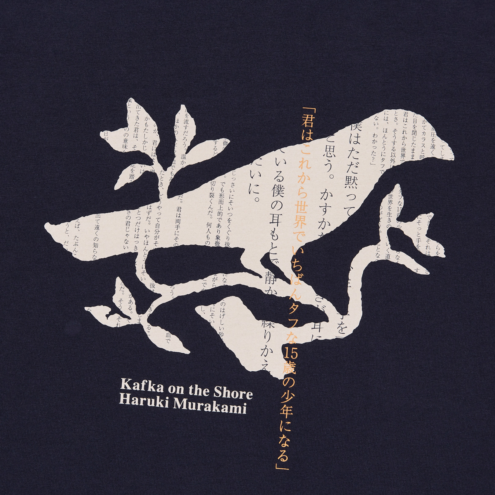
Haruki Murakami is a novelist, but for some time his name has been no less a global brand than, say, Uniqlo’s. Though both the man and the clothing company happen to have come into existence in Japan in 1949, this comparison goes beyond mere nationality. In their homeland, both Uniqlo and Murakami came into their own in the 1980s, the decade when the former opened its first casual-wear shop and the latter published the name-making A Wild Sheep Chase and the cultural phenomenon that was Norwegian Wood. Having assiduously cultivated markets outside Japan, both have become internationally known in the 21st century: just as Uniqlo now has shops all over the world, Murakami’s books have been translated into at least 50 languages.
Therefore, perhaps Murakami and Uniqlo’s convergence was only a matter of time. “Haruki Murakami and Uniqlo have teamed up for a line of T‑shirts inspired by the author’s novels like Norwegian Wood and 1Q84, as well as his radio program,” writes Spoon & Tamago’s Johnny Waldman.
With graphics contributed by sources like illustrator and frequent Murakami collaborator Masaru Fujimoto, “the collection showcases the world of his masterpiece novels, his love for music, and of course cats.” The reverse of the Murakami Radio shirt, seen at the top of the post, even features this unambiguous quotation of the man himself: “Books, music, and cats have been my friends from way back.”
More than a few of Murakami’s fans could no doubt say the same. They’ll also delight in the nuances of the words and images on the seven other Murakami shirts Uniqlo has created for sale from March 15th. Many have read Norwegian Wood, but relatively few will notice that Uniqlo’s shirt based on that book comes in the very same red-and-green color scheme as its two-volume Japanese first edition. Far from drawing only on the popularity of such big hits, the collection also pays tribute to Murakami’s lesser-known works: his sophomore effort Pinball, 1973, for instance, which went without a major English translation for 35 years.
Still unpublished outside Asia are most of Murakami’s essays, which he’s been writing on music, food, travel, and a variety of other subjects nearly as long as he’s been a novelist. But this November, Knopf will publish Murakami T: The T‑Shirts I Love, a book documenting his impressive collection including T‑shirts “from The Beach Boys concert in Honolulu to the shirt that inspired the beloved short story ‘Tony Takitani,’ ” all “accompanied by short, frank essays that have been translated into English for the first time.” Writing essays or fiction, whatever the language in which they appear, Murakami’s work remains broadly appealing yet distinctively his own, belonging at once everywhere and nowhere in the world — more than a bit, come to think of it, like Uniqlo’s clothing. On March 15, purchase the shirts online here.
Based in Seoul, Colin Marshall writes and broadcasts on cities, language, and culture. His projects include the Substack newsletterBooks on Cities, the book The Stateless City: a Walk through 21st-Century Los Angeles and the video series The City in Cinema. Follow him on Twitter at @colinmarshall or on Facebook.
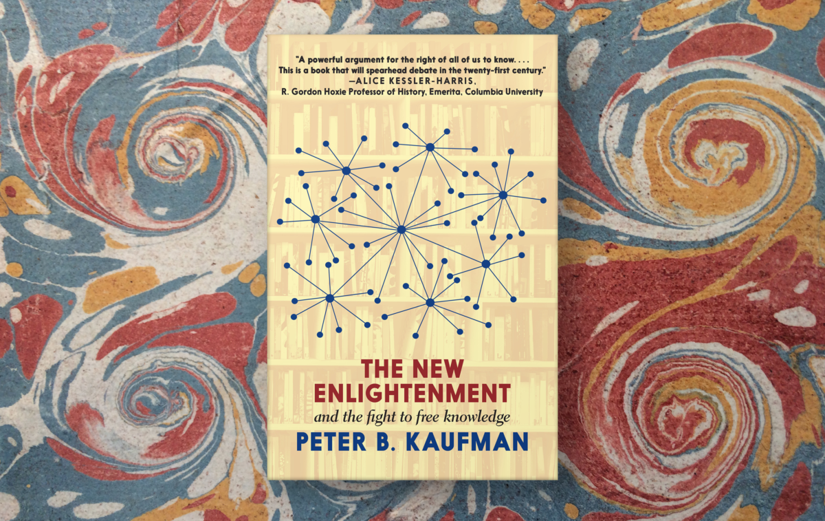
Editor’s Note: This month, MIT Open Learning’s Peter B. Kaufman has published The New Enlightenment and the Fight to Free Knowledge, a book that takes a historical look at the powerful forces that have purposely crippled our efforts to share knowledge widely and freely. His new work also maps out what we can do about it. In the coming days, Peter will be making his book available through Open Culture by publishing three short essays along with links to corresponding sections of his book. Today, you can find his short essay “The Monsterverse” below, and meanwhile read/download the first chapter of his book here. You can purchase the entire book online.
The Monsterverse – what exactly is it? Like Sauron and his minions from Mordor in The Lord of the Rings, like Sheev Palpatine and the armies of the Galactic empire from Star Wars, like Lord Voldemort and his henchmen the Death Eaters in Harry Potter, it’s the collective force of evil, one that strives to shut down human progress, freedom, justice, the spread of knowledge –the dissemination of (let us just say it) open culture. It’s the subject of the first chapter of my book, The New Enlightenment and the Fight to Free Knowledge – and its incarnations have been with us for thousands of years.
In 1536, which is when the book begins, it found its embodiment in Jacobus Latomus, who oversaw the trial and execution – by strangling and burning at the stake – of a translator and a priest named William Tyndale. Latomus, who himself was overseen by Thomas More, who himself was overseen by Henry VIII (with Pope Clement VII in a supporting role), choreographed Tyndale’s formal degradation, such that a couple dozen apostolic inquisitors and theologians, university rectors and faculty, lawyers and privy councilors – “heresy-hunters,” as his biographer calls them – led him out of his prison cell in public and in his priestly raiment to a high platform outdoors where oils of anointment were scraped symbolically from his hands, the bread and wine of the Eucharist situated next to him and then just as quickly removed, and then his vestments “ceremonially stripped away,” so that he would find himself, and all would see him as, no longer a priest. Death came next. This scholar and polymath to whom, it is now known, we owe as much as we owe William Shakespeare for our language, this lone man sought and slain by church and king and holy Roman emperor – his initial strangling did not go well, so that when he was subsequently lit on fire, and the flames first lapped at his feet and up his legs, lashed tight to the stake, he came to, and, while burning alive in front of the crowd of religious leaders and so-called justices (some seventeen trial commissioners) who had so summarily sent Tyndale to his death and gathered to watch it, live, he cried out, less to the crowd, it would seem, than to Another: “Lord! Lord! Open the King of England’s eyes!”
What did Tyndale do? He believed that the structure of communication during his time was broken and unfair, and with a core, unwavering focus, he sought to make it so that the main body of knowledge in his day could be accessed and then shared again by every man alive. He engaged in an unparalleled act of coding (not for nothing do we speak of computer programming “languages”), working through the Latin, Greek, Hebrew, and Aramaic of the Bible’s Old, then New, Testaments to bring all of its good books – from Genesis 1 to Revelation 22—into English for everyday readers. He is reported to have said, in response to a question from a priest who had challenged his work, a priest who read the Bible only in Latin: “I will cause a boy that driveth the plough shall know more of the Scripture than thou dost.” And he worked with the distribution technologies of his time – the YouTubes, websites, and Twitters back then – by connecting personally with book designers, paper suppliers, printers, boat captains, and horsemen across sixteenth-century Europe to bring the knowledge and the book that contained it into the hands of the people.
It wasn’t easy. In Tyndale’s time, popes and kings had decreed, out of concern for keeping their power, that the Bible could exist and be read and distributed “only in the assembly of Latin translations” that had been completed by the monk Saint Jerome in approximately 400 CE. The penalties for challenging the law were among the most severe imaginable, for such violations represented a panoply of civil transgressions and an entire complexity of heresies. In taking on the church and the king – in his effort simply and solely to translate and then distribute the Bible in English – Tyndale confronted “the greatest power[s] in the Western world.” As he “was translating and printing his New Testament in Worms,” his leading biographer reminds us, “a young man in Norwich was burned alive for the crime of owning a piece of paper on which was written the Lord’s Prayer in English.” The Bible had been inaccessible in Latin for a thousand years, this biographer writes, and “to translate it for the people became heresy, punishable by a solitary lingering death as a heretic; or, as had happened to the Cathars in southern France, or the Hussites in Bohemia and Lollards in England, official and bloody attempts to exterminate the species.”
Yuckadoo, the Monsterverse, but very much still with us. The strangleholds are real. And Tyndale’s successors in the fight to free knowledge include many freedom fighters and revolutionaries – going up against the forces that seek to constrain our growth as a society. Were Tyndale alive today, he would wonder about the state of copyright law and its overreach; the pervasive estate of surveillance capitalism; the sweeping powers of government to see and interfere in our communication. And he would wonder why the seemingly progressive forces on the side of freedom today – universities, museums, libraries, archives – don’t fight more against information oppression. Tyndale would recognize that the health pandemic, the economic crisis, the political violence we face today, are all the result of an information disorder, one that relies on squelching knowledge and promoting the darkest forms of ignorance for its success. How we come to grips with that challenge is the number-one question for our time. Discovering new paths to defeating it – overcoming the Dark Lords, destroying the Horcruxes, finally harnessing the Force – is the subject of the next two articles, and of the rest of the book.
Brenda (laughing): Can you imagine a Taoist advertising agency? “Buy this if you feel like it. If it’s right. You may not need it.”
Ursula: There was an old cartoon in The New Yorker with a guy from an advertising agency showing his ad and the boss is saying “I think you need a little more enthusiasm Jones.” And his ad is saying, “Try our product, it really isn’t bad.”
Perhaps no Chinese text has had more lasting influence in the West than the Tao Te Ching, a work so ingrained in our culture by now, it has become a “changeless constant,” writes Maria Popova. “Every generation of admirers has felt, and continues to feel, a prescience in these ancient teachings so astonishing that they appear to have been written for their own time.” It speaks directly to us, we feel, or at least, that’s how we can feel when we find the right translation.
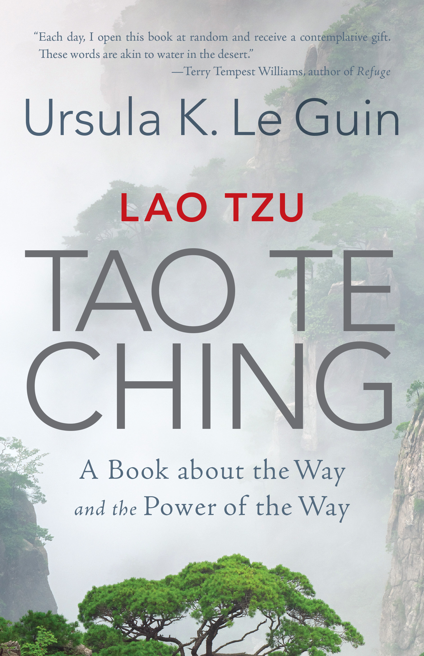
Admirers of the Taoist classic have included John Cage, Franz Kafka, Bruce Lee, Alan Watts, and Leo Tolstoy, all of whom were deeply affected by the millennia-old philosophical poetry attributed to Lao Tzu. That’s some heavy company for the rest of us to keep, maybe. It’s also a list of famous men. Not every reader of the Tao is male or approaches the text as the utterances of a patriarchal sage. One famous reader had the audacity to spend decades on her own, non-gendered, non-hierarchical translation, even though she didn’t read Chinese.
It’s not quite right to call Ursula Le Guin’s Tao Te Ching a translation, so much as an interpretation, or a “rendition,” as she calls it. “I don’t know Chinese,” she said in an interview with Brenda Peterson, “but I drew upon the Paul Carus translation of 1898 which has Chinese characters followed by a transliteration and a translation.” She used the Carus as a “touchstone for comparing other translations,” and started, in her twenties, “working on these poems. Every decade or so I’d do another chapter. Every reader has to start anew with such an ancient text.”
Le Guin drew out inflections in the text which have been obscured by translations that address the reader as a Ruler, Sage, Master, or King. In her introduction, Le Guin writes, “I wanted a Book of the Way accessible to a present-day, unwise, unpowerful, perhaps unmale reader, not seeking esoteric secrets, but listening for a voice that speaks to the soul.” To immediately get a sense of the difference, we might contrast editions of Arthur Waley’s translation, The Way and Its Power: a Study of the Tao Te Ching and Its Place in Chinese Thought, with Le Guin’s Tao Te Ching: A Book about the Way and the Power of the Way.
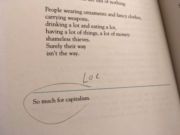
Waley’s translation “is never going to be equaled for what it does,” serving as a “manual for rulers,” Le Guin says. It was also designed as a guide for scholars, in most editions appending around 100 pages of introduction and 40 pages of opening commentary to the main text. Le Guin, by contrast, reduces her editorial presence to footnotes that never overwhelm, and often don’t appear at all (one note just reads “so much for capitalism”), as well as a few pages of endnotes on sources and variants. “I didn’t figure a whole lot of rulers would be reading it,” she said. “On the other hand, people in positions of responsibility, such as mothers, might be.”
Her version represents a lifelong engagement with a text Le Guin took to heart “as a teenage girl” she says, and found throughout her life that “it obviously is a book that speaks to women.” But her rendering of the poems does not substantially alter the substance. Consider the first two stanzas of her version of Chapter 11 (which she titles “The uses of not”) contrasted with Waley’s CHAPTER XI.
Waley
We put thirty spokes together and call it a wheel; But it is on the space where there is nothing that the usefulness of the wheel depends. We turn clay to make a vessel; But it is on the space where there is nothing that the usefulness of the vessel depends.
Le Guin
Thirty spokes meet in the hub. Where the wheel isn’t is where is it’s useful.
Hollowed out, clay makes a pot. Where the pot’s not is where it’s useful.
Le Guin renders the lines as delightfully folksy oppositions with rhyme and repetition. Waley piles up argumentative clauses. “One of the things I love about Lao Tzu is he is so funny,” Le Guin comments in her note,” a quality that doesn’t come through in many other translations. “He’s explaining a profound and difficult truth here, one of those counterintuitive truths that, when the mind can accept them, suddenly double the size of the universe. He goes about it with this deadpan simplicity, talking about pots.”
Such images captivated the earthy anarchist Le Guin. She drew inspiration for the title of her 1971 novel The Lathe of Heaven from Taoist philosopher Chuang Tzu, perhaps showing how she reads her own interests into a text, as all translators and interpreters inevitably do. No translation is definitive. The borrowing turned out to be an example of how even respected Chinese language scholars can misread a text and get it wrong. She found the “lathe of heaven” phrase in James Legge’s translation of Chuang Tzu, and later learned on good authority that there were no lathes in China in Chuang Tzu’s time. “Legge was a bit off on that one,” she writes in her notes.
Scholarly density does not make for perfect accuracy or a readable translation. The versions of Legge and several others were “so obscure as to make me feel the book must be beyond Western comprehension,” writes Le Guin. But as the Tao Te Ching announces at the outset: it offers a Way beyond language. In Legge’s first few lines:
The Tao that can be trodden is not the enduring and unchanging Tao. The name that can be named is not the enduring and unchanging name.
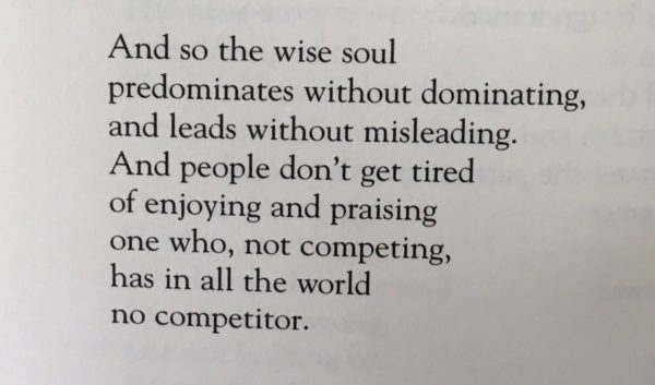
Here is how Le Guin welcomes readers to the Tao — noting that “a satisfactory translation of this chapter is, I believe, perfectly impossible — in the first poem she titles “Taoing”:
The way you can go isn’t the real way. The name you can say isn’t the real name.
Heaven and earth begin in the unnamed: name’s the mother of the ten thousand things.
So the unwanting soul sees what’s hidden, and the ever-wanting soul sees only what it wants.
Two things, one origin, but different in name, whose identity is mystery. Mystery of all mysteries! The door to the hidden.
Where were you when you heard that Hunter S. Thompson had died? The uniquely addled, uniquely incisive taker of the strange trip that was 20th-century America checked out sixteen years ago last month, a span of time in which we’ve also lost a great many other influential figures cultural and countercultural. The departed include many of Thompson’s colleagues in letters: societal diagnosticians like David Foster Wallace and Christopher Hitchens; conjurers of the fantastical and the familiar like Ursula K. Le Guin and Gabriel García Márquez; and specialists in other fields — Oliver Sacks from neurology, Anthony Bourdain from the kitchen, Nora Ephron from Hollywood — who on the page entertained us as they shared their expertise.
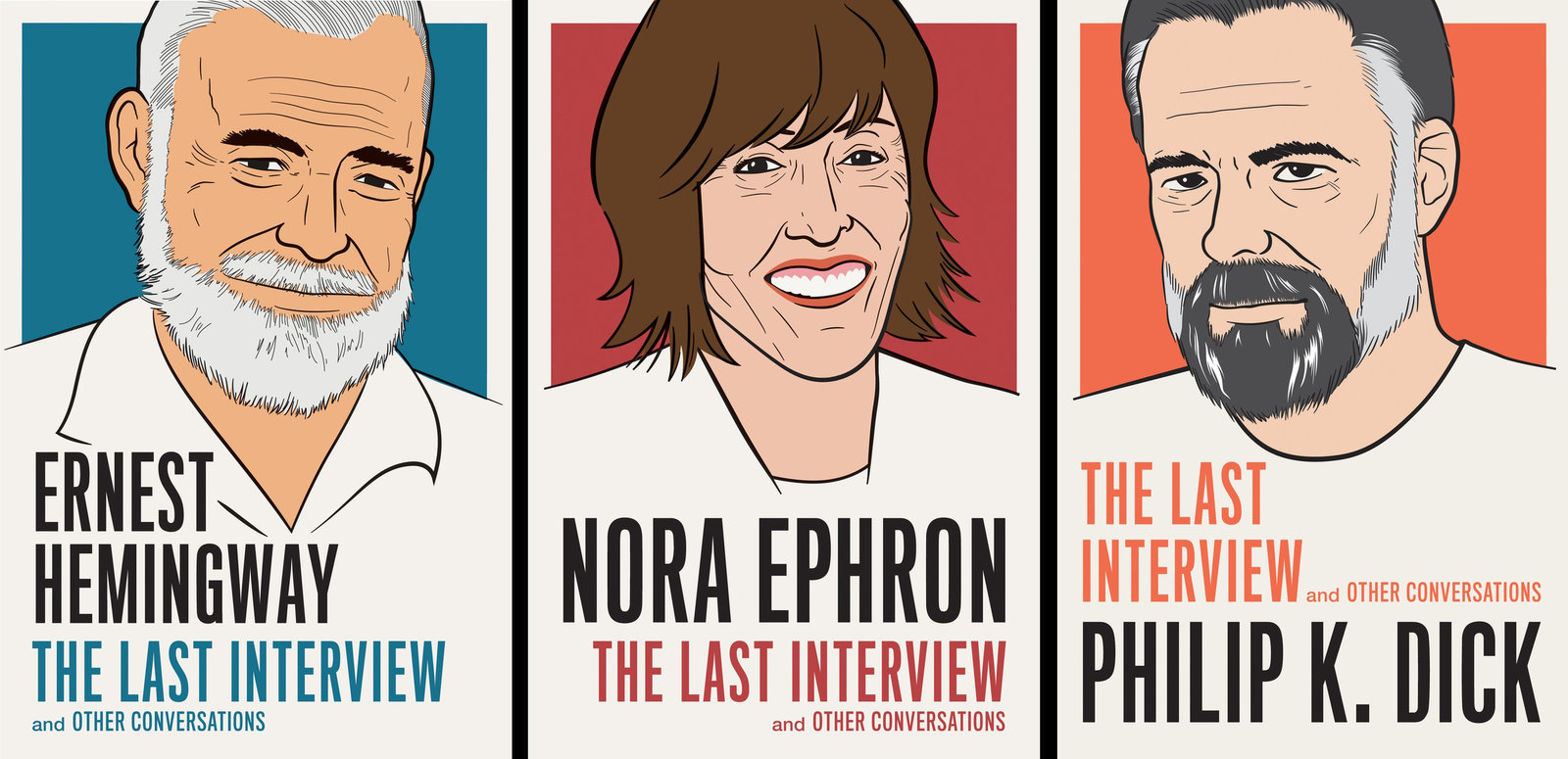
“Hemingway would have knocked back the booze and gone all moody and silent; the notoriously paranoid Dick would have been under the table checking for bugging devices and Ephron would’ve channeled what she called ‘the truly life-saving technique’ taught to her by her Hollywood screenwriter parents to get through a rough time: the mantra, ‘Someday this will be a story!’ ”
With a range of deceased icons, including Marilyn Monroe and Martin Luther King, Jr., Julia Child and Jorge Luis Borges, Fred Rogers and Frida Kahlo, the Last Interview books cast a wide net for such an aesthetically and intellectually unified project. “Each volume offers, besides useful insights into its particular author’s work, what an old friend would call ‘civilized entertainment,’ ” writes Michael Dirda in The Washington Post. “Nearly all the titles actually contain several interviews, and some add introductions. For instance, the Roberto Bolaño opens with a 40-page critical essay.” In some cases the interviewers are as notable as the interviewees: “Two of Lou Reed’s questioners — the multi-talented novelists Neil Gaiman and Paul Auster — are now probably as well known as the legendary co-founder of the Velvet Underground.”
From the world of music theseries includes not just Reed but David Bowie and Prince, two other one-man cultural forces who left us in the past decade, as well as their equally irreplaceable predecessors Johnny Cash and Billie Holiday. At the moment you can buy the entire Last Interview collection on Amazon (in Kindle format) for USD $344, which comes out to about $10 per book with 34 volumes in total. You may find this an economical solution, a way to explore the final thoughts of figures featured more than once here on Open Culture.
Based in Seoul, Colin Marshall writes and broadcasts on cities, language, and culture. His projects include the Substack newsletterBooks on Cities, the book The Stateless City: a Walk through 21st-Century Los Angeles and the video series The City in Cinema. Follow him on Twitter at @colinmarshall or on Facebook.
Do metal singers take vocal lessons? Surely not the greats of old! Did Bruce Dickinson, Rob Halford, and Ozzy Osbourne take lessons? Or did they dive into the debauchery headfirst, screaming?
Judas Priest’s Halford? He doesn’t mention a coach, but he does talk a lot about care and training. “My form of extreme singing,” he says, “it’s like a workout, you know…. Your vocal cords are muscles — they get burned out, they get tired.” As for his pioneering screams of over 40 years ago, he muses, “I sometimes think that’s a bit of a curse that I sang and recorded those certain songs so long ago, when I was a younger guy with a younger set of vocal cords.” He nearly wrecked his voice, he says, with cocaine and Jack Daniels.
It’s not opera, but metal singing is a seriously athletic activity and has only become more so as its vocals have grown more extreme, even if its fashion sense has not. As classically trained singer and actress Melissa Cross — the “Queen of Scream” — relates in the video at the top, she first became a metal vocal coach when a producer friend called her in dismay: the singers he was recording couldn’t get through a session without coughing blood.
Where did the metal scream come from, and why is it so prevalent if it’s such an unhealthy way to move one’s vocal folds day after day without training and technique? Vikings, Screamin’ Jay Hawkins’ “I Put a Spell on You,”; Led Zeppelin, Black Sabbath, AC/DC, and Judas Priest, of course… babies…. These are all points of origin for today’s extreme metal singing, say hosts LA Buckner and Nahre Sol in the PBS video further up.
The two talk to Cross about screaming without bleeding, and metal vocalist Natalie Kreuger talks about how warmups and opera-like breathing techniques are essential to maintaining vocal fitness. And if you need more convincing that metal singing requires serious power and stamina, take a look at the 10 longest live screams in metal, above. Let’s hope they all heed the example of the elder metal gods.
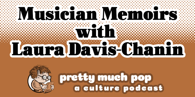
There’s been an explosion of rock and roll autobiographies in recent years, with pretty much every music legend (and many others) being invited by some publisher or other to write or dictate their story. What’s the particular appeal of this kind of recounting, what’s the connection between writing and reading these books on the one hand and producing and listening to the actual music on the other? Do we get a roughly equivalent benefit from a biography, documentary, or film depiction of the person’s life?
Your hosts Mark Linsenmayer, Erica Spyres, and Brian Hirt along with guest Laura Davis-Chanin, author of her own music memoir, each picked a book, covering Elvis Costello, Carrie Brownstein, Ozzy Osbourne, and Debbie Harry respectively. Reflecting on these reading experiences we compare the author’s purposes in writing the book, how confessional or drug-addled or twisted the story is, what is emphasized and what’s not, and what resonated in the story beyond the idiosyncratic recounting of that person’s life.
We're hoping to rely on loyal readers, rather than erratic ads. Please click the Donate button and support Open Culture. You can use Paypal, Venmo, Patreon, even Crypto! We thank you!
Open Culture scours the web for the best educational media. We find the free courses and audio books you need, the language lessons & educational videos you want, and plenty of enlightenment in between.

