“Democracy may not exist,” Astra Taylor declares in the title of her new book, “but we’ll miss it when it’s gone.” This inherent paradox, she argues, is not fatal, but a tension with which each era’s democratic movements must wrestle, in messy struggles against inevitable opposition. “Perfect democracy… may not in fact exist and never will, but that doesn’t mean we can’t make progress toward it, or that what there is of it can’t disappear.”
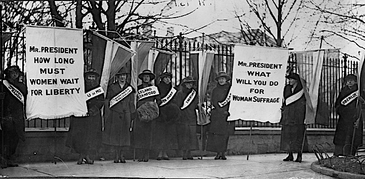
Taylor is upfront about “democracy’s dark history, from slavery and colonialism to facilitating the emergence of fascism.” But she is equally celebratory of its successes—moments when those who were denied rights marshaled every means at their disposal, from lobbying campaigns to confrontational direct action, to win the vote and better the lives of millions. For all its imperfections, the women’s suffrage movement of the 19th and early 20th century did just that.
It did so—even before electronic mass communication systems—by building international activist networks and forming national associations that took highly-visible action for decades until the 19th Amendment passed in 1920. We can learn how this all came about from the sources themselves, through the “letters, speeches, newspaper articles, personal diaries, and other materials from famed suffragists like Susan B. Anthony and Elizabeth Cady Stanton.”
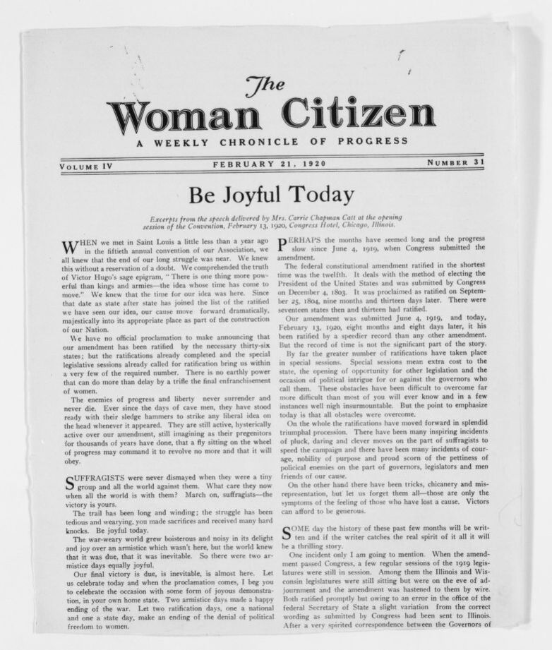
So reports Mental Floss, describing the Library of Congress’ digital collection of suffragist papers, which includes dozens of famous and less famous activist voices. In one example of both international cooperation and international tension, Carrie Chapman Catt, Anthony’s successor (see a published excerpt of one of her speeches below), describes her experience at the Congress of the International Woman Suffrage Alliance in Rome. “A more unpromising place for a Congress I never saw,” she wrote, dismayed. Maybe despite herself she reveals that the differences might have been cultural: “The Italian women could not comprehend our disapproval.”
The fractious, often disappointing, relationships between the larger international women’s suffrage movement, the African American women’s suffrage movement, and mostly male Civil Rights leaders in the U.S. are represented by the diaries. letters, notebooks, and speeches of Mary Church Terrell, “a founder of the National Association of Colored Women. These documents shed light on minorities’ laborious suffrage struggles and her own dealings with Civil Rights figures like W.E.B. Du Bois.” (Terrell became an activist in 1892 and lived to fight against Jim Crow segregation in the early 1950s.)
The collection includes “some 16,000 historic papers related to the women’s rights movement alone.” All of them have been digitally scanned, and if you’re eager to dig into this formidable archive, you’re in luck. The Library of Congress is asking for help transcribing so that everyone can read these primary sources of democratic history. So far, reports Smithsonian, over 4200 documents have been transcribed, as part of a larger, crowdsourced project called By the People, which has previously transcribed papers from Abraham Lincoln, Clara Barton, Walt Whitman, and others.
Rather than focusing on an individual, this project is inclusive of what is arguably the main engine of democracy: large-scale social movements—paradoxically the most democratic means of claiming individual rights. Enter the impressive digital collection “Suffrage: Women Fight for the Vote” here, and, if you’re moved by civic duty or scholarly curiosity, sign up to transcribe.
via Mental Floss
Related Content:
Odd Vintage Postcards Document the Propaganda Against Women’s Rights 100 Years Ago
Josh Jones is a writer and musician based in Durham, NC. Follow him at @jdmagness.
