Now, this avian Vatican also has its own Michelangelo.
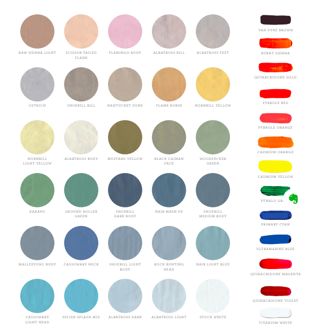
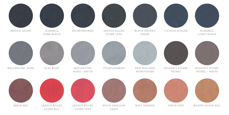
And the Class of Aves has its very own avian Pantone chart, created by science illustrator Jane Kim in service of her 2,500 square-foot Wall of Birds mural at Cornell University’s Lab of Ornithology.
The custom chart’s fifty-one colors comprise about 90 percent of the finished work. A palette of thirteen Golden Fluid Acrylics supplied the jewel-toned accents so thrilling to birdwatchers.
Along the way, Kim absorbed a tremendous amount of information about the how and why of bird feather coloration:
The iridescence on the neck and back of the Superb Starling comes not from pigment,
but from structural color. The starling’s outer feathers are constructed in a way
that refracts light like myriad prisms, making the bird appear to shimmer. The eponymous
coloring of the Lilac-breasted Roller results from a different kind of structural
color, created when woven microstructures in the feathers, called barbs and barbules,
reflect only the shorter wavelengths of light like blue and violet.
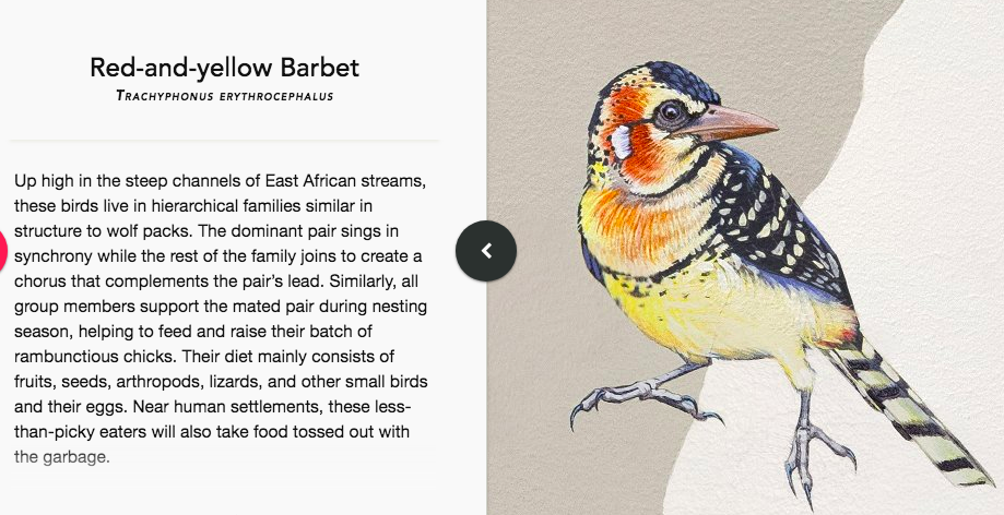
The primary colors that lend their name to the Red-and-yellow Barbet are
derived from a class of pigments called carotenoids that the bird absorbs in its diet.
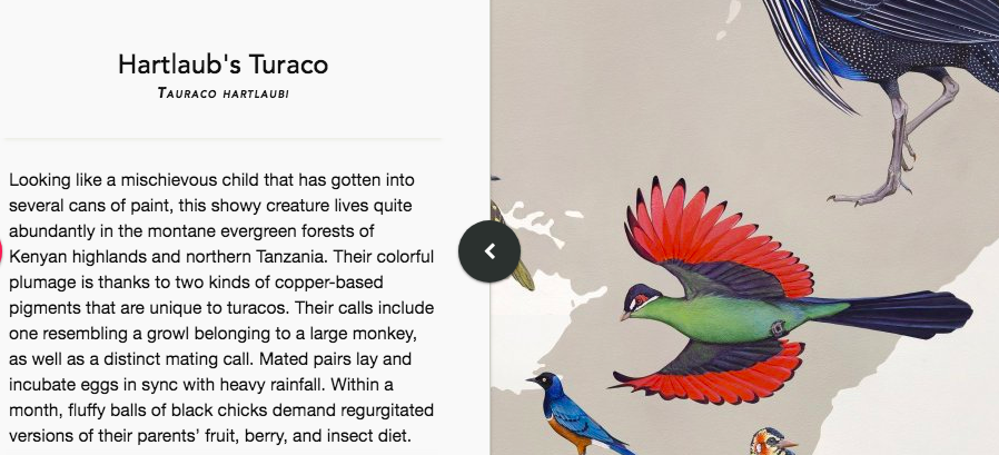
These are the same compounds that turn flamingos’ feathers pink. As a member of
the family Musophagidae, the Hartlaub’s Turaco displays pigmentation unique in the
bird world. Birds have no green pigmentation; in most cases, verdant plumage is a
combination of yellow carotenoids and blue structural color. Turacos are an exception,
displaying a green, copper-based pigment called turacoverdin that they absorb
in their herbivorous diet. The flash of red on the Hartlaub’s underwings comes from
turacin, another copper-based pigment unique to the family.
Kim also boned up on her subjects’ mating rituals, dietary habits, song styles, and male/female differences prior to inscribing the 270 life-size, lifelike birds onto the lab’s largest wall.
She examined specimens from the center’s collection and reviewed centuries’ worth of field observations.
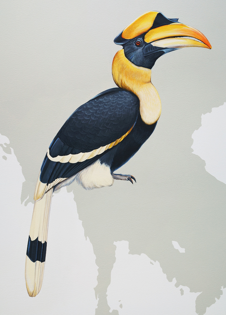
(The seventeenth-century English naturalist John Ray dismissed the hornbill family as having a “foul look,” a colonialism that ruffled Kim’s own feathers somewhat. In retaliation, she dubbed the Great Hornbill, “the Cyrano of the Jungle” owing to his “tequila-sunrise-hued facial phallus,” and selected him as the cover boy for her book about the mural.)
Research and preliminary sketching consumed an entire year, after which it took 17 months to inscribe 270 life-size creatures—some long extinct—onto the lab’s main wall. The birds are set against a greyscale map of the world, and while many are depicted in flight, every one save the Wandering Albatross has a foot touching its continent of origin.
Those who can’t visit the Wall of Birds (official title: From So Simple a Beginning) in person, can log some digital birdwatching using a spectacular interactive web-based version of the mural that provides plenty of information about each specimen, some of it literary. (The aforementioned Albatross’ entry contains a passing reference to The Rime of the Ancient Mariner.)
Explore the Wall of Birds’ interactive features here.
You can download a free chapter of The Wall of Birds: One Planet, 243 Families, 375 Million Years by subscribing to Kim’s mailing list here.
Via Hyperallergic
Related Content:
What Kind of Bird Is That?: A Free App From Cornell Will Give You the Answer
Modernist Birdhouses Inspired by Bauhaus, Frank Lloyd Wright and Joseph Eichler
Ayun Halliday is an author, illustrator, theater maker and Chief Primatologist of the East Village Inky zine. See her onstage in New York City February 11 for Theater of the Apes book-based variety show, Necromancers of the Public Domain. Follow her @AyunHalliday.