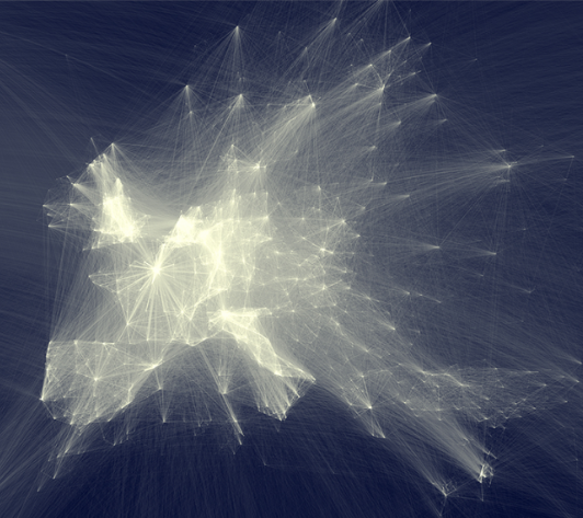
 A few years ago, digital humanists at Stanford mapped the Republic of Letters, carefully detailing the social networks that connected thinkers during the Enlightenment of the eighteenth century. Now Olivier Beauchesne, a data scientist in Canada, has used data visualization techniques to map out a more modern set of relationships — collaborations taking place among scientists across the globe.
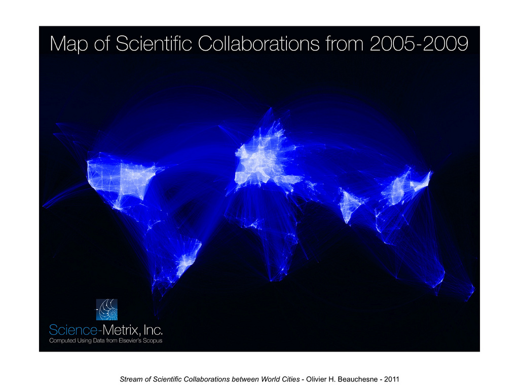
What’s an example of such a collaboration? Beauchesne writes: “If a UCLA researcher published a paper with a colleague at the University of Tokyo, this would create an instance of collaboration between Los Angeles and Tokyo.” By checking out this cool zoomable map, you can see thousands of these collaborations taking place worldwide between 2005 and 2009, and pretty soon you realize the extent to which modern science is an international affair. The data was pulled from Science-Metrix database.
H/T Pavel
Related Content:
The Art of Data Visualization: How to Tell Complex Stories Through Smart Design
The History of Philosophy Visualized
Visualizing WiFi Signals with Light
New MOOC Introduces You to the Wonderful World of Infographics & Data Visualization
Watch a Cool and Creepy Visualization of U.S. Births & Deaths in Real-Time
How is this slick? there is no legend or labeling to explain where the nodes are.