Roxana Küwen is a German-born circus artist who “likes to take her audience into her world and make them be astonished, confused or amazed by playing with categories and presence.” Witness the video above, where Küwen does something quite simple. She puts her feet next to her hands and moves her 20 digits in unison. Familiar body parts are put into strange motion, leaving you feeling charmed. But also a bit disconcerted.
Then Roxana starts her foot juggling routine. It’s not the most high velocity, risk-filled juggling act. The balls move slowly and never get more than a few feet off of the ground. There’s a strange simplicity to it, though captivating nonetheless.
While the sci-fi dreams of virtual and “augmented” reality are now within the grasp of artists and game designers, the technology of the adult human brain remains rooted in the stone age—we still need a good story to accompany the flickering shadows on the cave wall. An artist as wise as Laurie Anderson understands this, but—given that it’s Laurie Anderson—she isn’t going to retread familiar narrative paths, especially when working in the vehicle of VR, as she has in her new piece Chalkroom, created in a collaboration with Taiwanese artist Hsin-Chien Huang.
The piece allows viewers the opportunity to travel not only into the space of imagination a story creates, but into the very architecture of story itself—to walk, or rather float, through its passageways as words and letters drift by like tufts of dandelion, stars, or, as Anderson puts it, like snow. “They’re there to define the space and to show you a little bit about what it is,” says the artist in the interview above, “But they’re actually fractured languages, so it’s kind of exploded things.” She explains the “chalkroom” concept as resisting the “perfect, slick and shiny” aesthetic that characterizes most computer-generated images. “It has a certain tactility and made-by-hand kind of thing… this is gritty and drippy and filled with dust and dirt.”
Chalkroom, she says, “is a library of stories, and no one will ever find them all.” It sounds to me, at least, more intriguing than the premise of most video games, but the audience for this piece will be limited, not only to those willing to give it a chance, but to those who can experience the piece firsthand, as it were, by visiting the physical space of one of Anderson’s exhibitions and strapping on the VR goggles. Once they do, she says, they will be able to fly, a disorienting experience that sends some people falling out of their chair. Last spring, Chalkroom became part of an ongoing exhibit at the Massachusetts Museum of Contemporary Art, a “Laurie Anderson pilgrimage,” as Mass MoCA director Joseph C. Thompson describes it, that also features a VR experience called Aloft.
In August, Chalkroom appeared at the Louisiana Museum of Modern Art in Denmark, where the interview above took place. Watching it, you’ll see why the piece has generated so much buzz, winning “Best VR Experience” at the Venice Film Festival and visiting major museums around Europe and the U.S. “Mostly VR is kind of task-oriented,” she says, “you get that, you do that, you shoot that.” Chalkroom feels more like navigating catacombs, traversing dark labyrinths punctuated by brilliant constellations of light made out of words, as Anderson’s voice provides enigmatic narration against a backdrop of three-dimensional sound design. It’s an immersive journey that seems, as promised, like the one we take as readers, pursuing elusive meanings that can seem tantalizingly just out of reach.
The composer Mussorgsky’s most famous work, Pictures at an Exhibition(listen here), had a tremendous influence on some of the most famous composers of the day when it debuted, which happened to be after its author’s death. Written in 1874 as a solo piano piece, it didn’t see publication until 1886, when it quickly became a virtuoso challenge for pianists and a popular choice for arrangements most notably by Maurice Ravel and Nikolai Rimsky-Korsakov, who, along with Igor Stravinsky and others, interpreted and expanded on many of Mussorgsky’s ideas into the early 20th century.
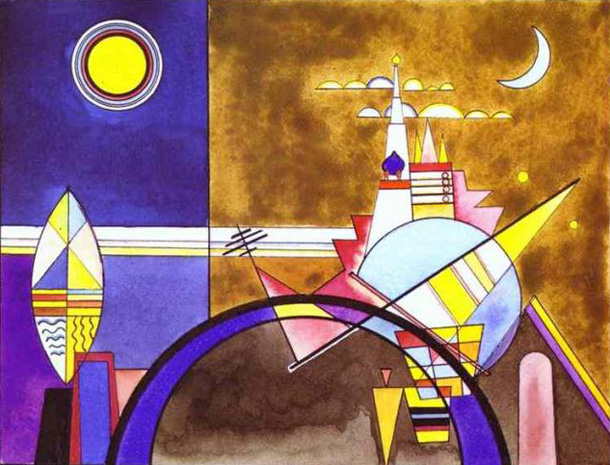
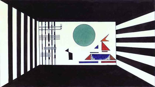
Mussorgsky’s early death in 1881 prevented any living collaboration between the painter and composer, but it’s only natural that his minimalist musical piece should have inspired Kandinsky’s only successful stage production. In Kandinsky’s theory, musical ideas operate like primary colors. His paintings explicitly illustrate sound. In his stage adaptation of Pictures at an Exhibition, he had the opportunity to paint sound in motion.
Kandinsky was first inspired to paint, at the age of 30, after hearing a performance of Wagner’s Lohengrin. “I saw all my colors in spirit,” he remarked afterward, “Wild, almost crazy lines were sketched in front of me.” The Denver Art Museum’s Renée Miller writes of Kandinsky’s experience as an example of synesthesia. He drew from the work of Arnold Schoenberg in his abstract expressionist canvases, and “gave many of his paintings musical titles, such as Composition and Improvisation.”
For his part, Mussorgsky found inspiration for his nonrepresentational work in the strangely uncanny representational visual art of Russian architect and painter Viktor Hartmann, his closest friend and member of a circle of artists attempting a nationalist Russian cultural revival. Mussorgsky’s Pictures at an Exhibition sets music to a collection of Hartmann’s paintings and drawings exhibited after the artist’s death, including sketches of opera costumes and a monumental architectural design.
The creation of several highly distinctive musical motifs is of a piece with Mussorgsky’s opera compositions. Both he and Kandinsky were drawn to opera for its dramatic conjunction of visual art, performance, and music, or what Wagner called Gesamtkunstwerk, the “total work of art.” And yet, despite their mutual admiration for classical forms and traditional Russian folklore, both artists illustrated the title of Wagner’s essay on the subject, “The Artwork of the Future,” more fully than Wagner himself.
Mussorgsky’s piece, as composed solo on the piano, is willfully odd, ugly and piercingly beautiful by turns, and always unsettling, like the Hartmann paintings that inspired it. So visually descriptive is its musical language that it might be said to induce a virtual form of synesthesia. In illustrating Pictures at an Exhibition, Kandinsky “took another step towards translating the idea of ‘monumental art’ into life,” notes the site Modern Art Consulting, “with his own sets and light, color and geometrical shapes for characters.”
On April 4, 1928, the première at the Friedrich Theater, Dessau, was a tremendous success. The music was played on the piano. The production was rather cumbersome as the sets were supposed to move and the hall lighting was to change constantly in keeping with Kandinsky’s scrupulous instructions. According to one of them, “bottomless depths of black” against a black backdrop were to transform into violet, while dimmers (rheostats) were yet to be invented.
Rather than translating Mussorgsky’s piece back into Hartmann’s representational idiom, Kandinsky creates an operatic movement of geometrical figures from the lexicon of the Bauhaus school. (Only “The Great Gate of Kiev,” at the top, resembles the original painting.) Rather than create narrative, “Kandinsky’s task was to turn the music into paintings,” says Harald Wetzel, curator of a recent exhibit in Dessau featuring many of the set designs. Those static elements “give just a limited impression of the stage production,” which was “constantly in motion.”
We may not have film of that original production, but we do have a very good sense of what it might have looked like through its many re-stagings over the past few years, including the production further up with pianist Mikhaïl Rudy at the théâtre de Brive in 2011 and the animated video remake above, which brings it even further into the future. See a selection of photos from the Kandinsky exhibit at Deutsche Welleand compare these paintings with the original pictures by Viktor Hartmann that inspired Mussorgsky’s piece.
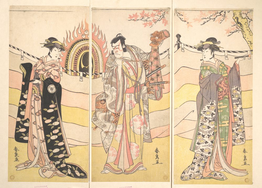
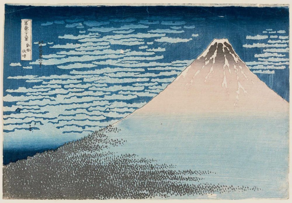
Most of us have now and again seen and appreciated Japanese woodblock prints, especially those in the tradition of ukiyo‑e, those “captivating images of seductive courtesans, exciting kabuki actors, and famous romantic vistas.” Those words come from the Metropolitan Museum of Art, whose essay on the art form describes how, “in the late seventeenth and early eighteenth century, woodblock prints depicting courtesans and actors were much sought after by tourists to Edo and came to be known as ‘Edo pictures.’ In 1765, new technology made possible the production of single-sheet prints in a range of colors,” which brought about “the golden age of printmaking.”
At that time, “the popularity of women and actors as subjects began to decline. During the early nineteenth century, Utagawa Hiroshige (1797–1858) and Katsushika Hokusai (1760–1849) brought the art of ukiyo‑e full circle, back to landscape views, often with a seasonal theme, that are among the masterpieces of world printmaking.”
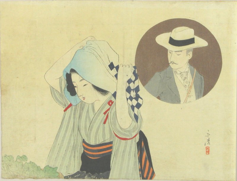
This English-Japanese bilingual site, a project of programmer and Khan Academy engineer John Resig, launched in 2012 and now boasts 213,000 prints from 24 museums, universities, libraries, auction houses, and dealers worldwide. You can search it by text or image (if you happen to have one of a print you’d like to identify), or you can browse by period and artist: not just the “golden age” of Hiroshige and Hokusai (1804 to 1868), but ukiyo-e’s early years (early-mid 1700s), the birth of full-color printing (1740s to 1780s), the popularization of woodblock printing (1804 to 1868), the Meiji period (1868 to 1912), the artist-centric Shin Hanga and Sosaku Hanga movements (1915 to 1940s), and even the modern and contemporary era (1950s to now).
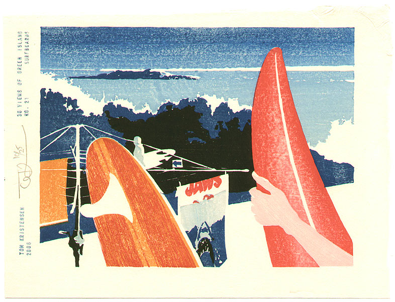
That last group includes woodblock prints of styles and subject matter one certainly wouldn’t expect from classic ukiyo‑e, though the works never go completely without connection to the tradition of previous masters. Some of these more recent practitioners, like Danish-German-Australian printmaker Tom Kristensen, have even gone so far as to not be Japanese. Kristensen, who “works in typically Japanese ‘sosaku hanga’ style: self-carved and self-printed with natural Japanese pigments on hand-made washi paper,” has produced works like the 36 Views of Green Island series, of which number 21 appears below. The surfboards may at first seem incongruous, but one imagines that Hiroshige and Hokusai, those two great appreciators of waves, might approve. Enter the digital archive here, and note that if you click on an image, and then click on it again, you can view it in a larger format.
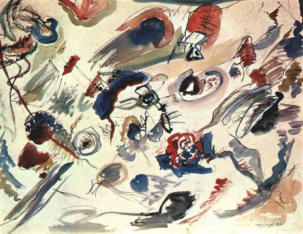
Many painters today concentrate on producing abstract work — and a fair few of those have only ever produced abstract work. But look not so very far back in human history, and you’ll find that to paint meant to paint representatively, to replicate on canvas the likenesses of the actual people, places, and things out there in the world. Humanity, of course didn’t evolve with its representational art skills pre-installed: though some cave paintings do recognizably depict men and beasts, many strike us today as what we would call abstract, or at least abstracted. So which modern artists can lay claim to having rediscovered abstraction first?
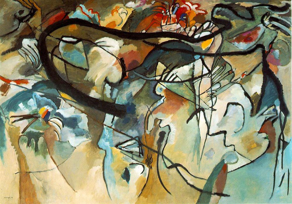
Kandinsky, Composition V, 1911
If you’ve studied any art history, you might well name the early 20th-century Russian painter Wassily Kandinsky (whose first abstract watercolor from 1910 appears at the top of the post). But “while Kandinsky is today hailed as the father of abstract painting,” writes Artsy’s Abigail Cain, “he was by no means the only player in the development of non-representational painting,” though “his work Komposition V did, admittedly, jumpstart public interest in abstract painting.”
First exhibited in Munich in December 1911, “this monumental work was just barely representational” and also “the first such work to be put on display,” inspiring the art world not just to take abstraction seriously but to see it as the future.
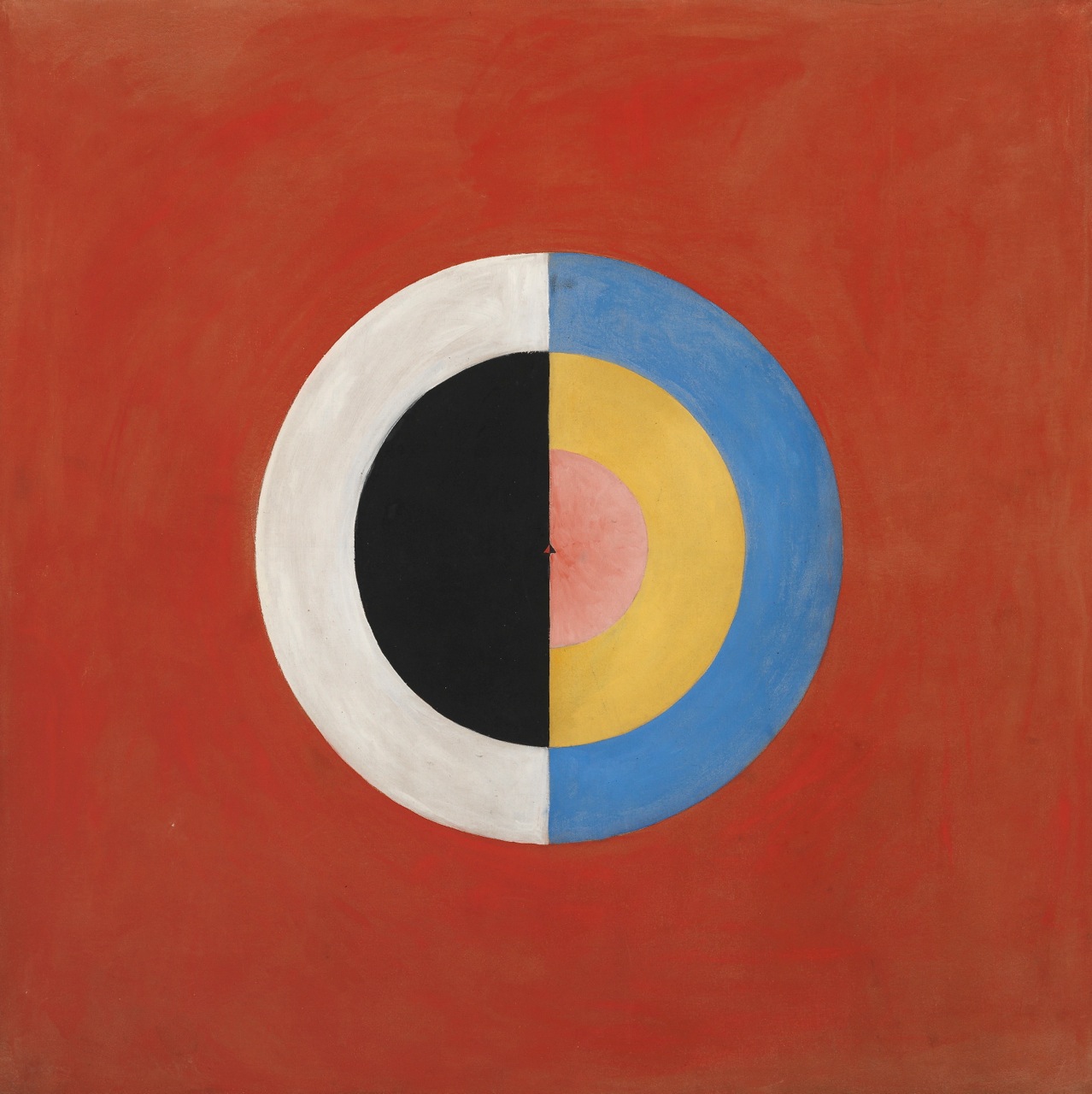
Hilma af Klint, Svanen, 1915
Kandinsky, inspired by Goethe’s Theory of Colors, had already given the subject of abstraction no small amount of thought. He’d first written a manifesto defining abstract art a few years earlier, titling it On the Spiritual in Art, a title that would have resonated with Hilma af Klint, a painter who might have actually gone abstract first. “Af Klint, who was born in Stockholm, showed an early interest in nature, mathematics and art, and she began studying at the Royal Swedish Academy of Fine Arts in 1882,” writes the New York Times’ Natalia Rachlin. She made her name as a landscape and portrait painter after graduation, but at the same time “also continued a more private pursuit: she had begun showing an interest in the occult and attending séances as early as 1879, at the age of 17.”
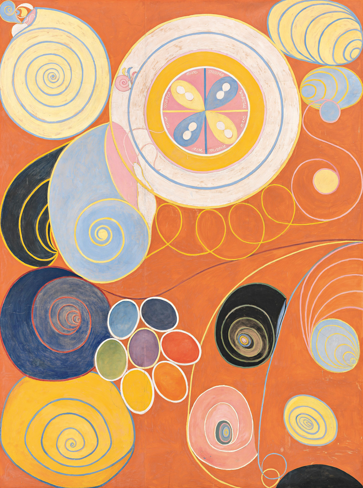
Hilma af Klint, ‘Staggering’: The Ten Largest, Youth, 1907.
Af Klint’s “curiosity about the spiritual realm soon developed into a lifelong interest in spiritism, theosophy and anthroposophy,” and during one séance she heard a spirit tell her to “make paintings that would represent the immortal aspects of man. This proved to be the turning point in af Klint’s work: from the naturalistic to the abstract, from portrayals of physical reality to conveying the invisible.” She went on to produce the 193 abstract Paintings for the Temple. The exhibitions of her representational work continued, but she kept the rest private, and in her will “even asked that her abstract paintings not be shown in public until at least twenty years after her death, noting that audiences were not yet capable of understanding her work.”
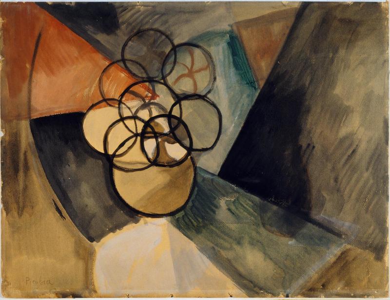
Francis Picabia, Caoutchouc, 1909.
Both Kandinsky and Af Klint look like plausible candidates for the first abstract painter — it just depends on how you define the beginning of abstraction — but they’re hardly the only ones. Cain also brings up the Czech-born, Paris-based artist František Kupka, or his colleague in the French avant-garde Francis Picabia, whose 1909 watercolor Caoutchouc (Rubber), pictured just above, came before Kandinsky had painted an abstract image or even completed any writing on the subject. Still, some objectors note that “the work still retains some semblance of form, reminiscent of a bouquet of flowers.” These questions of purity, innovation, and especially originality do get complicated. As Clive James once said, “It’s very hard to be totally inventive, so I’m not terribly interested in originality. Vitality is all I care about” — a quality that all these works exude still today.
Art Nouveau, Art Deco… these are terms we associate not only with a particular period in history—the turn of the 20th century and the ensuing jazz-age of the 20s—but also with particular locales: Paris, New York, L.A., London, Vienna, or the Jugendstil of Weimar Munich. We probably do not think of Rio de Janeiro. This may be due to biases about the privileged location of culture, such that most people in Europe and North America, even those with an arts education, know very little about art from “the colonies.”
But it is also the case that Brazil had its own modern art movement, one that strove for a distinctly Brazilian sensibility even as it remained in dialogue with Europe and the U.S. The movement announced itself in 1922, the centennial of the South American nation’s independence from Portugal.
In celebration, artists from São Paulo held the Semana de Arte Moderna, seven days in which, the BBC writes, they “constructed, deconstructed, performed, sculpted, gave lectures, read poetry and created some of the most avant-garde works ever seen in Brazil.”
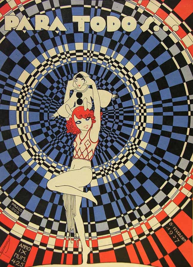
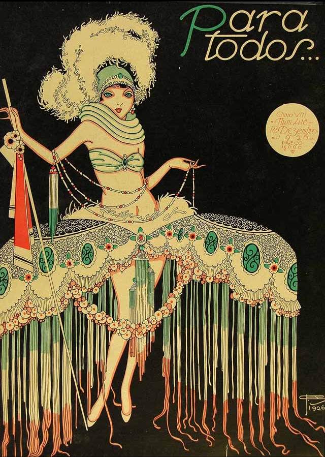
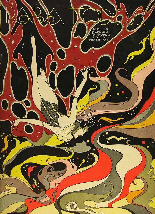
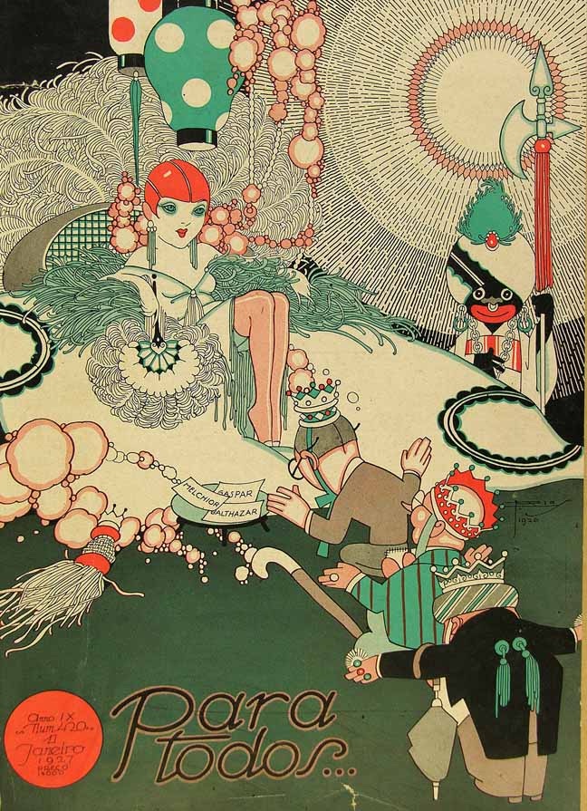
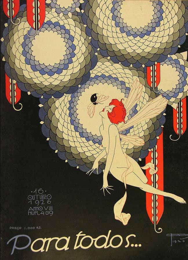
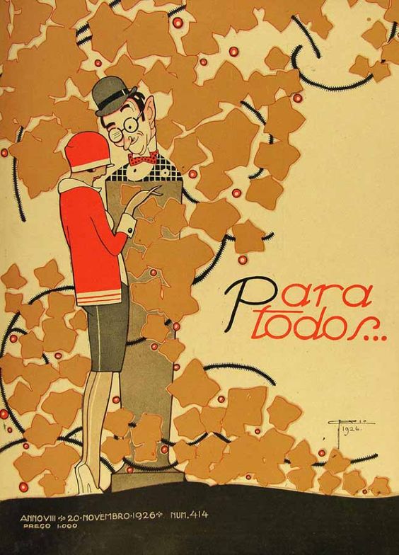
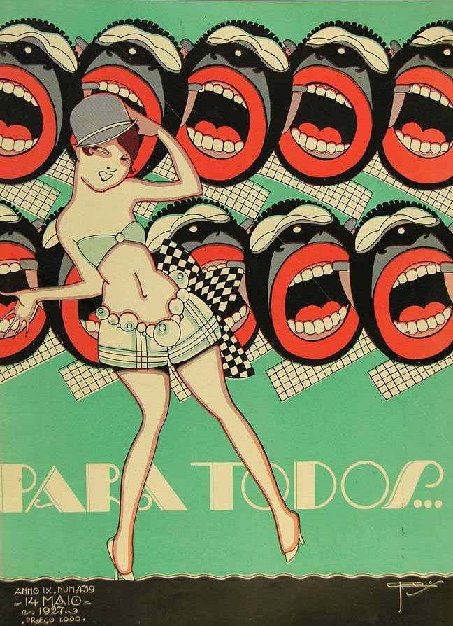
1922 also happened to be the year that a Rio de Janeiro-born artist, illustrator, and graphic designer who went by the name J. Carlos (José Carlos de Brito e Cunha) took over the direction of the magazine Para Todos. Founded in 1918, the magazine began as a film rag, and its covers faithfully featured photo spreads of movie stars. But in 1926, Carlos, who had already proven himself a “major talent in Brazilian Art Deco graphic design,” writes Messy Nessy, began drawing his own cover illustrations, and he continued to do so for the next four years, as well as drawing thousands of cartoons and writing vaudeville plays and samba lyrics.
His work clearly draws from Euro-American sources, including several unfortunate racial caricatures. But it also introduces some uniquely Brazilian elements, or uniquely Carlos-ian elements, that seem almost proto-psychedelic (we might imagine a jazz-age Os Mutantes accompanying these trippy designs). J. Carlos was a prolific artist who “collaborated in design and illustration in all the major publications of Brazil from the 1920s until the 1950s.” In all, it’s estimated that he left behind over 100,000 illustrations. So devoted was Carlos to the art and culture of his native city that he apparently turned down an invitation by Walt Disney to work in Hollywood.
Print magazine describes Carlos’ work as “a cross between Aubrey Beardsley and John Held Jr.,” and while there is no shortage of the willowy, doll-like flappers, elongated, elfin figures, and intricate, spidery patterns we would expect from this derivation, Carlos is also doing something very different from either of those artists—or really from anyone working in the Northern Hemisphere. He has since become a heroic figure for Brazilian artists and scholars, inspiring an extensive web project, a visual thesis on Issuu, and two recent documentary films (all in Portuguese), which you can find here.
In 2009, Carlos received a posthumous honor that probably would have thrilled him in life, a tribute song by the Académicos da Rocinha samba club. Listen to it here and find several more of Carlos’ Para Todos covers at Messy Nessy, Print, and the Brazilian blog Os caminhos do Journalismo.
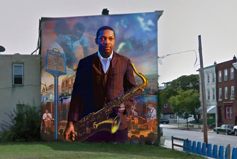
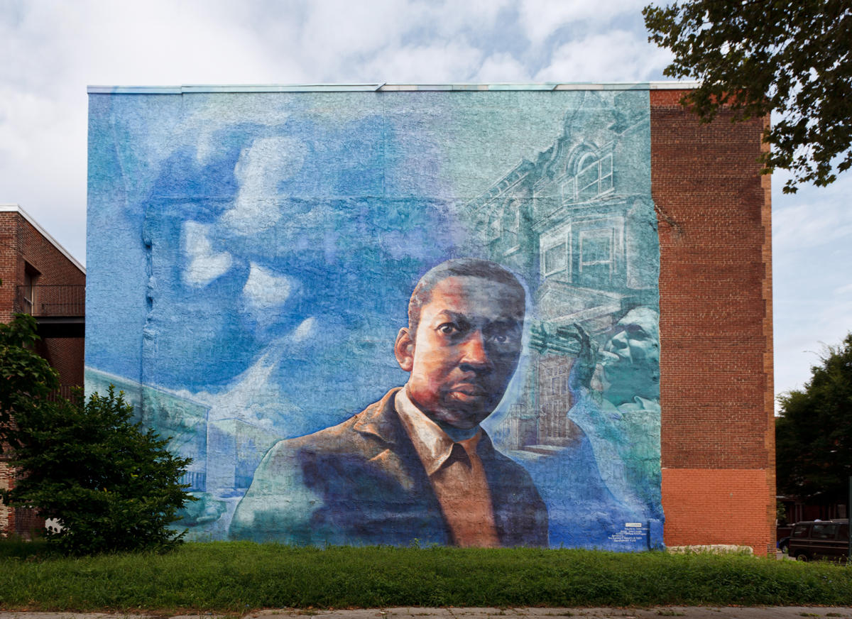
Earlier this summer, artists painted a 10-story high mural of Muddy Waters in the heart of Chicago. Now, Philadelphia answered with a mural of its own, right at the corner of 29th and Diamond. There, you’ll find a giant painting of John Coltrane by artist Ernel Martinez, which takes visual cues from another Coltrane mural that graced the side of a Philly building from 2002 until 2014.
If you would like to support the mission of Open Culture, consider making a donation to our site. It’s hard to rely 100% on ads, and your contributions will help us continue providing the best free cultural and educational materials to learners everywhere. You can contribute through PayPal, Patreon, and Venmo (@openculture). Thanks!
When you think of the accomplishments of the Islamic world, what comes to mind? For most of this century so far, at least in the West, the very notion has had associations in many minds with not creation but destruction. In 2002, mathematician Keith Devlin lamented how “the word Islam conjures up images of fanatical terrorists flying jet airplanes full of people into buildings full of even more people” and “the word Baghdad brings to mind the unscrupulous and decidedly evil dictator Saddam Hussein.” Ironically, writes Devlin, “the culture that these fanatics claim to represent when they set about trying to destroy the modern world of science and technology was in fact the cradle in which that tradition was nurtured. As mathematicians, we are all children of Islam.”
You don’t have to dig deep into history to discover the connection between Islam and mathematics; you can simply see it. “In Islamic culture, geometry is everywhere,” says the narrator of the brief TED-Ed lesson above. “You can find it in mosques, madrasas, palaces, and private homes.”
Scripted by writer and consultant on Islamic design Eric Broug, the video breaks down the complex, abstract geometric patterns found everywhere in Islamic art and design, from its “intricate floral motifs adorning carpets and textiles to patterns of tilework that seem to repeat infinitely, inspiring wonder and contemplation of eternal order.”
And the tools used to render these visions of eternity? Nothing more advanced than a compass and a ruler, Broug explains, used to first draw a circle, divide that circle up, draw lines to construct repeating shapes like petals or stars, and keep intact the grid underlying the whole pattern. The process of repeating a geometric pattern on a grid, called tessellation, may seen familiar indeed to fans of the mathematically minded artist M.C. Escher, who used the very same process to demonstrate what wondrous artistic results can emerge from the use of simple basic patterns. In fact, Escher’s Dutch countryman Broug once wrote an essay on the connections between his art and that of the Islamic world for the exhibit Escher Meets Islamic Art at Amsterdam’s Tropenmuseum.
Escher first encountered tessellations on a trip to the Islamic world himself, in the “colorful abstract decorations in the 14th century Alhambra, the well-known palace and fortress complex in Southern Spain,” writes Al.Arte’s Aya Johanna Daniëlle Dürst Britt. “Although he visited the Alhambra in 1922 after his graduation as a graphic artist, he was already interested in geometry, symmetry and tessellations for some years.” His fascinations included “the effect of color on the visual perspective, causing some motifs to seem infinite — an effect partly caused by symmetry.” His second visit to Alhambra, in 1936, solidified his understanding of the principles of tessellation, and he would go on to base about a hundred of his own pieces on the patterns he saw there. Those who seek the door to infinity understand that any tradition may hold the keys.
We're hoping to rely on loyal readers, rather than erratic ads. Please click the Donate button and support Open Culture. You can use Paypal, Venmo, Patreon, even Crypto! We thank you!
Open Culture scours the web for the best educational media. We find the free courses and audio books you need, the language lessons & educational videos you want, and plenty of enlightenment in between.