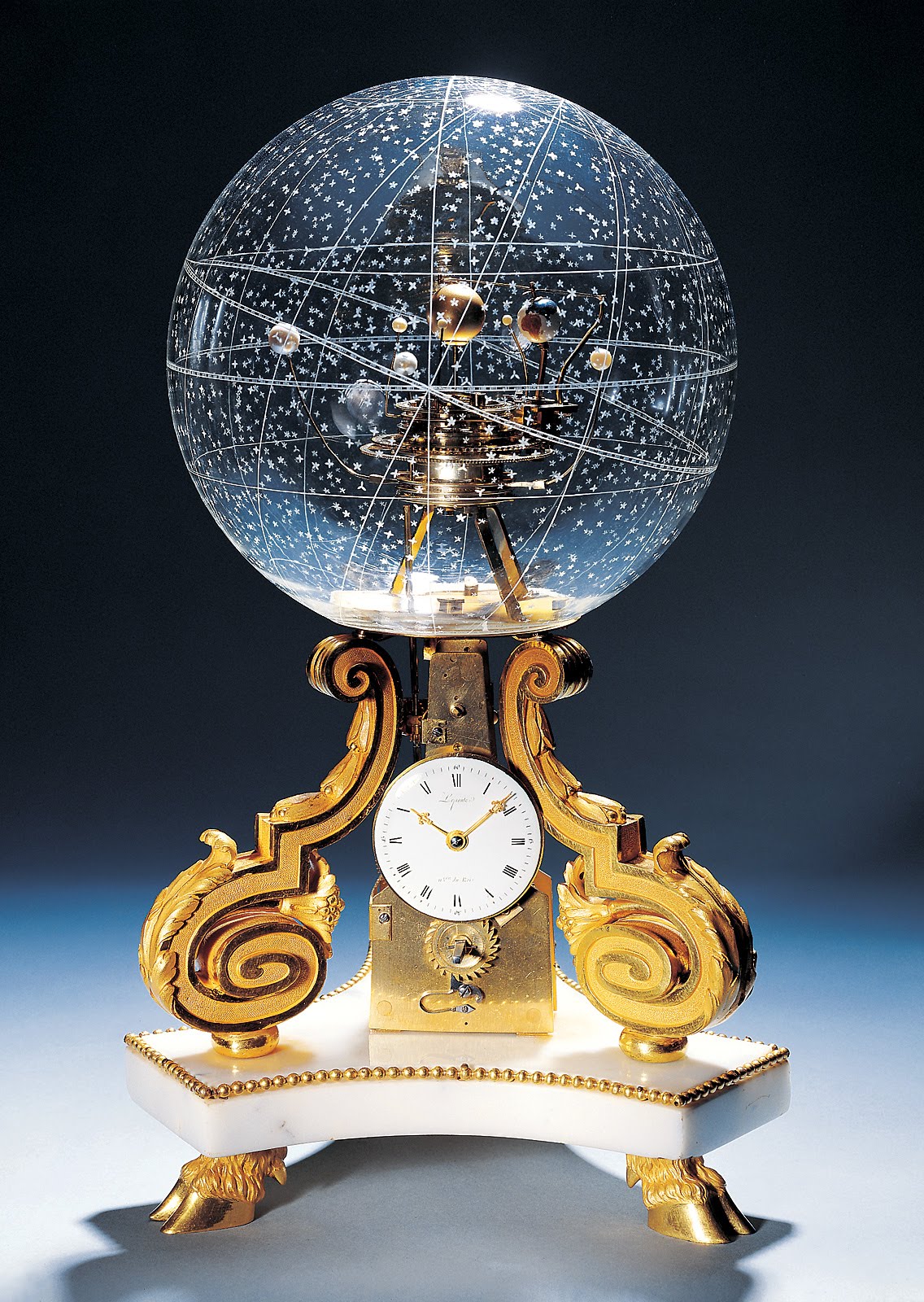
If you’re in Zurich, head over to the Beyer Clock and Watch Museum, which presents the history of timekeeping and timekeeping instruments, from 1400 BC to modern times. On display, you’ll find sundials, water and tower clocks, Renaissance automata, and pendulum clocks. And the Planetarium Table Clock featured above.
Made circa 1775, the planetarium clock keeps time … and so much more. According to the Museum of Artifacts website, the earth (look in the glass orb) “rotates around the sun in perfect real time.” And the “other five planets rotate as well–they “go up, down, around, in relation to the etched constellations of precisely positioned stars on the crystal globe, which if you are smart enough will reveal what season it is.” This fine timekeeping piece was the joint creation of Nicole-Reine Lepaute, a French astronomer who predicted the return of Halley’s Comet, and her husband, Jean-André Lepaute, who presided over a clockmaking dynasty and became horloger du Roi (clockmaker to the king).
It’s hard to imagine that the Planetarium clock didn’t somehow inspire a more modern creation–the Midnight Planétarium, an astronomical watch that shows the rotation of five planets — Mercury, Venus, Earth, Mars, Jupiter, and Saturn. It has a price tag of $220,000 (excluding sales tax). See it on display below.
If you would like to support the mission of Open Culture, consider making a donation to our site. It’s hard to rely 100% on ads, and your contributions will help us continue providing the best free cultural and educational materials to learners everywhere. You can contribute through PayPal, Patreon, and Venmo (@openculture). Thanks!
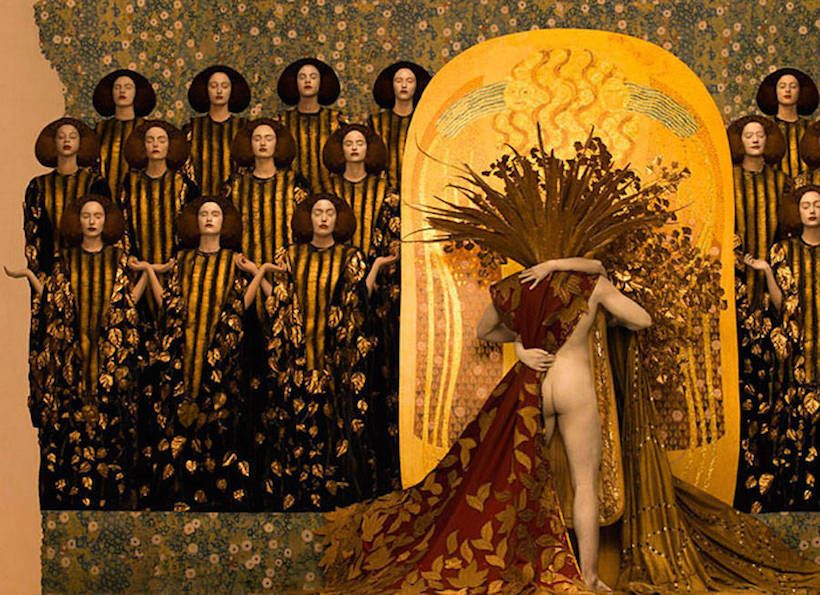
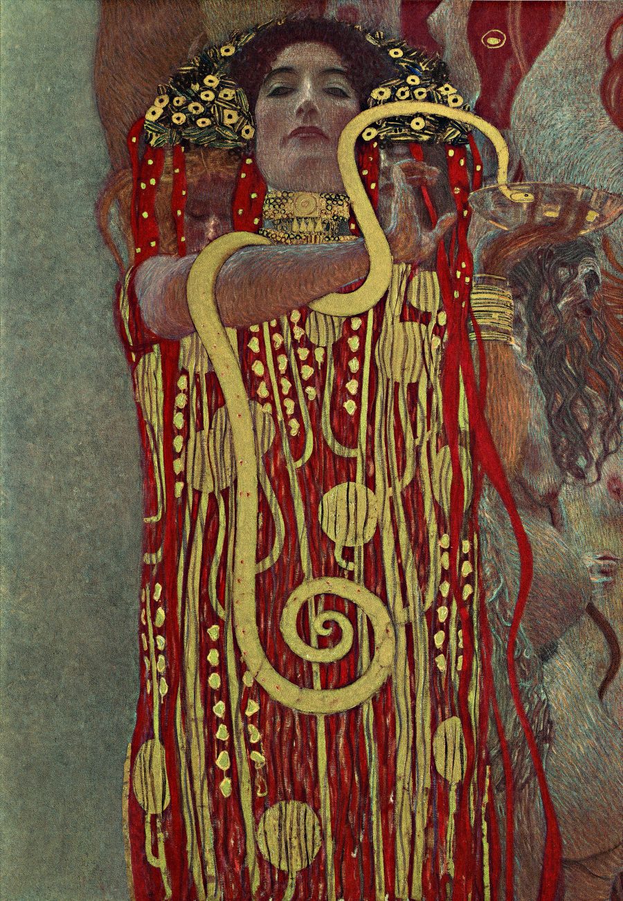
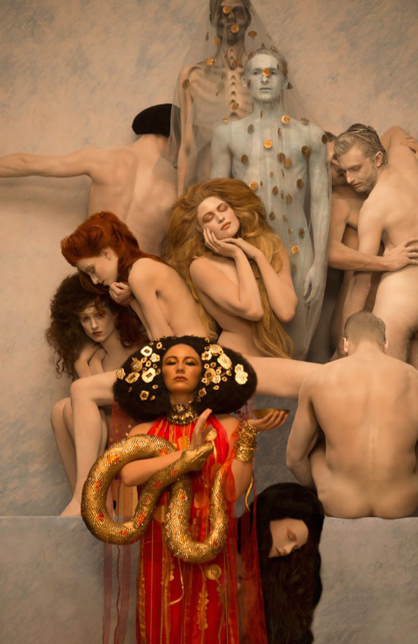
Gustav Klimt painted a glittering, erotic, haunting reality of his own, distinctive even by the standards of his artistically abundant environment of late 19th- and early 20th-century Vienna. “Whoever wants to know something about me,” he once wrote in a commentary on the self-portrait he never painted, “ought to look carefully at my pictures.” Given the level of scrutiny with which she’s no doubt had to look at his pictures, Klimt’s countrywoman Inge Prader must therefore know everything about the painter there is to know.
Image by Inge Prader
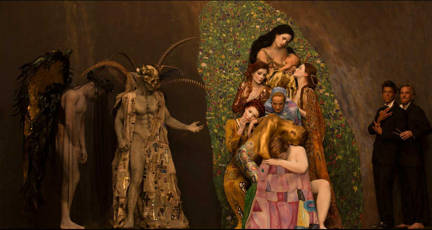
A photographer with a wide variety of corporate clients, Prader has drawn a good deal of attention by shooting recreations of Klimt’s canvasses made for Vienna’s Life Ball, an AIDS charity event, using real models, real costumes, and real gold. That last has a particular importance, given Prader’s focus on paintings from the “Golden Phase” that Klimt entered after becoming a success. “In 1903 Klimt visited Venice, Ravenne and Florence,” writes Konbini’s Donnia Ghezlane-Lala. “It was his visit to the San Vitale basilica in Ravenne that struck him the most. Fascinated by Byzantine mosaics, he decided to integrate the colour gold into his work using gold paper and gold leaf. Also, fun fact, Klimt was the son of a goldsmith.”
Image by Inge Prader
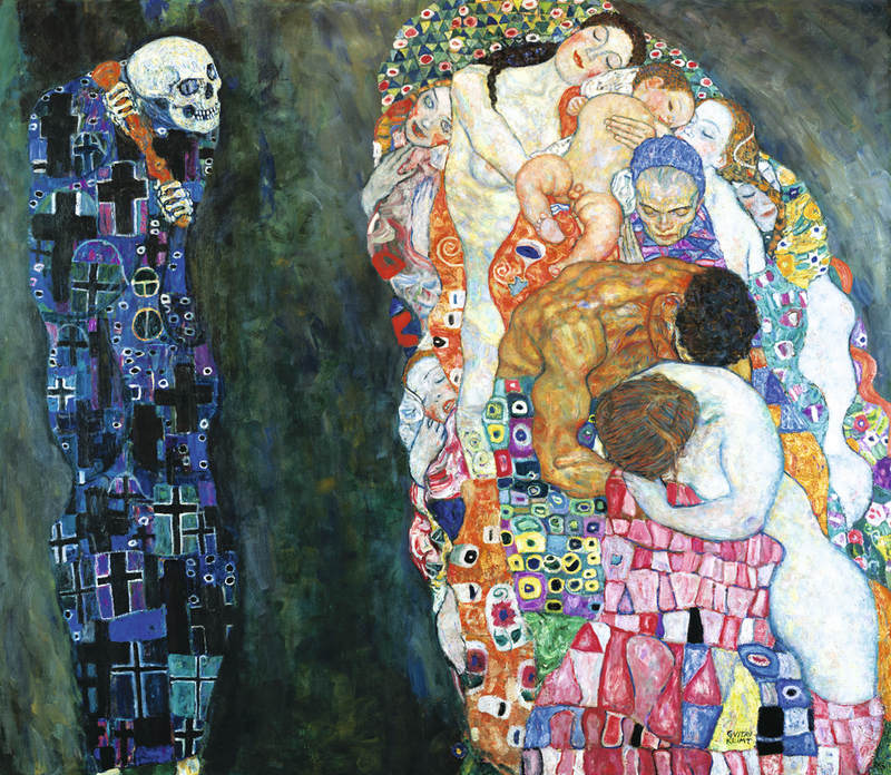
Prader’s “carefully posed models and intricately crafted props duplicate some of Klimt’s most iconic masterworks like Death and Life and Beethoven Frieze, mirroring the gold hued, highly decorative and erotic aesthetic the Austrian artist became best known for,” writes Designboom’s Nina Azzarello. “Richly ornamented costumes clothing warriors and women alike are situated alongside semi-nude figures and set against detailed mosaic backdrops.” These “paradise-like conditions” on the canvas transfer surprisingly well to photography, especially with the eye Prader has developed in fashion and advertising, two realms guaranteed to instill anybody with a positively Klimt-like appreciation for striking compositions, luxurious materials, and beautiful women.
It’s an ungainly word for English speakers, which is maybe why we do not hear it often: Gleichschaltung. Yet the concept remains central for a clear view of what happened to Germany in the 1930s. In 1933, the nation completely transformed, seemingly overnight, through “a concerted policy of ‘coordination’ (Gleischaltung),” the U.S. Holocaust Museum writes. “Culture, the economy, education, and law all came under Nazi control.” Those artists and organizations that were not purged had their essential character changed to reflect an entirely different set of artistic and political values. One publication, especially, serves as an example of the Nazification of culture.
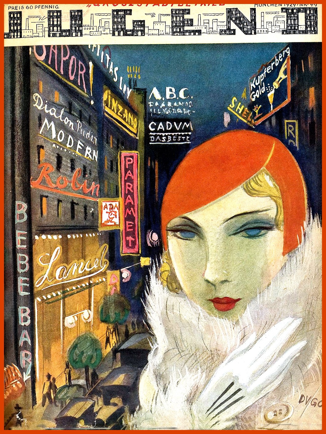
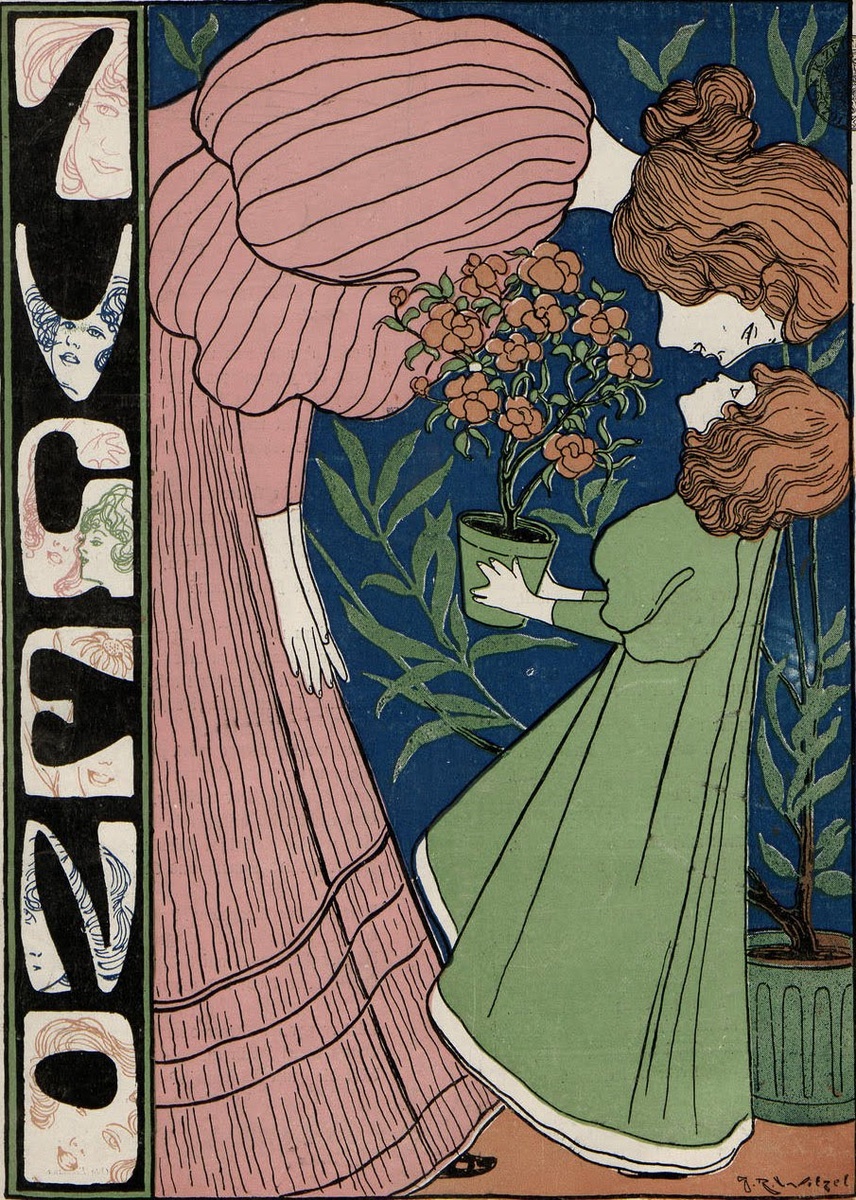
The arts journal Jugend (Youth), writes Messy ’N Chic, “had been turned largely into propaganda” between 1933 and 1940, its final year. But prior to the regime’s takeover, Jugend showcased the most avant-garde, “degenerate” artists of the era, and might have been “the ‘brainiest’ periodical of the day,” as one critic wrote in a 1904 issue of The Yale Literary Magazine. “There is no magazine published in England or in this country which is at all like it.”
As in England, France, Austria, and the U.S., the Art Nouveau movement in Germany emerged from a whirlwind of post-Impressionist painting, Orientalist motifs, folk art, modernist art and advertising, book illustration, and graphic and industrial design. Appropriately, given its perch on the threshold of a new millennium, Art Nouveau looked both backward—to the medieval, gothic, and Romantic—and forward toward a more modernist, urbane, and urbanized sensibility.
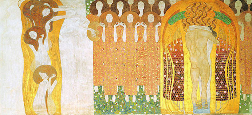
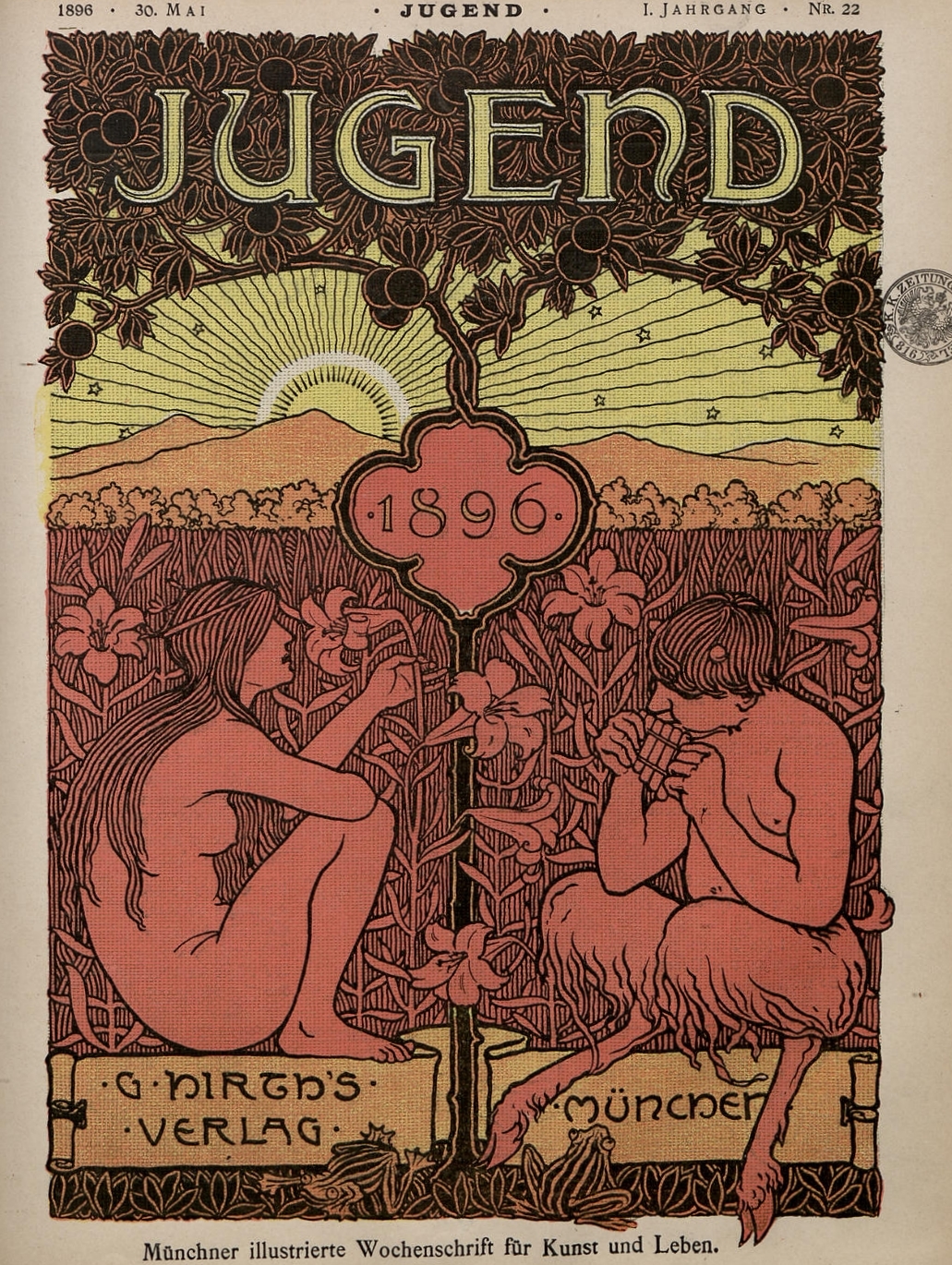
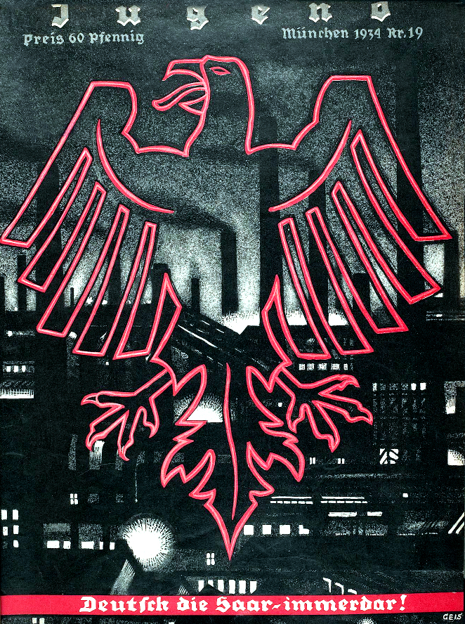
So influential was Jugend that Art Nouveau in Germany became known as Jugendstil. The Oxford Critical and Cultural History of Modernist Magazines writes, “Among Jugend’s most important qualities—indeed, an essential aspect of Art Nouveau and its German equivalent Jugendstil—was its brilliant escapism.” Founded in 1896 by writer George Hirth, the magazine was “from the start a venue to promote the new cultural Renaissance without recourse to the established ‘vintage’ art.” (See its very first cover right above.)
Jugenstil was primarily based in Munich, where most of its artists, designers, and writers lived and worked, until the turn of the century, when, notes the Art Encyclopedia, “the Munich group dispersed, heading for Berlin, Weimar and Darmstadt.” Art Nouveau in Germany developed in two phases, “a pre-1900 phase dominated by floral motifs, themselves rooted in English Art Nouveau and Japanese art,” and a “post-1900 phase, marked by a tendency towards abstract art.”
While we know the names of many Art Nouveau artists from elsewhere in Europe—Henri Toulouse-Lautrec in France, Aubrey Beardsley in England, Gustave Klimt in Austria, for example— Jugendstil in Germany produced few international stars. Many of the artists published in its pages were relatively unknown at first. But its shockingly brilliant covers and radical editorial tone put it at the forefront of German arts for decades. “Jugend’s political and social platform,” wrote the The Yale Literary Magazine critic, “is one of opposition—opposition to everything.”
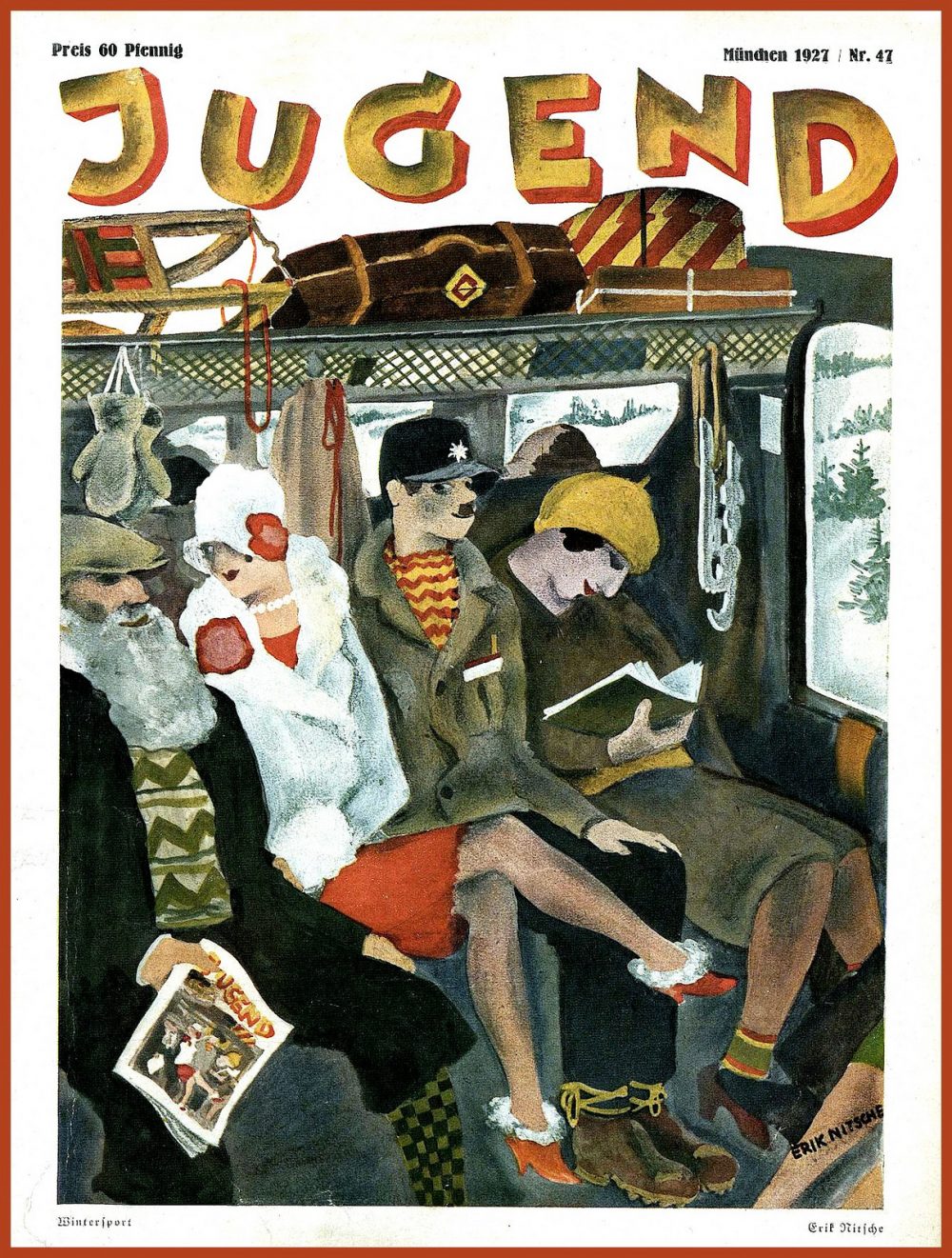
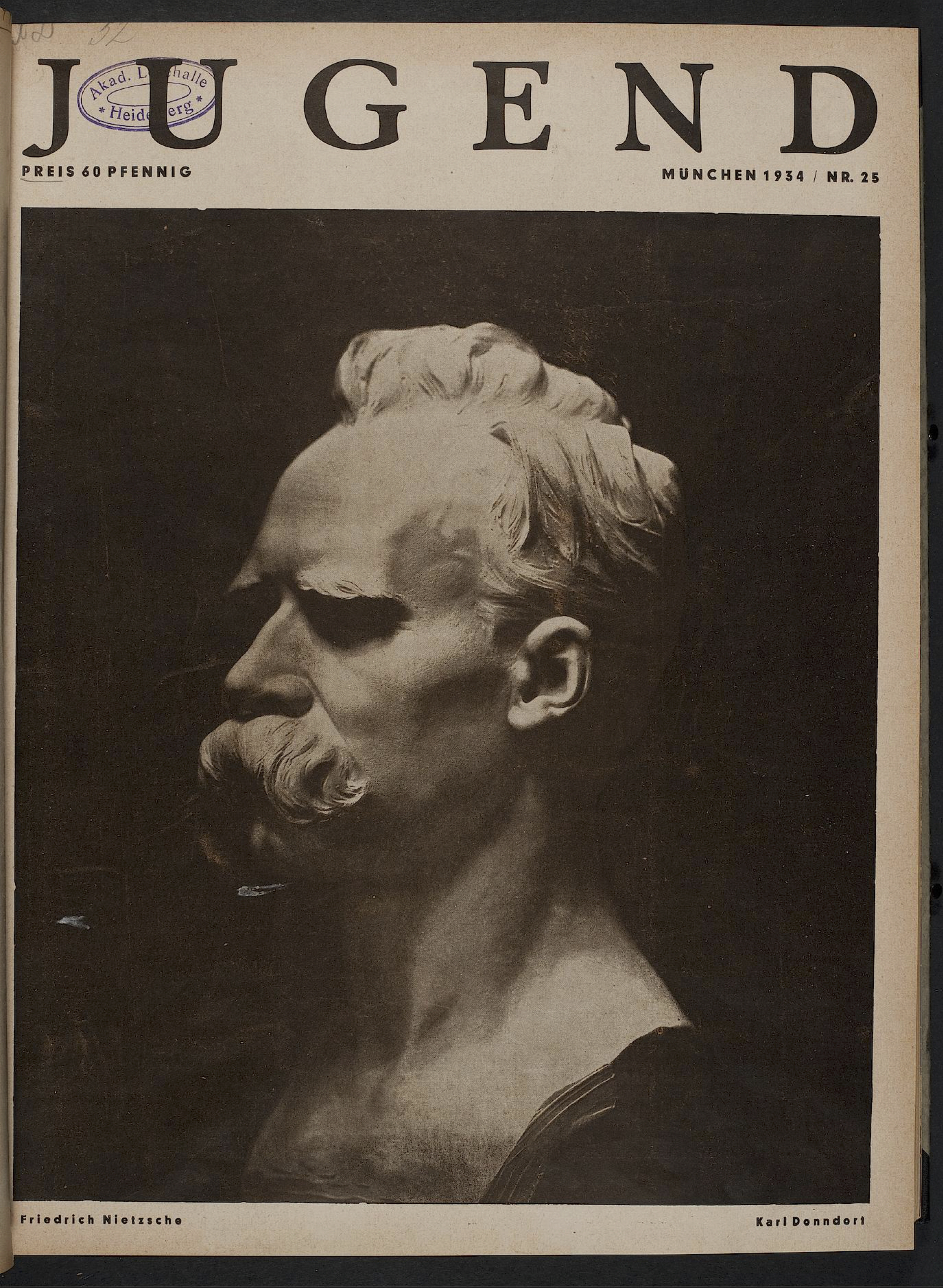
In 1933, however, the magazine was forced to comply with the kind of dour conservatism it had arisen explicitly to protest. Its wild covers and proudly original contents turned sombre and neoclassical, as in the bust of Nietzsche on the cover above from 1934. Many of its artists disappeared or went into exile. But as we observe this transformation happening abruptly in the University of Heidelberg archive, we still see a magazine whose editorial staff held fast to notions of artistic quality, as they were forced to turn away from everything that had made Jugend exciting, cutting-edge, and worthy of its title.
When humorist and New Yorker contributor David Sedaris quit smoking about a decade ago, he chose Tokyo in which to do it: “Its foreignness would take me out of myself, I hoped, and give me something to concentrate on besides my own suffering.” That first extended trip not only allowed him to kick the habit and gave him plenty of culture clashes to write about, but began his relationship with Tokyo that continues to this day. “Windows flanked the moving sidewalks, and on their ledges sat potted flowers,” he writes in appreciation in his first diaries there. “No one had pulled the petals off. No one had thrown trash into the pots or dashed them to the floor. How different life looks when people behave themselves.”
Most strikingly of all, there stood all “those vending machines, right out in the open, lined up on the sidewalk like people waiting for a bus.” The then-Paris-based Sedaris commiserates with a French Japanese language school classmate: “ ‘Can you believe it?’ he asked. ‘In the subway station, on the street, they just stand there, completely unmolested.’ ”
Our Indonesian classmate came up, and after listening to us go on, he asked what the big deal was.
“In New York or Paris, these machines would be trashed,” I told him.
The Indonesian raised his eyebrows.
“He means destroyed,” Christophe said. “Persons would break the glass and cover everything with graffiti.”
The Indonesian student asked why, and we were hard put to explain.
“It’s something to do?” I offered.
“But you can read a newspaper,” the Indonesian said.
“Yes,” I explained, “but that wouldn’t satisfy your basic need to tear something apart.”
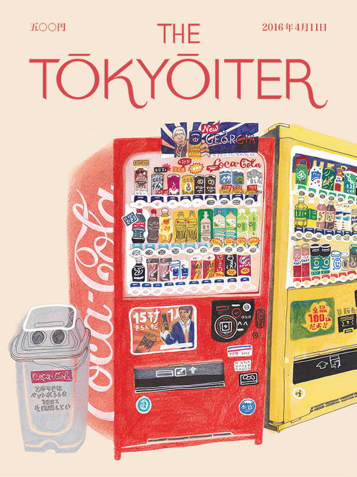
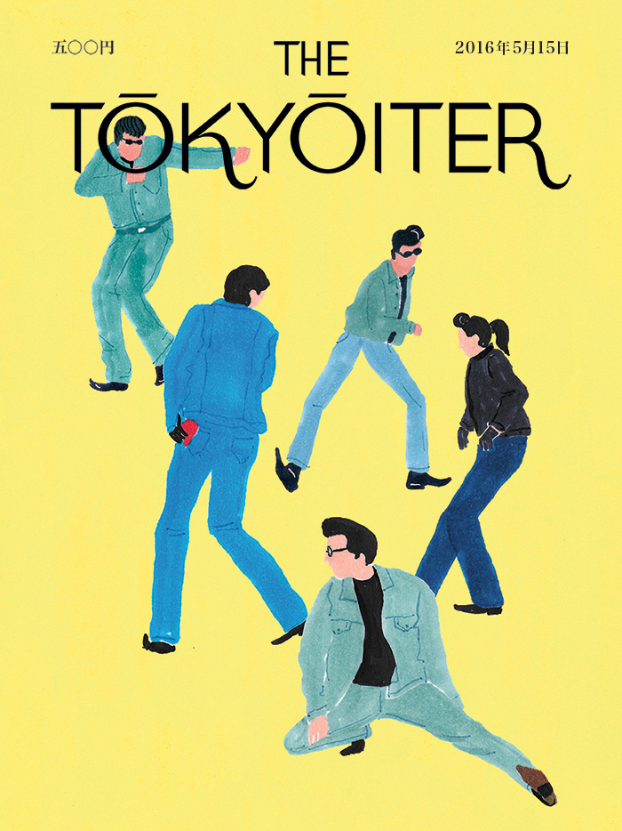
Those vending machines, a basic expectation to Tokyoites but a barely imaginable luxury to many a foreigner, appear on one cover of theTokyoiter, a collaborative art project producing a series of covers for an imaginary New Yorker-style magazine based in the Japanese capital. This tribute to a distinctively Japanese form of automated sidewalk commerce comes from Hennie Haworth, an illustrator based in England (where Sedaris also now lives, incidentally) who spent six months in Japan doing nothing but drawing its vending machines.
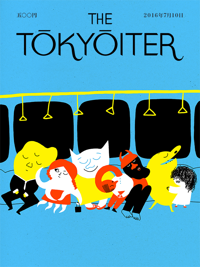
“I have a family member living in Japan which gives me excuse to visit every now and again,” writes illustrator Yuliya. “One of the main inspirations I find in folklore and all the magical beings of Japan. I’m originally from Ukraine and grew up surrounded by folk tales and superstitions, and even though I never truly believed in any of it, it always fascinated me. I miss that in modern Western world. So the creatures on my cover are made up but they are inspired by Japanese Yokai and just like the rest of Tokyo, they’re taking a spontaneous nap on the train.” Other Tokyoiter covers, contributed by artists from all around the world, take as their subjects Tokyo’s architecture, its food, its street life, its bath houses, and much more besides.
Taken as a collection, the project presents a combination of images of Tokyo familiar even to those who’ve never set foot in the city and references whose nuances only a Tokyoite — or at least someone with a Sedaris-level familiarity with the place — can immediately grasp. What could be more Tokyo, for instance, than the Rockabilly dancers of YoyogiPark, portrayed here by Australian artist Grace Lee, who for more than 40 years have spent their Sunday afternoons taking 1950s Americana to its absolute limit for the enjoyment of all who pass by? And if you’ve gone to see them yourself, you’ll know that, if you get thirsty while watching, you can simply buy a drink from one of the many vending machines nearby, all lined up right out in the open.
If you don’t move, nothing happens. — Jeff Koons
Jeff Koons, the subject of Oscar Boyson’s recent pop video essay, above, is surely one of the most widely known living artists. As with fellow artists Damien Hirst and Cindy Sherman the spotlight has produced an army of detractors who know very little about him, or his large, far-ranging body of work.
The choice of Scarlett Johansson to provide snarky second-person narration might not jolly Koons’ naysayers into suspending judgment long enough for a proper reintroduction. (His show-and-tell display of his Venus of Willendorf coffee mug causes her to quip, “You sexy motherfucker.” Ugh.)
On the other hand, there’s rapper Pharrell Williams’ onscreen observation that, “We need haters out there. They’re our walking affirmations that we’re doing something right.”
The potential for clamorous negative reaction has never propelled Koons to shy away from doing things on the grand scale in the public arena, as the giant open air display of such sculptures as “Seated Ballerina,” “Balloon Flower,” and “Puppy” will attest.
Surely, the genial affect he brings to the film is not what those who abhor “Made in Heaven,” a series of erotic 3‑D self-portraits co-starring his then-wife, porn-star Ilona “Cicciolina” Staller, would have expected.
Nor does he come off as a pandering, high priest of kitsch, something certain to disappoint those who abhor “Michael Jackson and Bubbles,” his gaudy, larger-than-life glazed porcelain sculpture of the King of Pop and his pet chimp.
“Kitsch is a word I really don’t believe in,” he smiles (possibly all the way to the bank).
Instead, he veers toward reflection, a fitting preoccupation for an artist given to mirror-polished stainless steel and more recently, gazing balls of the sort commonly found on 20th-century American lawns. He wants viewers to take a good look at themselves, along with his work.
Those whose hearts are set against him are unlikely to be swayed, but the undecided and open-minded might soften to a list of influences including Duchamp, Dali, DaVinci, Fragonard, Bernini, and Manet.
Ditto the opinions of a diverse array of talking heads like Frank Gehry, Larry Gagosian, and fellow post-modernist David Salle, who praises Koons’ artistic dedication to “everyday American-style happiness.”
An artist just starting out might first imitate the styles of others, and if all goes well, the process of learning those styles will lead them to a style of their own. But how does one learn something like an artistic style in a way that isn’t simply imitative? Artificial intelligence, and especially the current developments in making computers not just think but learn, will certainly shed some light in the process — and produce, along the way, such fascinating projects as the video above, a re-envisioning of Disney’s Alice in Wonderland in the styles of famous artists: Pablo Picasso, Georgia O’Keeffe, Katsushika Hokusai, Frida Kahlo, Vincent van Gogh and others.
The idea behind this technological process, known as “style transfer,” is “to take two images, say, a photo of a person and a painting, and use these to create a third image that combines the content of the former with the style of the later,” says an explanatory post at the Paperspace Blog.
“The central problem of style transfer revolves around our ability to come up with a clear way of computing the ‘content’ of an image as distinct from computing the ‘style’ of an image. Before deep learning arrived at the scene, researchers had been handcrafting methods to extract the content and texture of images, merge them and see if the results were interesting or garbage.”
Deep learning, the family of methods that enable computers to teach themselves, involves providing an artificial intelligence system called a “neural network” with huge amounts of data and letting it draw inferences. In experiments like these, the systems take in visual data and make inferences about how one set of data, like the content of frames of Alice in Wonderland, might look when rendered in the colors and contours of another, such as some of the most famous paintings in all of art history. (Others have tried it, as we’ve previously featured, with 2001: A Space Odyssey and Blade Runner.) If the technology at work here piques your curiosity, have a look at Google’s free online course on deep learning or this new set of courses from Coursera— it probably won’t improve your art skills, but it will certainly increase your understanding of a development that will play an ever larger role in the culture and economy ahead.
Here’s a full list of painters used in the neural networked version of Alice:
Pablo Picasso
Georgia O’Keeffe
S.H. Raza
Hokusai
Frida Kahlo
Vincent van Gogh
Tarsila
Saloua Raouda Choucair
Lee Krasner
Sol Lewitt
Wu Guanzhong
Elaine de Kooning
Ibrahim el-Salahi
Minnie Pwerle
Jean-Michel Basquiat
Edvard Munch
Natalia Goncharova
When an artist becomes an adjective—think Orwellian, Kafkaesque, or Joycean—one of two things can happen: their work can be superficially appropriated, reduced to a collection of obvious gestures clumsily combined in bad pastiche. Or their distinctive style can inspire artists with more skill and depth to make original creations that may themselves become touchstones for the future. What might distinguish one from the other is the degree to which we understand not only the work of Orwell, Kafka, or Joyce, but also the work that influenced them.
When it comes to David Lynch, there’s no doubt that the “Lynchian” stands as a model for so much contemporary film and television. But while some directors make excellent use of Lynch’s influence, others strive for Lynchian atmosphere only to reach a kind of uninspired, unintentional parody. The sublime balance of humor and horror Lynch has achieved over the course of his extraordinary career seems like the kind of thing one shouldn’t attempt without serious study and preparation.
Without Lynch’s surrealist vision, oddball characterization and dialogue fall flat—as in Twin Peaks’ second season, which Lynch himself says “sucked.” So what defines the Lynchian? A very distinctive use of music, for one thing. And as the video essay above by Menno Kooistra demonstrates, the significant influence of painting. Lynch himself began painting and drawing at a young age and studied art at the School of the Museum of Fine Arts in Boston in the sixties. While he found his calling in film, his art education prepared him to dream up the unforgettable compositions of the Lynchian world.
Rene Magritte, Edward Hopper,Arnold Böcklin, and the master of psychological horror, Francis Bacon—all of these painters have directly informed Lynch’s nightmarish mise-en-scène. As you’ll see in Kooistra’s video, in side by side comparisons, Lynch adapts the work of his favorite artists for his own purposes. In an interview clip, he says he discovered Bacon at a gallery in 1966 and found the experience “thrilling”—later using the painter’s work as inspiration for The Elephant Man and Twin Peak’s disorienting Red Room.
We see Lynch’s homage to his favorite painters in Eraserhead and Blue Velvet, as well as the current, third season of Twin Peaks, over which he has (as he well should) complete creative control. You may not find Francis Bacon’s disturbing portraits quite as thrilling as Lynch does, or draw on Edward Hopper for a warped version of 1950’s Americana. These are Lynch’s references; they resonate on his particular frequency, and hence provide him with visual frames for his own personal dream logic.
But what we might take away from “The Art of David Lynch” is that the Lynchian is necessarily tied to a painterly sensibility, and that without the influence of fine art on composition, color, and framing, a Lynchian production may be in danger of looking—as he says of that disappointing Twin Peaks’ second season—“stupid and goofy.”
The problem is there are no Nixons around at the moment. That’s what we need — we need a real good Nixon to give something for other people to get their teeth into, to really … loathe him, to become themselves more effective as opposition leaders.
Alas, his prayers have been answered.
Steadman, who has brought his inky sensibilities to bear on such works as Animal Farm andAlice in Wonderland, has a new American president to add to the collection he discussed several years ago, in the video above.
Steadman’s pen was the sword that rendered Gerald Ford as a scarecrow, Ronald Reagan as a vampire, and George W. Bush as a monkey in a cage of his own making.
Barack Obama, one of the candidates in that comparatively bland 2012 election, is depicted as a tenacious, slender vine, straining ever upward.
Jimmy Carter, somewhat less benignly, is a puppy eagerly fetching a stick with which to pardon Nixon, the Welsh cartoonist’s dark muse, first encountered when he accompanied Thompson on the road trip that yielded Fear and Loathing: On the Campaign Trail ’72.
And now…
Donald Trump has given Steadman reason to come out fighting. With luck, he’ll stay out as long as his services are required. The above portrait, titled “Porky Pie,” was sent, unsolicited, to Gerry Brakus, an editor of the New Statesman, who published it on December 17, 2015.
At the time, Steadman had no reason to believe the man he’d anthropomorphized as a human pig hybrid, squeezed into bloody flag-print underpants, would become the 45th president:
Trump is unthinkable. A thug and a molester. Who wants him?
The portrait’s hideousness speaks volumes, but it’s also worth looking beyond the obvious-seeming inspiration for the title to a reference few Americans would get. “Pork pie”—or porky—is Cockney rhyming slang for “a lie.”
See a gallery of Steadman’s portraits of American presidents on his website.
We're hoping to rely on loyal readers, rather than erratic ads. Please click the Donate button and support Open Culture. You can use Paypal, Venmo, Patreon, even Crypto! We thank you!
Open Culture scours the web for the best educational media. We find the free courses and audio books you need, the language lessons & educational videos you want, and plenty of enlightenment in between.

