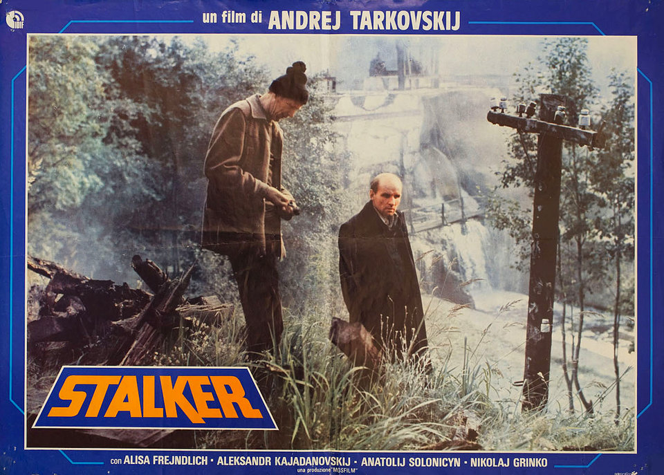
Here we have a poster for a film many of you will have heard of, and some of you will have watched right here on Open Culture: Stalker, widely considered the most masterful of Soviet auteur Andrei Tarkovsky’s career full of masterpieces. Needless to say, the film has inspired no small amount of cinephile enthusiasm in the 37 years since its release, and if it has inspired the same in you, what better way to express it than to hang its poster on your wall? And why not take it to the next level by hanging a Stalker poster from another country, such as the Italian one here?
We found it on Posteritati, a New York movie poster gallery whose online store also functions as a digital archive of over 40,000 of these commercial-cinematic works of art, all conveniently sorted into categories: not just Tarkovsky posters, but posters from the former East Germany and Iran, posters from the Czech New Wave, and posters designed by the Japanese artist Tadanori Yokoo (whose works, said no less an observer of the human condition than Yukio Mishima, “reveal all of the unbearable things which we Japanese have inside ourselves”). And that’s just a small sampling of what Posteritati has to offer. If you dig deep enough, you can even find posters from Poland and the Czech Republic with cats in them.

Avid Open Culture readers might find Posteritati’s philosophy section especially worthwhile, containing as it does posters for movies we’ve previously featured and movies about thinkers we like to write about, like Derrida, Examined Life, Wittgenstein, and of course the Slavoj Žižek-starring The Pervert’s Guide to Ideology and Žižek!
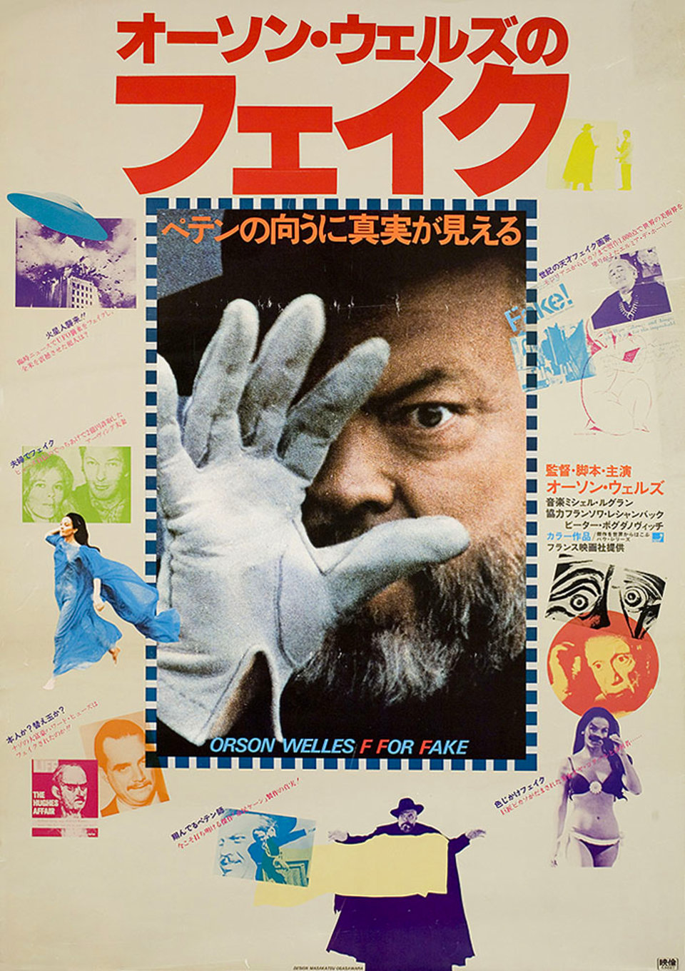
They also sell posters at the site, though even the ones not in stock remain available to view as images: just toggle the “IN STOCK ONLY” switch to the OFF position, and you can then see all of the posters in the collection. No matter what your cinematic, intellectual, or aesthetic interests, you’ll find at least a few posters that pique your interest. The Japanese poster for Orson Welles’ F for Fake just above, for instance, represents a near-perfect intersection of most of my own interests. Just as well Posteritati doesn’t have it in stock — I’d probably pay anything.
Related Content:
50 Film Posters From Poland: From The Empire Strikes Back to Raiders of the Lost Ark
The Strange and Wonderful Movie Posters from Ghana: The Matrix, Alien & More
Japanese Movie Posters of 10 David Lynch Films
A Look Inside Martin Scorsese’s Vintage Movie Poster Collection
100 Greatest Posters of Film Noir
Striking French, Russian & Polish Posters for the Films of Andrei Tarkovsky
Watch Stalker, Andrei Tarkovsky’s Mind-Bending Masterpiece Free Online
F for Fake: Orson Welles’ Short Film & Trailer That Was Never Released in America
Based in Seoul, Colin Marshall writes and broadcasts on cities, language, and style. He’s at work on a book about Los Angeles, A Los Angeles Primer, the video series The City in Cinema, the crowdfunded journalism project Where Is the City of the Future?, and the Los Angeles Review of Books’ Korea Blog. Follow him on Twitter at @colinmarshall or on Facebook.