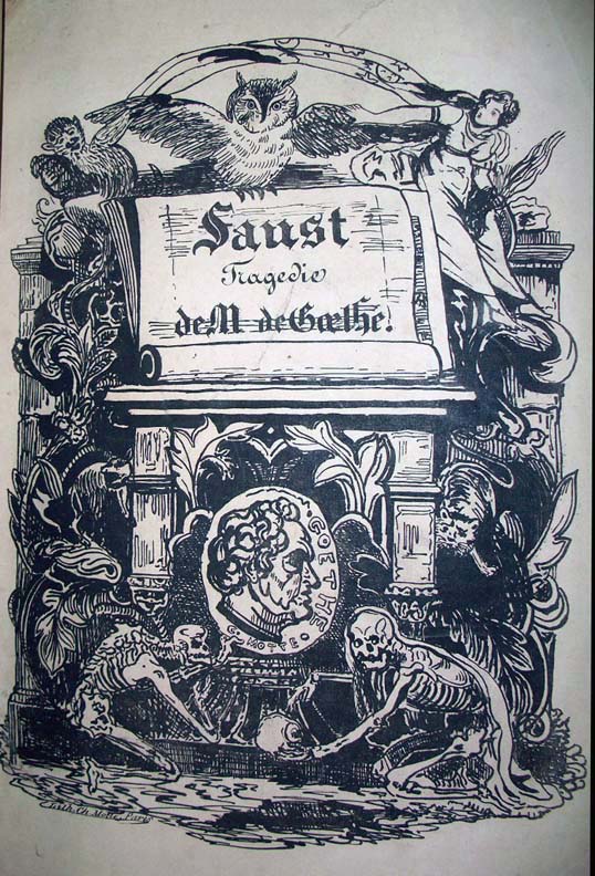
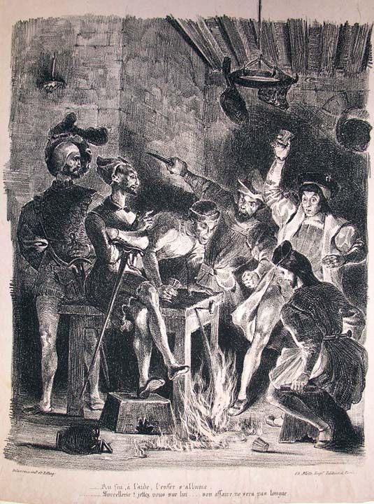
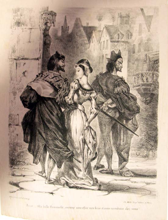
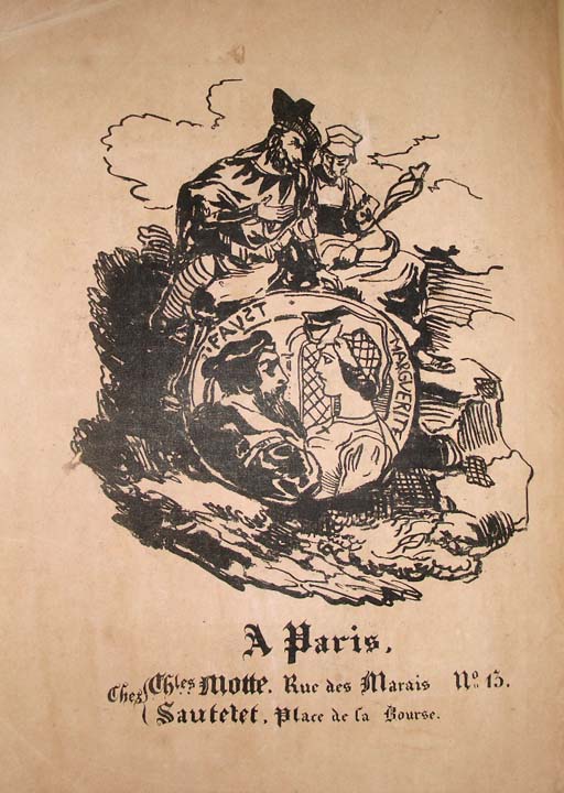
Did our post last month on Édouard Manet’s illustrations of Stephane Mallarmé’s translation of Edgar Allan Poe’s The Raven get you excited enough to track down Dover Publications’ collection of those haunting images? If so, you’ll notice that the book also contains Eugène Delacroix’s illustrations of Johann Wolfgang von Goethe’s Faust, a bold set of artworks that earned high praise, at least from Goethe himself: “Delacroix,” said the writer upon viewing the lithographs made for the text’s 1828 edition, “has surpassed my own vision.” You can see/read a complete version online here.
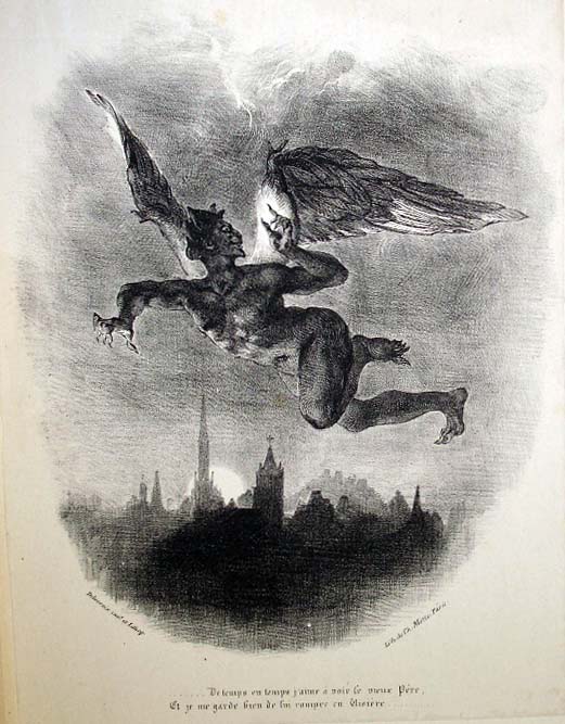
Princeton University Library’s Julie L. Mellby uses that line to open a post on Delacroix’s Faust, “considered by most historians to be one of the finest publications of the nineteenth century. Gordon Ray calls Delacroix’s illustrations ‘the high point of Romantic book illustration,’ and David Bland called the volume ‘one of the very greatest of all illustrated books.’ ” On that Princeton page you’ll find images scanned straight from Princeton’s copy of the book, and here we offer a select few to get you started appreciating how Delacroix interpreted Goethe’s oft-told tale of divine wagers, pacts with the devil, and the temptations of infinite knowledge.
“Every time I look at the engravings of Faust I am seized with a longing to use an entirely new style of painting that would consist, so to speak, in making a literal tracing of nature.” Delacroix wrote that in his journal before taking on the project of illustrating Faust himself.
Maria Popova at BrainPickings quotes it in her own post on the work that resulted in “a mesmerizing dialogue across disciplines between these two geniuses, half a century apart in age.” (You can see more images on her site.) Whether or not Goethe knew he had written a work that would still resonate with humanity centuries later, he did seem to understand that no one who saw Delacroix’s visions of it would ever forget them.
H/T Princeton University / BrainPickings
Related Content:
Watch Goethe’s Haunting Poem, “Der Erlkönig,” Presented in an Artful Sand Animation
Baudelaire, Balzac, Dumas, Delacroix & Hugo Get a Little Baked at Their Hash Club (1844–1849)
The Death Masks of Great Authors: Dante, Goethe, Tolstoy, Joyce & More
Colin Marshall writes on cities, language, Asia, and men’s style. He’s at work on a book about Los Angeles, A Los Angeles Primer, and the video series The City in Cinema. Follow him on Twitter at @colinmarshall or on Facebook.


