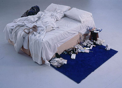
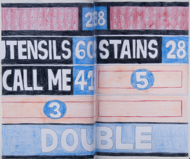
3D Printed Zoetrope Animates Rubens’ Famous Painting, “The Massacre of the Innocents”

In the 17th cen­tu­ry, the Flem­ish Baroque painter Peter Paul Rubens paint­ed “The Mas­sacre of the Inno­cents” (see below), an artis­tic depic­tion of a very brief Bib­li­cal pas­sage in The Gospel of Matthew. The pas­sage recounts the sto­ry of how Herod the Great, a Roman client king of Judea, ordered the exe­cu­tion of young male chil­dren in Beth­le­hem, hop­ing to avoid los­ing his throne to a new­ly-born King of the Jews. And it reads like this:

Then Herod, when he saw that he was deceived by the wise men, was exceed­ing­ly angry; and he sent forth and put to death all the male chil­dren who were in Beth­le­hem and in all its dis­tricts, from two years old and under, accord­ing to the time which he had deter­mined from the wise men. Then was ful­filled what was spo­ken by Jere­mi­ah the prophet, say­ing:

“A voice was heard in Ramah,
Lamen­ta­tion, weep­ing, and great mourn­ing,
Rachel weep­ing for her chil­dren,
Refus­ing to be com­fort­ed,
Because they are no more.”

In the 21st cen­tu­ry, Sebas­t­ian Bur­don and Mat Coll­ishaw have now come along and cre­at­ed “All Things Fall,” a 3d zoetrope that brings the “Mas­sacre of the Inno­cents” to life. Using a 19th cen­tu­ry opti­cal tech­nique that pro­duces the illu­sion of motion, the zoetrope vir­tu­al­ly ani­mates the grue­some Bib­li­cal scene. You can watch it play out, eeri­ly, above.

Accord­ing to Bur­don, it took “6 months to do all the 3d mod­el­ing and ani­ma­tions” and involved “cre­at­ing over 350 char­ac­ter fig­ures, envi­ron­ment ele­ments and archi­tec­ture. A pret­ty stun­ning effort.

Peter_Paul_Rubens_-_Massacre_of_the_Innocents_-_WGA20259

Relat­ed Con­tent:

Down­load Over 250 Free Art Books From the Get­ty Muse­um

Watch Art on Ancient Greek Vas­es Come to Life with 21st Cen­tu­ry Ani­ma­tion

5‑Minute Ani­ma­tion Maps 2,600 Years of West­ern Cul­tur­al His­to­ry

by | Permalink | Make a Comment ( 1 ) |

Salvador Dalí Takes His Anteater for a Stroll in Paris, 1969

dali anteater

Sal­vador Dalí had a thing for anteaters. They made for good schtick, espe­cial­ly in Europe, and Dalí nev­er saw schtick that he did­n’t like.

And yet maybe there’s some­thing a lit­tle more to this pic­ture tak­en in Paris, in 1969. Maybe there’s some kind of sym­bol­ism, or even a play­ful trib­ute, tak­ing place in the pho­to above.

Sur­re­al­ism offi­cial­ly came into being in 1924, when André Bre­ton wrote Le Man­i­feste du Sur­réal­isme (read an Eng­lish trans­la­tion here). First a lit­er­ary move­ment, Sur­re­al­ism lat­er embraced painters, includ­ing fig­ures like Dalí.

LeTamanoir

In 1930, Dalí cre­at­ed a book­plate for Bre­ton called, “André Bre­ton le tamanoir.” That trans­lates to “André Bre­ton the Anteater,” the nick­name giv­en to Bre­ton by his fel­low sur­re­al­ists. Now con­sid­er the fact that the 1969 pho­to was tak­en three short years after Bre­ton’s death, and per­haps we can read an homage into it.

What nick­name did Bre­ton give to Dalí, you might ask? “Avi­da Dol­lars.” An ana­gram for “Sal­vador Dalí,” “Avi­da Dol­lars” trans­lates to “eager for dol­lars.” Pret­ty apt.

Fol­low us on Face­book, Twit­ter, Google Plus and LinkedIn and  share intel­li­gent media with your friends. Or bet­ter yet, sign up for our dai­ly email and get a dai­ly dose of Open Cul­ture in your inbox.

Relat­ed Con­tent:

Sal­vador Dalí Illus­trates Don Quixote: Two Spaniards with Unique World Views

Sal­vador Dalí Sketch­es Five Span­ish Immor­tals: Cer­vantes, Don Quixote, El Cid, El Gre­co & Velázquez

Sal­vador Dalí’s Haunt­ing 1975 Illus­tra­tions for Shakespeare’s Romeo and Juli­et

Sal­vador Dalí Illus­trates Shakespeare’s Mac­beth

Chris Burden (R.I.P.) Turns Late-Night TV Commercials Into Conceptual Art

Chris Bur­den got shot with a rifle, closed up in a lock­er for five days, made to crawl across fifty feet of bro­ken glass, cru­ci­fied on a Volk­swa­gen Bee­tle, and wedged for an extend­ed peri­od under a large piece of non-bro­ken glass. But he did it all vol­un­tar­i­ly, sur­viv­ing these and oth­er threats to life and limb, all under­tak­en in the name of art, only dying this past Sun­day. That con­clud­ed a long and aston­ish­ing­ly var­ied career in which Bur­den pro­duced work not just of the grim trapped-in-a-box and bul­let-in-the-arm vari­ety, but elab­o­rate, even whim­si­cal sculp­tures, mod­els, and machines that cap­ti­vate their view­ers to this day.

Bur­den also, between the years of 1973 and 1977 (a peri­od after the shoot­ing and the lock­er entrap­ment), worked in the medi­um of tele­vi­sion com­mer­cials, pro­duc­ing work that, aired late at night, sure­ly cap­ti­vat­ed their own view­ers (who, giv­en the era, may have already entered their own states of altered con­scious­ness). At the top of the post, you can watch all of them in a row, a pro­gram accom­pa­nied by tex­tu­al com­men­tary from Bur­den him­self which details the nature of his self-assigned mis­sion “to break the omnipo­tent stran­gle­hold of the air­waves that broad­cast tele­vi­sion held.”

The 2013 video from the Muse­um of Con­tem­po­rary Art just above fea­tures Bur­den remem­ber­ing this dar­ing project of buy­ing and artis­ti­cal­ly repur­pos­ing Los Ange­les com­mer­cial air­time. But Bur­den’s inter­est in tele­vi­sion did­n’t stop, or indeed start, with these com­mer­cials. At East of Bor­neo, Nick Still­man has an essay putting all the artist’s TV-relat­ed work in con­text. “By sit­u­at­ing the tele­vi­sion set and by using the com­mer­cial form as implic­it ves­sels of author­i­ty,” Still­man writes, “Burden’s work about how tele­vi­sion influ­ences behav­ior asked the most pen­e­trat­ing and eth­i­cal ques­tion of any artist I can think of who used the medi­um: Do you believe in tele­vi­sion?”

Though Bur­den’s com­mer­cials haven’t seen reg­u­lar broad­cast in near­ly forty years, his spir­it nev­er­the­less enjoys strong prospects of liv­ing on through his lat­er work, which reflects and inhab­its not the medi­at­ed world around us, but the con­crete one. In 2011, we fea­tured his Metrop­o­lis II, a kinet­ic sculp­ture mod­el­ing the city of the future in swoop­ing ramps, archi­tec­tural­ly fan­tas­ti­cal tow­ers, and count­less toy cars on dis­play at the Los Ange­les Coun­ty Muse­um of Art.

And if you so much as pass by the muse­um on Wilshire Boule­vard, you’ll see his instal­la­tion of vin­tage lamp­posts known as Urban LightOdds are you’ll also take a pic­ture with it; from what I’ve seen, it has to rank has the most pho­tographed place in the city. “Heat is life,” Bur­den blankly intoned in his 1975 com­mer­cial Poem for L.A. — but light seems to have a pret­ty fair claim as well.

Relat­ed Con­tent:

Metrop­o­lis II: Chris Burden’s Amaz­ing, Fre­net­ic Mini-City

Sal­vador Dalí Goes Com­mer­cial: Three Strange Tele­vi­sion Ads

Fellini’s Fan­tas­tic TV Com­mer­cials

Col­in Mar­shall writes on cities, lan­guage, Asia, and men’s style. He’s at work on a book about Los Ange­les, A Los Ange­les Primer, and the video series The City in Cin­e­maFol­low him on Twit­ter at @colinmarshall or on Face­book.

Van Gogh’s 1888 Painting, “The Night Cafe,” Animated with Oculus Virtual Reality Software

Vin­cent van Gogh’s 1888 paint­ing, “The Night Cafe,” now hangs at the Yale Uni­ver­si­ty Art Gallery, accom­pa­nied by this descrip­tion:

In a let­ter to his broth­er writ­ten from Arles in the south of France, van Gogh described the Café de l’Al­cazar, where he took his meals, as “blood red and dull yel­low with a green bil­liard table in the cen­ter, four lemon yel­low lamps with an orange and green glow. Every­where there is a clash and con­trast of the most dis­parate reds and greens.” The clash­ing col­ors were also meant to express the “ter­ri­ble pas­sions of human­i­ty” found in this all-night haunt, pop­u­lat­ed by vagrants and pros­ti­tutes. Van Gogh also felt that col­ors took on an intrigu­ing qual­i­ty at night, espe­cial­ly by gaslight: in this paint­ing, he want­ed to show how “the white cloth­ing of the café own­er, keep­ing watch in a cor­ner of this fur­nace, becomes lemon yel­low, pale and lumi­nous green.”

The can­vas, though dry and most­ly flat, does a per­fect­ly good job of cap­tur­ing the life force that ran through that 19th cen­tu­ry French café. That’s an under­state­ment, of course. But I sup­pose there’s no harm in ani­mat­ing the already ani­mat­ed scene with some new-fan­gled tech­nol­o­gy. Above, you can see Mac Cauley’s “immer­sive vir­tu­al real­i­ty” trib­ute to Van Gogh, which he cre­at­ed for Ocu­lus’ Mobile VR Jam 2015. On a page ded­i­cat­ed to the project, Cauley writes:

My main goal with this project was to see what kinds of styl­ized 3D ren­der­ing could be expe­ri­enced through VR. I have always been drawn to the paint­ings of Van Gogh and I imag­ined it would be amaz­ing to be inside one of these col­or­ful worlds. While the GearVR offered cer­tain chal­lenges with its tech­ni­cal lim­i­ta­tions com­pared with a PC, it forced me to pri­or­i­tize and real­ly define what makes a Van Gogh paint­ing unique.

While cre­at­ing the envi­ron­ments of these paint­ings in 3D space I’ve had to expand on areas that can’t be seen; rooms behind doors, objects hid­den from view, peo­ple turned away from the view­er. It’s been an inter­est­ing process in using ref­er­ence mate­r­i­al from Van Gogh and oth­er expres­sion­ist painters but also imag­in­ing what might have been there, just off the edges of the can­vas.

The win­ners of the Ocu­lus Mobile VR Jam will be announced in June. More cre­ative takes on famous paint­ings can be found below.

via Coudal

Relat­ed Con­tent:

A 3D Tour of Picasso’s Guer­ni­ca

Edvard Munch’s Famous Paint­ingThe Scream Ani­mat­ed to the Sound of Pink Floyd’s Pri­mal Music

Dripped: An Ani­mat­ed Trib­ute to Jack­son Pollock’s Sig­na­ture Paint­ing Tech­nique

Late Rem­brandts Come to Life: Watch Ani­ma­tions of Paint­ings Now on Dis­play at the Rijksmu­se­um

Van Gogh’s ‘Star­ry Night’ Re-Cre­at­ed by Astronomer with 100 Hub­ble Space Tele­scope Images

by | Permalink | Make a Comment ( 1 ) |

David Byrne’s Unusual Forms of Visual Art: Bike Racks, Corporate Signs & Powerpoint Presentations

A decade ago, I vol­un­tar­i­ly watched a Pow­er­point pre­sen­ta­tion. That may sound unre­mark­able, but under nor­mal cir­cum­stances I go to almost any length to avoid Pow­er­point pre­sen­ta­tions. I throw my lot in with The Visu­al Dis­play of Quan­ti­ta­tive Infor­ma­tion author Edward Tufte, known for his indict­ment of the “Pow­er­point cog­ni­tive style” that “rou­tine­ly dis­rupts, dom­i­nates, and triv­i­al­izes con­tent.” But this par­tic­u­lar Pow­er­point pre­sen­ta­tion did­n’t hap­pen under nor­mal cir­cum­stances: it came from none oth­er than artist, writer, and for­mer Talk­ing Head David Byrne.

Byrne 1

Byrne may have done a num­ber of such pre­sen­ta­tions under the ban­ner of “I Love Pow­er­point,” but he and Tufte regard that omnipresent Microsoft slideshow appli­ca­tion more sim­i­lar­ly than you might think. “Hav­ing nev­er used the pro­gram before, I found it lim­it­ing, inflex­i­ble, and biased, like most soft­ware,” Byrne wrote of his user expe­ri­ence in Wired. “On top of that, Pow­er­Point makes hilar­i­ous­ly bad-look­ing visu­als.” And yet, “although I began by mak­ing fun of the medi­um, I soon real­ized I could actu­al­ly cre­ate things that were beau­ti­ful. I could bend the pro­gram to my own whim and use it as an artis­tic agent.”

Byrne 2

The fruits of Byrne’s exper­i­men­ta­tion, apart from those talks in the 2000s, include the book Envi­sion­ing Epis­te­mo­log­i­cal Emo­tion­al Infor­ma­tion, a col­lec­tion of his Pow­er­point “pieces that were mov­ing, despite the lim­i­ta­tions of the ‘medi­um.’ ” You can find more infor­ma­tion on davidbyrne.com’s art page, which doc­u­ments the host of non-musi­cal projects Byrne has pulled off in his post-Heads career, includ­ing whim­si­cal urban bike racks installed in Man­hat­tan and Brook­lyn. The short Wall Street Jour­nal video at the top of the post doc­u­ments the project, which fits right in the wheel­house of a such a design-mind­ed, New York-based, bicy­cle-lov­ing kind of guy.

Byrne 3

Byrne, as his musi­cal out­put might have you expect, tends to stray from too-estab­lished forms when­ev­er pos­si­ble. Just above, we have one exam­ple of his works in the form of the cor­po­rate sign, each image of which shows the name of a big, bland com­pa­ny when viewed from one angle, and a world like “TRUST,” “GRACE,” or “COURAGE” when viewed from anoth­er. “Multi­na­tion­al tomb­stones nes­tled in the (land­scaped) pas­toral glade,” Byrne’s site calls these enhanced pho­tographs tak­en in North Car­oli­na’s office park-inten­sive Research Tri­an­gle. “A utopi­an vision in the Amer­i­can coun­try­side.”

Byrne 4

How­ev­er wit­ty, amus­ing, and even friv­o­lous it may look on its face, Byrne’s infra­struc­tur­al, cor­po­rate, and Pow­er­point-ified art also accom­plish­es what all the best art must: mak­ing us see things dif­fer­ent­ly. He may not have made me love Pow­er­point, but I’ve nev­er quite looked at any slideshow cre­at­ed in the pro­gram in quite the same way since — not that any­one else has since cre­at­ed one that I could sit through whol­ly with­out objec­tion. Still, all the best art also gives us some­thing to aspire to.

Relat­ed Con­tent:

David Byrne: From Talk­ing Heads Front­man to Lead­ing Urban Cyclist

David Byrne: How Archi­tec­ture Helped Music Evolve

Hear the Ear­li­est Known Talk­ing Heads Record­ings (1975)

Radio David Byrne: Stream Free Music Playlists Cre­at­ed Every Month by the Front­man of Talk­ing Heads

Col­in Mar­shall writes on cities, lan­guage, Asia, and men’s style. He’s at work on a book about Los Ange­les, A Los Ange­les Primer, and the video series The City in Cin­e­maFol­low him on Twit­ter at @colinmarshall or on Face­book.

A Short History of the Venice Biennale, the World’s Most Important Art Exhibition

From Oscar Boyson comes “A Short His­to­ry of the World’s Most Impor­tant Art Exhi­bi­tion,” the first of a series of films that will take us inside the Venice Bien­nale, the pres­ti­gious art exhi­bi­tion that dates back to 1895.

Pro­duced by Art­sy and UBS, the short film “pulls back the cur­tain on the event’s reach, extend­ing beyond art and into pol­i­tics and his­to­ry at large,” and helps “us nav­i­gate the cul­tur­al influ­ence of this some­what enig­mat­ic, 120-year-old tra­di­tion. For a longer look at Italy’s most impor­tant art fair, you can watch The Vice Guide to the Venice Bien­nale.

Fol­low us on Face­book, Twit­ter, Google Plus and LinkedIn and  share intel­li­gent media with your friends. Or bet­ter yet, sign up for our dai­ly email and get a dai­ly dose of Open Cul­ture in your inbox.

Relat­ed Con­tent:

The Nazi’s Philis­tine Grudge Against Abstract Art and The “Degen­er­ate Art Exhi­bi­tion” of 1937

The Pra­do Muse­um Cre­ates the First Art Exhi­bi­tion for the Visu­al­ly Impaired, Using 3D Print­ing

Down­load 422 Free Art Books from The Met­ro­pol­i­tan Muse­um of Art

Down­load 100,000 Free Art Images in High-Res­o­lu­tion from The Get­ty

by | Permalink | Make a Comment ( 1 ) |

Maurice Sendak’s Bawdy Illustrations For Herman Melville’s Pierre: or, The Ambiguities

pierre 1

Mau­rice Sendak—like some few oth­er excep­tion­al children’s authors—also did work for adults, and in at least one case, did adult work, in his illus­tra­tions for a con­tro­ver­sial 1995 edi­tion of Her­man Melville’s Pierre: or, The Ambi­gu­i­ties. The draw­ings are erot­ic, as well as homo­erot­ic, illus­trat­ing the gay sub­text in the nov­el. Sendak may seem like an unlike­ly illus­tra­tor for the Moby Dick author’s work; he was already an unlike­ly Amer­i­can children’s lit­er­ary icon—“Jewish, gay, poor,” he nonethe­less became “a major cul­tur­al influ­ence,” writes blog BLT. As Sendak declared in an inter­view with Bill Moy­ers, he learned to “find a sep­a­rate peace” from his own anx­i­ety not through reli­gious faith but through a “total faith in art.” “My gods,” Sendak told Moy­ers, “are Her­man Melville, Emi­ly Dick­in­son, Mozart,” among oth­ers. The author of Pierre fig­ured high­ly in that divine hier­ar­chy.

pierre 2

But Melville, at the time of Pierre’s pub­li­ca­tion, was not loved as a god. Shunned by crit­ics and the read­ing pub­lic after the dev­as­tat­ing recep­tion accord­ed Moby Dick, his self-pro­fessed great­est work, Melville felt fur­ther humil­i­at­ed when his pub­lish­er demand­ed he accept 20 cents on the dol­lar instead of 50 for the next nov­el, Pierre. Crushed, he signed the new con­tract. Then, though he had been sat­is­fied with Pierre, con­sid­er­ing the nov­el fin­ished at the end of 1851, he added 150 pages, much of it a scathing, sar­don­ic indict­ment of the lit­er­ary estab­lish­ment, includ­ing a non-too-sub­tle chap­ter titled “Young Lit­er­a­ture in Amer­i­ca.”

pierre 3

Whether the expan­sion was, as Maria Popo­va sug­gests at Brain Pick­ings, an elo­quent riposte to his crit­ics, or, as Library Jour­nal sug­gests, made at the behest of his pub­lish­ers (unlike­ly) is unclear. Uni­ver­si­ty of Delaware pro­fes­sor Her­schel Park­er, the Melville schol­ar who edit­ed the Sendak edi­tion of Pierre, admits, “we had NOT known when the expan­sion start­ed and had not known just why.” Sendak him­self describes Pierre as “a great and inge­nious work of art.” Of the notion that Melville’s addi­tions were “a vin­dic­tive dia­tribe against all his crit­ics” Sendak spec­u­lates, “he might have been mad and hurt—He must have been mad and hurt. But he wouldn’t have spent that much time on a book being just mad and hurt.”

pierre 4

Sendak, a life­long ama­teur Melville schol­ar, knows what he’s talk­ing about. His famil­iar­i­ty with the author is such that his opin­ion was cit­ed approv­ing­ly in the acknowl­edg­ments of a schol­ar­ly edi­tion of Moby Dick. Despite Sendak’s com­ments in defense of Melville’s lat­er addi­tions, his and Park­er’s ver­sion of Pierre attempts to strip them out and restore the nov­el to its ear­li­er form, one Melville called his “Krak­en book.” Sendak appar­ent­ly ini­ti­at­ed the project in order to pub­lish the draw­ings. In them, writes John Bryan in a review for Col­lege Eng­lish, “Pierre is a full-blown ado­les­cent: mus­cu­lar, ecsta­t­ic, des­per­ate, devot­ed, and lone­ly; he is the man-child invin­ci­ble.” The novel’s hero spends much of his time a blue Super­man out­fit, “red cape and all,” so tight “that it is skin itself, con­ceal­ing noth­ing.”

melvillepierresendak22

Bib­liokept com­pares the illus­tra­tions to William Blake. They also con­tain ref­er­ences to Goya and oth­er artists who explored the grotesque, as well as the mor­bid, trans­gres­sive sex­u­al­i­ty of the Pre-Raphaelite painters. “Nowhere else in the his­to­ry of Melville illus­tra­tion,” writes John Bryan, “do we find such open­ings into the latent sex­u­al­i­ty of Melville’s prose.” Brain Pick­ings describes the draw­ings as “the most sex­u­al­ly expres­sive of any of his work, fea­tur­ing 27 dis­cernible nip­ples and 11 male ‘pack­ages’…. Bold, unapolo­getic, and incred­i­bly sen­su­al, the illus­tra­tions are also sub­tly sub­ver­sive in their treat­ment of gen­der iden­ti­ty and stereo­types.”

See many more of these hero­ic and sen­su­al illus­tra­tions at Brain Pick­ings. “The Krak­en Edi­tion”—as Sendak’s Pierre is called—can be had in rather pricey hard­cov­er or used, and appar­ent­ly now out of print, paper­back.

via Bib­liok­lept

Relat­ed Con­tent:

The Only Draw­ing from Mau­rice Sendak’s Short-Lived Attempt to Illus­trate The Hob­bit

Mau­rice Sendak’s Emo­tion­al Last Inter­view with NPR’s Ter­ry Gross, Ani­mat­ed by Christoph Nie­mann

An Ani­mat­ed Christ­mas Fable by Mau­rice Sendak (1977)

Josh Jones is a writer and musi­cian based in Durham, NC. Fol­low him at @jdmagness

R. Crumb Describes How He Dropped LSD in the 60s & Instantly Discovered His Artistic Style

As Nan­cy Rea­gan and my junior high school health teacher will tell you, LSD is ille­gal and ille­gal drugs are bad.

Unlike oth­er drugs, how­ev­er, LSD can blow open — as Aldous Hux­ley described it — the doors of per­cep­tion and remove the fil­ters of con­ven­tion­al thought. It has pushed some of the 20th century’s most cre­ative minds into mak­ing impor­tant cog­ni­tive leaps. Nobel Prize-win­ning sci­en­tist Fran­cis Crick famous­ly first imag­ined DNA’s dou­ble-helix struc­ture after drop­ping acid. Steve Jobs described his first trip as one of the most pro­found expe­ri­ences in his life. And in June 20, 1970, Pirates pitch­er Dock Ellis threw a no-hit­ter (or so the leg­end goes) while trip­ping on a pre­pos­ter­ous­ly large dose of the stuff. Let’s see you do that on meth.

r. crum lsd

Add to this list of acid acolytes Robert Crumb, the most influ­en­tial car­toon­ist of his gen­er­a­tion. His strange, fre­quent­ly obscene, often hilar­i­ous stream-of-con­scious­ness car­toons defined a cer­tain sub­set of hip­py­dom as much as the Grate­ful Dead and Ken Kesey. And his style emerged almost imme­di­ate­ly after his first trip.

It all start­ed in 1964, when the drug was still legal. Crumb was stuck in a dead end job draw­ing greet­ing cards in Cleve­land. “I took this very weird drug. Sup­pos­ed­ly it was LSD, but it had a real­ly weird effect where it made my brain all fuzzy,” he said while hunched over a draw­ing pad in Ter­ry Twigoff’s 1994 doc­u­men­tary Crumb. (You can watch the full clip above. ) “And this effect last­ed for a cou­ple months.”

The effect of that first encounter proved to be huge­ly influ­en­tial, a “road-to-Dam­as­cus expe­ri­ence” as he told the Paris Review:

It knocked you off your horse, tak­ing LSD. I remem­ber going to work that Mon­day, after tak­ing LSD on Sat­ur­day, and it just seemed like a card­board real­i­ty. It didn’t seem real to me any­more. Seemed com­plete­ly fake, only a paper-moon kind of world. My cowork­ers, they were like, Crumb, what’s the mat­ter with you, what hap­pened to you? Because I was just star­ing at every­thing like I had nev­er seen it before. And then it changed the whole direc­tion of my art­work. […] I got flung back into this crud­er for­ties style, that sud­den­ly became very pow­er­ful to me. It was a kind of grotesque inter­pre­ta­tion of this for­ties thing, Pop­eye kind of stuff. I start­ed draw­ing like that again. It was bizarre to peo­ple who had known my work before. Even [Mad Mag­a­zine Edi­tor Har­vey] Kurtz­man said, What the hell are you doing? You’re regress­ing!

A cou­ple of years lat­er, Crumb ditched Cleve­land (and his first wife) and head­ed for San Fran­cis­co, which was just start­ing to become the Mec­ca of the coun­ter­cul­ture. Soon issues of his Zap Comix would be blow­ing minds. All of his most famous char­ac­ters from those car­toons– from Mr. Nat­ur­al to Fritz the Cat to the Snoid – were first pro­duced in the months imme­di­ate­ly fol­low­ing that first trip.

But remem­ber, drugs are bad. And we don’t rec­om­mend them. And if you’re won­der­ing about LSD’s down­sides, tune into what Louis CK has to say.

You can see hear Crumb expound more about LSD, San Fran­cis­co and the whole Haight-Ash­bury scene below.

Relat­ed Con­tent:

Beyond Tim­o­thy Leary: 2002 Film Revis­its His­to­ry of LSD

Artist Draws Nine Por­traits on LSD Dur­ing 1950s Research Exper­i­ment

Watch The Bicy­cle Trip: An Ani­ma­tion of The World’s First LSD Trip in 1943

Beyond Tim­o­thy Leary: 2002 Film Revis­its His­to­ry of LSD

Jonathan Crow is a Los Ange­les-based writer and film­mak­er whose work has appeared in Yahoo!, The Hol­ly­wood Reporter, and oth­er pub­li­ca­tions. You can fol­low him at @jonccrow. And check out his blog Veep­to­pus, fea­tur­ing lots of pic­tures of bad­gers and even more pic­tures of vice pres­i­dents with octo­pus­es on their heads.  The Veep­to­pus store is here.

« Go BackMore in this category... »
Quantcast