Anyone with a Facebook or Twitter account last week couldn’t avoid hearing about Walter James Palmer, the Minnesota dentist who allegedly went trophy hunting in Zimbabwe and killed Cecil the Lion, a local favorite who had been illegally lured away from a protected wildlife preserve. I won’t say anything more about it, other than that you can sign a petition to get Palmer extradited to Zimbabwe and let him defend his actions to local authorities.
Meanwhile, back in New York City, two artists Travis Threlkel and Louie Psihoyos were getting ready to turn The Empire State building into a Noah’s Ark of Endangered Animals. And that’s exactly what happened on Saturday night. Placing “40 stacked, 20,000-lumen projectors on the roof of a nearby building,” Threlkel and Psihoyos projected an array of endangered animals “onto a space 375 feet tall and 186 feet wide covering 33 floors,” reports The New York Times. You can see photos of the animals over at the Racing Extinction Twitter stream. Touchingly, there was an homage to Cecil the Lion. A video from the Times appears above; another from The New Yorker below.
To learn more about how Project Mapping works, and to see other examples of Threlkel’s work, see the videos on this page.
At Biloxi Junior High School, the teachers are spending their summer pretty productively. They’re taking an entire hallway lined with dull green (currently unused) lockers and they’re repainting each and everyone of them — 189 in total. By the time students return in the fall, each locker will look like the spine of a famous book, and the hallway will be known as the “Avenue of Literature.” One teacher told WLOX, “We want students to come back to school in August and … be absolutely amazed with what we’ve done and be curious. We want that to be the spark for reading in our classrooms… We’re hoping the students come and they become completely immersed in a collection” that contains everything from Watership Down and Johnny Tremain to books in the Twilight series, reports Electric Lit.
When you think of traditional Japanese art, you might think of a sumi‑e ink painting that evokes a copse of bamboo with a few masterful lines. A haiku that captures the fragility of beauty in the length of a tweet. A garden that somehow conveys the transcendence of all things by elegantly framing the wind in the trees.
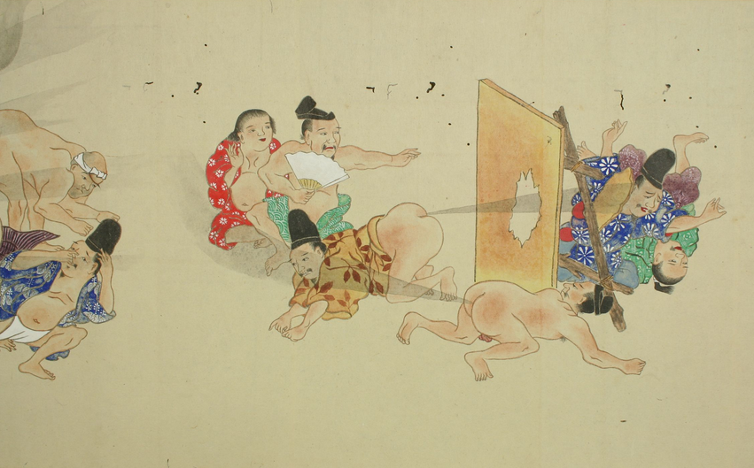
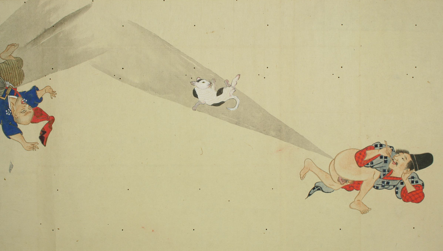
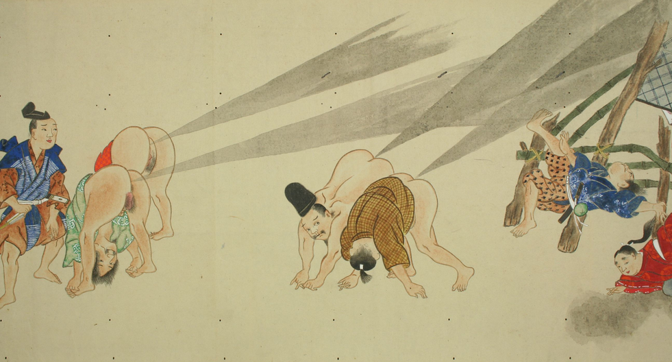
While the He-Gassen scroll from roughly the 1840s has little of the Zen-like restraint of the above examples, it definitely shows the wind in the trees. He-Gassen (屁合戦) literally translates into “fart battle” and it shows various men and women with their rears in the air, breaking hurricane-strength wind — blasts so powerful that they can launch cats into the air, blow through walls, knock over buildings and generally send victims reeling. The scroll is easily one of the most remarkable, and hilarious, pieces of art I’ve seen in a long while.
The whole thing might look like an extended sketch from Terreace and Phillip, those gassy Canadian TV stars from South Park, but some argue that He-Gassen might have a political dimension. During the Edo period (1603–1867), flatulence was used as a way to mock westerners. Japan was closed off from the outside world and they were feeling more and more pressure from the West until finally American gun boats led by Commodore Matthew Perry forced the country open in 1853. What better way to thwart these Western interlopers than with a cavalcade of industrial strength gas?
Jonathan Crow is a Los Angeles-based writer and filmmaker whose work has appeared in Yahoo!, The Hollywood Reporter, and other publications. You can follow him at @jonccrow. And check out his blog Veeptopus, featuring lots of pictures of vice presidents with octopuses on their heads. The Veeptopus store is here.
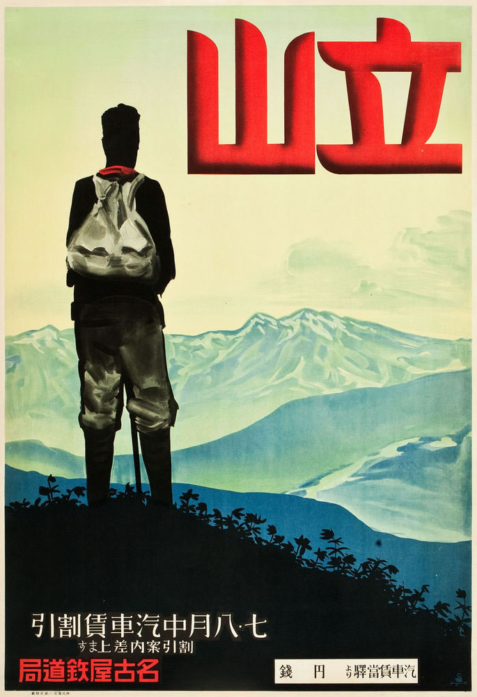
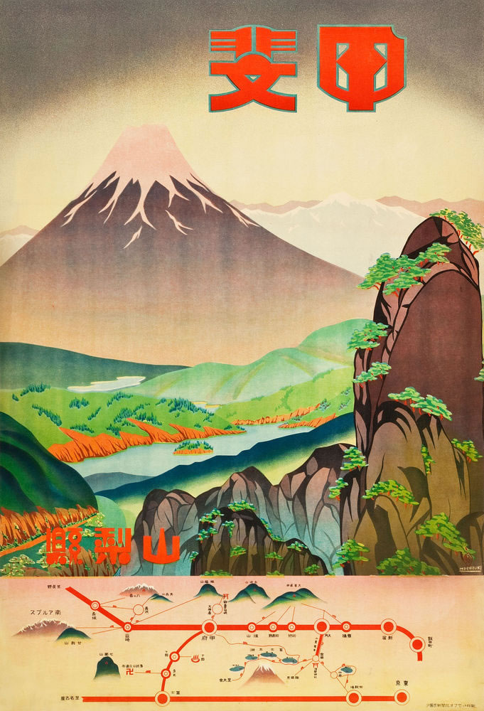
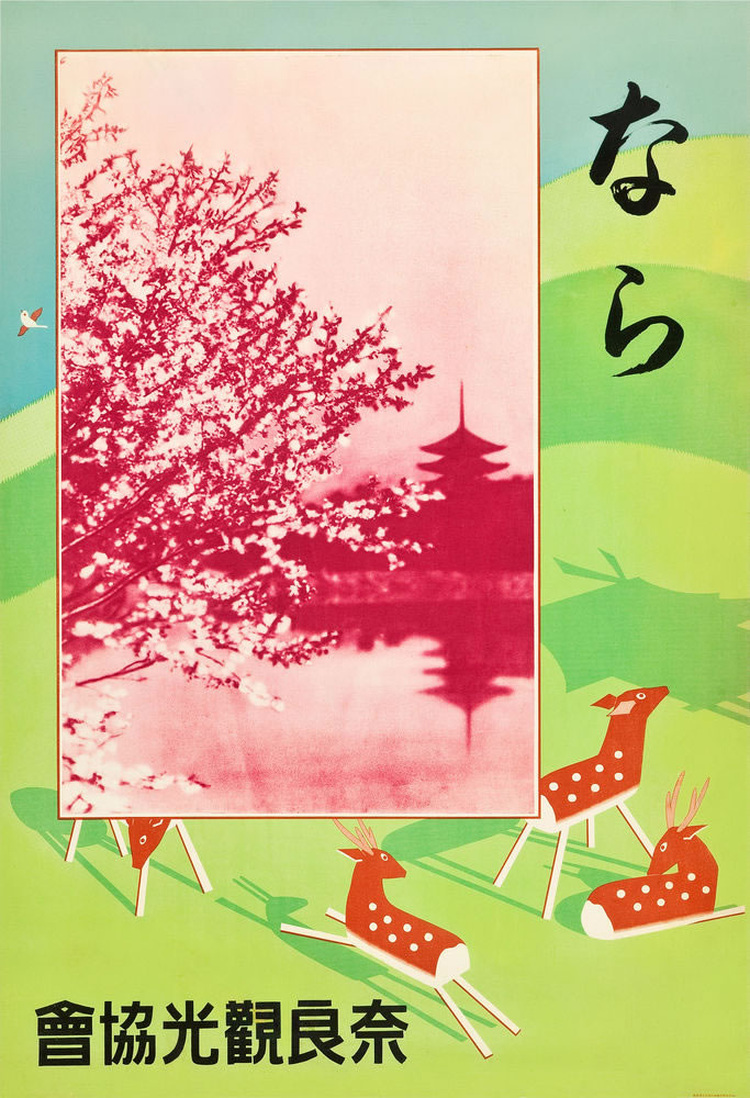
Earlier this year, we featured vintage Japanese print advertisements from the golden age of Art Deco and for such products as beer, sake, and cigarettes. If you like that sort of thing, you might consider paying attention to the recently launched Branding in Asia, a site detected to covering “the art of branding” as expressed in “the exciting new ideas and concepts exploding from the mind of Asia” — or the exciting old ideas and concepts which, aesthetically speaking, remain pretty explosive still.
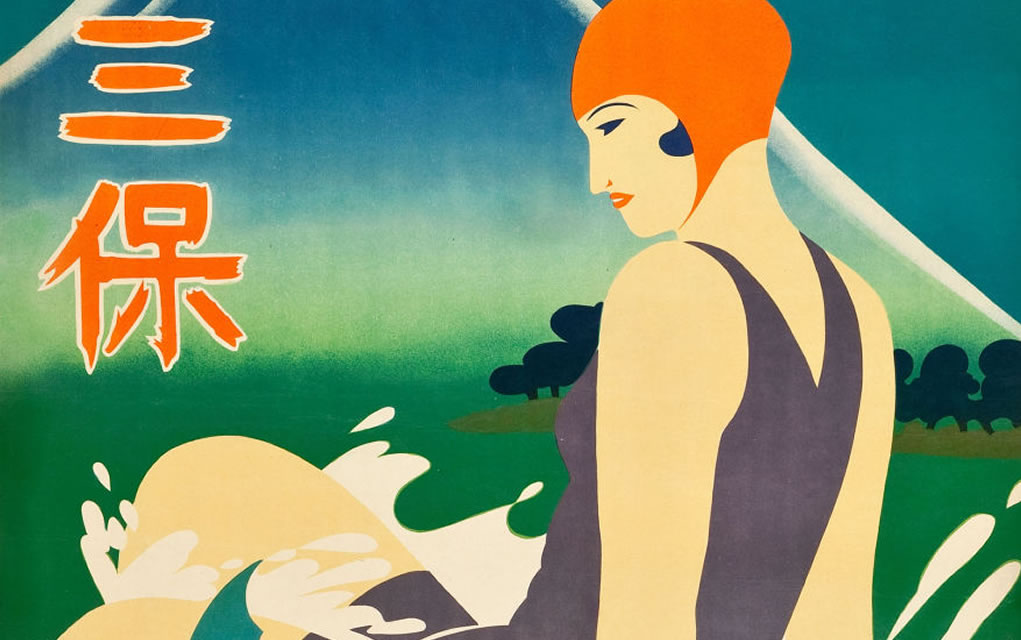
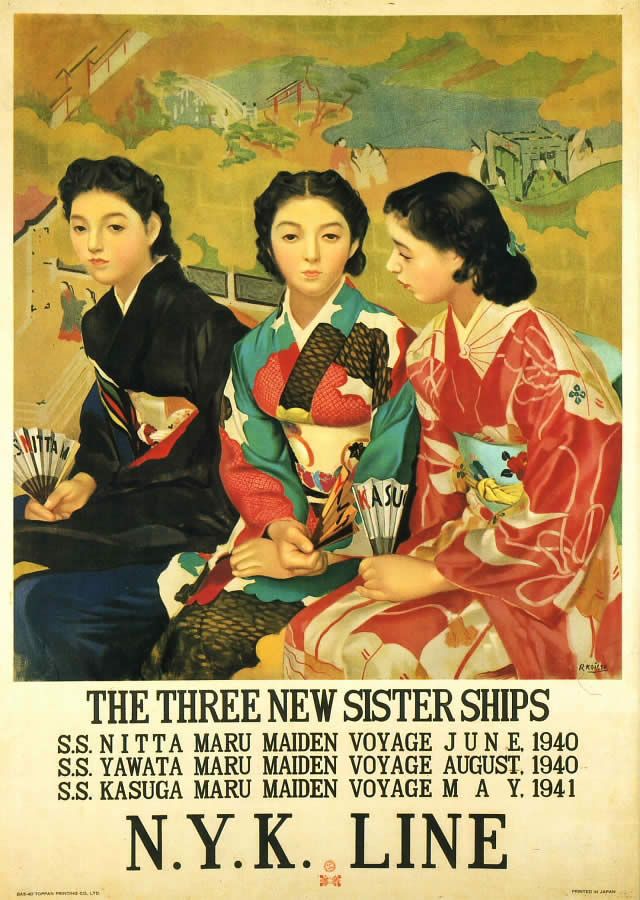
Take, for instance, their collection of classic Japanese steamship ads. “In the early part of the 20th century,” writes Steph Aromdee, “Japan’s increasingly prosperous middle class was taking to the high seas for travel. One company, the Japan Mail Steamship, advertised heavily, hoping to attract would-be tourists to their luxury ships. What were likely at the time regarded as simple advertisements and brochures that simply showed departures and destinations, have today become viewed as stunning works of art.”
Here we’ve excerpted a few such advertisements from their impressive selection which, as you can see, ranges artistically from the stylized to the realistic, and conceptually from the practical to the purely evocative. They might entice readers onto a steamship voyage with an Art Deco bathing beauty, a contrast of human traveler against mountain’s majesty, a detailed map enumerating a variety of possible destinations, or, as in the case of deer-filled Nara, a scattering of local icons.
The age of the steamship has, of course, long since dissolved into the romantic past, even in Japan. Or perhaps I should say especially in Japan, whose shinkansen bullet train not only put every other mode of transport straight into obsolescence, but — at least to my mind — also boasts a cutting-edge romance of its own.
And so these advertisements, more than 70 years after their printings, still get me planning my next trip to Japan, a country that knows a thing or two about desire and place. “Even in Kyoto,” wrote 17th-century poet Matsuo Bashō, “I long for Kyoto.”
The illustrated letters make for humanizing insights into the private world of artists that we usually only experience through their work.
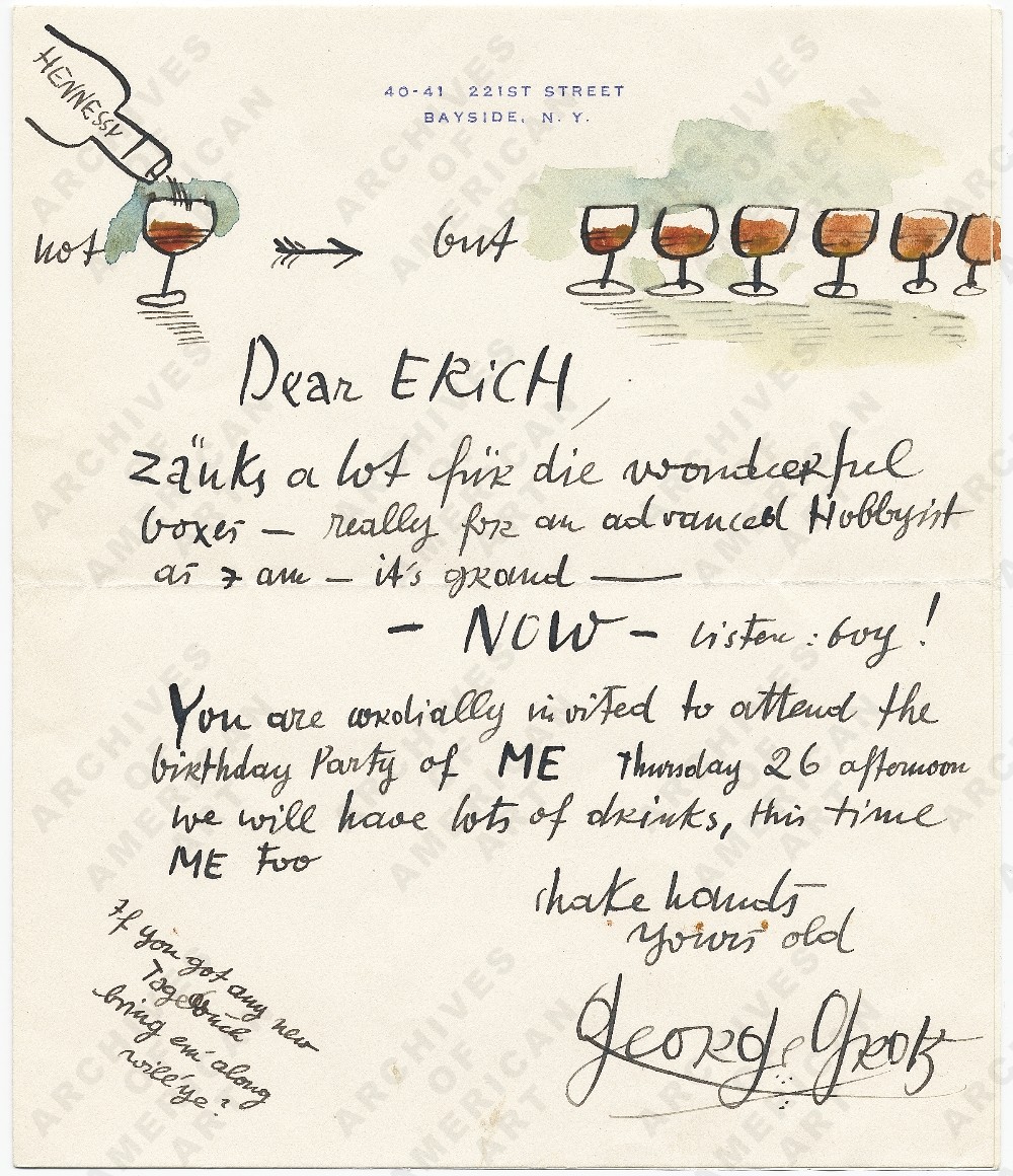
The 1945 letter from George Grosz to Erich S. Herrmann (above) is to invite his friend (and art dealer) to his birthday party, promising not just one glass of Hennessy, but six (and more). “Listen: boy!” he declares. “You are cordially invited to attend the birthday party of ME.” This was when Grosz was in his 50s and living in Huntington, New York. It should be noted that Grosz met his end falling down a flight of stairs while drunk, but the man knew how to party.
Joseph Lindon Smith was an American illustrator best known for being the artist who traveled to Egypt and documented the excavations at Giza and the Valley of the Kings, very faithful in their representation. But in 1894, this letter finds Smith, 31 years old, living in Paris, trying to make a go of it as an artist, and having enough success to tell his parents: “Behold your son painting under a shower of gold,” he writes. Check out that handwriting: it’s beautiful.
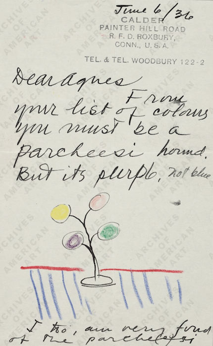
Sculptor Alexander Calderwrote this note to Vassar colleague and friend Agnes Rindge Claflin in 1936, continuing some conversation they were having about color, and noting her choices mark her as a “Parcheesi hound,” and adding that he’s a fan of the game too. The little illustration, which is straight Calder, is cute too. Claflin would later go on to narrate one of MOMA’s first films to accompany an exhibit, Herbert Matter’s 1944 film on Calder, Sculpture and Constructions.
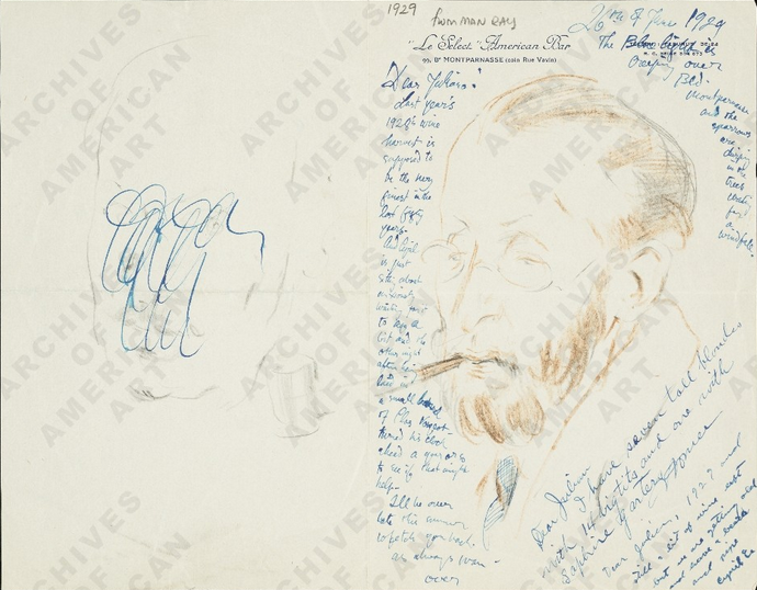
This Man Rayletter to painter Julian E. Levi looks like it has been worried over or recycled—-“Dear Julian” appears several times on the stationery from Le Select American Bar in Montparnasse. It’s a bit difficult to make out all his writing: he starts mentioning “Last year’s 1928 wine harvest is supposed to be the very finest in the last fifty years” at the beginning, but I’m more fascinated with the bottom right: “I have seven tall blondes with 14 big tits and one with sapphire garters.”
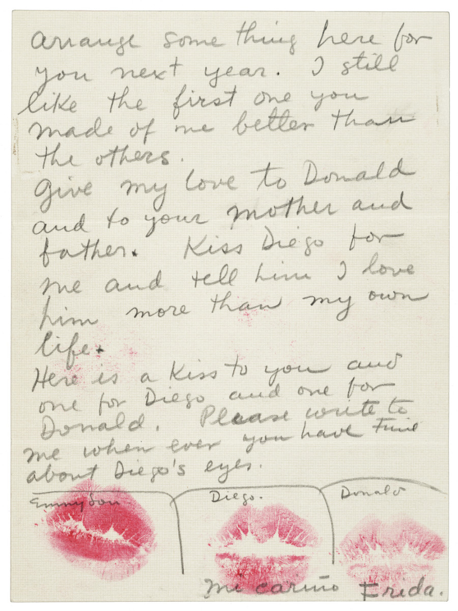
Finally, we close out with a letter Frida Kahlo sent to her friend Emmy Lou Packard in 1940, where she thanked Packard for taking care of Diego during an illness. The letter gets sealed, Priscilla Frank notes at HuffPo, with three lipstick kisses — “one for Diego, one for Emmy Lou, and one for her son.”
There’s plenty more illustrated letters to explore at the Smithsonian site and in Kirwin’s handsome book, featuring artists well known and obscure, but all who knew how to compose a good letter.
Ted Mills is a freelance writer on the arts who currently hosts the FunkZone Podcast. You can also follow him on Twitter at @tedmills, read his other arts writing at tedmills.com and/or watch his films here.
Gallagher worked for ten months to counteract the various indignities it had suffered, including a re-stretching that left the original canvas severely creased, and a Gilded Age application of varnish that weathered poorly over time.
It’s a painstaking process, restoring such a work to its original glory, requiring countless Q‑tips and a giant roller that allowed staffers to safely flip all 9 x 10.75 feet of the massive canvas. Gallagher identifies the last step, a sprayed-on coat of varnish necessary for teasing out the painting’s original luster, as the most nerve-wracking part of the odyssey.
Now that you know what went into it, you really should go visit it in person, if only to marvel at how the majority of visitors stream obliviously past, bound for the gift shop, the cafe, or other more name brand attractions.
(Certainly Le Brun, First Painter to Louis XIV, was a name brand in his day.)
Not too long ago, an older relative tried to donate the Funk & Wagnalls encyclopedia he’d owned since boyhood to a local charity shop, but they refused to take it.
What an ignominious end to an institution that had followed him for seven decades and twice as many moves. Like many such weighty possessions, its provenance was sentimental, a graduation gift I believe, bestowed all at once, rather than purchased piecemeal from a traveling encyclopedia salesman.
By the time I came along, its function had been reduced to the primarily decorative. Every now and then, he’d find some pretext to pull one of its many volumes from the shelf.
Did I know that Tanzania was once called Tanganyika?
And Thailand was once Siam!
The vintage Funk & Wagnalls’ many facts, maps, and illustrations were not the only aspects in need of an update. Its pre-Women’s Lib, pre-Civil Rights attitudes were shocking to the point of camp. There was unintentional comic gold in those pages. A collage artist could’ve had a ball. Witness the success of the Encyclopedia Show, an ongoing performance event in Chicago.
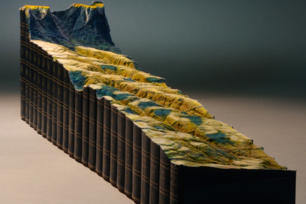
Multidisciplinary artist Guy Laramée takes a much more sober approach, above. Adieu, his sculptural repurposing of a 24-volume Encyclopedia Britannica feels like a memento mori for a dimly recalled ancestor of the information age.
Quoth the artist:
I carve landscapes out of books and I paint romantic landscapes. Mountains of disused knowledge return to what they really are: mountains. They erode a bit more and they become hills. Then they flatten and become fields where apparently nothing is happening. Piles of obsolete encyclopedias return to that which does not need to say anything, that which simply IS. Fogs and clouds erase everything we know, everything we think we are.
An enemy of 3D printing and other 21st-century technological advances, Laramée employs old fashioned power tools to accomplish his beautiful, destructive vision. What’s left is a deliberate wasteland.
Kudos to filmmaker Sébastien Ventura for transcending mere documentation to deliver the befitting elegy at the top of the page. He presents us with a beautiful ruin. Whatever happened there, nature will reclaim it.
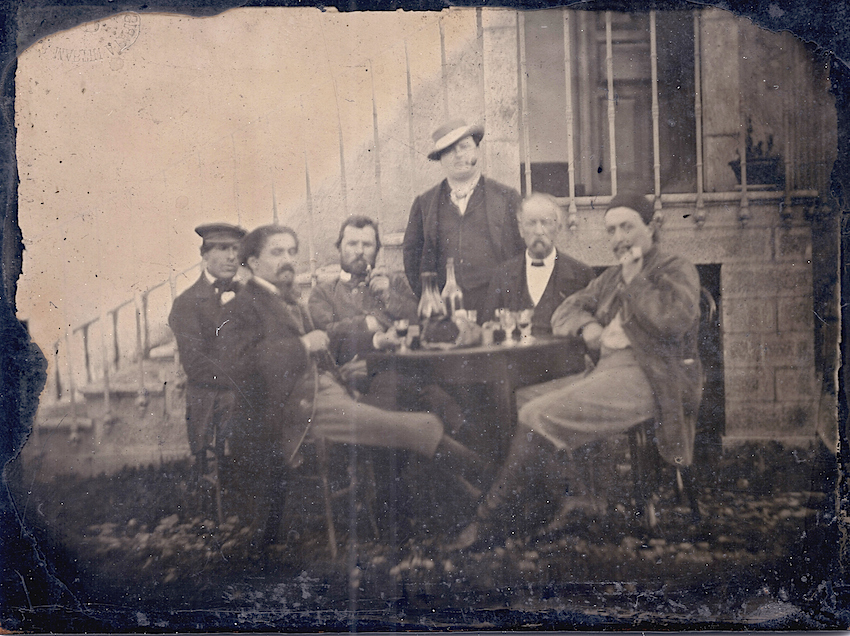
Thanks to the recently discovered photograph at the top of this article, we may soon have the option of picturing the actual Vincent Van Gogh as an adult artist. As Petapixel tells us, he sat for portraits at age 13, and again as a 19-year-old gallery apprentice (below), but beyond that no photographic evidence of the camera-shy artist was known to exist.
So thought the two collectors who purchased the small 1887 photo at a house sale a couple of years ago. Serge Plantureux, an antiquarian bookseller and photography expert who examined their find was optimistic enough to help them with further research, as he noted in the French magazine, L’Oeil de la Photographie:
I didn’t want to start doing what Americans call “wishful thinking,” that trap into which collectors and researchers fall, where their reasoning is governed only by what they want to see.
Don’t ditch Douglas, Roth, and Scorsese just yet, however. Experts at Amsterdam’s Van Gogh Museum say the bearded fellow cannot be the artist. According to them, there’s not even much of a resemblance. He wasn’t so much camera shy, as deadly opposed to the photographic medium. His refusal to be photographed was an act of resistance.
That kind of puts a damper on things…
So.. no go Van Gogh? Oh well…vive la photo nouvellement découverte de Paul Gauguin (and friends)!
We're hoping to rely on loyal readers, rather than erratic ads. Please click the Donate button and support Open Culture. You can use Paypal, Venmo, Patreon, even Crypto! We thank you!
Open Culture scours the web for the best educational media. We find the free courses and audio books you need, the language lessons & educational videos you want, and plenty of enlightenment in between.


