The entity to whom Dutch group, Lifehunters, attributes the museum quality artwork in the video prank above doesn’t exist. The “famous” Swedish artist’s handle –IKE Andrews –is but a puckish reference to IKEA, the purveyor of the 10€ print (oh snap, it’s not even an original!) various unnamed “art experts” are asked to evaluate, having been led to believe it’s something rare and wonderful. IKE Andrews’ fellow fictional entity, Borat, would be gratified by how readily these experts accept presenter Boris Lange’s suggestions as to the value of this work.
So how bad is this “painting”? Walter Keane bad? Margaret Keane bad? Is it a Velvis? A sad clown? The sort of crummy landscape artist Wayne White might snap up in a thrift store?
Only if you think IKEA achieved global dominance by choosing designs, patterns, and images in order for snotty hipsters to buy them ironically…
As several YouTube, Twitter, and blog commenters have mentioned, the print itself is pretty cool.
It’s a media frenzy, but interestingly, the artist is not coming forward to herald his or her role in the hoax.
Make that artists. Turns out IKE Andrews is a pair of Swiss street artists, Christian Rebecchi and Pablo Togni, who collaborate as NEVERCREW.
They have a fascination with cross sections. As their website somewhat murkily explains [all sic]:
These models, as such, from time to time actually contain more or less extensive realities, represented as autonomous systems of which the reality of the viewer becomes a part. This then the rapport becomes the very subject, mainly highlighted as the relationship between man and nature (between human being and its nature), but automatically extended to a vision of total and inevitable relationship between everything, between every part, where it is only the point of view, the position within a system, to define a selection.
IKEA streamlines the artists’ philosophy for the masses thusly:
We call the theme “living structures” and we like to see them as models of living systems. We would like our art to generate interest and curiosity, and the viewer to become a part of the mechanism with his or her thoughts, perspective and emotions.
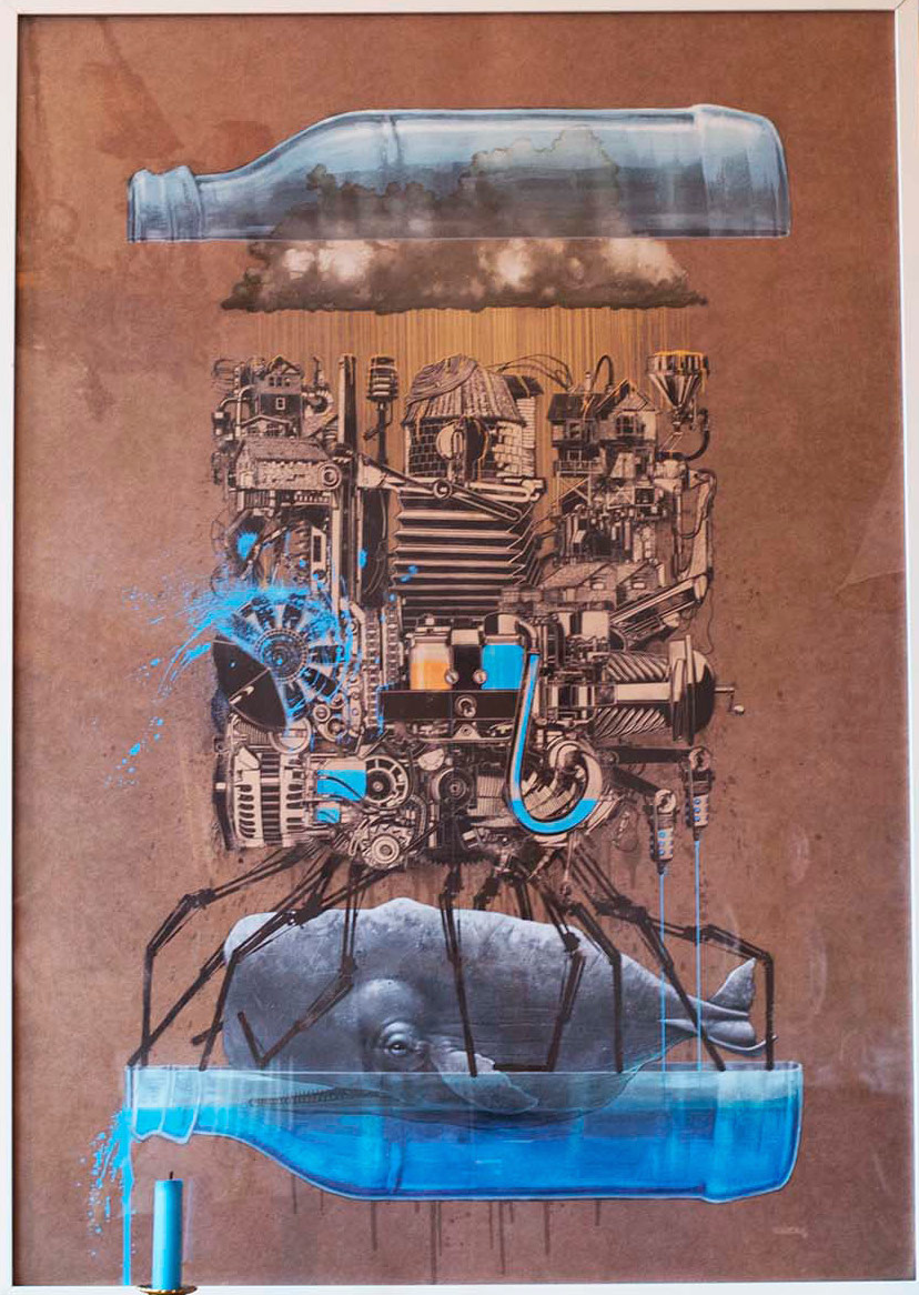
Philosophy’s all well and good, but what’s it actually look like, this “Message in a Bottle”?
Well, it seems to me to be a bottle, implausibly halved lengthwise to reveal a bunch of steampunk stuff balanced atop robot spider legs, forming a cage around an ancient-looking whale. Also, a cloud raining yellow liquid, or possibly light. (Hopefully the latter). Oh! And it appears to have been painted on a brown paper bag.
I can think of plenty of people who’d not only like it, but find meaning in it, as the experts do. The only difference is the experts do so on camera, a fact not all of them are willing to laugh at, when host Lange informs them they’ve been punked.
The artists aren’t the only ones playing it cool. The internet may be exploding, but so far, neither IKEA, nor the Netherlands’ Arnhem Museum, where the prank was staged, have made mention of this business.
via Hyperallergic
Related Content:
F for Fake: Orson Welles’ Short Film & Trailer That Was Never Released in America
The Great Dr. Fox Lecture: A Vintage Academic Hoax (1970)
Ayun Halliday is an author, illustrator, and mother of a teen filmmaker whose best known work was shot guerrilla style in a Red Hook, Brooklyn Ikea. Follow her @AyunHalliday


