In Mexico on November 2, mortality is approached with music and laughter.
“On the Day of the Dead, when the spirits come back to us,” explains the Dr. Vigil character in the 1984 film of Malcolm Lowry’s Under the Volcano, “the road from heaven must be made easy, and not slippery with tears.”
The souls of the dead are welcomed back with offerings of food and drink. Skulls and frolicking skeletons, often dressed in full costume, are depicted on alters, food and elsewhere — a playful reminder that all of us, despite our vanities, will one day turn to dust.
The origins of the Day of the Dead and its basic motifs can be traced back 3000 years, to the Aztecs, but the satirical skeletons of its present-day iconography bear the strong influence of one man who died 101 years ago: the printmaker and draughtsman José Guadalupe Posada.
Posada was an obscure newspaper illustrator when he settled in Mexico City in 1888 and began working for a company that published graphic flyers designed to bring the news of the day to a largely illiterate public. Posada’s engravings soon caught on.
“Long drawn to the sensational,” writes Jesse Cordes Selbin at the Henry Ransom Center, “Posada’s interest centered on such fantastic and unsavory aspects of life as murders, robberies, bullfights, political scandals, and illicit love affairs. While his political work alternately satirized President Porfirio Díaz and lauded the populist revolutionary leaders Emiliano Zapata and Francisco Madero, for the most part his prints successfully struck the fine line between hard-hitting and light-hearted, resonating widely throughout Mexico.”
Despite their humble purpose, Posada’s engravings were a major influence on the development of 20th century Mexican art. Octavio Paz described his technique as “a minimum of lines and a maximum of expression.” In his introduction to Mexico: Splendors of Thirty Centuries, Paz writes, “By birthright Posada belongs to a manner that has left its stamp on the twentieth century: Expressionism. Unlike the majority of Expressionist artists, however, Posada never took himself too seriously.”
Others, however, did. The muralists who flourished in post-revolutionary Mexico revered Posada. Diego Rivera and José Clemente Orozco, in particular, praised him as an inspirational figure. In his autobiography, Orozco writes:
Posada used to work in full view, behind the shop windows, and on my way to school and back, four times a day, I would stop and spend a few enchanted minutes in watching him, and sometimes I even ventured to enter the shop and snatch up a bit of the metal shavings that fell from the minimum-coated metal plate as the master’s graver passed over it. This was the push that first set my imagination in motion and impelled me to cover paper with my earliest little figures; this was my awakening to the existence of the art of painting.
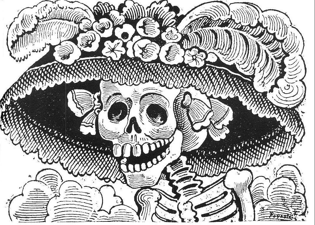
The most influential of Posada’s works were his Calaveras, meaning “skulls,” or, by extension, “skeletons.” Perhaps the most famous work from the series is Calavera Catrina (above), a zinc etching completed in about 1910. It depicts a woman of the social class known as the Catrins (from a Spanish word meaning “over-elegant”), a group who denied their Maya heritage and thought of themselves only as European.
In 1947 Diego Rivera paid homage to Posada by placing him at the center of his panoramic Dream of a Sunday Afternoon in the Alameda Central with a full-length version of the Calavera Catrina on his arm, while Rivera himself, depicted as a young boy, stands on the other side holding her bony hand. For more of Posada’s Calaveras, scroll down.
The Folk Dance Beyond the Grave:
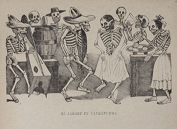
Another zinc etching from around 1910, El Jarabe en ultratumba (“The Folk Dance Beyond the Grave”) depicts a merry group of skeletons eating, drinking, making music and dancing the traditional jarabe. The reproduction is from the posthumous 1930 monograph Las Obras de José Guadalupe Posada, Grabador Mexicano.
Calavera from Oaxaca:
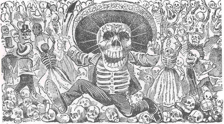
Calavera Oaxaqueña (“Calavera from Oaxaca”) was first published on a broadside in 1910. It shows a proud-looking skeleton dressed as a charro, running past a crowd of skeletons with a blood-stained knife in his hand.
Calavera of Don Quixote:
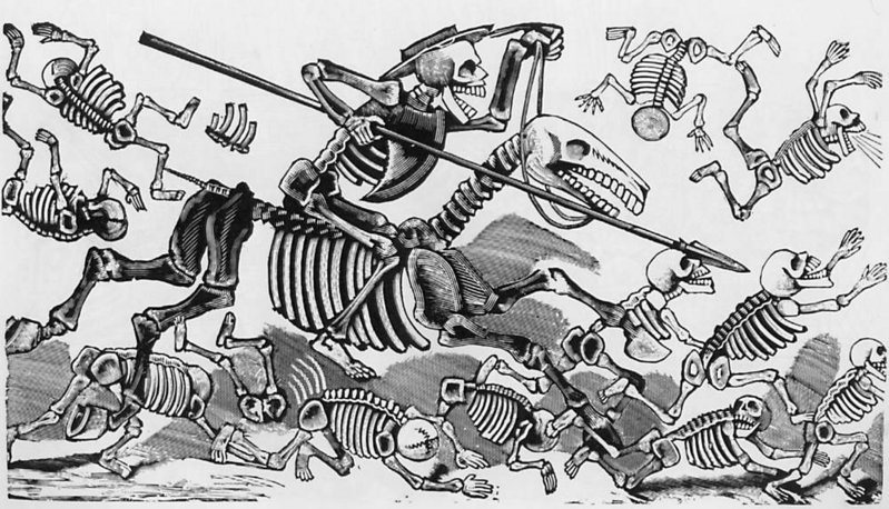
In this etching made sometime between 1910 and Posada’s death in 1913, Don Quixote rides into battle wearing an upside-down barber’s basin he imagines to be the legendary helmet of Mambrino, a solid-gold relic said to make its wearer invulnerable. He vanquishes every foe. “This is the calavera of Don Quixote,” says the caption on the original broadside publication, “the first-class one, the matchless one, the gigantic one.”
Click on the images above to view them in a larger format. You can view more prints by Posada at MoMA and The Public Domain Review.
Related Content:
Charles & Ray Eames’ Short Film on the Mexican Day of the Dead (1957)
Frida Kahlo and Diego Rivera Visit Leon Trotsky in Mexico, 1938
Speaking in Whistles: The Whistled Language of Oaxaca, Mexico