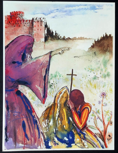
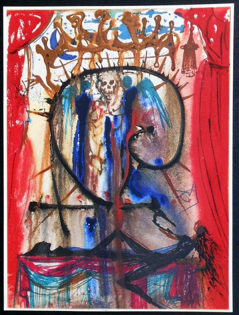
Even from just what we’ve posted about Salvador Dalí, you can tell he had a mission to spread his distinctive sensibility far and wide: he made films with Luis Buñuel, collaborated with Walt Disney and Alfred Hitchcock, showed up for Andy Warhol’s “screen tests,” and illustrated some of the best-known texts in western history, like Dante’s Divine Comedy, Lewis Carroll’s Alice’s Adventures in Wonderland, and Shakespeare’s Macbeth. All those projects might seem well suited to the Spanish surrealist’s famous skill at artistically rendering the torn edges of human consciousness, but what would he do when presented with something more psychologically straightforward — Romeo and Juliet, say? You can see the results of just such a project at Twisted Sifter, which presents ten notable illustrations from Dalí’s second Shakespearean project.
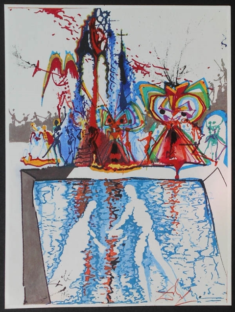
These images come from a 1975 Rizzoli and Rizzoli edition consisting of “ten off-set lithographs on heavy paper with 99 pages of bound text contained in a red/burgundy silk slipcase with the lithographs signed in the place.” You can find out more about this book at the site of Plainfield, Illinois’ Lockport Street Gallery, which offers the copy for sale and a warning against all the “fake prints” (inauthentic Dalí having long constituted a robust industry of its own) in circulation. Romeo and Juliet, perhaps due to its tendency to get assigned in high school, can come off as one of Shakespeare’s milder, more familiar plays, and modern interpretations of the material fall flat as often as they rise up to it. But Dalí’s contribution makes the old tale of star-crossed lovers strange and haunting again — exactly the specialty, I suppose, that would attract anybody to him with an offer of collaboration in the first place.
Related Content:
Two Vintage Films by Salvador Dalí and Luis Buñuel: Un Chien Andalou and L’Age d’Or
See Salvador Dali’s Illustrations for the 1969 Edition of Alice’s Adventures in Wonderland
Salvador Dalí’s 100 Illustrations of Dante’s The Divine Comedy
Destino: The Salvador Dalí – Disney Collaboration 57 Years in the Making
Alfred Hitchcock Recalls Working with Salvador Dali on Spellbound
Free Online Shakespeare Courses: Primers on the Bard from Oxford, Harvard, Berkeley & More
Colin Marshall hosts and produces Notebook on Cities and Culture and writes essays on cities, language, Asia, and men’s style. He’s at work on a book about Los Angeles, A Los Angeles Primer. Follow him on Twitter at @colinmarshall or on Facebook.


