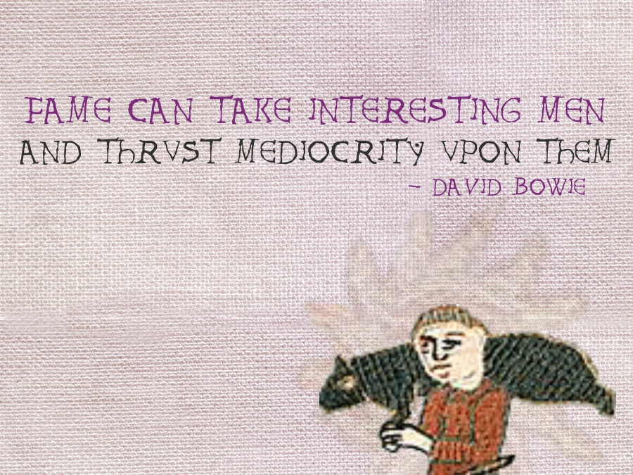
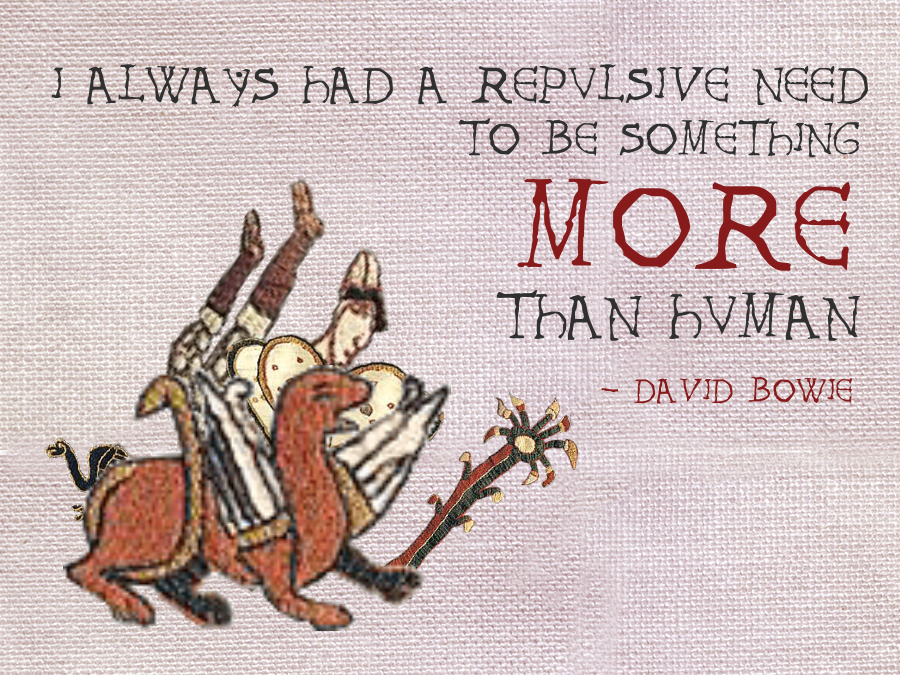
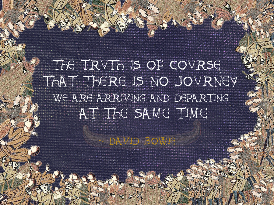
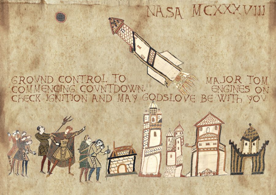
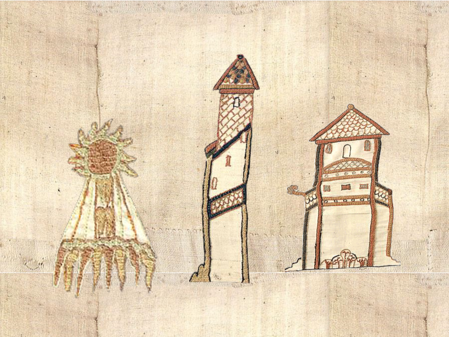
A wise woman once quoth that one man’s adult coloring book is another’s Medieval Tapestry Edit.
If taking crayons to empty outlines of mandalas, floral patterns, and forest and ocean scenes has failed to calm your mind, the Historic Tale Construction Kit may cure what ails you.
They separated out various elements of the Bayeux Tapestry,allowing you to freely mess around with 1000-year-old images of warriors, commoners, beasts, and buildings:
Choose a background, add some text in your choice of Bayeux or Augusta font and you’ll have done your bit to revive the fading art of the Medieval Macro (or meme.)
The original tapestry used some 224 feet of wool-embroidered linen to recount the Battle of Hastings and the events leading up to it.
You need not have such lofty aims.
Perhaps test the waters with a Father’s Day greeting, resizing and rotating until you feel ready to export as a PNG.
The interface is extremely user friendly, kind of like a tech-savvy 11th-century cousin of the online drag-and-drop graphic design tool, Canva.
The Historic Tale Construction Kit’s most impressive bells and whistles reside in the paintbrush tool in the lower left corner, which allows you to lay down great swaths of folks, birds, or corpses in a single sweep.
Your palette will be limited to the shades deployed by the Bayeux embroiderers, who obtained their colors from plants—dyer’s woad, madder, and dyer’s rocket (or weld).
The text, of course, is entirely up to you.
It pleased us to go with the eminently quotable David Bowie, and only after we groped our way into the three fledgling efforts you see above did we discover that we’re not the only ones.
You know Times New Roman, you know Helvetica, you know Comic Sans — and though you may not realize it, you know Cooper Black as well. Just think of the “VOTE FOR PEDRO” shirt worn in Napoleon Dynamite (and in real life for years thereafter), or a few decades earlier, the cover of Pet Sounds. In fact, the history of Cooper Black extends well before the Beach Boys’ mid-1960s masterpiece; to see and hear the full story, watch the Vox video above. It begins, as narrator Estelle Caswell explains, in Chicago, at the turn of the 1920s when type designer Oswald Bruce Cooper created the series of fonts that bear his name. Nearly a century after the 1922 introduction of the variant Cooper Black, we see it everywhere, not just on album covers and T‑shirts but storefronts, movie posters, and candy wrappers all over the world.
The evolution of printing, specifically the evolution from carved wood type to cast metal, made Cooper Black possible. Its distinctive look — and the curved edges that made it forgiving to imperfect printing processes — made it a hit. And when film strips replaced metal type, allowing the kind of closely-spaced printing that Cooper thought best presented his font, the already-popular Cooper Black underwent a renaissance.
“It thrived, as always, in advertising,” says Caswell. “Its friendly curves fit the tongue-in-cheek aesthetic of the 1960s and 70s, but it also showed up in magazines, movies, and hundreds of album covers.” To typography enthusiasts, Pet Sounds seemingly remains Cooper Black’s finest hour: “Just look at the way the D works with the E and the Y, and ‘Boys’ fits so nicely over the O,” as art director Stephen Heller says in the video.
In the 1920s Cooper Black not only showcased cutting-edge printing technology, its aesthetic looked exhilaratingly modern as well. Now, of course, it looks comfortingly retro, evocative of the era of handmade graphic design slipping out of living memory in our digital 21st century. But the 21st century so far has also been a time of “retromania”: with all previous media increasingly at our fingertips, we draw inspiration (and even material) for our art and design more directly and instinctively than ever from the trends of the past. No wonder we continue to feel a resonance in Cooper Black, whose letters, as Caswell puts it, bring with them the weight of “a century’s worth of changes in technology and pop culture.” Nor is Cooper Black’s next century, whatever uses it sees the font put to, likely to diminish its appeal.
Based in Seoul, Colin Marshall writes and broadcasts on cities, language, and culture. His projects include the book The Stateless City: a Walk through 21st-Century Los Angeles and the video series The City in Cinema. Follow him on Twitter at @colinmarshall, on Facebook, or on Instagram.
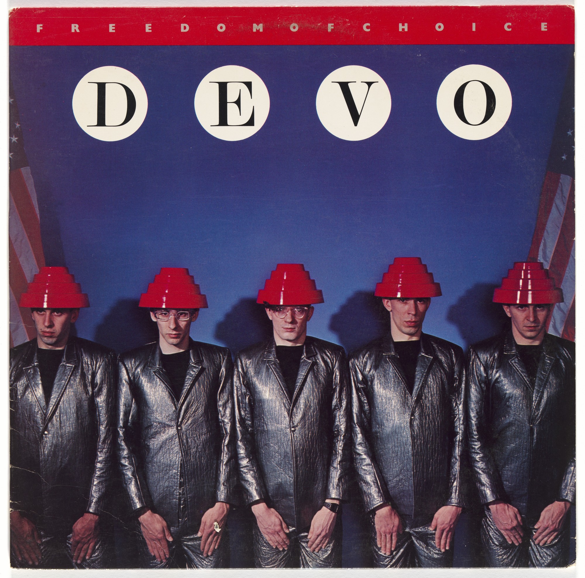
According to DEVO’s co-principle songwriter and bassist Gerald Casale, the experimental art band turned early MTV pop-punk darlings were “pro-information, anti stupid conformity and knew that the struggle for freedom against tyranny is never-ending.”
Their singular performance garb also set them apart, and none more so than the bright red plastic Energy Dome helmets they donned 40 years ago this month, upon the release of their third album, Freedom of Choice.
The record, which the band conceived of as a funk album, exploded into mainstream consciousness. The visuals may have made an even more lasting impact than the music, which included the chart topping “Whip It.”
Even the most anti-New Wave metalhead could identify the source of those domes, which have been likened to upturned flower pots, dog bowls, car urinals, and lamp shades.
What they probably don’t know is the Energy Dome was “designed according to ancient ziggurat mount proportions used in votive worship. Like the mounds, it collects energy and recirculates it. In this case, the dome collects energy that escapes from the crown of the human head and pushes it back into the Medula Oblongata for increased mental energy.”
Thus sayeth Casale, anyway.
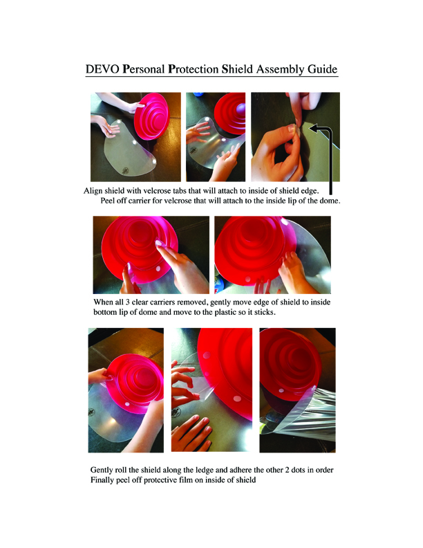
DEVO’s 2020 concert plans were, of course, scotched by the coronavirus pandemic, but the band has found an alternative way to mark the 40th anniversary of Freedom of Choice and the birth of its iconic headgear.
In addition to face masks emblazoned with the familiar red tiered shape, DEVOtees with money and confidence to spare can ante up for a DIY Personal Protective Equipment kit that transforms a standard-issue Energy Dome into a face shield.
It’s worth noting that before taking your converted energy dome out for a particle deflecting spin, you’ll have to truffle up a hard hat suspension liner and install it for a proper fit.
Here we are 40 years later, living in the alternate reality nightmare spawned by Covid 19 and the botched response of our world “leaders” to do the right thing quickly. We are not exaggerating when we say that 2020 could be the last time you might be able to exercise your freedom of choice. If you don’t use it, you can certainly lose it.
Perhaps the power of the Energy Dome is such that it could reawaken the pro-information, anti-stupidity sensibilities of some dormant DEVO fans among the unmasked rank and file.
As Casale himself posited in an interview with American Songwriter: “You make it taste good so that they don’t realize there’s medicine in it.”
While there are obviously much greater tragedies unfolding daily, it’s hard not to empathize with students who have watched countless special events—proms, commencements, spring sports, performances, hotly anticipated rites of passage—go poof.
In New York City, students in Parsons School of Design’s Narrative Spaces: Design Tools for Spatial Storytelling course were crestfallen to learn that their upcoming open-to-the-public exhibition of group and solo projects in the West Village—the centerpiece of the class and a huge opportunity to connect with an audience outside of the classroom—was suddenly off the menu.
Multidisciplinary artist Jeff Stark, who co-teaches the class with Pamela Parker, was disappointed on their behalves.
Stark’s own work, from Empire Drive In to Miss Rockaway Armada, is rooted in live experience, and New York City holds a special place in his heart. (He also edits the weekly email list Nonsense NYC, an invaluable resource for independent art and Do-It-Yourself events in the city.)
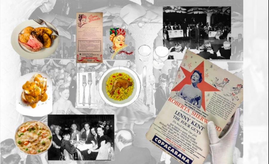
Student Rylie Cooke, an Australian who aspires to launch a design company, found that her research deepened her connection to artifacts she encountered at the Reliquary, as she came to appreciate the fabled Copacabana’s influence on the popular culture, food, and music of the period:
… with COVID-19 it became important to have this connection to the artifacts as I wasn’t able to physically touch or look at them when Parsons moved to online for the semester. I am a very hands-on creative and I love curating things, especially in an exhibit format.
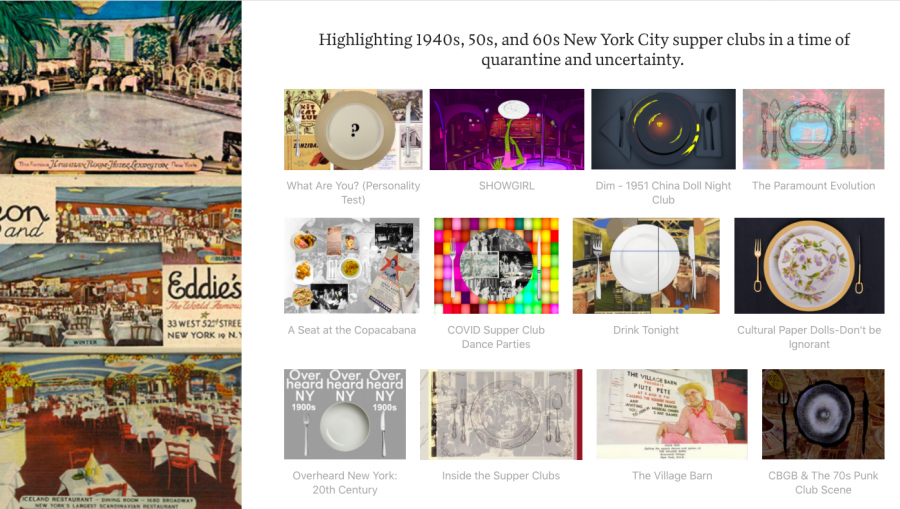
Rather than scrap their goal of public exhibition, the class decided to take things into the virtual realm, hustling to adapt their original concepts to a purely screen-based experience, The New York Supper Club: From Nightlife to Social Distancing.
The plan to wow visitors with a period-appropriate table in the center of their West Village exhibition space became a grid of digital placemats that serve as portals to each project.
Cooke’s contribution, A Seat at the Copacabana, begins with an interview in which baseball great Mickey Mantle recounts getting into a cloakroom brawl as he and fellow New York Yankees celebrated a birthday with a Sammy Davis Jr. set. Recipes for steak and potatoes, Chicken a la King, rarebit, and arroz con pollo provide flavor for a floorshow represented by archival footage of “Let’s Do the Copacabana” starring Carmen Miranda, a Martin and Lewis appearance, and a dance rehearsal from 1945. The tour ends at the Copa’s current incarnation in Times Square, with a vision of pre-socially distanced contemporary merrymakers salsa-ing the night away.
(Navigate this exhibit using toolbar arrows at the bottom of the screen.)
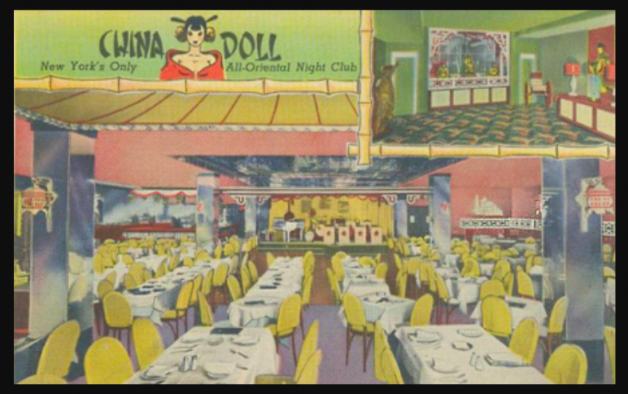
Student Hongxi Chen’s investigations into The China Doll nightclub resulted in an elaborate interactive immersive experience on the topic of cultural appropriation:
The China Doll… was founded in 1946 by Caucasian stage producer Tom Ball, who deemed it the only “all-oriental” night club in New York. While the club sometimes played off “Oriental” stereotypes, and titled one of its shows “Slant-Eyed Scandals,” they featured Asian dancers and Asian singers presenting popular songs in a way New Yorkers had never seen before. The Dim interactive experience unfolds with the story of Thomas, a waiter at the China Doll.
As a junior in Parsons’ Design and Technology program, Chen had plenty of previous experience forging virtual environments, but working with a museum collection was new to him, as was collaborating on a virtual platform.
He sought Stark’s advice on creating vivid dialogue for his fictional waiter.
Chen stayed up until 7 am for two weeks, devouring open source tutorials in an attempt to wrangle and debug the many elements of his ambitious project—audio, video, character models and animation, software, game engines, and game server platform.
As Chen noted at the exhibition’s recent Zoom opening (an event that was followed by a digital dance party), the massive game can be a bit slow to load. Don’t worry, it’s worth the wait, especially as you will have a hand in the story, steering it to one of five different endings.
Chen, an international student, could not safely return to China and has not left his student apartment since mid-March, but gamely states that remaining in the same time zone as his school allowed him to communicate efficiently with his professors and the majority of his classmates. (Cooke is back home in Australia.)
Adds Chen:
Even though we are facing a difficult circumstance under the pandemic and had to pivot our original ideas into a virtual presentation, I’m glad that our class was able to quickly change plans and adapt to the situation. This… actually inspired me a lot and opened up ways to invite and connect people with virtual artwork.
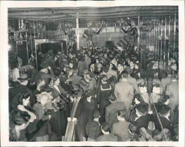
(Apparently, I’m headed to Cafe Zanzibar, below, where the drinks are cheap, the aspirin is free, and Cab Calloway is a frequent headliner.)
Stark admits that initially, his students may not have shared his swooning response to the source material, but they share his love of New York City and the desire to “get in the thick of it.” By bringing a Generation Z perspective to this historical ephemera, they stake a claim, making work that could help the City Reliquary connect to a new audience.
Enter The New York Supper Club: From Nightlife to Social Distancing here.
Explore the City Reliquary online here, and join in the civic pride by participating in its weekly Instagram Live events, including Thursday Collectors’ Nights.
(All images used with permission of the artists and The City Reliquary)
The state of virtual and augmented reality technology has reached the threshold of a time in which VR meetings will be the norm. Apart from other applications, this may soon allow consumers to stroll through virtual aisles rather than clicking boxes on a screen, picking up products and viewing them from every angle. Still, designers recognize that an essence of the human experience is lost without the sense of touch. There may even be a future in which we wear clothes with haptic feedback systems embedded in them, to feel the pages of a virtual book beneath our fingers…
Yet our slow transition from the physical to the virtual world leaves out intangibles. Something is lost from both. Big box stores still devote significant floor space to books and records, for example. But I submit that a glossiness prevails in print design, perhaps a consequence of competing with screens. There’s a wabi-sabi quality to browsing a used bookstore or record shop in person, thumbing through an old collection of vintage paperbacks and LPs, that cannot be simulated or enhanced in any way. On the internet, however, where video is king, it can be made the subject of some hypnotic video art.
As the sensible majority of us are hopefully staying put for the long haul (if we can), we may find ourselves curiously edified by the video art of Henning M. Lederer. We’ve previously featured Lederer’s animations of mid-century minimalist book covers and vintage psychology and philosophy books. He turns the abstract geometric patterns beloved by book and record company designers of the latter half of the 20th century into moving images that hint at how proper cover design can set the imagination whirring (even if it’s a cover design for Basic Accounting).
If Lederer’s mesmerizing videos simulate anything, it’s the experience of wandering into a used bookstore next to a liberal arts college—full of professors’ fascinatingly outdated hand-me-downs—after having ingested a small quantity of LSD. Maybe you’ll have a slightly different association. But the point is that Lederer’s art suggests a scenario rather than attempting to recreate one. His studies of modernist cover designs also recall Marcel Duchamp’s Rotoreliefs, conceptual art pieces intended for popular use as optical illusions.
Duchamp’s spinning disks became features of early Surrealist cinema, iconic symbols of dreams on film. There is a mysterious opacity to his physical objects onscreen, just as Lederer’s book and record covers seem to have a weight of their own, a use of digital technology to highlight the strange uniqueness of physical objects, rather than their endless reproducibility.
A few years ago we featured the Japanese art of chindōgu, or the invention of amusingly “useless” inventions. The chindōgu canon includes such simultaneously sensible and nonsensical objects as miniature toecap umbrellas (to keep one’s shoes dry in the rain) and chopsticks fitted with miniature fans (to cool down ramen noodles before consumption). Today we present a Japanese invention that may at first glance look chindōgu-like, but would never qualify due to its simplicity and sheer usefulness: an anti-virus face shield that anyone can make in three easy steps. After you’ve downloaded the template, all you need is a printer, paper, scissors, and some kind of clear plastic sheet.
“Healthcare workers around the world are putting their lives on the line to fight COVID-19 but their battle continues to be fought uphill as a shortage of medical supplies threatens to disrupt an already overwhelmed system,” writes Spoon & Tamago’s Johnny Waldman. We’ve all read of the lack of necessities like face masks and ventilators in some of the most afflicted countries, and in such places having access to face shields could make a real difference in the number of lives saved.
“Face shields are typically made with multiple parts and would be difficult to create and assemble at home,” Waldman notes. “But Tokujin Yoshioka’s brilliant idea simplifies the design greatly, allowing it to be held in place with ordinary eyewear.” Best known as an artist and designer, Yoshioka has made his name creating striking sculptures, installations, works of architecture, and many other objects besides.
Yoshioka even designed the torch for the 2020 Summer Olympics in Tokyo, shaped like a Japanese cherry blossom and made with the same aluminum extrusion technology used to manufacture the country’s equally iconic bullet trains. Clearly the coronavirus-caused postponement of the games hasn’t got Yoshioka too down to continue pursuing his calling. “I am grateful to the brave and dedicated healthcare workers for fighting the contagious disease,” he writes in the note accompanying the video at the top of the post that shows you how to make and wear his face shield. As you can see, it’s made to be worn with glasses, so the non-bespectacled will need to stick with other forms of protection against the virus — or take the opportunity to order some fashionable frames of the kind that all the best designers seem to be wearing these days.
Based in Seoul, Colin Marshall writes and broadcasts on cities, language, and culture. His projects include the book The Stateless City: a Walk through 21st-Century Los Angeles and the video series The City in Cinema. Follow him on Twitter at @colinmarshall, on Facebook, or on Instagram.
Whatever did people do with themselves all day before social media and streaming video? Before TV, film, and radio? If you were most people in Europe, before various revolutions, you worked from dawn to dusk and collapsed in bed, with rare holidays to break up the monotony.
But if you were an aristocrat, you not only had the pleasures of juicy gossip, lively correspondence, and bawdy novels to look forward to, but you might also—just as millions do now—encounter such pleasures while gaming.
The gaming technology of the time was all handcrafted, and said aristocrats might find themselves trading wicked barbs while seated around the height of tech above, a table that unfolds a series of leaves to reveal a felt surface for card games, a board for chess or checkers, and a leather writing surface that offers the option of a bookrest, for propping up a scandalous book of verse.
If you think that’s impressive, the table hasn’t finished yet. It further opens into a backgammon board, with sliding lids revealing compartments for game pieces. Then, the whole thing folds back to its size as a small side table, with detachable legs that can be stored inside it for easy portage.
The animated video of the ultimate 18th century gaming system at the top comes to us from the Metropolitan Museum of Art, demonstrating a piece in their collection designed by German cabinetmaker David Roentgen that “once graced the intimate interior of an aristocratic European home.” Not to be outdone, the Getty Museum brings us the 3D animation above of an 18th-century French mechanical table, with intricate workings designed by Jean-François Oeben.
“An affluent lady might spend hours at a fashionable table, engaged in leisure or work,” notes a companion video above. It illustrates the point with a pair of ghostly animated hands composing a letter on the table’s silk writing surface.
One can imagine these hands spilling the ink while opening juniper-scented drawers, and propping up the book stand; losing their place in a book while searching through compartments, early forms of scrolling or opening multiple tabs.
We may now carry mechanical tables in our pockets and rightly think of gaming systems as portals to other worlds, but there’s no denying that these bespoke ancestors of our devices offered plenty of opportunity for pleasant distraction.
Most fever dreams require very little pre-planning and coordination. All it takes is the flu and a pillow, and perhaps a shot of Ny-Quil.
A fever dream on the order of composer Philip Glass’ 1984 opera, Akhnaten, is a horse of an entirely different color, as “How An Opera Gets Made,” above, makes clear.
For those in the performing arts, the revelations of this eyepopping Vox video will come as no surprise, though the formidable resources of New York City’s Metropolitan Opera, where the piece was recently restaged by director Phelim McDermott, may be cause for envy.
The costumes!
The wigs!
The set!
The orchestra!
The jugglers!
… wait, jugglers?
Yes, a dozen, whose carefully coordinated efforts provide a counterpoint to the stylized slow motion pace the rest of the cast maintains for the duration of the three and half hour long show.
This maximalist approach to minimalist modern opera has proved a hit, though theNew York Times’ critic Anthony Tommasini opined that he could have done with less juggling…
We presume everyone gets that bringing an opera to the stage involves many more departments, steps, and heavy labor than can be squeezed into a 10-minute video.
Perhaps the biggest surprise awaiting the uninitiated is the playful offstage manner of Anthony Roth Costanzo, the supremely gifted countertenor in the title role. As the pharaoh who reduced ancient Egypt’s pantheon to a single god, Aten, aka the sun, he makes his first entrance completely nude, head shaved, flecked in gold, facing the audience for the entirety of his four-minute descent down a 12-step staircase.
(One step the video doesn’t touch on is the workout regimen he embarked on in preparation for his nude debut, a 6‑day-a-week commitment that inspired him to found one of the first American businesses to offer fitness buffs training sessions using Electrical Muscle Stimulation.)
His dedication to his craft is obviously extraordinary. It has to be for him to handle the score’s demanding arpeggios and intricate repetitions, notably the six-minute segment whose only lyric is “ah.” His breath control on that section earns high praise from his longtime vocal coach Joan Patenaude-Yarnell.
But—and this will come as a shock to those of us whose concept of male opera stars is informed nearly exclusively by Bugs Bunny cartoons and the late Luciano Pavarotti—his outsized talent does not seem to be reflected in outsized self-regard.
He treats viewers to a self-deprecating peek inside the Met’s wig room while clad in a decidedly anti-primo uomo sweatshirt, gamely dons his styrofoam khepresh for close range inspection, and cracks himself up by high-fiving his own pharaonic image in the lobby.
There’s incredible lightness to this being.
As such, he may be more effective at attracting a new generation of admirers to the art form than any discounts or pre-show mixer for patrons 35-and-under.
We're hoping to rely on loyal readers, rather than erratic ads. Please click the Donate button and support Open Culture. You can use Paypal, Venmo, Patreon, even Crypto! We thank you!
Open Culture scours the web for the best educational media. We find the free courses and audio books you need, the language lessons & educational videos you want, and plenty of enlightenment in between.


