Let’s pretend our Fairy Art Mother is granting one wish—to spend the night inside the painting of your choice.
What painting will we each choose, and why?
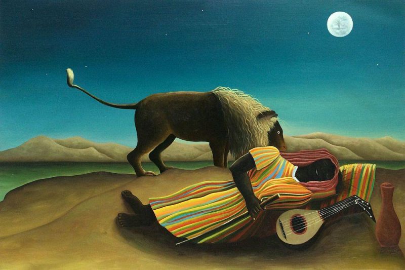
Will you sleep out in the open, undisturbed by lions, a la Rousseau’s The Sleeping Gypsy?
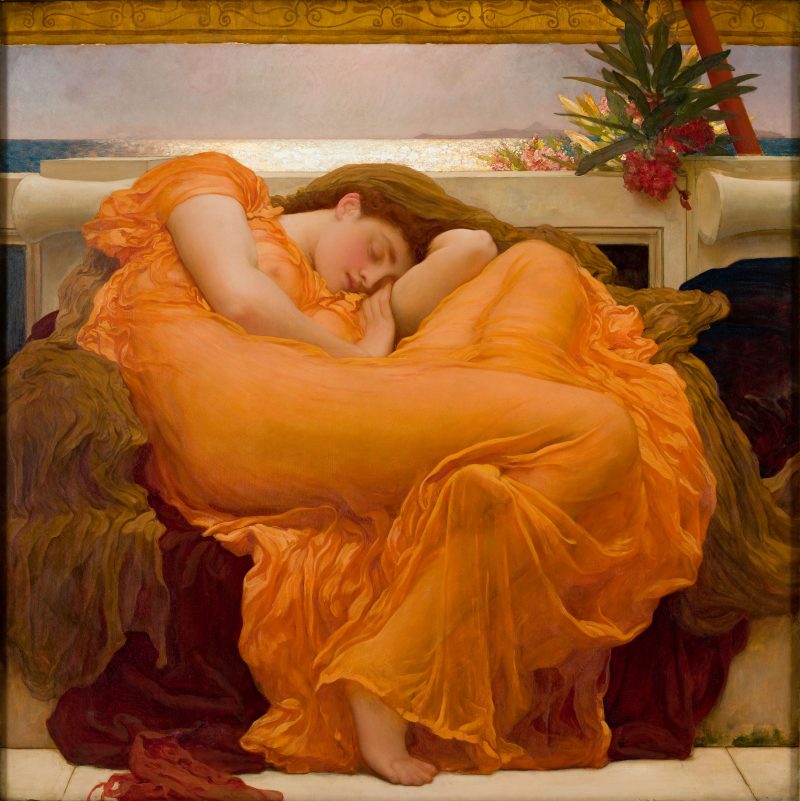
Or experience the voluptuous dreams of Frederic Leighton’s Flaming June?
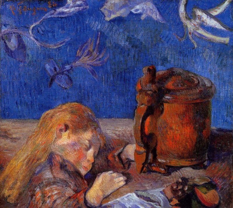
Paul Gauguin’s portrait of his son, Clovis presents a tantalizing prospect for those of us who haven’t slept like a baby in decades…
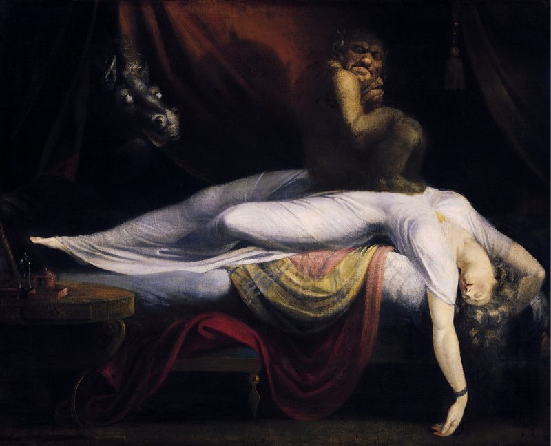
The Nightmare by Herny Fuseli should chime with Gothic sensibilities…
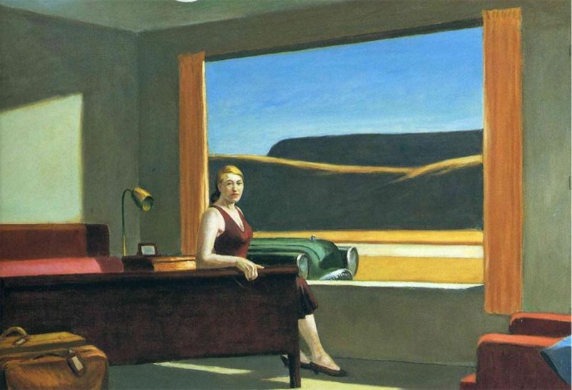
And it’s a fairly safe bet that some of us will select Edward Hopper’s Western Motel, at the top of this post, if only because we heard the Virginia Museum of Fine Arts was accepting double occupancy bookings for an extremely faithful facsimile, as part of its Edward Hopper and the American Hotel exhibition.
Alas, if unsurprisingly, the Hopper Hotel Experience, with mini golf and a curated tour, sold out quickly, with prices ranging from $150 to $500 for an off-hours stay.
Ticket-holding visitors can still peer in at the room any time the exhibit is open to the public, but it’s after hours when the Instagramming kicks into high gear.
What guest could resist the temptation to strike a pose amid the vintage luggage and (bluetooth-enabled) wood paneled radio, filling in for the 1957 painting’s lone figure, an iconic Hopper woman in a burgundy dress?
The Art Institute of Chicago notes that she is singular among Hopper’s subjects, in that she appears to be gazing directly at the viewer.
But as per the Yale University Art Gallery, from which Western Motel is on loan:
The woman staring across the room does not seem to see us; the pensiveness of her stare and her tense posture accentuate the sense of some impending event. She appears to be waiting: the luggage is packed, the room is devoid of personal objects, the bed is made, and a car is parked outside the window.
Hopefully, those lucky enough to have secured a booking will have perfected the pose in the mirror at home prior to arrival. This “motel” is a bit of a stage set, in that guests must leave the painting to access the public bathroom that constitutes the facilities.
(No word on whether the theme extends to a paper “sanitized for your protection” band across the toilet, but there’s no shower and a security officer is stationed outside the room for the duration of each stay.)
The popularity of this once-in-a-lifetime exhibit tie-in may spark other museums to follow suit.
The Art Institute of Chicago started the trend in 2016 with a painstaking recreation of Vincent Van Gogh’s room at Arles, which it listed on Air BnB for $10/night.
Think of all the fun we could have if the bedrooms of art history opened to us…
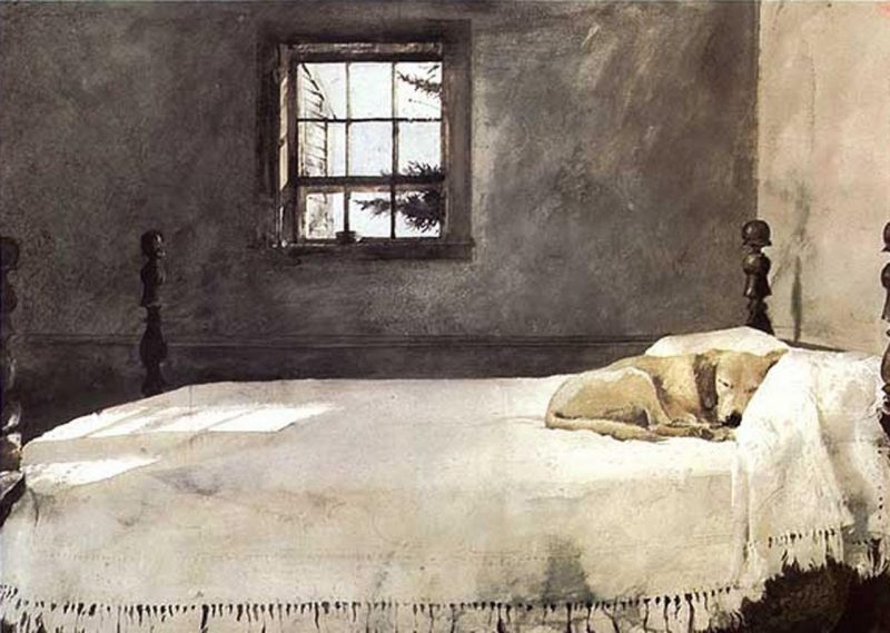
Dog lovers could get cozy in Andrew Wyeth’s Master Bedroom.
![]()
Delacroix’s The Death of Sardanapalus (1827) would require something more than double occupancy for proper Instagramming.
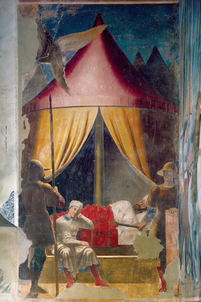
Piero della Francesca’s The Dream of Constantine might elicit impressive messages from the sub-conscience…
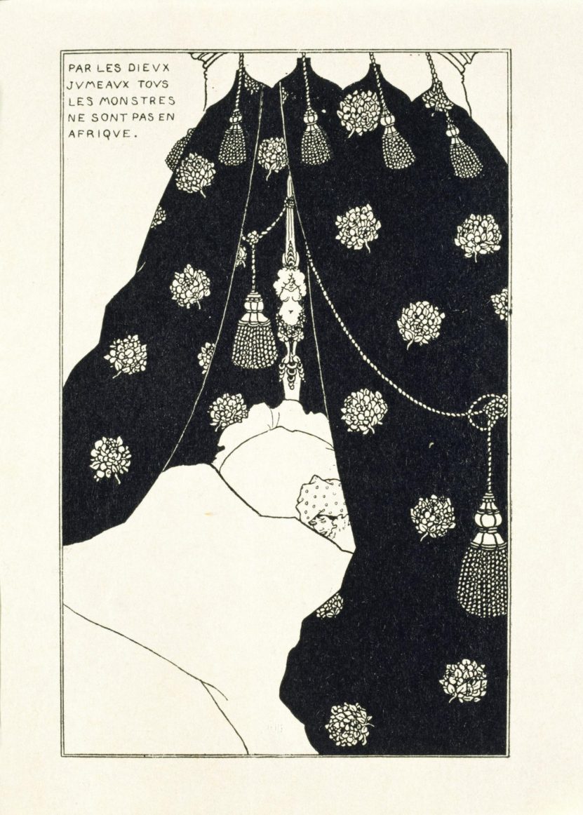
Tuberculosis nothwithstanding, Aubrey Beardsley’s Self Portrait in Bed is rife with possibilities.
Or skip the cultural foreplay and head straight for the NSFW pleasures of The French Bed, a la Rembrandt’s etching.
Edward Hopper and the American Hotel will be traveling to the Indianapolis Museum of Art at Newfields in June 2020.
Related Content:
Take a Journey Inside Vincent Van Gogh’s Paintings with a New Digital Exhibition
How Edward Hopper “Storyboarded” His Iconic Painting Nighthawks
Ayun Halliday is an author, illustrator, theater maker and Chief Primatologist of the East Village Inky zine. Join her in NYC on Monday, December 9 when her monthly book-based variety show, Necromancers of the Public Domain celebrates Dennison’s Christmas Book (1921). Follow her @AyunHalliday.


